


I evaluated dozens of products to identify the best data visualization tools for different reporting, dashboarding, and analytics needs and the top 7 are: Canva, Looker, Domo, Looker Studio, AgencyAnalytics, SAP HANA Cloud, and Kibana.
I've always found it fascinating how the right visualization can turn thousands of rows of data into a story people can understand in seconds. But choosing data visualization software isn't really about creating prettier charts.As a marketer, I want visuals that show me what's driving conversions, which campaigns are working, and where to invest next without digging through endless spreadsheets. That's just one use case, though.
Some teams need a platform where business users can build reports without relying on analysts. Others want live executive dashboards, governed enterprise reporting, or a way to combine marketing and analytics data into a single view.
As I analyzed G2 reviews across this category to find the best tool, one thing became impossible to ignore: today's data visualization platforms are built for very different purposes. Some excel at self-service reporting, others at enterprise business intelligence, while several stand out for marketing analytics and interactive dashboards. Ultimately, buyers aren't just looking for visualization tools; they're looking for faster, more confident decision-making.
In this article, I'll share the seven data visualization tools that consistently stood out in my research, G2 reviews, and product evaluation. I'll explain where each platform performs best, the strengths users mention most often, and which types of teams are likely to get the most value from it.
Canva: Best for quick, presentation-ready charts and visual reports
Combines drag-and-drop chart creation, infographic templates, Brand Kit, AI-powered design tools, collaboration, and presentation features for fast visual storytelling. (Free; paid plans from $15/user/month)
Looker: Best for governed business intelligence and interactive analytics
Delivers LookML-powered data modeling, interactive dashboards, governed metrics, embedded analytics, and enterprise data exploration across large datasets. (Custom pricing)
Domo: Best for unifying marketing, sales, and business data into live dashboards
Brings together hundreds of data connectors, Magic ETL, real-time dashboards, alerts, AI-assisted insights, and collaboration for organization-wide reporting. (Custom pricing; free trial available)
Data Studio (formerly Looker Studio): Best for building shareable dashboards from Google data
Connects Google Analytics, BigQuery, Sheets, Ads, and other data sources to create interactive, real-time reports that are easy to share across teams. (Free; paid plans from $9/user/project/month)
AgencyAnalytics: Best for automated client reporting for marketing agencies
Centralizes SEO, PPC, social media, web analytics, branded reports, dashboards, and scheduled reporting for agencies managing multiple clients. (free trial available; paid plans from $20/client/month)
SAP HANA Cloud: Best for enterprise-scale analytics on large, connected datasets
Supports in-memory analytics, data virtualization, real-time processing, enterprise reporting, and SAP ecosystem integrations for high-volume business intelligence workloads. (Custom pricing)
Kibana (by Elastic Stack): Best for visualizing operational, security, and observability data
Creates interactive dashboards, log analytics, search-driven visualizations, monitoring views, and Elasticsearch-powered reporting for technical teams. (Free with self-managed deployments; commercial Elastic Cloud plans available)
*These data visualization tools are top-rated in their category, according to the G2 Summer 2026 Grid Report. I've included their standout capabilities and current pricing information to make comparisons easier.
As I evaluated products for this list, I found that the best data visualization software does far more than create charts or dashboards. The strongest platforms help teams communicate insights more clearly, uncover patterns faster, and make data easier for decision-makers to understand. Whether you're building executive reports, monitoring business performance, or exploring trends, the right approach to data visualization can significantly improve how information is shared and acted upon.
That growing demand is reflected in the market itself. The global data visualization tools market is projected to grow to $23.76 billion by 2033, representing a compound annual growth rate (CAGR) of 14.8%. As organizations generate larger volumes of data, buyers increasingly expect visualization platforms to support everything from self-service reporting to enterprise-scale analytics.
I started by identifying the products with the strongest combination of market presence, user satisfaction, and G2 review activity. To narrow the list, I focused on platforms that help teams move beyond static charts by supporting interactive dashboards, reporting, business intelligence, and data storytelling. Throughout my evaluation, I compared product capabilities with recurring themes in verified user reviews to identify the best data visualization software for different business needs.
I also used AI to analyze G2 reviews at scale, helping me identify consistent patterns around usability, reporting workflows, integrations, scalability, and long-term value. Rather than relying on isolated opinions, I focused on recurring user feedback to understand where each platform consistently performs well and where buyers should expect trade-offs.
The final recommendations reflect a combination of G2 review insights, product research, and category analysis. The screenshots featured throughout this article come from G2 vendor profiles and publicly available product documentation.
Choosing the best data visualization software isn't simply about finding the platform with the most chart types or dashboard templates. As I analyzed G2 reviews and researched products across this category, I found that the strongest solutions help teams transform raw data into insights that are easier to explore, share, and act on.
The seven tools that made this list consistently performed well across the following evaluation areas:
To qualify for inclusion in the Data Visualization Tools category, a product must:
*This data was pulled from G2 in 2026. Some reviews may have been edited for clarity.
Looking for free options? See the best free data visualization tools for a closer comparison of free-plan limits, trial terms, and upgrade costs.
Canva is the tool I kept coming back to whenever speed and clarity mattered more than technical depth. Based on the G2 reviews I analyzed, it’s rarely positioned as a traditional data tool. Instead, it’s where teams go to turn data into something immediately usable, whether that’s a report, a presentation, or a client-facing visual.
Ease of use is the most consistent theme across both my experience and the Looker data. Canva scores 96% for ease of use and 97% for ease of setup, which shows in how quickly I can go from raw inputs to finished visuals. I didn’t need to think about configurations or workflows: the platform removes that friction entirely, which explains why it’s heavily adopted by small (68%) and mid-market (28%) teams that prioritize speed over complexity.
Another pattern that surfaced in G2 feedback is how much value users place on design flexibility. Instead of being locked into rigid chart structures, I could control layout, spacing, fonts, and color systems in a way that made outputs feel cohesive. This becomes especially useful when maintaining consistent visual branding across decks, reports, and social content—something that traditional BI tools don’t handle as naturally.
Templates are another reason Canva performs well in this category. I rarely had to start from scratch. Whether I needed a quick dashboard-style layout or a presentation-ready infographic, there was almost always a strong starting point. Based on the G2 reviews I analyzed, this is one of the biggest productivity drivers for users who need fast turnaround without compromising quality. For teams looking to extend this further with premium assets and workflows, it’s worth exploring Canva Pro.
Collaboration also came up repeatedly in review patterns. Instead of exporting files and managing feedback externally, I could share work directly and iterate in real time. This is particularly useful for marketing and stakeholder-heavy workflows where speed and alignment matter more than advanced data modeling.
AI features are becoming a more noticeable part of the experience as well. G2 reviewers frequently mention tools like Magic Write, Magic Design, and background editing. While these don’t replace creativity, they significantly reduce repetitive work, making Canva more than just a design tool; it becomes a workflow accelerator for teams producing content at scale.
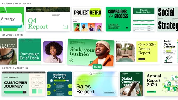
One constraint that became clear while working with Canva is its limited depth for complex data visualization. When I moved beyond simple datasets or needed more advanced chart configurations, the platform started to feel restrictive. G2 reviewers highlight similar concerns, particularly around analytical flexibility, but for presentation-focused use cases, this trade-off rarely gets in the way.
Another limitation is that outputs are primarily static rather than interactive. While exporting PDFs or visuals is seamless, I couldn’t create live dashboards or dynamic reports. Based on G2 feedback, this is a known gap, though it doesn’t take away from Canva’s strength in delivering clear, polished outputs quickly.
Where Canva consistently delivers is in making data easier to communicate. It doesn’t try to compete with full-scale BI platforms, and that’s exactly why it works. For teams that need fast, well-designed visuals rather than deep analytical workflows, it simplifies the entire process without adding unnecessary complexity.
If you want to see how broadly this shift is happening, G2 data reveals how non-designers are using Canva, highlighting just how much its role has expanded beyond design.
“I use features like Magic Write, Magic Design, AI image generation, and the newer AI tools almost every day, and they've made putting together the first draft of a campaign much faster. They don't replace creative decisions, but they definitely take a lot of the repetitive work off my plate. What I really like is that I can work on presentations, documents, social media content, and even spreadsheets without jumping between different apps. It keeps everything in one place, and it's much easier to keep the same visual style across an entire campaign. These days, I don't really think of Canva as just a graphic design tool. It's become the place where our content, designs, presentations, documents, and AI tools all come together.”
- Canva review, Valeria B.
“While Canva is an excellent design platform, there are a few things I don’t like. Some of the best templates, graphics, and features are locked behind a Pro subscription, which can feel limiting for free users. Large or complex designs can also occasionally run a bit slow. I also wish there were more advanced editing capabilities for professional design work, since certain tasks still require specialized software.”
- Canva review, Faizan A.
Data visualization is only as strong as the data behind it. If you’re working with multiple sources, exploring the best data extraction software can help improve accuracy before visualization.
As I worked through G2 reviews, Looker consistently appeared in scenarios where teams needed their reporting to stay consistent across departments. It is not just used to visualize data. It is used to ensure that everyone uses the same definitions, metrics, and logic when making decisions.
One of the clearest strengths in the Looker dataset is its reporting layer. The dashboards and reports interface is rated at 89%, reflecting how frequently users rely on it for recurring analysis. Based on the G2 reviews I analyzed, teams are not rebuilding reports every time. Instead, they are working with dashboards that already reflect a defined structure and can be reused across workflows.
That consistency extends into overall product performance. With 88% for “meets requirements” and 89% for ease of doing business, Looker performs reliably once implemented. I found that switching between stakeholders and datasets felt structured, especially when working with warehouse integrations like BigQuery and Snowflake, where maintaining a single source of truth becomes critical.
Usability also shows up strongly in the data. Looker maintains around 85% across ease of use, ease of setup, and ease of admin, which is notable for a platform of this depth. While it is not immediately intuitive for first-time users, once the structure is in place, navigating dashboards and exploring data becomes much more efficient.
Support and reliability are other areas where Looker holds up well. With 87% support quality, reviewers consistently describe it as a dependable platform for ongoing reporting. That stability matters when analytics becomes part of daily decision-making rather than occasional reporting.
The modeling layer is where Looker differentiates itself most. LookML allows teams to define metrics once and reuse them across dashboards. This reduces inconsistencies and ensures that reporting stays aligned across teams. That becomes especially useful for organizations working with multiple datasets or combining insights from tools like audience intelligence platforms, where consistency in interpretation is essential.
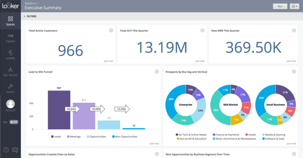
From an operational perspective, Looker is also predictable to implement. Based on G2 Insights data, it is 100% cloud-based, with an average implementation time of 1.9 months. That reflects the time required to build a robust data model with business intelligence, but once that foundation is in place, scaling reporting across teams becomes significantly easier.
One limitation that comes up consistently in both G2 reviews and usage patterns is the learning curve around LookML and data modeling. Getting comfortable with how metrics are defined can slow down adoption, particularly for non-technical users. However, once that model is established, reporting becomes more consistent and easier to manage at scale.
Another area to consider is performance and cost at scale. Some reviewers mention slower queries when working with large or complex datasets, often tied to how the underlying warehouse is configured. Pricing can also feel higher for smaller teams. For organizations with mature data infrastructure, however, these trade-offs tend to be less restrictive.
For teams that depend on structured, repeatable reporting, Looker becomes more valuable over time. It is not the fastest tool to get started with, but it supports long-term consistency as reporting complexity grows.
“Dashboards are clean and the scheduled reports feature is something I set up for a few client and basically forget about. Every monday morning the right numbers land in the right inbox without anyone having to manually run anything. That kind of automation compounds over time, it sounds small but it removes a whole category of recurring tasks.”
- Looker review, Anurag S.
“The visualizations in Looker feel a little dated, as they have not kept up with the options provided by competitors for visualizing data. There is very little to no AI functionality out of the box, which feels like a miss. The pricing for our use cases grew significantly from 2022 onwards, increasing from mid-5 figures to 6-figures in GBP per year.”
- Looker review, Jesse S.
To understand how tools like Looker extend beyond dashboards into product-level reporting, it’s worth exploring how analytics is delivered through embedded business intelligence.
As I worked through G2 reviews for Domo, what stood out wasn’t just how often dashboards were mentioned, but also how often users described Domo as the place where all their data finally comes together. Instead of switching between tools, teams rely on Domo to bring marketing, sales, and operational data into one environment they can actually use day to day.
That becomes especially clear when looking at how reviewers talk about real-time visibility. Across G2 feedback, users consistently highlight how quickly dashboards update and how much that impacts decision-making. That pattern is reflected in Domo’s 91% rating for real-time updating, which aligns closely with how often users describe checking live performance rather than waiting for reports to refresh. It also answers a question I kept seeing in reviews: which data visualization tools pull data from paid and organic marketing channels into a single live view? Domo stands out here because that capability is built into how teams use it.
Reporting and sharing follow a similar pattern. G2 reviewers don’t just mention dashboards, they talk about using them to communicate insights across teams. That usage shows up in feature ratings like 90% for report sharing and 89% for graphs and charts, reinforcing how frequently Domo is used to present and distribute data rather than just analyze it. I saw this reflected in reviews where users describe combining multiple systems into a single reporting layer, especially when working across different types of marketing analytics software.
Ease of use feels more balanced in comparison. Based on G2 data, Domo scores 85% for ease of use and 80% for ease of setup, which aligns with the tone of most reviews I read. Users don’t find it immediately intuitive, but they do note that once dashboards and workflows are established, the platform becomes easier to manage.
Another theme that came up repeatedly in G2 feedback is data preparation. Users frequently reference Domo’s ETL capabilities as a way to clean and combine data without relying heavily on external tools. That flexibility becomes especially useful for teams working with fragmented datasets, where preparing data is often as important as visualizing it.
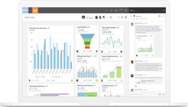
Collaboration is another area where Domo changes how teams work with data. Instead of exporting reports or sharing static files, G2 reviewers describe interacting directly within dashboards. That shift allows teams to explore insights together rather than reviewing snapshots, making reporting more dynamic and less dependent on manual updates.
At the same time, G2 reviewers frequently point out that pricing can feel high or difficult to justify early on, particularly for smaller teams. While that concern persists, many users also note that as data usage expands across departments, the value becomes easier to justify.
A similar pattern appears around complexity. As workflows become more advanced, the platform can feel less intuitive, especially when working with deeper customization or large datasets. However, reviewers also mention that once those workflows are understood, Domo becomes significantly more capable and flexible.
Based on the G2 reviews I analyzed, for organizations trying to unify multiple data sources into a single real-time environment, that added complexity often comes with stronger long-term value.
“I love how Domo pulls data from basically anywhere and throws it into clean, real-time dashboards without needing a degree in data science. The ETL tools (Magic ETL) are super intuitive—you can drag and drop your way to combining messy data sources quite easily. Plus, being able to check accurate, live metrics on the mobile app while on the go is a huge lifesaver.”
- Domo review, Karthik S.
“The things I do not like about Domo include the fact that it can be costly for small organizations to use. Some of the sophisticated capabilities might be challenging to master due to the fact that users are new to analytics software. Some large amounts of data may impact performance at times, and customization of reporting/dashboards can take extra training effort.”
- Domo review, Anil B.
When I worked through G2 reviews for Data Studio, what stood out wasn’t depth or complexity. It was how consistently users described it as the easiest way to turn raw data into something shareable. Most reviewers aren’t trying to build complex data models here. They’re trying to create dashboards quickly and make them accessible across teams.
That behavior is clear in how often dashboards and reporting are mentioned in G2 feedback. Users repeatedly talk about building reports once and then sharing them with stakeholders, rather than exporting files manually. That aligns with feature ratings where dashboards and report sharing are both at 92%, reinforcing how central this workflow is. It also answers a practical question teams are asking: which data visualization platforms replace manual spreadsheet exports with real-time shareable dashboards? Based on the reviews I analyzed, Data Studio is often used specifically for that transition.
Another pattern that comes through strongly is real-time visibility. Reviewers frequently mention dashboards updating automatically as new data flows in, especially when connected to Google data sources. Instead of rebuilding reports or refreshing spreadsheets, teams rely on dashboards that stay up to date. This becomes especially useful for teams managing performance data across channels and trying to connect insights from tools like attribution software into a single reporting view.
Integration plays a major role in making that possible. G2 users consistently highlight how easy it is to connect sources like Google Sheets, Analytics, and BigQuery, then combine them into a single view. That ability to consolidate data without heavy setup is one of the reasons the platform is widely used for marketing and performance reporting workflows.
Ease of use also comes through clearly in both the data and the reviews. With 84% ease of use and 86% ease of setup, reviewers often describe it as beginner-friendly rather than feature-heavy. Many users value how quickly they can go from raw data to a working dashboard without needing technical support.
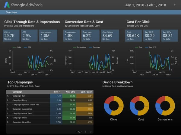
Interactivity is another strength that consistently shows up. Reviewers mention using filters, date ranges, and dynamic views to explore data directly within dashboards. That aligns with 91% for graphs and charts, which reflects how often users rely on interactive visuals rather than static reports.
At the same time, G2 feedback points to a clear ceiling. Performance can slow down when dashboards become large or complex, especially when multiple data connections are used. This tends to show up more as reporting scales rather than in smaller use cases.
Another limitation that appears consistently is the lack of deeper analytical capabilities. Reviewers mention that while Data Studio works well for visualization, advanced data modeling and customization are limited compared to more robust BI tools. For teams that need deeper statistical modeling or analysis beyond dashboards, this is where tools like statistical analysis software often come into play alongside visualization platforms.
For teams that compare it to more advanced tools, Data Studio may feel limited. But based on the G2 reviews I analyzed, for teams focused on fast, shareable dashboards within the Google ecosystem, it delivers exactly what they need without adding unnecessary complexity.
“Looker Studio helps create customized dashboards that enable cross-functional teams to extract meaningful insights and identify actionable opportunities. Once connected to data sources, the dashboards refresh automatically in real time, eliminating manual updates and saving significant time. Its visual reporting capabilities make it easier to identify trends and patterns at a glance. The reports are also highly interactive, allowing users to apply multiple filters, adjust date ranges, and analyze data from different perspectives to uncover deeper insights.”
- Data Studio review, Gautam V.
“Looker Studio can sometimes be slow when working with large datasets or complex dashboards, which affects performance. The customization options, while useful, can feel limited compared to more advanced BI tools. Occasionally, data connections may break or require reauthentication, which can interrupt workflows. Improving speed, adding more advanced customization features, and making data connections more stable would make the platform even better.”
- Data Studio review, Mohamed Razeeth M.
If you’re using dashboards for financial reporting and want deeper forecasting capabilities, it’s worth exploring the best FP&A software to understand how planning tools complement visualization platforms.
Agency reporting usually breaks when data is scattered. Campaign performance lives in one tool, SEO metrics in another, and client reports end up stitched together manually. From the G2 feedback I reviewed, AgencyAnalytics is used to remove that fragmentation rather than add another layer on top of it.
What becomes clear quickly is how central reporting and sharing are to the product experience. G2 data shows report sharing and dashboard-related capabilities scoring around 95%, which aligns with how users describe their workflows. Instead of exporting files or rebuilding reports, teams rely on a single dashboard that can be reused across clients. That consistency is what makes it relevant for teams looking for the best data visualization platforms to connect multiple marketing and analytics sources into one dashboard.
Ease of use is another strong signal. With 94% ease of use and 94% ease of setup, the platform is consistently described as one that teams can adopt quickly with minimal onboarding. I didn’t see reviewers positioning it as a technical tool. It’s treated more as a reporting system that fits directly into agency workflows.
The platform’s ability to consolidate data also stands out in G2 feedback. Users repeatedly mention pulling metrics from tools such as Google Analytics, SEO platforms, and ad channels into a single place. That unified view removes the need to switch between tools, which becomes especially useful when managing multiple clients simultaneously.
Support and reliability are other strengths reflected in the data. With 96% support quality and 96% ease of doing business, reviewers consistently describe the platform as dependable. That matters in agency environments where reporting delays or issues can directly impact client relationships.
Another pattern I noticed is how much users value automation. Scheduled reports and automatic updates are mentioned frequently in G2 reviews, especially by teams managing recurring reporting cycles. Instead of manually compiling data, they rely on pre-built workflows that keep clients updated with minimal effort.
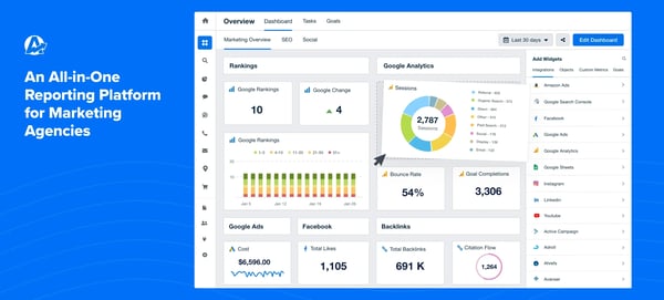
SEO and marketing-specific reporting also show up as a strong use case. Many reviewers highlight how the platform simplifies tracking rankings, traffic, and campaign performance in one dashboard. This becomes particularly useful for teams already working across multiple SEO tools and trying to unify insights without duplicating effort.
At the same time, there are clear boundaries to what the platform is designed for. Customization can feel limited when reports need to go beyond standard layouts. While templates speed up reporting, some users say they need more flexibility to meet highly specific client requirements. For agencies prioritizing speed and consistency, though, those same templates are part of the advantage.
Another limitation appears around the depth of advanced analytics. The platform focuses heavily on reporting existing data, and reviewers note that it doesn’t go far into forecasting or modeling. Teams looking for deeper predictive capabilities may need to complement it with tools focused on predictive analytics, although for most agency reporting workflows, that gap doesn’t block day-to-day use.
For agencies managing multiple clients, AgencyAnalytics feels less like a visualization tool and more like a reporting system built around efficiency. It simplifies how data is collected, structured, and delivered, which becomes more valuable as reporting demands scale.
“Agency Analytics enables us to centralize all our analytics data from multiple sources into a single, streamlined system. From there, we can curate only the most relevant data for our clients and present it in visually stunning, fully branded reports. This powerful reporting platform not only saves us valuable time but also delivers meaningful insights that drive informed decision-making.”
- AgencyAnalytics review, Mike D.
“I'd love even more customization for charts and dashboard layouts, but overall there isn't much I'd change. I also would appreciate being able to combine data from different tools and getting more in-depth AI insights (though they do have an AI tool, it costs more and the last time I tried it wasn't as useful as I hoped it would be - though that may have changed.”
- AgencyAnalytics review, Shannon M.
Building visualizations directly into a product instead of using a no-code platform? G2's best data visualization libraries software list covers the developer side of this category.
I don’t approach SAP HANA Cloud the same way I look at most data visualization tools. While reviewing G2 reviews, I noticed users weren’t treating it as a dashboarding layer. They were treating it as the system that actually powers their analytics at scale. That distinction matters because it changes what “good” looks like here.
The first thing I paid attention to was performance, because that’s where enterprise tools usually break. In the reviews I analyzed, speed wasn’t described as an improvement. It was described as a given. That lines up with G2 data showing 94% ratings for both data visualization and data modeling, and I saw the same pattern in feedback around in-memory processing and real-time query execution. For teams dealing with large datasets, this directly answers a bigger question: what data visualization platforms scale well for teams managing large datasets without performance slowdowns? SAP HANA Cloud shows up in those conversations because it’s built for that exact constraint.
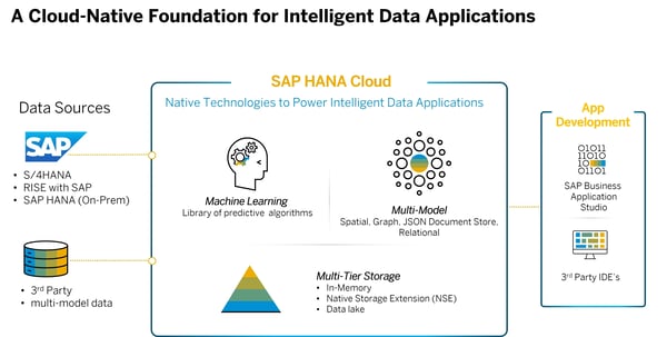
What I found equally important is how tightly everything connects. I didn’t see reviewers talking about stitching tools together. Instead, they described working across systems that already talk to each other. That becomes especially relevant in environments built around ERP software, where analytics depends on how smoothly data flows between applications rather than how dashboards look on top of it.
Another theme that kept surfacing in reviews was flexibility at scale. With 91% for “meets requirements”, users consistently mention adjusting compute and storage independently, depending on workload. I found that interesting because it shifts the focus from visualization to infrastructure decisions. You’re not just building dashboards. You’re deciding how your data system behaves under load.
Support and operational reliability also came up more often than I expected. Based on G2 data, support sits at 89% and ease of doing business at 90%, which matches what I read in reviews, where users described the system as stable once deployed. That’s not something I see mentioned as often in lighter tools.
One thing I didn’t expect to see was how often users referenced real-time analytics alongside transactional workflows. Instead of separating reporting and operations, many reviewers described working with both in the same environment. That reduces latency and removes the need for duplicate systems, which becomes important in enterprise-scale setups.
I also noticed that some teams use it in ways that go beyond traditional reporting. In a few cases, reviewers described handling system-level data and large-scale monitoring workflows. That reinforces the idea that SAP HANA Cloud operates at a different layer than most tools in this category.
That said, I wouldn’t position it as accessible out of the box. One challenge that came up repeatedly is cost predictability. I saw multiple reviewers mention that pricing becomes harder to estimate as usage scales, especially for teams unfamiliar with SAP’s consumption model. It doesn’t make the platform unusable, but it does require planning.
Another limitation I kept seeing is the complexity of the setup. Getting everything configured properly isn’t immediate. Several users described needing experienced teams to manage deployment and optimization. From what I read, though, once that foundation is in place, the system becomes significantly easier to operate.
From my perspective, SAP HANA Cloud operates differently from most tools in this category. Instead of focusing solely on visualization, it strengthens the foundation that enables large-scale analytics. For teams working with complex, connected datasets, that deeper capability becomes a clear advantage, especially when performance and scalability matter as much as the insights themselves.
“What I like best about SAP HANA Cloud is its ability to combine high-performance data processing with flexibility and scalability in a single platform. It enables real-time analytics on large datasets, which significantly improves decision-making speed and operational efficiency.”
- SAP HANA Cloud review, Mahendra S.
“The pricing model can be quite complex to navigate, making it difficult to predict monthly costs as data volume grows. Additionally, while powerful, the steep learning curve for junior developers means that onboarding new team members takes longer than it would with more traditional SQL databases.”
- SAP HANA Cloud review, Sujit S.
I didn’t approach Kibana (by Elastic Stack) as a typical visualization tool, because the way teams use it feels different. While going through G2 reviews, I kept seeing it positioned less as a reporting layer and more as the interface teams rely on when they need to understand what’s happening inside systems in real time.
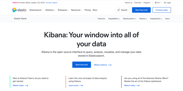
What stood out most to me is how tightly visualization is tied to search. G2 data shows 93% for search and 91% for dashboards, and that combination comes up constantly in reviews. Users aren’t just looking at charts. They’re moving between logs, queries, and dashboards to investigate issues as they happen. That creates a very different workflow compared to tools focused purely on presentation.
Another pattern I noticed is how frequently teams depend on Kibana for real-time monitoring. Reviewers consistently describe tracking system behavior, application performance, and security events without needing to export or preprocess data. That immediacy is what makes it valuable for teams working in observability and operations-heavy environments.
Ease of use lands in a more nuanced position. With 83% ease of use and 78% ease of setup, the platform isn’t considered beginner-friendly, but it is powerful once understood. I found that many reviewers accept the learning curve because the payoff is a much more flexible way to explore data.
One area where Kibana performs particularly well is handling large-scale data streams. G2 feedback often references working with massive log volumes and still being able to query and visualize data efficiently. That makes it relevant for teams dealing with infrastructure-level data rather than just business metrics.
Integration also plays a key role in how teams use it. Kibana works closely within the Elastic Stack, and reviewers frequently describe using it alongside other tools for monitoring and diagnostics.
Another use case that came up repeatedly is analyzing behavioral and usage data at scale, which is especially when teams are trying to understand patterns across large datasets.
At the same time, a couple of limitations show up consistently in G2 feedback. The interface can feel complex at first, especially for non-technical users. Many reviewers mention needing time to get comfortable navigating queries and dashboards. However, once teams become familiar with the system, that complexity becomes easier to manage.
Another challenge is configuration and maintenance effort. Users often describe the setup process as resource-intensive, particularly when scaling clusters or optimizing performance. That said, for teams already working with large-scale data systems, this to often part of the expected trade-off.
One thing I paid attention to while reviewing feedback is whether teams continue using Kibana after the initial setup. The answer is clearly yes. It directly connects to a broader question: data visualization platforms analysts actually keep using past initial setup without a steep ongoing learning curve. While onboarding takes effort, reviewers consistently describe using Kibana as part of their daily workflow once it’s in place.
For teams working with operational, security, or observability data, Kibana doesn’t just visualize information. It becomes the place where analysis actually happens.
"The Kibana dashboard provides clear visual insights into system health and behavior, and the advanced filtering and query capabilities make it easy to isolate specific errors in users, requests, or services. Real-time log ingestion allows the team to monitor issues as they occur visually across multiple applications, simplifying investigations. Custom dashboards help track operational and business metrics in one place. What I personally find most valuable is Kibana's visualization capability to correlate logs, trends, and system behavior through dashboards, helping identify root causes much faster than manually reviewing all log files."
- Kibana review, Ravindra N.
“Elastic Stack can be complex to configure and requires significant tuning for large-scale deployments. Scaling clusters is resource-intensive, and some advanced features are only available under commercial licensing. Better documentation for integrations would make adoption smoother.”
- Kibana review, Jai P.
If you’re working with system logs and real-time monitoring, exploring the log monitoring category can help you compare tools built specifically for those workflows.
The best data visualization tools for this include AgencyAnalytics, Data Studio, and Domo. They consolidate marketing, sales, and analytics data into a single dashboard, enabling teams to track performance across channels without switching between multiple reporting tools.
Canva and Data Studio are strong options for non-technical teams. They offer intuitive interfaces, drag-and-drop builders, and templates that make it easy to create, customize, and share charts without requiring coding or data engineering support.
Data Studio, Domo, and AgencyAnalytics replace manual spreadsheet exports with live, automatically updating dashboards. These tools eliminate repetitive reporting tasks and allow teams to share real-time insights through links instead of static files.
AgencyAnalytics and Domo are commonly used to combine paid and organic marketing data into a single dashboard. They connect with ad platforms, SEO tools, and analytics systems, giving teams a complete view of campaign performance in one place.
Data Studio and Canva enable non-technical stakeholders to build reports independently. Their simplified interfaces and pre-built templates reduce reliance on analysts, allowing teams to create dashboards and presentations without advanced technical knowledge.
SAP HANA Cloud and Elastic Stack are designed to handle large-scale datasets efficiently. These platforms use distributed systems and in-memory processing to maintain performance, making them suitable for enterprise teams working with complex, high-volume data environments.
Tools like Data Studio and Canva offer predictable pricing models or free tiers that don’t scale aggressively with usage. This makes them practical choices for teams looking to manage costs while still accessing essential visualization capabilities.
Data Studio, AgencyAnalytics, and Canva are frequently mentioned as tools analysts continue using long-term. Their ease of use, consistent performance, and minimal maintenance requirements make them reliable for ongoing reporting without steep learning overhead.
Data Studio and Domo are highly rated for replacing manual spreadsheet workflows. They allow analysts to automate reporting, build live dashboards, and eliminate repetitive data exports, improving efficiency and reducing the risk of manual errors.
Based on user reviews, Canva, Data Studio, and AgencyAnalytics are among the most trusted data visualization tools for small to mid-size teams. They balance ease of use, affordability, and functionality, making them widely adopted across marketing and analytics workflows.
Working across so many platforms made one thing clear: the best data visualization tools don’t just present information; they shape how decisions are made. The difference isn’t in how many charts a tool offers, but in how clearly it helps teams interpret what’s actually happening.
Across everything I evaluated, the tools that stood out most were the ones that balanced usability with purpose. Some made it easier to build and share dashboards quickly, while others handled scale, performance, or system-level data more effectively. What mattered more than features was how well each tool fit the context it was designed for.
That’s also why there isn’t a single “best” option for everyone. The most trusted data visualization software by data analysts and marketing teams at small to mid-size companies, based on user reviews, tends to reflect how well a tool aligns with real workflows, not just how powerful it looks on paper.
Choosing the right platform ultimately comes down to clarity. When teams can trust the data, understand it quickly, and act on it confidently, the tool has done its job.
Ready to go beyond dashboards and improve how your data actually flows? Explore dataops platforms to streamline pipelines, improve data quality, and make your visualization tools more effective.

Keeping up with the growing demands of data analysis and reporting isn’t easy. I’ve seen teams...
 by Washija Kazim

Recently updatedSummer 2026 Grid® Report · Published May 26, 2026 The 10 best...
 by Soundarya Jayaraman

Images have the power to transcend language barriers.
 by Mara Calvello