May 29, 2024
 by Mara Calvello / May 29, 2024

Images have the power to transcend language barriers.
They have the ability to convey complex ideas to the masses, and we know this because we’ve seen it in things such as hieroglyphics and medieval paintings.
And while technology has made communication somewhat “easier,” being able to translate research or business data can be difficult without a visual representation. This is why the use of data visualization tools are so important.
Data visualization is the process of translating data and metrics into charts, graphs, images, videos, and other visual reports. These visualizations are then used to help companies have a clearer understanding of their performance and goals.
No matter the industry in which your business falls, chances are you have a large amount of data at your fingertips. Unfortunately, data is only as good as what we make of it, and it serves no purpose when it’s just sitting in a data center, completely unused and ineligible. However, when it’s correctly processed, data can be digital gold to your business.
When utilizing data visualization, the main goal is to be able to easily read and understand big data to identify patterns, trends, and outliers in large datasets.
There are many ways to visualize data. Let’s go over a few of the most common you’ll see when it comes to business intelligence.
A lot goes into data visualization as it’s so much more than just making pretty visuals for company presentations. To really take a deep dive into it, we first need to understand how humans gather and process information.
It all comes down to the work of psychologists Amos Tversky and Daniel Kahn, whose research on how we form thoughts can be broken down into two methods:
With these two systems defined, Kahn was able to explain why humans often struggle to think in terms of statistics. He believes that the thinking behind System I is based on heuristics and biases as humans handle the volume of stimuli that we encounter daily. Examples of heuristics are trial and error, an educated guess, or common sense.
Thanks to these two systems, as well as biases and heuristics, it’s important that we ensure that data is presented in a way that correctly works within the System I thought process. When it does, it allows System II to analyze the data correctly.
Because we process more information through vision than any other sense, data visualization is the perfect way to communicate patterns and insights that we can get through large amounts of data.
When data visualization was starting to gain popularity, the most common technique that businesses were using was spreadsheet software to transform data into a table. Some other common types include charts, graphs, maps, dashboards, and infographics.
Now, there are many more types of data visualization, and some get very specific with how they show data. These include heat maps, Gantt charts, scatter plots, box charts, bubble clouds, cartograms, timelines, treemaps, word clouds, and more.
Which type you choose is going to depend on what sort of trend or pattern you want to showcase. For instance, a line chart displays upward and downward trends, while a pie chart easily shows proportions.
No matter which type of data visualization you choose to use to showcase specific patterns and trends, it should have three main elements:
When all three come together, a visual masterpiece of data is created.
You now have a firm grasp on what data visualization means, so the next step is to actually start visualizing your business intelligence data.
The process of going about this takes five steps:
One of the easiest ways to practice data visualization is by getting familiar with spreadsheet software like Google Sheets and Microsoft Excel or using dashboard software. Learning a handful of basic formulas and chart formats, as well as design elements like what makes one chart stand out over another, will come in handy when creating compelling visualizations.
Below you can see a simple line chart that you can create using a spreadsheet.

While this isn’t the fanciest and most complex data visualization, it’s a quick and simple way to showcase your findings if you don’t have much time or experience with data.
Even though the data on the left and the data on the right is the same, the data within the line graph makes it easy to follow the trends of inbound leads month to month and see the dip in inbound leads in April as well as the surge in May.
For companies with larger sets of data from multiple sources, it may be useful to consider data visualization software. Instead of having to input data yourself or link multiple spreadsheets, these tools automate the entire data collection and visualization process with many more charts and graphics options.
Most data visualization tools will integrate with other software in your tech stack. For example, you can have your CRM and marketing automation metrics visualized in a single space instead of having to bounce between tools. Overall, it’s more efficient.
Another advantage of these tools? Real-time updating.
Spreadsheets may be a free option for simple data visualization, but the data is often retrospective and won’t provide a clear picture of what to expect next. If a company relies on real-time data, having a tool that provides these insights on both mobile and desktop can be a huge plus.
Whether data visualization is being used to show changes over time, display correlations between relationships, or determining complex metrics, it is often the most effective way to get a point across.
Our eyes are naturally drawn to colors and patterns. We can quickly identify orange from blue and a circle from a triangle. We are naturally visual beings, which is why we so often gravitate towards magazines, television, and movies. Data visualization is just another form of this, making it easy to identify trends and patterns in charts.
Because of this, there are many benefits to utilizing data visualization:
No matter which industry you find yourself working in, data visualization is important in almost every career since all industries can benefit from making data easier to understand.
Whether a teacher uses it to analyze the results of an exam or a computer scientist uses it to discover advancements within artificial intelligence, it plays an important role in big data projects.
Sales and marketing teams often pay attention to sources of web traffic, trends within the traffic, and how it can help the company generate revenue. Data visualization for sales makes it easy to see the ebb and flow of web traffic and how it correlates to sales and marketing efforts.

A common way that data visualization is used throughout politics is by utilizing geographical maps that show the party of each state, as well as how each district voted in various campaigns and elections.

Source: Edition
Those in the healthcare industry typically use choropleth paths to see health data. These maps show specific geographical areas that are assigned a specific color in relation to a numerical value.
This makes it easy for healthcare professionals to see how each variable, such as mortality rates of lung cancer, changes across specific regions. Data visualization in healthcare was helpful in understanding the number of active cases across the globe.

Source: BBC
Professionals within the finance sector may find themselves using data visualization as a way to track the performance of their investment decisions when knowing if they should buy or sell an asset.
A type of visualization called a candlestick chart can be used as a tool to see how the price has changed over time, detect trends, and display important information.

Source: Investopedia
Whether a customer service team is in a contact center or receiving questions from customers through a help desk, there are a variety of instances where data visualization can be used.
For instance, representatives can visualize the number of calls they have taken that day, how many are waiting to be answered, and how long the average call has been. For support teams, they’ll be able to see how many tickets they have resolved and how many are still in the queue.

Source: Geckoboard
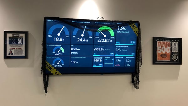
As a C-suite employee, data visualization is used to monitor KPI dashboards to keep track of all company goals and how they’re progressing. This ensures that a CEO doesn’t have to take the time to check in with every team, but so they can track metrics in one place. Similarly, C-level executives can take dashboards into important board meetings to help illustrate how the company is performing as a whole.
As an example, checkout the data visualization we at G2 once used to see where we were on specific goals, how far it was through the month, and more.

When it comes to data visualization software, there’s a wide variety of options you can choose from. This software translates data and metrics into charts and graphs to help companies track business metrics and key performance indicators in real-time.
These tools are specifically designed to benchmark and visualize important metrics and are not intended to be used for data analysis. While some of these products may offer drill-down or data-joining functionality, their primary purpose is to provide dashboards and visualizations to monitor data.
Here’s a look at the top ten data visualization software from G2's Spring 2024 Grid® Report.
You can read an in-depth review of the best data visualization software here.
DISCLAIMER: Some reviews may be edited for clarity.
Canva empowers anyone to create stunning data visualizations, even without design expertise. Drag-and-drop functionality and a library of professionally designed templates make it simple to transform your data into clear, impactful charts and graphs.
"I am a content writer and a lot of times I need infographics or other graphics for my work, and it's a hassle to get it done from someone else, but with Canva, now I can just make my infographics, banners and other graphics since Canva makes it so simple. I use it multiple times a week for my work and it has made me 1.5 times more productive."
- Canva Review, Meghna D.
"I feel that while Canva offers many tools and features, some are limited in the free version and access to the full range of features requires a subscription. Overall, Canva is a great tool for creating simple projects."
- Canva Review, Vinit K.
MongoDB Atlas, the leading cloud database platform for modern applications, goes beyond data storage. It empowers you to visualize your MongoDB data directly within the Atlas interface. Atlas Charts, a native visualization tool, lets you create interactive charts and dashboards in real-time.
"MongoDB chart is very easy to use and the interface is very user friendly. MongoDB Charts can easily connect with MongoDb Database and provides the visualization of the data. It provides different types of graphs and charts and also provides customization support for visualize the data."
- MongoDB Atlas Review, Pratik P.
"If the data we store in other types of database or file format, you need to extract and transform the data before using it. The second thing is if we user another database as the primary database, it requires additional setups."
- MongoDB Atlas Review, Rafiq J.
Looker Studio (formerly Google Data Studio) is a free data visualization tool that empowers you to create impactful and informative reports and dashboards. Drag-and-drop functionality makes it easy to transform your data.
"I find this tool easy-to-use for creating tables, maps, reports, and graphs. Even, it's easy to integrate with other Google platforms. What I like the most is that this data visualization tool comes at free of cost."
- Looker Studio Review, Subhani M.
"Something I don't like very much is that there isn't really very active support when problems occur with the platform, and that's wrong considering that today there is a large community that makes use of this tool."
- Looker Studio Review, Juan O.
SAP Crystal offers a robust suite of tools for creating formatted reports and data visualizations. It is ideal for users working with diverse data sources, including legacy systems, or businesses requiring pixel-perfect report formatting and layout control.
“Mode is a software that is flexible and combines different forms of database storing to achieve a truthful result. When using Mode, I like that we can style reports in different methods such as JavaScript, HTML, and others. Scheduling reports to be sent to customers is pretty easy and takes no time to do, as well as storing data that can be searched easily in case someone requests it. I think that Mode is a software that is very visual, and it comes with features that are pretty and interactive, therefore they are easy to use.”
- SAP Crystal Review, Salem R.
"Crystal reports has a steep learning curve and it might take a long time to learn how to create more complex reports, so prepare to spend some time training before trying to create a non-basic report. Technically, I think the graphs can be improved as they feel a bit dated compared to other solutions."
- SAP Crystal Review, Jim P.
AgencyAnalytics empowers marketing agencies and data-driven businesses to transform complex marketing data into clear, actionable visualizations. Pre-built templates and metrics tailored to key marketing channels like social media, SEO, and PPC simplify data analysis.
"The reporting tool pulls in from all the data points I need including Analytics, GSC, GMB, has its own rank and backlink tracker, all at one low price."
- AgencyAnalytics Review, Altug K.
"I wish it could provide designs of how you could display and present your data for better UX and visualization."
- AgencyAnalytics Review, Isabel R.
Visme is an intuitive online tool that allows non-designers and professionals to create beautiful interactive presentations and infographics right in their browser. It provides a great starting point with hundreds of easy-to-edit templates and thousands of icons and images, along with the ability to upload your own assets, and add media (including video and audio) to create compelling visual content that goes beyond traditional content.
"Visme is super user-friendly. I was able to figure out the system with little to no training and have been using it to build our annual impact reports for the past three years. The data visualization tools are my favorite thing about the product, because they make illustrating complicated figures and concepts easy to create."
- Visme Review, Julie B.
"Sometimes when I have gone to save my presentation to a .PDF, it changes some of the widgets size/fonts."
- Visme Review, Christopher M.
JMP combines robust statistical analysis with interactive visualizations, providing a comprehensive toolkit for data exploration. It goes beyond basic charts. JMP offers advanced visualizations like treemaps, parallel coordinates, and surface plots.
"I like the ability to run simple statistical tests. It can be used to create graphs from data. It is incredibly easy to use. It provides extensive examples for each test. It is very useful for plotting data. I love how easy it is to use."
- JMP Review, Rogerio M.
"Formatting graphs for publication can sometimes be time-consuming."
- JMP Review, Dabe B.
Grow.com stands out as an all-in-one business intelligence (BI) platform that simplifies data visualization for users of all technical abilities. Grow.com combines data extraction, transformation, loading (ETL), data warehousing, and visualization in a single platform, streamlining your data analysis workflow.
"As an analyst, I have recently started working on this tool and this is by far the best. It helps me to create powerful data visualisation as well as to gain insight from that data. The dashboards are easy to use and the real time insights gives even more understanding of the data."
- Grow.com Review, Riya A.
"I wish there were a few more options inside of each metric for customizing labels, colors, etc."
- Grow.com Review, Ben R.
In today’s high-velocity business environment, it’s all about “how fast can you get me results and in what ways can you show me the success?” Time is money, and if you’re planning on an hour-long, text-filled presentation to your directors and stakeholders, you might want to reconsider.
Instead, a well-designed presentation with a few visuals displaying KPIs will have much more of an impact. Of course, being able to describe the content of these visuals will only help your cause.
So, the next time you’re asked to present the results of last quarter’s marketing efforts, be sure to explore your data visualization options.
Interested in doing even more with your data? Learn the ins and outs of business analytics and how it can be used to achieve success.
This article was originally published in 2020. It has been updated with new information.
Mara Calvello is a Content and Communications Manager at G2. She received her Bachelor of Arts degree from Elmhurst College (now Elmhurst University). Mara writes content highlighting G2 newsroom events and customer marketing case studies, while also focusing on social media and communications for G2. She previously wrote content to support our G2 Tea newsletter, as well as categories on artificial intelligence, natural language understanding (NLU), AI code generation, synthetic data, and more. In her spare time, she's out exploring with her rescue dog Zeke or enjoying a good book.
I’ve always been fascinated by how the right visuals can turn complex information into...
 by Jaya Bordoloi
A picture is worth a thousand words.
 by Mara Calvello
“Let me paint you a picture.”
 by Mary Clare Novak
I’ve always been fascinated by how the right visuals can turn complex information into...
 by Jaya Bordoloi
A picture is worth a thousand words.
 by Mara Calvello


