

I’ve worked with enough dashboards to know that data isn’t always the problem. Answers are. Teams today can track almost everything, from marketing performance and sales activity to customer behavior and product adoption. But having access to metrics doesn’t automatically make it easier to understand what’s driving results or what action to take next.
That was top of mind as I evaluated Microsoft Power BI, Tableau, SAS Viya, Databricks, Looker, and Domo to find the best analytics platform. I wasn’t looking for the tool with the most charts or the longest list of features. I wanted to understand which platforms actually help teams connect the dots, uncover meaningful trends, and turn data into decisions.
Whether you’re an analyst building reports, a marketer measuring campaign performance, a product team tracking user behavior, or a business leader looking for clearer visibility, choosing the right analytics platform can make a noticeable difference. In this guide, I’ll break down the platforms that stood out, the tradeoffs I found, and the types of teams each solution is best suited for.
*These data analytics platforms are top-rated in their category, according to the G2 Summer 2026 Grid Report. I’ve included pricing information where available and noted when vendors require custom quotes, so you can get a clearer picture of each option.
When I evaluate analytics platforms, I look at how well they help teams make sense of growing volumes of data. At their core, analytics platforms bring together information from multiple sources, whether that’s a CRM, marketing software, product analytics tools, financial systems, or data warehouses, and turn it into insights that support better decision-making.
As organizations collect more data, analytics platforms have evolved beyond static reports and dashboards. Many now offer capabilities like self-service analytics, real-time monitoring, predictive modeling, and AI-assisted insights. In fact, a 2025 global survey revealed that 43% of organizations are already using AI-powered analytics in production, showing just how quickly analytics is becoming a core part of business operations.
What stood out during my research is that the best analytics platforms don’t just help teams visualize data. They make it easier to identify trends, explore performance drivers, and share insights across the organization. Whether the goal is tracking business performance, understanding customer behavior, measuring campaign results, or monitoring operations, the value comes from turning data into actions teams can confidently take.
The platforms in this guide approach that challenge differently. Some focus on self-service reporting and data visualization, while others are built for advanced analytics, large-scale data processing, or AI-driven insights. I’ll break down those differences to help you find the platform that best fits your team’s needs.
I started with G2’s latest Grid® Report for analytics platforms to identify the highest-rated products in the category. To narrow down the list, I looked at G2 Score, customer satisfaction ratings, market presence, review volume, and review recency. This helped me focus on platforms that consistently receive positive feedback from verified users.
From there, I analyzed user reviews to understand how these platforms perform in real-world analytics workflows. I paid close attention to feedback around dashboard creation, data visualization, reporting capabilities, ease of use, data integration, scalability, performance, and collaboration features. My goal was to understand not only what each platform offers, but how effectively it helps teams turn data into actionable insights.
To add another layer of analysis, I used AI to review hundreds of verified G2 reviews and identify recurring strengths, limitations, and common use cases across the category. This helped me spot patterns around adoption, usability, reporting flexibility, data connectivity, and the overall experience of working with each platform.
When I couldn’t test a platform firsthand, I validated my research using insights from professionals with hands-on experience and cross-referenced their feedback with verified G2 reviews.
The screenshots featured in this article come from G2 vendor listings and publicly available product materials.
Not every highly rated tool makes sense for every team, and that became clear early in my research. So instead of focusing solely on feature lists, I looked at the capabilities that have the biggest impact on day-to-day analytics workflows. These are the criteria I kept coming back to:
After evaluating more than 20 analytics platforms, I narrowed the list down to the six solutions featured below. Each one approaches analytics differently, whether through self-service reporting, advanced modeling, AI-driven insights, or enterprise-scale performance, but all stood out for their ability to help teams make better use of their data.
To be included in this category, a solution must:
*This data was pulled from G2 in 2026. Some reviews may have been edited for clarity.
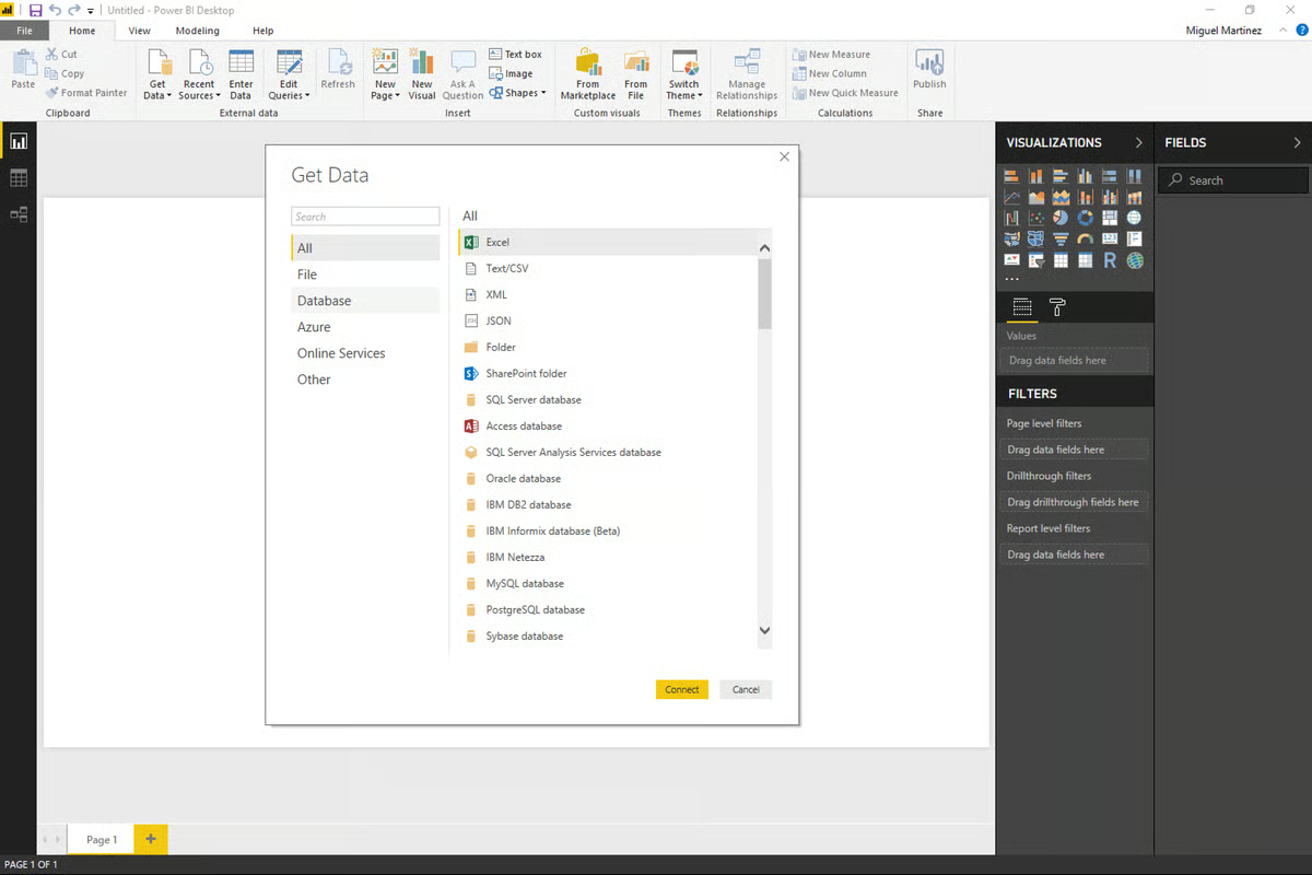
Microsoft Power BI is one of those tools that comes up in almost every conversation about analytics platforms. After reviewing the platform and analyzing G2 feedback, it’s easy to see why. Power BI combines extensive reporting and visualization capabilities with deep integrations across the Microsoft ecosystem. If you’re already using Excel, Azure, or Microsoft 365, it can fit naturally into existing workflows. Even outside of Microsoft environments, it remains a widely adopted business intelligence platform.
One of the things that stood out during my evaluation was how approachable Power BI Desktop feels, particularly for users familiar with Excel. Creating a basic dashboard was relatively straightforward, and the platform offers a broad range of reporting and visualization options from the start.
Building reports felt flexible, with access to a large library of visualizations, including custom visuals from the AppSource marketplace. I also found that Power BI offers strong control over formatting, themes, tooltips, and interactivity, allowing teams to tailor dashboards to different audiences and use cases.
The experience aligns closely with what I found in G2 reviews. What users consistently appreciate most is Power BI’s ability to transform raw data into interactive reports and dashboards. Whether it’s real-time sales tracking, ETL workflows, or more complex business intelligence initiatives, reviewers frequently mention the platform’s versatility.
I also came across consistent praise for the drag-and-drop report-building experience and the platform’s visualization capabilities. Several reviewers highlighted how easily Power BI connects with Excel, SQL Server, Azure, and other Microsoft products, making implementation and data access easier for teams already invested in that ecosystem.
Beyond analytics, Power BI receives positive feedback for collaboration features such as commenting and tagging, which help teams share findings and communicate insights more effectively.
The industries using Power BI span marketing, consulting, financial services, IT, and operations. Across reviews, it scores well for meeting requirements, administrative ease, and overall usability, reinforcing its position as a mature platform for organizations with a wide range of reporting needs.
That said, some recurring challenges appear in user reviews as well. Several reviewers mentioned a learning curve around DAX, Power BI’s formula language, particularly for users without experience in SQL, data modeling, or business intelligence tools.
A few G2 users also noted that the interface can feel crowded when working with large datasets or highly customized reports. And while the platform is capable of supporting complex workloads, performance can be affected when data models are not optimized.
Based on my research, Power BI is particularly well-suited for teams looking for flexible reporting, strong visualization capabilities, and deep Microsoft integrations. It currently holds a 4.5/5 rating on G2, with 96% of reviewers rating it four stars or higher.
I found it especially relevant for data analysts, finance teams, operations leaders, and marketing teams that rely on reporting and dashboard-driven decision-making.
However, teams with very simple reporting requirements may find some of Power BI’s more advanced capabilities unnecessary, while users new to analytics platforms should expect some time to become familiar with the platform’s deeper functionality.
Power BI Desktop is free to download for Windows users. To publish, collaborate on, or share reports in the cloud, users need a Power BI Pro license, which is available through Microsoft Fabric and select Microsoft 365 and Office 365 plans.
Microsoft also offers free Power BI trials through Microsoft Fabric, allowing teams to explore the platform before committing to a paid plan.
“Can easily connect to data sources like lists, SQL servers, as well as Excel /csv stored in SharePoint, then build semantic models which can also be further used to build reports using a wide variety of prebuilt charts,The charts can be populated with data by dragging and dropping the respective columns from the dataset to create the chart. It’s also easy to publish dashboards and write access control rules. It's a no-code business data analytics solution from Microsoft with minimal coding to build a dashboard.”
- Microsoft Power BI review, Ashutha K.
“It's a great program, but it's not perfect by a long shot. It can be complex when you start working with formulas. It lags at times when the datasets are a bit larger. Lastly, power queries can be confusing and hard to interpret and understand.”
- Microsoft Power BI review, Connie J.
Explore G2's complete guide to data analytics that covers everything from business analytics to big data analytics.
Tableau is one of those tools that comes up in almost every analytics conversation, and for good reason. It’s been around for years, has a large user base, and is now part of the Salesforce ecosystem, giving it a strong presence in the enterprise market.
When it comes to data visualization, Tableau is often used as a point of comparison for other analytics platforms. It remains one of Power BI’s biggest competitors and is widely recognized for its dashboarding and visual analytics capabilities.
Connecting to data in Tableau is relatively straightforward when working with common sources such as Excel, Google Sheets, SQL databases, or Snowflake.
One capability that stood out during my evaluation was Tableau Prep, the platform’s data preparation tool. For teams that want more control over shaping data before analysis, especially when working with multiple sources or inconsistent datasets, Tableau Prep provides a more visual approach to data cleaning and transformation without relying heavily on SQL or scripts.
Data visualization remains Tableau’s strongest differentiator. The platform offers highly customizable visuals, interactive dashboards, dual-axis charts, custom color palettes, and detailed tooltips. I also found that its storytelling capabilities make it easier to guide stakeholders through insights in a structured way, which can be valuable for executive reporting, presentations, and data-driven narratives.
That strength is reflected in G2 feedback as well. Data visualization, dashboards, and charting capabilities are among Tableau’s highest-rated features, with satisfaction scores exceeding 93% in these areas. Across reviews, users frequently highlight the platform’s ability to present complex data in a way that is both interactive and easy to understand.
I also noticed consistent praise from users in industries such as IT, finance, higher education, and marketing. Many reviewers described Tableau as a flexible platform for exploring data, creating customized reports, and supporting more advanced analytics workflows once teams become familiar with its capabilities.

That said, Tableau isn’t without tradeoffs. A recurring theme in reviews is that while the interface appears approachable at first, building more advanced dashboards can become challenging, particularly when blending data from multiple sources or creating complex calculations. However, many users also point to Tableau’s extensive documentation, training resources, and active user community as valuable resources for overcoming that learning curve.
Pricing was another area that appeared regularly in reviews. Some users, particularly those from smaller organizations, felt Tableau’s licensing costs were higher than competing options. At the same time, many reviewers noted that the platform’s visualization capabilities, flexibility, and scalability justified the investment for teams that rely heavily on analytics and reporting.
Tableau currently holds a 4.4-star rating on G2, with 94% of reviewers rating it four stars or higher. Based on my research, it stands out for organizations that prioritize data visualization and dashboard design. Teams that regularly present insights to executives, clients, or other non-technical stakeholders may find its storytelling and interactive reporting capabilities particularly valuable compared to other analytics platforms on this list.
Tableau is available as a desktop application for Windows and macOS, through Tableau Cloud for online collaboration, and as an on-premises deployment. A free trial is also available for teams that want to evaluate the platform before making a commitment.
“I really like how Tableau makes data visualization and analysis easy with its drag-and-drop interface, which is very user-friendly. It allows me to build dashboards quickly without heavy coding skills. Also, the interactive reports are a standout; filtering data and drilling down into details is smooth and efficient. I appreciate its ability to connect with multiple data sources and handle large datasets with ease. The quick transformation of complex data into simple visuals saves a lot of time and makes spotting trends much more straightforward. Plus, having everything visual and easy to understand makes it great for sharing insights with non-technical team members.”
- Tableau review, Rahul S.
“Performance can sometimes slow down with the very large datasets or complex dashboards. I've also found that managing calculated fields, parameters, and dashboard dependencies can become difficult in large reporting projects. Additionally, licensing costs are very high for broader enterprise usage."
- Tableau review, Atharva P.
SAS Viya is a cloud-native analytics and AI platform that brings data preparation, modeling, deployment, and monitoring into a single environment. Built to support SAS, Python, R, and SQL workflows, it’s designed for organizations that need advanced analytics capabilities without stitching together multiple tools across the analytics lifecycle.
One thing that stood out during my research was how often users mentioned SAS Viya’s ability to handle large and complex datasets. A recurring theme in G2 reviews is performance at scale, with reviewers highlighting faster processing times for computationally intensive analyses and large data volumes. That aligns with its distributed, in-memory architecture, which is built for enterprise workloads where performance can quickly become a bottleneck.
Another capability I came across repeatedly is the platform’s end-to-end approach to analytics. Several G2 reviews reference workflows that span data preparation, modeling, reporting, and deployment within the same environment. From what I gathered, many teams appreciate being able to move through the analytics process without constantly switching between separate tools, which helps reduce handoffs and maintain consistency across projects.
I also noticed frequent praise for SAS Viya’s support for multiple programming languages. The ability to work with SAS, Python, R, and SQL in the same workspace came up often in reviews, particularly from organizations with diverse analytics teams. For companies where statisticians, data scientists, and analysts all have different preferences, that flexibility appears to make collaboration much easier.
Accessibility for non-technical users was another strength that surfaced throughout my research. Several reviews highlighted the drag-and-drop interface and self-service capabilities, noting that business users can build dashboards, create data pipelines, and explore data without relying heavily on technical teams. For organizations trying to reduce reporting bottlenecks, that balance between advanced analytics and usability seems to resonate with users.
Governance and explainability are two areas where SAS Viya appears particularly strong. From the reviews I analyzed, users in banking, healthcare, insurance, and other regulated industries frequently highlighted capabilities such as model auditability, lineage tracking, monitoring, and compliance support. Rather than treating governance as an add-on, many reviewers described it as a core part of the platform experience.
Data visualization is another area where SAS Viya performs well, earning 89% satisfaction for data visualization and 89% for data filtering. I came across multiple reviews praising the platform’s dashboards, reporting capabilities, and ability to surface insights quickly. Several users also mentioned AI-assisted visualizations that help connect data exploration with decision-making workflows.
That said, the learning curve is one of the most commonly mentioned challenges in G2 reviews. I noticed this concern most often among users transitioning from older SAS environments or navigating multiple Viya applications for the first time. However, many reviewers also highlighted SAS’s training resources, documentation, and support team as valuable resources that help teams get up to speed.

Source: SAS Viya
Licensing costs were another recurring theme in the feedback I reviewed. Some users felt SAS Viya’s pricing could be difficult to justify compared to open-source alternatives, especially for smaller organizations. At the same time, many enterprise reviewers noted that the platform’s breadth of functionality, governance capabilities, and ability to consolidate multiple analytics tools can make the investment worthwhile for larger organizations.
SAS Viya currently holds a 4.3-star rating on G2, with 94% of users rating it four or five stars. Based on my research, it stands out for organizations operating in highly regulated industries where governance, explainability, compliance, and scalability are critical requirements. Teams looking for a unified platform that supports the entire analytics lifecycle may find SAS Viya particularly well-suited to their needs.
SAS Viya is available as a cloud-native platform and supports deployment across public cloud, private cloud, and hybrid environments. SAS offers demos and consultations for organizations evaluating the platform.
“I like the precision with which data can be extracted, because it helps pinpoint exactly what I want to understand or analyze. I also appreciate how intuitive the tool is: it enables all team members to create their own dashboards, and I love being able to turn metrics into charts and share links with other team members.”
- SAS Viya review, Sivar G.
“One downside of SAS Viya is that it can have a steep learning curve for new users, especially those without a strong analytics background. Additionally, the cost can be relatively high compared to other tools, and some advanced features require extra configuration, which can slow down initial setup.”
- SAS Viya review, Venkatesh D.
Databricks is a unified data and AI platform built around the Lakehouse architecture, a model that combines the flexibility of data lakes with the performance and governance capabilities traditionally associated with data warehouses. Created by the original developers behind Apache Spark, Delta Lake, and MLflow, the platform brings data engineering, analytics, machine learning, and AI development together in a single environment.
What I kept coming back to while evaluating Databricks was the idea of consolidation. Many of the reviews I analyzed weren’t focused on a single feature; instead, they described how Databricks helped replace fragmented stacks made up of separate ingestion, transformation, governance, and analytics tools. For teams managing increasingly complex data environments, the ability to centralize workflows appears to be one of the platform’s biggest advantages.
That theme carried into feedback around Delta Lake, Workflows, and Unity Catalog. Several reviewers described moving data management, orchestration, and governance processes into the same environment instead of maintaining multiple systems. From what I gathered, reducing the number of tools in the stack also helps reduce maintenance overhead and simplifies day-to-day operations for data teams.
Scale is where Databricks seems to earn much of its reputation. Across the reviews I analyzed, users frequently discussed large datasets, streaming workloads, and machine learning projects that would have been difficult to manage in more traditional environments. Many reviewers highlighted Spark-powered processing and managed infrastructure as reasons they could spend less time tuning systems and more time working on analytics and modeling.
Beyond the infrastructure itself, collaboration appears to be another meaningful strength. Databricks’ notebook environment came up frequently in G2 reviews, with users describing it as a shared workspace where analysts, engineers, and data scientists can work together more efficiently. Several reviewers also noted that sharing notebooks, code snippets, and project context directly within the platform helped reduce communication gaps across teams.
Integrations were another area that surfaced repeatedly throughout my research. Databricks connects with cloud storage platforms, BI tools, orchestration frameworks, machine learning services, and external data sources. I also noticed positive feedback around its support for AWS, Azure, and Google Cloud, as well as open formats like Delta Lake and Apache Iceberg, which help organizations maintain flexibility as their data environments evolve.
Databricks’ AI and machine learning capabilities also appeared throughout the reviews I read. Users frequently mentioned MLflow for experiment tracking and model management, while others highlighted the Genie AI assistant as a useful productivity tool. Several reviewers described being able to troubleshoot issues, accelerate development cycles, and manage machine learning workflows without relying on separate platforms.

The tradeoff for all that flexibility is complexity. Several reviews mentioned the learning curve associated with cluster configuration, Spark optimization, permissions management, and overall platform administration. However, many reviewers also noted that Databricks provides extensive documentation, training resources, and community support that help teams become productive as they gain experience.
Cost management was another recurring consideration. Many G2 users expressed that compute usage, storage costs, and DBU consumption require ongoing monitoring, particularly in larger deployments. At the same time, many reviewers pointed out that consolidating multiple tools into a single platform can improve overall efficiency and reduce costs elsewhere in the analytics stack, making the value proposition easier to justify over time.
Databricks currently holds a 4.6-star rating out of 5 on G2, with 94% of users rating it four or five stars. If there’s a common thread across the feedback I analyzed, it’s that Databricks resonates most with organizations that have outgrown disconnected analytics and engineering tools. Teams looking to unify data engineering, analytics, governance, and AI development on a single platform, particularly in cloud-first environments, appear to get the most value from what it offers.
Databricks is available as a cloud-native platform across AWS, Microsoft Azure, and Google Cloud. The company offers a free trial for teams that want to explore the platform before committing to a paid plan.
“What I like most about Databricks is its Integrations part. In the workplace, we integrate databases within multiple data sources. Also, I can't complete my review without mentioning UX and UI design, which makes the overall workflow feel intuitive and genuinely user-friendly. When it comes to the speed of the processes, it never offended us. It works as expected. Compared to the market pricing, the price of the service is quite reliable for us. There is a help center of Databricks, if you can't find any answers to your questions, there are specialists that may assist you with your inquiries. As an instance, I can remember the case where we had an issue within the exam process, they helped us to solve this problem.”
- Databricks review, Yelnur K.
“What I don’t like about Databricks is that it can feel a bit heavy when you’re just trying to do something simple. There’s a lot going on under the hood, and while that’s great for scaling, it also comes with a learning curve. Things like clusters, configurations, and job setup take some time to get comfortable with.
Cost is another concern. Usage can creep up quickly if you’re not actively monitoring it, especially when teams can spin up compute freely. And at times, the overall experience feels a little fragmented across notebooks, jobs, and repos, rather than being one smooth, unified flow.
So, yes—it’s powerful, but it definitely takes discipline to keep things clean, efficient, and under control.”
- Databricks review, Hunar M.
Looker is Google’s analytics platform, but it approaches analytics differently than many of the other tools I evaluated. Rather than focusing primarily on dashboards and visualizations, it emphasizes data modeling, governance, and consistency across the organization.
Compared to traditional BI tools, Looker is model-driven, developer-oriented, and built around SQL-based analytics workflows. After connecting to a data source, users define metrics, relationships, and business logic using LookML, Looker’s proprietary modeling language.
What stood out during my evaluation was the modeling layer itself. It creates a shared source of truth, so teams across the organization can work from the same definitions for metrics such as customer churn or lifetime value. Maintaining that level of consistency across dashboards and reports can be challenging in many analytics platforms, which is why this capability appeared so frequently in user feedback.
That perspective is reflected in G2 reviews as well. Users consistently praise Looker’s semantic layer and the control LookML provides over how data is queried, governed, and reused. It appears particularly valuable for organizations managing complex data environments or requiring consistent metric definitions across teams.
I also noticed frequent mentions of Looker’s integrations with cloud data warehouses such as BigQuery, Snowflake, and Redshift. Given its Google Cloud roots, the platform appears well-suited for organizations building analytics workflows around modern cloud infrastructure.
Another capability that stood out was Looker Blocks, the platform’s library of prebuilt code, dashboards, and data models. For teams working with common use cases such as marketing reporting, Google Analytics, Salesforce, or HubSpot data, these templates can help reduce setup time and accelerate deployment.
I also came across positive feedback around dashboard consistency and governance. Once data models are established, teams can build reports from shared definitions, helping reduce discrepancies across departments and reporting workflows.
Several reviewers highlighted Looker’s embedded analytics capabilities, which allow organizations to surface insights directly within internal tools, customer-facing applications, or business systems. For teams looking to bring analytics closer to day-to-day workflows, this can be a valuable advantage.

That said, a learning curve is one of the most commonly mentioned challenges in G2 reviews. Looker requires a different mindset than traditional dashboarding tools, particularly when working with LookML or building custom data models. However, teams with dedicated analysts or data professionals often view that complexity as a tradeoff for greater governance and flexibility.
I also came across feedback around dashboard performance when working with particularly large datasets or complex reporting environments. While this wasn’t a universal concern, some users noted slower loading times in more demanding analytics scenarios, though many organizations continue to use the platform successfully for large-scale reporting and data exploration.
Looker currently holds a strong rating of 4.4 out of 5 on G2, with 95% of reviewers rating it four stars or higher. Based on my research, it stands out for organizations that prioritize governed metrics, semantic modeling, and cloud-scale analytics. Teams already invested in Google Cloud or modern data warehouse architectures may find its approach particularly valuable compared to other analytics platforms on this list.
“Dashboards are clean and the scheduled reports feature is something I set up for a few client and basically forget about. Every monday morning the right numbers land in the right inbox without anyone having to manually run anything. That kind of automation compounds over time, it sounds small but it removes a whole category of recurring tasks.”
- Looker review, Anurag S.
“There are a few areas that could be improved. The learning curve can be challenging for new users, especially when working with advanced features or LookML modeling. Some customizations and configurations still require technical knowledge, which may not be ideal for all teams. Performance can also slow down when handling very large datasets or highly complex dashboards. Another area for improvement is pricing, as it can be expensive for smaller organizations or teams with limited budgets.”
- Looker review, Rahul S.
Great analytics don’t stop at collecting data. See G2’s review of the best data visualization software to learn which platforms turn complex datasets into clear, actionable insights through powerful charts and interactive visualizations.
Domo is a cloud-native analytics platform that combines data integration, transformation, visualization, and application development in a single environment. With more than 1,000 prebuilt connectors and a strong focus on self-service analytics, it’s designed to help business users work directly with live data rather than relying on technical teams to build every report or dashboard.
As I worked through the reviews, one theme appeared more often than almost anything else: ease of use. Several G2 reviews mention it directly, and the feedback goes beyond simply having a clean interface. Many users described how quickly non-technical teams were able to navigate dashboards, filter data, and answer their own questions without extensive training. From what I gathered, accessibility is one of the biggest reasons organizations choose Domo over more technical analytics platforms.
Another capability that stood out during my research was Magic ETL. It came up repeatedly in reviews from users who wanted more control over data preparation without relying heavily on SQL or engineering support. Several reviewers described using Magic ETL and Beast Mode calculations to build transformations, metrics, and reporting logic independently, which helped shorten the time between receiving data and delivering insights.
Domo’s connector ecosystem was another recurring strength. I came across multiple reviews from users who were bringing together data from CRM platforms, marketing tools, financial systems, websites, and cloud applications in one place. With more than 1,000 integrations available, many teams appear to use Domo as a central hub for reporting across multiple business functions rather than managing separate analytics tools for each department.
Dashboarding is another area where Domo performs well. Graphs and charts earned 90% satisfaction rating, while dashboards and data visualization both received 89%. What stood out in the reviews wasn’t just the visual design but the fact that dashboards update from live data sources. Several users described moving away from manually compiled reports and toward real-time visibility that keeps teams working from the same numbers.
I also noticed consistent praise for how Domo balances self-service analytics with governance. Rather than forcing data teams to choose between control and accessibility, reviewers frequently described workflows where centralized teams manage trusted datasets while business users build and customize their own reporting experiences. For organizations trying to scale analytics adoption without sacrificing data quality, that balance appears to be a meaningful advantage.
Another area that surfaced throughout my research was App Studio. While Domo is often associated with no-code analytics, reviewers also highlighted the ability to create custom applications, branded experiences, and specialized dashboards when standard reporting isn’t enough. That flexibility allows teams to extend beyond traditional BI use cases without introducing an entirely separate platform.

One limitation that appeared consistently in reviews relates to visualization flexibility. While most users were satisfied with Domo’s dashboards and reporting capabilities, some reviewers noted that advanced customization options can feel more limited than those available in platforms that focus heavily on visualization. However, many users also pointed to App Studio and custom development options as ways to extend the platform when more specialized reporting requirements arise.
Pricing and the platform’s credit-based consumption model were another recurring discussion point. A number of reviewers mentioned that monitoring usage and forecasting costs can take time, particularly for teams using Domo extensively for development and experimentation. At the same time, many long-term users noted that costs become easier to manage once reporting workflows and usage patterns are established.
Domo currently holds a 4.3 out of 5 rating on G2, with 94% of users rating it four or five stars. Looking across the feedback, Domo seems to resonate most with organizations that want to put analytics directly into the hands of business users. Teams whose biggest challenge is getting people to actually use data, rather than building highly technical data models, may find Domo particularly well-suited to that goal.
Domo is delivered as a cloud-native platform and includes web and mobile access for reporting and dashboard consumption. The company offers personalized demos and trial options for organizations evaluating the platform.
“What I like best about Domo is its ability to bring data from multiple sources into a single, easy-to-use dashboard. The real-time data updates and interactive visualizations make it very convenient to monitor performance and make quick decisions. It also offers strong reporting features and user-friendly interface, which helps both technical and non-technical users work efficiently. Additionally, the cloud-based access allows me to view insights anytime, anywhere, improving overall productivity.”
- Domo review, Anuj T.
“Domo makes it hard to manage consumption credits. I know people are consuming them but it is hard to distinguish when they are good credit spend or bad credit spend. Domostats could also use a nice overhaul. It is frustrating I have to pay to see my own stats.”
- Domo review, Zac L.
Got more questions? G2 has the answers!
The best analytics platform depends on your team’s needs. Microsoft Power BI is a strong choice for organizations already invested in the Microsoft ecosystem. Tableau stands out for advanced data visualization. Looker is well-suited for governed analytics and semantic modeling, Databricks excels at unifying data engineering and AI workflows, SAS Viya is a strong option for regulated industries, and Domo focuses on self-service analytics for business users.
Yes, ChatGPT can help analyze data, identify trends, explain patterns, generate formulas, write SQL queries, and summarize findings. However, it isn’t a replacement for dedicated analytics platforms. Tools like Power BI, Tableau, Looker, Databricks, and Domo are designed to connect to live data sources, build dashboards, and support large-scale analytics workflows..
Data analysis typically starts with collecting and preparing data from relevant sources. From there, you can clean the data, identify trends, build visualizations, compare metrics, and interpret results to support decision-making. Analytics platforms streamline this process by bringing data preparation, reporting, and visualization into a single environment.
I recommend starting with your team’s goals, technical expertise, and existing data stack. Consider factors such as data integration capabilities, dashboard and reporting features, scalability, governance controls, ease of use, and pricing. Teams that need self-service analytics may prioritize usability, while organizations managing large-scale data operations may focus more on performance and governance.
Microsoft Power BI and Tableau are often considered leading business intelligence platforms because of their broad adoption, reporting capabilities, and visualization features. Power BI is particularly popular among Microsoft users, while Tableau is frequently chosen for its dashboard design and storytelling capabilities.
Microsoft Power BI, Tableau, and Domo all support collaborative dashboards and mobile access. Power BI includes features such as commenting and report sharing, while Domo and Tableau offer mobile applications that help teams monitor dashboards and metrics from anywhere.
Domo is one of the strongest options for non-technical users, with many reviewers highlighting its ease of use and self-service capabilities. Microsoft Power BI is also approachable for users familiar with Excel, while Tableau offers a drag-and-drop experience that becomes increasingly intuitive as users gain experience.
Databricks and SAS Viya are frequently praised for handling large-scale workloads efficiently. Databricks is built for distributed processing and cloud-scale analytics, while SAS Viya’s in-memory architecture supports complex analyses and high-volume data environments.
Domo is particularly well-suited for business users who want to work with data without relying heavily on SQL or engineering teams. Microsoft Power BI and Tableau also provide drag-and-drop reporting experiences that help non-technical users build dashboards and explore data independently.
Based on the platforms evaluated in this guide, Databricks holds a 4.6-star rating on G2 and is widely used by enterprise organizations. For democratizing data access specifically, Domo, Power BI, and Tableau also stand out because of their focus on self-service reporting and cross-functional dashboard sharing.
Microsoft Power BI, Tableau, Databricks, Looker, SAS Viya, and Domo all maintain strong user ratings and large review volumes on G2. Databricks, Power BI, and Looker are frequently cited by data teams for their scalability, governance, and ability to support complex analytics workflows.
Domo is particularly well aligned with mid-market organizations focused on self-service analytics and cross-functional reporting. Microsoft Power BI is another popular option because it combines strong dashboarding capabilities with relatively accessible pricing and widespread familiarity.
Looker and SAS Viya are particularly strong in this area. Looker’s semantic modeling layer helps teams maintain consistent metric definitions across reports, while SAS Viya offers governance, lineage tracking, auditability, and compliance-focused controls that are especially valuable in regulated industries.
Looker and Databricks are especially well known for their integrations with modern cloud data warehouses, including Snowflake, BigQuery, and Amazon Redshift. Tableau, Power BI, and Domo also support integrations with these platforms through native connectors and data integrations.
Microsoft Power BI, Tableau, Databricks, and SAS Viya are frequently praised for helping users explore data interactively. Tableau and Power BI offer strong drill-down and visualization experiences, while Databricks and SAS Viya are often chosen for high-performance analytics workloads involving large datasets.
After spending time with these platforms and digging through hundreds of user reviews, one thing became clear: analytics is no longer just the responsibility of analysts.
The strongest platforms aren’t simply helping teams build reports faster. They’re making it easier for more people across the business to ask questions, explore data, and make decisions without waiting for someone else to pull the numbers. That’s why I saw such different approaches across the tools on this list. Some focus on governance and consistency, others on accessibility, visualization, AI, or large-scale data processing. They’re all solving different parts of the same problem.
What stood out to me wasn’t which platform had the most features. It was how clearly each one understood its audience. Databricks is built for organizations managing complex data ecosystems. Looker prioritizes governed metrics and consistency. Tableau focuses on communicating insights visually. Domo aims to put analytics directly in the hands of business users. Power BI balances flexibility with accessibility, while SAS Viya is designed for organizations where governance and compliance can’t be an afterthought.
The platform that works best for your team is the one that fits the way your organization already works and helps more people trust and act on data. Features matter, but adoption matters more.
If you’re still comparing options, I’d recommend exploring business intelligence software next. Many teams evaluating analytics platforms are also deciding how they’ll deliver reports, dashboards, and insights across the organization, making BI tools a natural next step in the evaluation process.


I’ve spoken with enough data teams to know the pattern: Organizations don’t struggle with...
by Soundarya Jayaraman

Keeping up with the growing demands of data analysis and reporting isn’t easy. I’ve seen teams...
 by Washija Kazim

Working in content strategy, I spend a lot of time analyzing trends, traffic shifts, search...
/DarshayitaThakur-OrangeBG.webp) by Darshayita Thakur
by Darshayita Thakur