

A picture is worth a thousand words.
Especially when that picture can explain what your data is trying to tell you. Do you know the best way to show your audience that picture?
Thanks to data visualization, you can translate data into charts, graphs, diagrams, and other visual reports. This allows businesses, no matter the industry, to create a better understanding of their performance and goals based on data.
After all, the data you collect is meaningless without a way to understand what it’s trying to tell you. To create a story with your data, there are many types of visualizations that you can choose. Which one you decide to go with depends on what you’re trying to convey.
Are you looking to show comparisons? How about proportions? Options for this and so much more can be found below.
A common type of data visualization is a chart, graph, or diagram that shows the differences or similarities between values. Visual charting with these types is a great way to show comparisons in your data.
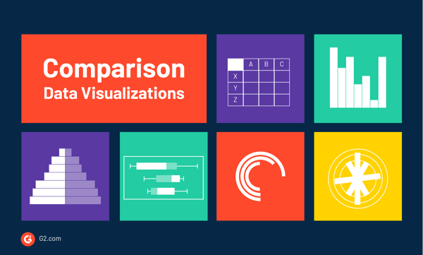
Perhaps the most common types of data visualizations are bar and column charts. We see these visual charts everywhere. Research reports, market reports, and analyses are just a few of the many places.
Both column and bar charts show the same data, just one is vertical and the other is horizontal. Consider using either when it comes to showing changes over a given time period or when you want to answer the question of “how many?”.
A table chart is when data is arranged in rows and columns. This common type of data visualization is often used through data analysis, print media, computer software, simple handwritten notes, and more. It is one of the most basic and effective ways to show data.
Similar to column and bar charts, a histogram will only show a single variable instead of multiple. And, instead of showing trends over time, a histogram shows frequency. An x-axis of a histogram is where the bins, or intervals, of the variable are, and the y-axis is the frequency. Each bar on a histogram represents the frequency of that bin.
For example, if you were showcasing the results of a satisfaction survey, the bins would be answers such as “neutral”, “dissatisfied”, and “very satisfied”. The bars would show how many people gave each answer.
It may be unclear how histograms and bar graphs are different. For starters, one of the easiest ways to distinguish them is by the gaps that are between the bars in a bar chart, whereas with histograms, the bars touch.
Additionally, histograms refer to a graphical representation that displays data using bars to show the frequency of numerical data. Bar graphs are a pictorial representation of data that uses bars to compare categories of data.
As the name suggests, population pyramids are stacked bar graphs that visualize a social narrative of a certain numerical dataset, typically a population.
Population pyramids can also be referred to as Age and Sex Pyramids, as they display two back-to-back histograms (one for each sex) that show the population and how it’s distributed based on age groups in both sexes.
This type of data visualization is ideal for pinpointing changes or differences in the population of specific groups.
A box and whisker plot, otherwise known as a box plot, is a way to show data distribution as it moves through quartiles, which are dividers within the data points that segment them into four more or less equal parts.
This type of data visualization gets its name by the lines that extend parallel from the boxes, which are known as the whiskers. These lines indicate variability outside the upper and lower quartiles. Outliers from this data are represented as individual points within the plot. These plots come in handy when data is distributed between multiple groups or datasets.
A radial bar chart is simply a bar chart that is plotted on a polar coordinate system. Sometimes referred to as a circular bar chart, these data visualizations tend to be very eye-catching. However, it’s important to keep in mind that a bar on the outer portion of the chart will be longer, regardless of the data, than one on the inside even if they show equal value.
Because of this, radial bar charts are best for illustration purposes only.
Sometimes referred to as a circular column graph or a star graph, radial column charts are situated on a grid of circles that each bar is plotted on. Each circle represents a value on a scale, while also using radial dividers and lines coming out from the center of the chart. These dividers and lines are used to to signify specific categories or intervals within the data.
A tally chart is a table with tally marks that show a dataset with tally marks. They show frequency, occurrences, or a total number being used to measure for a specific category. These types of charts are best used when representing a group of observations and are great for representing numbers without words or figures.
Some types of data visualizations reveal forms or patterns based on the data collected.
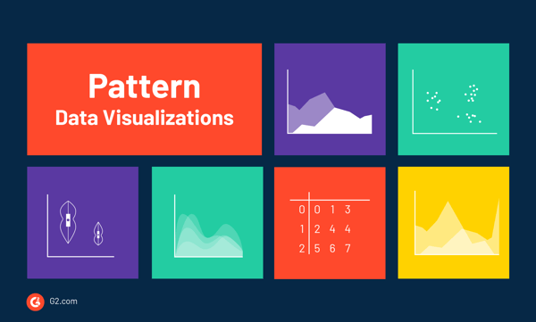
Another common type of data visualization is the line chart. These can also be used to show lengths of time, however, they’re a better fit for showcasing potential trends or projections. Typically, the x-axis is a period of time and the y-axis is a quantity.
The direction of the line is used to visualize what the data is showing. An upward slope indicates an increase and a downward slope indicates a decrease.
An area chart is a version of a line chart where the area under the line is filled in to signify emphasis. When choosing a color to fill under each line, make them slightly transparent so any overlapping areas can be distinguished.
These are used when you want to display multiple values in a time series that are signifying change. They typically show trends rather than conveying specific conclusions. There are also stacked area charts that show multiple data series stacked on top of one another.
Scatter plots are great for many data points and highlighting any anomalies or outliers. Each point on a scatter plot represents “when x = this, then y = that”. When you want to see the correlation between two variables, use a scatter plot.
How the points appear on the graph are going to show various elements regarding the data. For instance, trending from the bottom left to the upper right shows a positive scatter plot, meaning the values increase together. When the points go in the opposite direction, from upper left to bottom right, this shows a negative scatter plot.
Cluster analysis, or clustering, groups large quantities of data together based on their similarities. Data that is sporadically laid out on a chart can be grouped in strategic ways through cluster analysis. This analysis can also act as a preprocessing step, which means data is formatted in a way so other techniques can be easily applied.
This is a common data mining technique and statistical analysis method.
A density plot, which is sometimes referred to as a kernel density plot or a density trace graph, is used to visualize how data is distributed over a specific time period. They are similar to histograms, but instead of columns, they use kernel smoothing to plot values.
The shape of the distribution, which shows peaks and valleys, helps display the specific trends within the data and how it’s moving over time.
A violin plot is used to show the distribution of data and its probable density. Essentially, it’s a density plot that is placed on its side to show the distribution shape of data.
Named because it usually resembles a violin, the white dot in the middle signifies the media value and the thick black bar in the middle represents the interquartile range. There’s also a thin black line that represents the upper and lower values within the data.
A stem and leaf plot table is a type of data visualization where each data value is split into a "stem" (the first digit or digits) and a "leaf" (usually the last digit). As an example, a numerical value where the stem is 1 and the leaf is 8, the number will be 18.
When constructing these types of tables, the stem values are listed down and the leaf values go right or left from the stem values. These tables give readers a quick look as to how data is distributed, and it’s also useful for highlighting outliers and finding the mode.
A stream graph is a type of stacked area chart that displays the movement of data on a y-axis following another numeric value on an x-axis.
Sometimes referred to as a ThemeRiver, the evolution of this data is represented using distinct colors with rounded edges which gives the impression that the data is flowing into other data like a river. Data is typically displayed around a central axis, giving it a flowing shape.
These are best used when studying relative proportions of a whole. The size of each individual shape or stream is proportional to the values in each category. The axis that runs parallel is used to show a time scale.
There are specific types of data visualizations that show changes in price, most often found within the stock market or financial sectors.
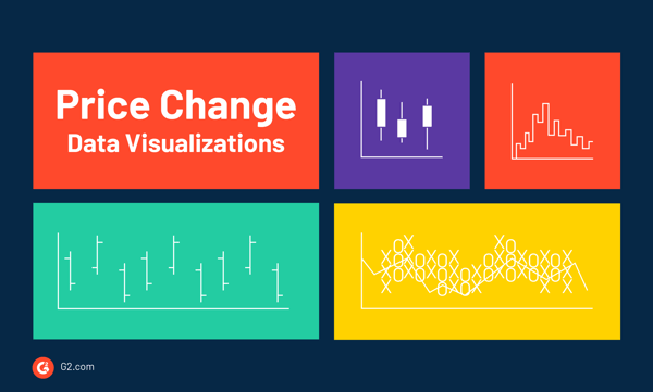
A candlestick chart is used as a trading tool to show and analyze the price movements over time. These are typically used for derivatives, currencies, stocks, bonds, and commodities. As far as their display, they show price information, like open price, close price, highest price, and lowest price.
Each symbol, or candlestick, represents trading activity during a specific time period.
Elements of a candlestick chart:
While candlestick charts are great for detecting and predicting market trends over time and interpreting the day-to-day sentiment of the market, they don’t express the events taking place between the open and close price -- only the relationship between two prices.
When you’re looking to track price movements and how to make a decision on if you should purchase a stock or not, you’d look at a Kagi chart.
Named after the Japanese word for romanized, a Kagi chart differs from a candlestick chart in the sense that it’s independent of time, and they help to filter out the noise that some other financial charts may show. These charts only show data that changes in direction when a specific amount or price is reached.
These charts are made up of vertical lines that reference the action of the stock’s price, rather than anchoring to a specific time in which the stock was at a specific price. The lines of these charts depend on what the price of the stock is doing.
When there is a shift in the line from thin to thick, this indicates to traders a buy signal, meaning the Kagi line has risen above a previous high. When a line turns from thick to thin, this is a sell signal that the Kagi line has fallen below a previous low.
Open-high-low-close charts, or OHLC charts for short, are a trading tool to visualize and analyze price changes in data like currencies, stocks, bonds, and other commodities. They can be helpful when looking to interpret the day-to-day trends of the stock market and when forecasting any future price changes.
In OHLC charts, the y-axis displays the price scale and the x-axis is the time scale, like days, weeks, or months. In terms of color, red indicates a bearish market, meaning the closing price is lower than what it was when it opened. Or, when the marker is green, it indicates a bullish market, meaning the closing price is higher than it was when it opened.
A point and figure chart, or a P&F chart, is designed for long-term investment and can determine specific entry and exit points in stock market trading. They monitor supply and demand for each issue, while also keeping track of developing trends in the market.
While other types of data visualizations in this category mark the degree of the stock’s movement over time, like a candlestick chart, P&F charts consist of stacked Xs and Os that represent a set amount of price movement. The Xs indicate rising prices while the Os indicate a falling price.
Data visualizations can also show relationships and connections between the data in addition to making clear correlations between two or more variables.
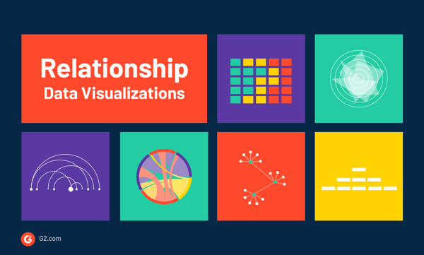
Heat maps are used to showcase massive datasets in terms of location. A specific formula is used to color each cell, and the areas within the map are colored or shaded to represent a specific value. Typically, a heat map is a representation of data where each value is contained with a matrix. The shades represent a specific quality, like low to high.
Heat maps are best used when visualizing a variable across a matrix of data, like a timeframe of days or hours. The different shades make it easy to see the extremes within the data.
Related: We use an example of heat-mapping in our guide on social media data mining.
A radar chart, which is sometimes referred to as a spider or web chart, is a two-dimensional chart that represents multivariate data. It does so by giving each variable an axis and plotting the data across all axes. Multivariate data is the data you get when an observation is based on more than two variables.
The shape of this data is typically a polygon. Radar charts are used when you need to plot a series of observations or cases that consist of multivariate data. This is because each observation is represented by its own polygon, making it easy to see any overlap in data.
It’s best to use a radar chart when you have a large number of variables and are looking for a quick way to see quality data.
A Venn diagram uses overlap circles to show the relationships between two or more sets of items. This type of data visualization is ideal when you need to visually organize information, compare two or more choices, and even solve a complex math problem.
Sometimes also referred to as a set diagram, each set of data is represented within a circle. The intersection area is where the circles overlap, which means the two sets have something in common.
A parallel coordinates plot is used to pinpoint specific data elements across varying dimensions. Each dimension directly correlates to a vertical axis, and each data element is shown as a series of connected dots along a dimension or axis. Each variable of data is given its own axis, and all of the axes are shown parallel to one another. Values are then plotted as lines that connect between each axis.
This type of data visualization is great for when you need to compare many variables together to see the relationship between them.
An arc diagram uses nodes or points along a single line. Arcs are then used to show connections between various nodes. The thickness of each arc can represent the frequency between the source and the target node.
Arc diagrams are typically used when finding the co-occurrence within the data.
Chord diagrams are used to represent flows or connections between several entities, which are called nodes. The connections between the nodes are used to show that they have something in common -- making these diagrams ideal for comparing similarities within a dataset.
These nodes are arranged within a circular graph and the relationship between points that are connected is shown by using arcs. A specific value is then assigned to each connection, which is indicated by the size of the arc. Color is also used to group the data by category, which helps to make comparisons within the data.
A non-ribbon chord diagram is an easier-to-read version of a chord diagram. Essentially, it only utilizes the nodes and the connection lines, which gives more emphasis to the connections within the data.
A tree diagram utilizes a tree-like structure to show hierarchy within data and is typically used as a data mining technique.
At the top of the diagram, you’ll find a root note which is the parent topic. Coming off of that are other nodes, which are linked together by a line. This is referred to as a branch. There are also leaf nodes, also referred to as end-nodes, that signify the end of the sequence.
Tree diagrams are best used when visualizing a family tree, evolution, or other classifications.
A network diagram, sometimes called a node-link diagram, shows how things are interconnected using nodes and link lines to represent the connections. This makes it easier to visualize the type of relationships a group of entities may have. In this type of diagram, a note is represented by a circle and the links are drawn using lines.
There are two types of network diagrams:
When looking to analyze and display the relationship between items, a matrix diagram can be helpful. Sometimes called an organizational chart, this type of data visualization shows the relationship between two, three, or four groups of information. It then provides additional insights into each relationship, such as the roles played by various individuals.
The shape of a matrix diagram is going to depend on how many groups are being compared. Six shapes are possible: L, T, Y, X, C, R, and a roof-shaped diagram.
A SWOT analysis is used as a planning method to visually show and evaluate the strengths, weaknesses, opportunities, and threats. Businesses across varying industries use this as a way to plan for an upcoming project or assignment.
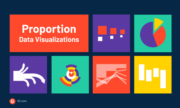
Some types of data visualizations use elements of size and area to show the differences or similarities between values.
A bubble chart is similar to a scatter plot, whereas each point is represented by a bubble. The area of each bubble signifies meaning, in addition to its placement within the axes. Bubble charts are used to compare and show the relationship between categorized circles, based on their position on the graph and their proportion. The overall chart is used to analyze patterns and correlations in the data.
The use of pie charts have diminished over recent years, however, they’re still an effective visualization to use. Particularly, pie charts are widely used for data visualization in marketing.
If there is one thing pie charts are great at, it's showing the many pieces that make up a single “pie” typically displayed as percentages. For example, if a company is trying to visualize the percentage each department makes up of the entire company, they can do so using a pie chart.
In its simplest terms, a donut chart is a pie chart with the area in the center cut out. A donut chart puts more emphasis on the actual data, not so much the size differences between the slices. Plus, since the center is cut out, this space can be used to display additional information to the reader.
A progress bar, or a status bar, is used to visualize the progression of an operation, like a download, file transfer, or installation. This visualization also sometimes uses a textual representation of the process in the form of a percent, which would say “50% complete”.
When you need to display data in units of dots, each with a specific color to represent a category or grouping, use a dot matrix chart.
These are great when you need to give a quick overview of the distribution or proportion of data within a specific category within a dataset. They can also be used to visualize and compare distribution and proportion to discover patterns within data.
Sometimes referred to as a mosaic plot, a Marimekko chart shows categorical data over a pair of variables.
In this type of data visualization, each axis shows a scale of percentages that are used to determine the width and height of each segment that is represented by a square or rectangle. This allows viewers to see relationships between the categories. The bigger the percentage, the larger the square or rectangle within the chart.
When you need to compare values or show proportions for a quick view of the data, a proportional area chart is ideal. While any shape can be used, they typically show squares or circles.
Because it can be difficult to estimate the values just by looking at the chart, these are best used for communication purposes rather than analytical ones.
There are also nested proportional area charts that are used for comparing size or quantities relative to the size of the data.
Sankey diagrams visualize flow and are typically used to show a flow of material, energy, measurable resource, or cost in proportion to one another. The size and width of the arrows in these diagrams are used to show magnitude -- the bigger the arrow, the larger the quantity of flow. Color is also used to divide the diagram into categories.
When you’re looking to put a visual emphasis on the major transfers or flows within a system, a Sankey diagram is ideal.
Parallel sets use lines to visualize the flow of data and their proportions. Each line directly corresponds to a dataset and the value is represented by the width of each line. The flow of the line is then color-coded based on the categories of data.
Treemaps are used to display hierarchical data in a nested format. This is done using rectangles, and the size of the rectangles is proportional to each category’s percent of the whole. Treemaps are most useful when comparing parts of a whole and have many categories to visualize at once. They make it easy to see the difference between data values and categories at a glance.
Circle packing is a type of data visualization that is a variation of a treemap, but instead of using rectangles, it uses circles.
Each node of the tree is represented by a circle, and its subnodes are visualized as circles inside of it. The size of each circle is proportional to a specific value which provides more data within the visualization.
Also referred to as a ring chart or radial treemap, a sunburst diagram consists of an inner circle that is surrounded by rings. Each portion of the ring is proportional to the value that it represents. Color is typically used to show groupings of data or specific categories of data.
A word cloud, otherwise known as a tag cloud, is a collection or cluster of words that are depicted based on size. The bigger and bolder the word appears in the cloud, the more it was mentioned within a text or speech.
Word clouds are great ways to visualize the more important parts of textual data, whether it be from a blog post or a database.
Re-made last night's #DemocraticDebate transcript, word cloud style. pic.twitter.com/j8SuL7K36J
— Amy Lecza (@amylecza) October 16, 2019
A nightingale rose chart famously got its name thanks to Florence Nightingale, who used this chart to show avoidable deaths of soldiers during the Crimean war.
Otherwise referred to as a Coxcomb chart or a polar area chart, these are similar to pie charts, except each section is represented by angles. How far the angle extends out from the center of the circle indicates the value that it represents.
A waterfall chart, sometimes called a flying bricks chart or a cascade chart, is used when showing how an initial value is increased or decreased by a series of intermediate values leading to a final value. It helps users understand the cumulative effect that is introduced by positive or negative values.
Typically, the initial and final values, or the endpoints in the chart, are shown using a whole column. The intermediate values, or the ones in between, are shown as floating columns that begin based on the data shown in the previous column. The columns are also color-coded to signify positive and negative values.
A pictogram is a type of data visualization chart that uses icons or shapes to give a more engaging view of smaller sets of data. These icons usually represent the data’s subject or category. For example, if you’re looking to show the population of different states in the US, you may choose to use the shapes of people. If you’re looking to show the growth of carrots on farms in Oklahoma, you may choose shapes of carrots to show this.
The use of shapes or icons can be helpful to overcome a language barrier between readers, or even differences in culture or education. It’s best to be as clear as possible in a pictogram, especially since using partial icons or symbols can be confusing when presenting data.
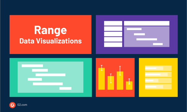
When you’re looking to display the variations between upper and lower limits on a scale, use a data visualization that can show specific ranges in data.
An error bar is typically a T-shaped bar on a graph that shows how much error is built into the chart. The use of “error” in the name doesn’t necessarily mean a mistake, but instead a range or spread of data that represents built-in uncertainty. This could be anything from a confidence interval or a standard error.
Most error bar charts show the data’s range. The range visualizes how spread out the data is from the lowest to the highest value. You can find error bars on scatter plots, bar charts, dot plots, or linen graphs for additional detail regarding the data.
Bullet graphs are used when you need to compare one value, which is represented by a horizontal bar, to another value, represented by a vertical line, and relate this data to a qualitative range. Bullet graphs function similar to a bar graph and are typically used to display performance data.
An important element of a bullet graph is called the Feature Measure. This is visualized by the length of the main bar in the middle of the chart. This line runs perpendicular to what is referred to as the Comparative Measure. This is used as the target market to compare the value of the Feature Measure against. When the main bar in the middle passes the Comparative Measure line, you can visually see that a goal has been hit.
Bullet graphs often use color as a way to display range scores, with each shade corresponding to a performance rating like poor, average, good, and satisfactory.
A Gantt chart is typically used when dealing with project management since it displays a list of activities or tasks along with their duration over time. This shows when each task starts or ends. When you need to plan and estimate how long an entire project may take, a Gantt chart is ideal.
These charts are drawn within a table where the rows are used for the activities and the columns are used as the timescale. A bar plotted along the timescale represents the duration that each activity will take to complete. You can also use connecting arrows to signify which tasks depend on one another.
A span chart, sometimes referred to as a floating bar graph or a high-low graph, displays dataset ranges between a minimum and maximum value. These are best used when comparing ranges without needing a lot of extra data or information.
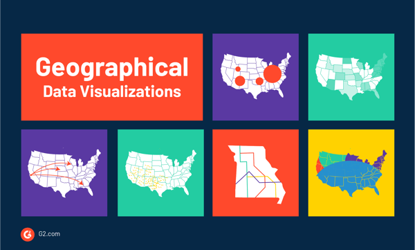
Another popular type of data visualization is one that uses a map to show data over a geographical region.
Similar to a choropleth map and a bubble chart, a bubble map uses circles over a specific geographical region. The area or size of the circle is proportional depending on the size or value of the dataset.
These maps are best when comparing proportions over geographical regions that are close to one another so you can see how they compare.
A choropleth map is similar to a heat map, but on these types of data visualizations, the shading of the data is applied to a geographical map. These are best used when comparing a dataset by a specific geographic region. Color is key when using a choropleth map, as color progression is used to represent specific amounts of data.
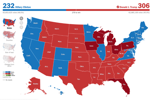 Source: NY Times
Flow maps are used to show the movement of information or objects from one location to another. This is typically used for people, animals, or products.
The number of people, animals, or products that are moving are signified by a single line that ranges in thickness. The thicker the line, the larger the amount. Arrows are also used to show the direction of the movement.
Connection maps, also referred to as Link Maps, are drawn using connecting dots placed on a map by either straight or curved lines. A connection map is used to show specific relationships geographically. These can be flight patterns or the migration of imported or exported goods.
Connection maps are similar to flow maps, but without the quantitative values between connections.
A dot map, sometimes called a point map, is when dots are placed within regions to show the density of a population.
This is typically done two ways:
This type of map is great for visualizing how things are distributed over a specific region and for revealing patterns when points are more clustered in specific areas than others.
An isoline map shows data as a third dimension on a geographical map, which makes them useful when showing surface elevations of a specific region or for weather data. A radar map, temperature map, or rainfall map are all examples of isoline maps.
A transit map is used to illustrate routes and stations within a public transportation system. This could be anything from bus lines, commuter rails, or ferry routes. Color is used to code the lines or services, while icons are used to indicate stations or stops along the route.
When you need to visually show or explain an idea, use a data visualization that can illustrate a concept.
A flowchart is a visual representation of the sequence of steps and decisions that are needed within a specific process. Each step in the process is noted with a specific shape, which is linked by connected lines and arrows.
When using shapes like circles, rectangles, or ovals, it’s easy to define the type of step within the chart. For instance, if a certain step requires a decision before removing on, you may use a triangle. Making a flowchart is ideal when you need help planning and developing a process or improving one that already exists.
A brainstorm, otherwise known as a mind map, is a diagram that shows ideas, words, images, or concepts and how they relate to one another. They are often used to classify ideas, organize information, or a general aid when studying.
Brainstorms come in handy when collaborating across various teams on one unified project. They typically start in the center with a title or main idea and have relevant or related words or categories written or drawn-out extending from the main idea.
A funnel is used to display values as they progressively decrease. The name comes from its shape, which starts with a broad head and ends with a narrow neck.
Ideally, a funnel will show a process that starts at 100% and ends with a lower percentage. Funnels are most helpful when you need to visualize a flow of things like users, people, or organizations, through a process - like a sales pipeline. The number at each stage within the funnel is indicated from the width as it narrows.
An illustration diagram is either one or multiple images that are accompanied by notes or labels. These notes are used to explain concepts or methods, describe objects, show how things move, or help provide additional information regarding the image being displayed.
These illustrations can be anything from a simple sketch to a complex photograph.
A pictorial fraction chart uses pictograms such as icons, pictures, or illustrations, to show fractions. This could be used to show something like “1 in 5 people have asthma”. You would then show five icons with one of the icons colored in to visualize the one person who has asthma.
This type of data visualization uses a diagram, picture, or a technical drawing of an object that shows the relationship or order of assembly of various parts. It will show the components of an object slightly suspended in the surrounding space combined with the object separated by a distance.
This type gets its name by suggesting that there was a small explosion in the middle of the object, causing you to see how it would be put back together.
These are often used in instructions, like how to put together furniture.
Certain types of data visualizations are used to show data and events over a specific period of time as a way to display trends or changes.
Whether you have a physical calendar hanging on your wall or you use the app on your phone, calendars are a helpful tool to remain organized and on schedule.
They display periods of time and the events that occur during a specific time. They are typically divided into days, weeks, months, and years. Some even go as far as to break down the hours of the day. The most common type of calendar we use is called the Gregorian Calendar, which uses seven grids to define the days of the week.
A timeline is a data visualization that displays a list of events in chronological order. The main purpose of a timeline is to display time-related information to present a story or view of history.
When it comes to a management tool that can be used to schedule events, tasks, and actions, a timetable is an absolute must.
This data is organized in a table, in either chronological or alphabetical order. An example of a timetable is how train stations show the arrival and departure times of trains throughout the day.
Spiral plots visualize time-based data along a spiral. The graph starts at the center and then progresses outward. These are often used for showing large sets of data that typically visualize a trend over a long time period. Color can be used to assign each interval to a specific time period. For instance, if you were showing data over a month, each day of the month would be a different color.
The right type of data visualization can take your data from confusing with no point to easy to understand with clear action items. Whether you’re presenting your data findings to the head of your department or getting organized as a team, knowing which type of data visualization to use can make all the difference.
When you’re ready to get started, check out the data visualization software you can use to make sure your data is telling the right story.


I’ve always been fascinated by how the right visuals can turn complex information into...
 by Jaya Bordoloi
Images have the power to transcend language barriers.
by Mara Calvello

If you’ve been paying attention to tech news recently, you know something big is on the...
 by Devin Pickell