
I’ve always been fascinated by how the right visuals can turn complex information into something easy to understand. Whether in presentations, reports, or dashboards, a well-designed chart can make data more engaging and impactful. But I never actively explored data analytics—until I joined a mentorship program at G2.
As part of the program, my mentor assigned me to create a compelling data story using visualization tools. I started with the ones we already used in the company, but they fell short—some lacked customization, and others didn’t effectively highlight key insights. So, my mentor encouraged me to explore alternatives to find a better fit.
That’s when I started researching the best data visualization software, looking for tools that could not only build charts but also enhance storytelling and engagement. As I tested different tools, I quickly saw how much of a difference the right platform makes. Some were feature-rich but overly complex, while others were easy to use but lacked depth. The best ones struck a balance between usability, customization, and storytelling.
Eventually, I found the right tools to help me complete my assignment, turning raw data into a clear, engaging, and meaningful narrative. That experience reshaped how I think about data—choosing the right visualization tool isn’t just about features; it’s about making information truly accessible and impactful.
In this article, I’ll share my experience working with different data visualization tools—what stood out, what fell short, and which ones I found best for different use cases. Whether you need a tool for in-depth analysis, interactive dashboards, or simple charts for presentations, these recommendations will help you find the right fit.
*These data visualization software are top-rated in their category, according to G2 Grid Reports. I’ve also added their monthly pricing to make comparisons easier for you.
If there’s one thing I’ve learned about data visualization in 2025, it’s that having the right tool makes all the difference. For me, it was like unlocking a new way to communicate—something more powerful than just words or spreadsheets. When you can visually express data in a way that people immediately understand, it changes how they react. It turns dry facts into insights that spark real conversations.
At first, I was focused on functionality. Could the tool handle complex datasets? Did it offer enough chart types? But as I got deeper into using them, I realized it wasn’t just about features—it was about how intuitive and engaging the experience felt, both for me as the creator and those viewing the result. If I could build something quickly and still make it look polished and insightful, that would be a win in my book.
What surprised me was how much a good visualization tool could influence decision-making. There were moments when a single well-designed chart helped steer discussions in the right direction simply because it clarified the data. It felt empowering to turn messy numbers into visuals that told a compelling story.
I took a hands-on approach to finding the best data visualization tools, testing each by creating real visualizations—from quick charts to complex dashboards. I wanted tools that made the process intuitive without sacrificing flexibility or design quality. Whether I was importing small spreadsheets or large datasets, I focused on how well each tool handled different scenarios.
For tools I had used before, I gave them another go, this time paying close attention to what had improved. Were they faster? More intuitive? Did they offer new features that actually mattered? Some tools pleasantly surprised me with fresh innovations, while others didn’t bring much new to the table.
I used AI to analyze user feedback to complement my testing from G2, where real users highlight what works and what doesn’t. This helped me quickly extract key takeaways and compare tools based on real-world performance and value. By combining hands-on experience with AI-driven insights and community input, I was able to assess which tools best align with different needs and use cases.
In cases where I couldn’t personally test a tool due to limited access, I consulted a professional with hands-on experience and validated their insights using verified G2 reviews. The screenshots featured in this article may be a mix of those captured during testing and ones obtained from the vendor’s G2 page.
Without utilizing analytics and visualization, companies don't get very far in formulating strategy with textual data. In fact, up to 81% of companies think that data should be at the heart of the business decision-making strategy.
Finding the right data visualization software isn’t just about generating charts—it’s about unlocking the stories hidden within the numbers. While industries leverage data science to manage and visualize data, the current market share of the global data visualization market is expected to reach USD 8.2 billion by 2033, exhibiting a growth rate (CAGR) of 7.38%, as per the latest survey by IMARC.
For me, it was about discovering tools that didn’t just simplify the process but empowered me to see data in new ways. I wanted platforms that could bridge the gap between raw information and real understanding, all while being intuitive, adaptable, and practical. Here’s how I approached evaluating these tools:
After months of analyzing over 15 data visualization software, I discovered that not all tools live up to their promises. Some dazzled with flashy features but lacked practicality, while others offered solid functionality without the flexibility I needed. It was a process of trial and error and plenty of learning, but seven tools stood out in the end. These weren’t just the most functional—they were the ones that transformed how data could be understood, shared, and acted upon.
To qualify for inclusion in the data visualization software category, a product must:
*This data was pulled from G2 in 2025. Some reviews have been edited for clarity.
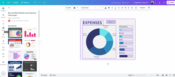
Canva, the tool I thought was just for creating sleek infographics and eye-catching social media posts, turned out to be much more than a basic design app. Initially, I saw it as a quick-fix solution when I needed something visually appealing without diving into complex design software. But as I spent more time with it, I realized Canva goes beyond aesthetics—it’s also a solid data visualisation platform. Whether building simple charts or comprehensive data-driven presentations, Canva offers an impressive range of features that make the process easy and enjoyable.
One of my favourite features is Canva’s chart customization. The drag-and-drop interface means I don’t need advanced design skills to create something that looks clean and well-crafted. Whether it’s a bar chart, line graph, or pie chart, I can effortlessly customize layouts, fonts, and colours to suit my style or branding. The collaboration feature is another highlight. My team can jump in, leave feedback, and refine visuals in real time, saving us from endless email threads and back-and-forth edits.
I also love how Canva handles interactive presentations. Embedding charts and graphs into slides is seamless, and it helps me tell a clear, data-driven story during meetings or presentations. It’s super convenient when I want to showcase data in an informative and visually appealing way.
Another thing that stands out is the variety of templates available. Whether I need a clean bar chart or a more elaborate infographic, there’s always something that fits my needs. And for someone like me, who doesn’t have a background in design, it’s incredibly intuitive—no steep learning curve, just straightforward, user-friendly tools.
However, there were a few areas of improvement. When working with complex datasets, I’ve found the chart options a bit basic, multi-axis charts or deeper customization just aren’t there. As shared in G2 user reviews, others looking for more advanced data visuals have expressed similar wishes for expanded functionality.
Exporting charts is another area with room for growth. While downloading as images or PDFs is easy, I’d love the ability to export interactive visuals or embed live data, something several G2 customers have also highlighted as a potential upgrade.
Lastly, while Canva’s stock library is generous, I’ve occasionally hit paywalls when trying to access specific premium icons or graphics. It’s manageable, but can be a bit limiting if you’re working on infographics with a tight budget, an issue echoed in G2 feedback from individual users and small teams.
“The Magic continues with Canva. Truly, over the past year, it has kept upgrading and evolving, bringing ease of use to the next level all the time! It has become an 'enterprise' where any material or need you can think of that will need creativity and a professional look in the fastest time is made available, and you're good to go!
I can edit on my computer and my phone amazingly! So Canva is not just for every need but anytime, anywhere!”
- Canva Review, Patricia C.
“While working on a certain project, the search menu could not allow the user to search for a certain tool/feature until navigating to its parent section, where we can search subcategories and certain features to use.
In certain cases, while using Canvas's free features to complete a project, there are areas where most of Canvas's features are strictly premium, which dishonours its users. It's a user experience that allows certain features to be used free of charge.”
- Canva Review, Safi K.
Data visualization is only as good as the data behind it. Check out the best data extraction software to ensure your dashboards and charts are powered by high-quality, well-collected data.
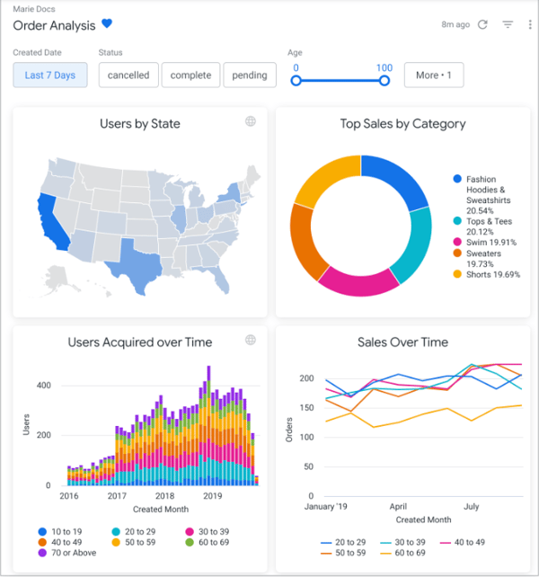
Using Looker feels less like working with a tool and more like stepping into a well-organized control room for your data. From the moment I started using it, I felt I had a direct line to uncover the stories hidden in our numbers. It’s not just about answering “what happened” but digging deeper into the “why” and “how.” I’ve found myself asking better questions and enjoying the process of finding answers.
The standout for me has been Looker’s dynamic dashboards. I found them incredibly interactive and versatile. For instance, I set up a project progress dashboard to drill down from overall metrics to specific task-level details. This ability to filter by categories like project stages or resource allocation gave me an immediate grasp of the data. Even as someone exploring the tool, I could see how such features would benefit teams needing clarity and detail.
Another feature that stood out during my testing was Looker’s integration capabilities. Pulling data from platforms like BigQuery and Snowflake into Looker was seamless. I experimented with combining multiple datasets to create unified views of team productivity and resource allocation. It felt efficient and eliminated the need to manually sync data between tools—a feature that could save significant time for teams working with diverse data sources.
Looker’s data modeling layer, LookML, was a steep learning curve at first. I had to rely heavily on tutorials and trial and error. But once I got the hang of it, I saw its value in delivering consistent metrics across dashboards. G2 user reviews often mentioned this same progression: initial complexity followed by long-term value, especially for teams prioritizing data standardization.
The limited selection of starter templates made onboarding feel slower than it needed to be. Based on G2 sentiment analysis, this is a recurring theme among users looking for a faster start with pre-built assets. I also found the visualization options a bit narrow; it was hard to build more advanced or polished charts compared to other tools I’ve used.
Finally, I noticed occasional technical issues, filters didn’t always behave as expected, and dashboards sometimes failed to refresh. These weren’t constant problems, but they did disrupt my workflow at key moments. G2 user feedback reflects similar experiences, especially when it comes to dashboard performance and filter reliability.
“Looker has been transformative for how we manage and interpret data. It has become a tool we use weekly, if not daily. It has been central to our data consolidation and centralization process. We've combined sources, including Google Analytics, Search Console, social, and custom spreadsheets, that have completely changed how we approach reporting. It has helped us reduce time to generate reports, draw insights, and reduce errors. It was also easy to implement and scale. Looker has helped us build a culture of data-driven decision-making year-round, giving every team the tools and insights they need to operate effectively and efficiently. I have never had to reach out to customer support, which tells me the tool is doing what it is supposed to do.”
- Looker Review, Andrea G.
“Looker can have a steep learning curve, especially with its LookML modelling language, which may be challenging for non-technical users. Its data visualization options are less customizable than tools like Tableau or Power BI. The reliance on LookML can create bottlenecks for self-service reporting. Looker's pricing can also be expensive, especially for smaller teams. Performance may slow with large datasets, and it lacks some out-of-the-box integrations and collaborative features in other BI tools.”
- Looker Review, Shubham S.
Want to make complex data easier to understand? Learn how to simplify data visualization with these 3 expert tips for data scientists.
I find it exciting to try tools that promise to simplify data chaos, so I decided to give Looker Studio a shot. At first, I wasn’t expecting much beyond the basics, but it surprised me. It wasn’t just about plugging in numbers and generating charts—it was about uncovering the stories within the data in a seamless way. For someone like me, exploring tools to find the best fit, Looker Studio felt like a step in the right direction.
One feature that stood out during my testing was data transformation. It’s not just about visualizing data; it’s about shaping it to tell a clearer story. I used some simple calculations to create new metrics directly in Looker Studio. For example, I combined revenue data with customer counts to generate a revenue-per-customer metric. Seeing these calculated fields blend seamlessly into the dashboard was satisfying, offering insights I hadn’t initially considered.
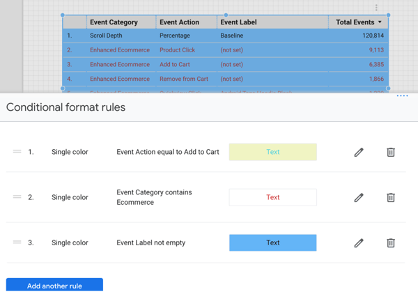
And then there’s conditional formatting. It might seem like a small feature, but for me, it made a big difference when working with large datasets. I set up a dashboard where low-performing metrics are highlighted in red and top performers stand out in green. It’s intuitive and streamlines decision-making, instantly drawing attention to what matters most.
Looker Studio impressed me with its visual dashboards and seamless Google integrations, but I ran into a few challenges along the way. The scheduled reporting feature, while helpful, had formatting issues. I noticed that charts in emailed reports didn’t always render as expected, which meant I had to do some extra polishing. According to G2 customer feedback, others have faced similar inconsistencies when automating report deliveries.
Another limitation I noticed was with native data connectors. It worked great within the Google ecosystem, but pulling in data from my CRM took extra setup. I used a third-party connector to bridge the gap, and while it eventually worked, the process felt more complicated than I anticipated. Insights from G2 reviewers reflect this same hurdle when connecting external tools.
Lastly, the mobile experience felt underdeveloped. Viewing dashboards on my phone was fine, but editing on the go was clunky and limited, something I found surprising given how polished the desktop version is. G2 users have pointed out this mobile gap as well, especially for teams that need flexibility on the move.
“It is a tool with direct connections to various common database systems like Excel, BigQuery, etc., so the ETL process is completely automated, which is very helpful. Once in the software, it is simple and offers a wide range of data transformations and calculated fields. My favourite aspect is that it is so fast, and even if you're querying dashboards at scale, you can use BI Engine with BigQuery to maintain high performance.”
- Looker Studio Review, Everhard O.
“What I like least is that for platforms external to Google, independent payment connectors are often necessary. Customer support for Looker Studio from Google is minimal.”
- Looker Studio Review, Raúl S.
Dashboards show what’s happening, but FP&A tools explain why. Explore the best FP&A software for deeper financial planning and forecasting.
When I started exploring MongoDB Atlas, it wasn’t an obvious choice for data visualization tools. I initially thought of it as a database platform rather than a tool for visual storytelling. As I dug into its features, I discovered capabilities that made me rethink its potential for data visualization.
One of the highlights for me was its geospatial capabilities. I worked with some location-based data, and Atlas handled it exceptionally well. I analyzed customer distribution and visualized regional performance, and the geospatial queries made the process surprisingly intuitive. What I expected to be tedious ended up being streamlined, and I found creative ways to represent geographic data visually.
Another feature I found particularly useful was the data federation. I liked being able to query data from multiple clusters, cloud storage, and external sources as if they were part of a single database. This saved me the time and effort of manual data consolidation or setting up complex pipelines.
I also explored the real-time performance monitoring tools, which are incredibly insightful. I could see how my queries performed, pinpoint slowdowns, and make quick adjustments. This level of visibility gave me confidence that dashboards depending on live data would run smoothly and responsively, even in high-demand scenarios.
That said, I ran into some challenges with storage optimization. Based on mine and G2 user patterns, whenever I deleted data to free up space, the compaction process didn’t reclaim as much storage as I expected. This felt like a missed opportunity to better manage storage costs, particularly on data-heavy projects.
Budgeting with Atlas was also tricky. Since pricing is tied to CPU, memory, and storage usage, it was difficult to forecast long-term costs. Even minor usage changes led to unexpected expenses. G2 user reviews also mentioned this unpredictability, especially among users trying to manage cost-efficiency in dynamic workloads.
“Highly efficient and scalable database service. MongoDB Atlas is a highly effective database web service in terms of features and integrations. With just a few clicks, you can browse through your data collections. It provides us with a very smooth interface and a lot of integration tools. also, Atlas offers us a wide range of monitoring and deployment tools. You can connect your codebase to mongodb and can easily fetch, upload and perform other CRUD operations within seconds.”
- MongoDB Atlas Review, Aryan K.
“Clusters shared with other users do not seem to work as efficiently as single-user clusters. There is a time lag, and collaboration features are not that effective. I cannot use it if I have too much querying.”
- MongoDB Atlas Review, Rohit T.
Looking for the best free tools to visualize your data? Check out the 11 top free data visualization tools to simplify your work.
If you've been searching for a tool that handles data visualization and reporting like a pro, let me tell you about my experience with SAP Crystal Reports. It has some fantastic strengths that stood out to me, but it also came with a few quirks that I had to navigate and a few quirks you’ll want to keep in mind.
The dynamic report customization immediately caught my attention. When I added filtering parameters, the reports transformed from static documents into interactive experiences. I could filter by region, product category, or time period, which showcased how adaptable the tool can be for different needs. It felt satisfying to create something that could adapt to different audiences without duplicating effort.
Another standout feature was the control over layout design. I enjoyed tweaking every detail, from fonts to spacing, which made the reports look polished and professional. Even though I wasn’t creating reports for an audience, I could tell this level of precision would be invaluable in delivering high-quality presentations.
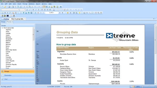
The integration capabilities were another highlight for me. Pulling data from SQL databases, Excel sheets, and cloud-based tools was seamless. When I combined data from multiple sources, everything came together smoothly, eliminating the need for manual consolidation. This made the process faster and gave me a clear picture of how SAP Crystal Reports could handle complex datasets.
The tool has solid reporting capabilities, but there were a few areas where it didn’t quite meet my expectations. The scripting environment felt outdated and unintuitive. Even simple customizations took more time than I anticipated, and I often wished for a more modern, user-friendly scripting experience, same as the sentiments of G2 reviewers.
Automation was another challenge. I tried setting up scheduled report distributions, but the workflow felt unnecessarily complex. Rather than saving time, I ended up managing tasks manually, much like other G2 reviewers that I scoured through.
Lastly, the lack of real-time collaboration slowed things down. When my team needed to review or edit reports, we couldn’t work simultaneously, which sometimes led to delays and duplicated efforts. Based on G2 feedback, this is a common request from users looking for smoother teamwork and more streamlined workflows.
“It's a powerful report tool with a sometimes counterintuitive design process, follows a ribbon region approach. It can report across a multitude of databases like MS SQL, MySQL, SQLite, and Oracle via JDBC, ODBC, ADO, etc. Basic reporting is easy, but it quickly gets hard once you try more complex reports. It was once widely used as an embedded reporting tool with canned reports.”
- SAP Crystal Reports Review, Yassiem D.
“There is a learning curve to using this tool to its fullest capabilities, but I could say that about many common tools, such as SQL queries and Excel. Fortunately, there are many resources to learn this, including Linked In Learning or in-person courses.
Some of the most useful tools, such as creating groups and moving them into the group's footers, work well, but it is not very transparent to go back and know that is what was done later.
The tool can get behind on some formats it supports—for example, once the XLSX format was the preferred format, Crystal took some time before it was available as an export, but that was also years ago, and they may be better at it currently.”
- SAP Crystal Reports Review, Melissa O.
AgencyAnalytics is another data visualization tool I explored, and it stood out to me as a great choice for agencies and marketers. While it’s designed with professionals in mind, it also felt accessible for someone like me who’s less experienced with such platforms.
One feature that worked well for me was the visual dashboard builder. It allowed me to create clear and customized snapshots of performance metrics with minimal effort. Using the drag-and-drop widgets felt intuitive, and I was able to organize data efficiently without any unnecessary complexity.
I also found the interactive charting tools incredibly helpful. When I worked with these charts, I could explore data dynamically. I loved how hovering over data points revealed additional insights, and drilling down into specific segments gave me clarity. This feature made it easier for me to identify trends and anomalies without feeling overwhelmed by the details.
Another feature that impressed me was the multi-source data visualization. I used it to pull data from platforms like Google Analytics and social media dashboards. Seeing everything in one cohesive view made a big difference for me. I found it particularly useful when I compared metrics across platforms and got a fuller picture of campaign results.
The tool offers a smooth experience for analyzing current and historical data, and I appreciated how quickly I could get started using the preset visualization templates. That said, I found those templates limiting when I wanted more creative control. I often wished for greater layout flexibility to better match my reporting needs, something G2 reviewers have also pointed out as a common limitation.
Another gap I noticed was the absence of predictive analytics. While it handled existing data well, it didn’t provide forecasting tools or trend analysis, which would’ve added value for long-term planning. I found similar patterns in G2's evaluation as it highlighted the need for more strategic insights.
Lastly, export options felt a bit basic. PDFs and shareable links worked fine, but I missed the ability to export interactive dashboards or embeddable visuals. G2 reviews reflect a similar sentiment, users want more dynamic ways to present and distribute insights.
“What I love most about AgencyAnalytics is how incredibly easy it is to use! The platform is not only intuitive but also packed with valuable insights that make my job so much simpler. One of the standout features is how frequently they update the platform. This ensures that users like me are always informed and ahead of the competition. It's like having a secret weapon that keeps evolving to meet my needs. AgencyAnalytics truly sets the bar high for analytics tools!”
- AgencyAnalytics Review, Bhavya J.
“Not having all the features we would like to see is quite frustrating at points, but the change request system seems effective, and we have seen updates appear quite swiftly, which addresses our issues. I'd still like to be able to offer more than two places after the decimal on more metrics (especially currency, where only having two places for something like CPV can frequently be completely irrelevant)”
- AgencyAnalytics Review, Pete G.
Getting started with SAP Crystal Server was like opening a toolbox with possibilities. I immediately noticed how seamlessly it tackled complex datasets, turning overwhelming information into clear, actionable insights.
What really caught my attention was its ability to handle hierarchical data structures. This means I can easily drill down into different levels of data—like starting with a comprehensive performance overview and then zooming into specific categories or variables. It’s a fantastic way to explore trends without overwhelming myself with information upfront.
Another feature that impressed me was the custom formulas and logic I could apply directly within reports. Whether it’s calculating trends across timeframes or creating conditional formatting rules, the system gives me the tools to add tailored analytics without needing external tools or coding expertise.
I also loved the advanced scheduling options for batch processing. It allows me to configure complex schedules for generating and distributing multiple reports to different teams or stakeholders. I can even set triggers based on specific data changes, which adds a whole new layer of automation and convenience.
The platform offers robust functionality and a solid foundation for enterprise use, but a few things held it back for me. The interface, while usable, feels dated compared to newer tools. I shared the same emotions as G2 feedback, as the tool lacked the sleek, intuitive experience I’ve come to expect.
Integration with cloud-based systems was another area where I hit some friction. Setting it up with newer SaaS platforms took extra configuration steps that felt more complex than necessary. G2 customer reviews also expressed these concerns, noting that modern integrations could be more seamless.
Lastly, as with many enterprise-level solutions, pricing could be a hurdle. It’s a powerful tool, but for teams with tighter budgets, the investment might be hard to justify, especially when more streamlined alternatives exist.
“SAP Crystal Server is the best tool for data visualization and reporting. Its best feature is its ability to handle large datasets. Even complex data can be analyzed, and reports are generated optimistically. Multi-language support is available for flexible working. It is an easy-to-use application with a friendly UI.”
- SAP Crystal Server Review, Mugdha R.
“As such, the SAP Crystal Server has no functional drawback. The only downside is that it requires an upgrade to access extra features like instant mobile access, dashboards, or scheduled notifications.”
- SAP Crystal Server Review, Rishabh J.

Based on my hands-on testing, the best software depends on your specific needs. Canva is fantastic for creating quick, visually appealing designs, while Looker and Looker Studio are better for in-depth analysis and interactive dashboards. MongoDB Atlas is my top pick if you're working with large, complex datasets.
For beginners, I’d recommend Canva. Its drag-and-drop interface and wide range of templates make it incredibly easy to use, even without a design background. It’s perfect for creating simple yet polished visuals.
Based on my tests, Looker Studio and Canva are the top free tools. Looker Studio is perfect for interactive dashboards, while Canva offers easy customization and templates for basic data visualizations.
For me, Canva takes the top spot for ease of use. Its intuitive interface, pre-designed templates, and flexibility make it a breeze to create visuals, even on a tight deadline.
Based on my research, Canva, Looker, Looker Studio, MongoDB Atlas, SAP Crystal Reports, and AgencyAnalytics are among the most popular tools in 2025.
I’ve had great success with Looker and Looker Studio for interactive dashboards. Looker Studio integrates seamlessly with Google tools, and Looker offers dynamic filtering and drill-down options that make exploring data effortless.
For large datasets, MongoDB Atlas is my top choice. Its geospatial capabilities and ability to unify data from multiple sources make it incredibly powerful.
If affordability is your priority, Canva and Looker Studio are excellent options. Both offer robust free versions, and I’ve found them perfect for small projects or startups on a budget.
When it comes to marketing analytics, AgencyAnalytics has been my favorite. It pulls in data from platforms like Google Analytics and social media, giving me a clear view of campaign performance in one place.
Looker and MongoDB Atlas excel in real-time data visualization. I’ve used both to build dashboards that update live, which is invaluable for tracking ongoing metrics.
Exploring data visualization tools taught me one key lesson: the right tool isn’t just about features—it’s about impact. It’s not enough to create visually appealing charts or dashboards; the magic happens when those visuals inspire action and clarity.
Each tool on my list had something unique to offer. Canva made designing simple, approachable, and collaborative. Looker Studio showed me how interactivity could completely change how data is understood. MongoDB Atlas proved how essential it is to manage complexity without losing precision. But no single tool could do it all—every choice depended on the story I wanted to tell and the audience I needed to reach.
If I’ve learned anything, it’s that simplicity is often the most powerful feature. Flashy visuals and endless options mean nothing if they don’t connect with the people who are viewing them. A good tool doesn’t just make data look good—it makes it meaningful, relatable, and impossible to ignore.
Here's my approach for anyone figuring out which tool to pick: start with the end in mind. Consider what you’re trying to communicate and who needs to hear it. Match the tool to your purpose, not just the trend. And don’t be afraid to test, tweak, and experiment—it’s the only way to figure out what works.
Data is more than numbers; it’s the language of insight. And with the right tools, you can be fluent.
Not sure if you’re using the best charts for your data? Explore 67 types of data visualizations and find the perfect match for your insights.

Images have the power to transcend language barriers.
 by Mara Calvello
A picture is worth a thousand words.
by Mara Calvello
If you’ve been paying attention to tech news recently, you know something big is on the...
 by Devin Pickell