Flaunt what you got.
That’s what most people think when considering how to create a newsletter for their brand. After all, why not? Newsletters seem so easy. Just throw in some pictures of your recent products, a catchy title, links to your blog – and you’re good! Right?
| Tip: Learn how to increase brand exposure creatively! |
Unfortunately, there’s more to email newsletters than meets the eye. A lot of strategy and planning is necessary in order for a newsletter to succeed. First and foremost, you must decide upon the newsletter’s goal and mission. (Of course, it should align with your marketing plan). That dictates everything moving forward.
Then, if you’re having trouble imagining the nuts and bolts, I suggest drawing inspiration from other successful email newsletters. Take some email marketing campaign tips from us: you don’t have to reinvent the wheel.
At G2, we love newsletters. So, I polled some colleagues on what their favorites are and why. I also reached out to a few creators of these newsletters for insight into their creative processes.
Following are some newsletters from all walks of life that represent the future of email marketing – B2B, B2C, blogs/media, nonprofit – that any marketer can learn from.
|
TIP: Don't make your job harder than it has to be. Use templates and email marketing software to make creating your email newsletter easy and fun! |
Every successful email newsletter focuses on knowing its audience and offering that audience what it wants or needs. You differentiate yourself in the sea of newsletters by adding a little somethin’-somethin’ no one else has. Is it a unique, engaging voice that matches your brand? Is it pointed, intriguing calls-to-action? Or maybe it’s a catch subject line that grabs your attention?
Jess Dang, Cook Smarts founder & chief kitchen cheerleader, gives this advice: "People receive hundreds, if not thousands, of emails a day, so make sure yours solves a problem (and doesn't involve multiple clicks to find that solution) and is fun to read. Personality is the best way to stand out! People want to hear from their friends, not corporations."
(Cook Smarts’ newsletter is featured in the Call-to-action section below.)
I’ve divided these examples into the different aspects each does exceptionally well. Feel free to skip around if some interest you more than others.
Hopefully, you’ll find inspiration among these excellent newsletters. Enjoy!
Have you ever opened up an email to be blinded by overwhelming text size, stomach-churning color schemes, or a layout that doesn’t load well on mobile? You close out of it immediately, right? Maybe you even unsubscribe?
Don’t let your newsletters get that reaction.
As with every other element of your newsletter, strategize with your audience in mind. What will attract them most? This could be an image-heavy layout, a sleek minimalistic design, or a lot of text – whatever it is, give it to them! You don’t want anyone turned off by your design before they even get to the important stuff: the content.
Following are great examples of designs that get the job done and look pretty doing it.
What is it: Bark is a company that wants to be the voice for dogs in a human-led world. BarkBox is a newsletter that accompanies a monthly box of themed dog toys and treats. It also offers an easy way for people to buy the offerings.
The exceptional: The newsletter shares a story about the themed toys and pictures of (very cute) dogs playing with them. The design is amusing and whimsical with vibrant colors, unusual text, and engaging images and graphics. It sets the tone for Bark’s mission perfectly.
“BarkBox has a super engaging and visual newsletter that I look forward to opening,” says Levi Olmstead, our community outreach and SEO manager – and a dog dad. “It always is themed for holidays, pop-culture events, or whatever is happening around the time of the send. It also always includes the cutest pups with quirky captions and content.”
BarkBox is also featured under Personalization below.

What it is: Away is a startup that creates “thoughtful” luggage with features that solve real travel problems. The luggage is also built with materials that are resilient and simple.
The exceptional: Away’s sleek design draws viewers eyes to the colors and call-to-action (CTA) buttons. It’s reminiscent of the brand’s sleek luggage design. The colors represent the products being featured, and the photos are completely user-generated. This encourages engagement among subscribers – wouldn’t you want to see yourself featured in this cool newsletter? Another plus: at the very top, Away suggests that you “refer a friend,” which is a great way to increase the email list.
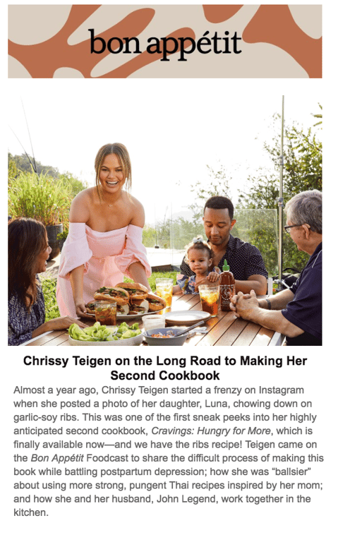
What it is: A magazine that encourages readers to “cook with confidence, enjoy your food, and find recipes.” Beware of skimming with an empty stomach.
The exceptional: Bon Appetit’s visually pleasing design includes a large feature image with a story at the top and pictures of food with very limited text at the bottom. This makes for easy scrolling. The lack of information with the pictures ensures the newsletter isn’t bogged down, but it also has readers hungry to learn more. Readers consequently click on the pictures and drive traffic to the website.
“What I love are definitely the visual images, but more than that, it’s the design elements the brand uses to let me pick and choose the content I feel is relevant,” says Kelsey Norris, an outreach specialist at G2 Crowd. “I think it’s hard to make 100 percent of a newsletter 100 percent relevant to all your readers, but making certain ‘nuggets’ of information easy to read makes it the best experience.”
What it is: Community.is is a company centered around defining, educating, and inspiring communities. It covers topics that affect communities, such as technology, customer experience, user-centered design, and community building.
The exceptional: Its newsletter design categorizes content by length: short, mid, and long. That way, readers know the time commitment they’ve made when looking at certain pieces of content and can easily scroll to what they’re interested in.
What it is: South by Southwest (SXSW) is a conference and festival that celebrates the convergence of the interactive, film, and music industries.
The exceptional: SXSW’s newsletter has a simple, image-heavy design. The conference contains unique offerings, and those offerings are showcased in the newsletter front-and-center. The arresting images are paired with bold text and intriguing language. SXSW realizes the photos are enough to attract people; blocks of text would be a waste of space. The only CTA is, “Register Now,” which is the goal of the newsletter.
Content is king. If your content isn’t useful, relevant, or interesting, why would people bother subscribing to your newsletter? Consider what you can provide recipients that no one else can. That is what they want from you.
What it is: Really Good Emails aims to be the best showcase of email design and resources. Its newsletter includes examples of, you guessed it, really good emails, companies that have done exceptionally well with certain email marketing techniques, and weekly tips and tricks.
The exceptional: Really Good Emails crowdsources most of its content through community submissions, so everyone gets a chance at being heard. This helps produce great content and ensures reader engagement.
“Not only does the brand highlight beautiful, inspiring design, but it always ties it back to how that specific communication impacts the customer experience and the business,” says G2 Crowd’s Jorge Selva. “It's not just about making something that looks great. It's about thinking through why that email is being sent in the first place, and how it fits into the bigger picture.”

What it is: A newsletter targeted to female millennials, The Daily Skimm breaks down current events in easily digestible writing. It’s delivered early each morning so subscribers can start their days off informed.
The exceptional: The quick-hit news bites offer all readers need to know to stay abreast of the news. Users don’t have to click around to get the full picture – all the information is right there. In case readers do want to know more, the brand does embed links that lead to more information. On top of the strategic content, the brand keeps the tone light with a quote of the day, gracing the top of each newsletter.
What it is: My guilty pleasure. Not only is its ice cream delicious, but Ben & Jerry’s tagline is “Peace, Love, & Ice Cream.” Need I say more?
The exceptional: Ben & Jerry’s fills its newsletter, ChunkMail, with a quirky tone and interesting facts about its ice cream. It often includes recipes, tips for the best ice-cream-eating experience, and updates on products. The brand also keeps with its mission to, “Use the company in innovative ways to make the world a better place,” by including one piece about an important social issue. Recipients who connect with the company’s values will appreciate this and feel even more loyal to the brand.
What it is: A newsletter full of advice, tips, and tricks for new entrepreneurs.
The exceptional: Fizzle’s newsletter includes content that cannot be found anywhere else on its site, podcasts, or blog posts. This exclusive information makes subscribers feel special and like the subscription is worthwhile. More likely than not, users will take the time to read the newsletter. The newsletter is unusually text-heavy, but it includes step-by-step advice that doesn’t involve clicking around to websites. Everything needed is right there in the newsletter guide. The author summarizes each post quickly at the very top, so recipients know what they’re getting into.
What it is: The newsletter helps readers understand the news and ideas that shape today’s restaurant industry.
The exceptional: Skift’s “Top Stories” section includes headlines of original articles, and then small blurbs called the Skift Take, where it summarizes, or highlights, what it believes to be the most important aspect of the article. This lets readers quickly get a taste for what the article will entail and helps them decide if they want to click on to read more. If they don’t, it still feels like they’ve received enough detail to be knowledgeable about the latest news.
“As someone whose job revolves around keeping on top of restaurant industry trends and developments, newsletters like Skift Table are extremely useful,” says Lauren Fram, a G2 Crowd research specialist focused on the restaurant industry. “Consistent updates in an easily digestible email make it easy to skim a large amount of information and choose what to delve into more deeply. Having the basic legwork already done makes my life a lot easier (and more interesting) on a day-to-day basis."
A dry, informational tone isn’t going to get you anywhere with your readers. Surprise and delight them with – gasp – a personality! Being vulnerable, weird, fun, or sassy. In short, being yourself – it can go a long way with readers. It can make them feel like they know you, like you’ve built a connection, and they can trust you. An emotional connection will only increase the odds of clicks, my friends.
What it is: Total Annarchy is a newsletter from Ann Handley, a writer, digital marketing pioneer and Wall Street Journal best-selling author who works to inspire and empower marketers. The newsletter shares her writing and content tips – new writing to keep readers in the know, and updates on where and when Ann is speaking.
The exceptional: Ann doesn’t shy away from saying it how it is. There is nothing formal about the newsletter – it’s Ann as she would be if you were chatting in real life or texting as pals. She uses abbreviations, incomplete sentences, and a quirkiness that keeps the reader smiling. If you didn’t want to meet her before reading the newsletter, you will after.
Kristen McCabe, a content whiz at G2 Crowd who adores Ann and has seen her speak in person at Content Marketing World, explains why she loves the newsletter.
“Ann’s newsletter gives me tools to use as a writer and a marketer,” Kristen said. “But, even more than that, I find regular inspiration from Total Annarchy, and that’s what makes it a must-read. Ann embraces her voice — it’s not about perfect punctuation and grammar; it’s about being authentic and connecting with people. (Not subscribers, real people!) Her newsletter regularly motivates me to take the risk of telling my story and using my voice, even if it won’t be liked by everyone. And, the content is full of gems I find myself bookmarking to use on a regular basis.”
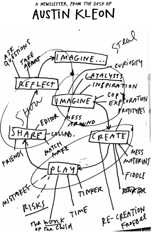
What it is: Austin is a New York Times bestselling author of illustrated books. He loves to discuss creativity in the digital age.
The exceptional: Austin’s newsletter is like peering through a window into his brain. He discusses the latest books he’s read, the music he’s listened to, shoutouts to other artists, and what’s going on in his life. The tone is personal, relaxed, and inspiring. He also includes a drawing with each newsletter to keep with his personal brand.
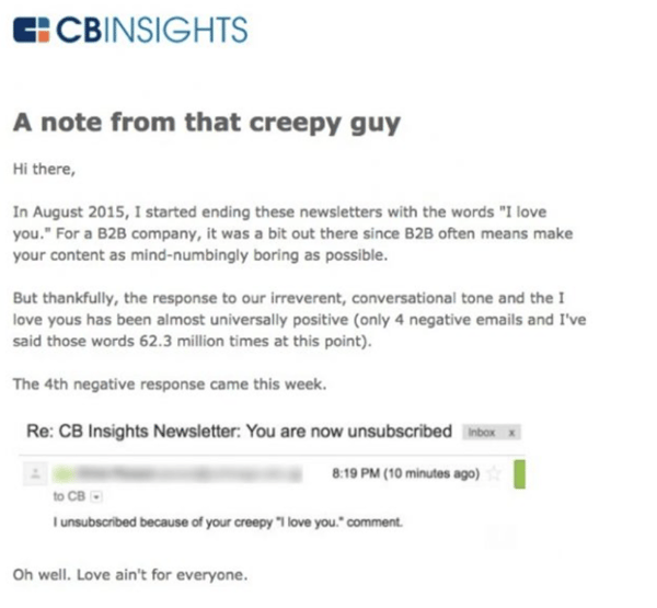
What it is: CB Insights helps corporations by providing business intelligence.
The exceptional: Did you yawn a little reading the above description? Me too. CB Insights might realize that, at first glance, it doesn’t come across as exciting, so it created a newsletter that’s the exact opposite of corporate stiffness. It’s irreverent, funny, and casual. Each email is signed off with “I love you” – words often not heard in the B2B world. Here’s an example in which the “I love you” sign off is discussed.
| Related: Discover how B2B email marketing plays a crucial role in a company's growth. |
What it is: Ok, so if Ben & Jerry’s is my guilty pleasure, Jeni’s is my, “treat yoself” ice cream. Jeni’s mission is to bring people together and make them feel good, all while providing excellent service.
The exceptional: Notice the “splendid” in Jeni’s name. It makes you feel happy and carefree, right? That’s the tone Jeni’s keeps in its newsletters. With a light and fun air, the brand talks about latest ice cream offerings and how they pair with the seasons – including, of course, delicious pictures of ice cream.

Newsletters, of course, have underlying goals. Some of these goals could be generating traffic to the website, increasing attendance to an event, raising brand awareness, getting prospects interested in reaching out, etc.
Often, the newsletter is only a gateway to the goal. Success entails clicking on a little button that leads recipients a step closer: a call-to-action (CTA) button.
These are so important that it’s worth looking at a few examples of different techniques successful newsletters use.
What it is: A digital product design platform that wants to deliver the best possible digital product experience. The newsletter offers its best blog content and favorite design links from the week.
The exceptional: InVision gets people to click on its CTA buttons by including creative, clever text. Wouldn’t you want to click on the button shown below? The bright pink also syncs up with the brand and conveniently captures attention.
Kristin Hillery, editor-at-large at InVision, reveals how they come up with these catchy CTAs.
“With our newsletter, we replace that ‘read more’ copy with a pun inspired by the blog post it points to. So, for a blog post about virtual reality (VR), for example, the "read more" button said "Livin' la VR loca." Every week, we get together as a team and brainstorm this copy—it's a really fun collaborative effort.”
She adds that if you’re new to the newsletter realm, the best thing to do is collaborate. “Ask your co-workers, friends, and family to take a quick look at your most recent newsletter and give feedback on what they like and don't like. Look for ways you can add delight for your readers. Just doing the same ol' thing is a missed opportunity to connect with your readers and deliver more than they're expecting. Don't be afraid to try something that seems out-of-the-box. Worst-case scenario is that you find out it doesn't work.”
What it is: Cook Smarts offers meal plans, guides, infographics, and cooking lessons designed to educate, inspire, and nourish readers.
The exceptional: This one may seem like a, “duh,” but it’s important to keep in mind as you build out your newsletter. CTAs at the bottom of emails are just as important as the ones peppered throughout. Cook Smarts includes CTAs that are all about engagement. The buttons suggest readers follow the brand on social media accounts or forward to a friend – a great way to lengthen the email list.
Of course, your subscribers and recipients don’t want to feel like one of a thousand people (or if you’re killing it, one of a million). They want to feel like you are speaking only to them. They want it to get personal.
The obvious way to do this is by including each recipient’s name in their specific email title and the salutation. Beyond that, using data to track each recipient’s preferences and showcasing those early in the newsletter will make them feel like you know and understand them.
Collecting this data will also help you decide what newsletters to send to certain customers based on their interests. If you want to alert people of the hot new deals on jewelry, send it to the customer that just recently bought a pair of earrings. If she loved the earrings, she might be convinced to return to the store based on that timely newsletter focused on her interest.
Personalization makes people feel special, and feeling special makes them enjoy interacting with your brand.
What it is: An entertainment system that my brother and I spent way too much time on as impressionable youngsters.
The exceptional: Each newsletter includes a greeting with the recipient’s name, the total trophies that person has earned, and the total gameplay hours. These are pieces of personal information each player wants to know – and it’s great to see those stats right at the top. It encourages users to keep playing and racking up those trophies.
What it is: We’ve already featured BarkBox under design, but it deserves another shoutout for personalization. Or maybe I’m just a shameless dog person. Sorry, not sorry.
The exceptional: I’ll let Levi, our resident BarkBox fan, take it from here.
“BarkBox has made me a brand advocate by having great customer advocacy and support teams,” he said. “It has 300,000+ followers on Twitter and still manages to interact with me whenever I Tweet at the brand. BarkBox even wished my pup, Frodo, a happy birthday and sent him a handwritten note and package, and I'm not even a paying subscriber."
What it is: The Nature Conservancy is a charitable environmental organization that has a mission to conserve the lands and waters that all life depends on.
The exceptional: As a nonprofit, The Nature Conservancy wants to inspire people to join its cause. If people are feeling particularly motivated after reading the content of a newsletter, The Nature Conservancy includes a donate button right at the top and bottom of the newsletter. It isn’t overwhelming or insistent, but it’s there. The brand also includes all the different social channels where readers can connect with it personally. Getting readers personally involved make them more likely to read each newsletter. The social networks are also great avenues for The Nature Conservancy to tell important stories, spread brand awareness, and interact with supporters.

Now that you’re hyped up on newsletter possibilities, I bet you’re wondering how to go about creating your own. Remember, no one is starting from scratch these days (unless you’re one of those overachieving types).
There are plenty of newsletter templates and email marketing software to choose from online. Choose one that best fits your identity, content, and goal – and, of course, tweak it as much as you want.
I hope these examples were helpful in guiding your next email newsletter. Now, go out there and sweep those subscribers off their digital feet!
Ready to make your first email newsletter? There are many free email marketing software tools available to help you create an industry recognized newsletter.
Holly is the former Director of Content Marketing at G2. An avid reader and writer, Holly graduated from the University of Missouri with a dual major in Journalism and English. She firmly believes in the power of content and is constantly seeking ways to better engage and delight readers.
B2B software buying is evolving. Gone are the days of the search engine deep dive, building an...
 by Tim Sanders
B2B buying behaviors are constantly evolving, with review sites – like G2 – playing a more...
 by Palmer Houchins
We live in a world where software purchases are no longer driven by human intuition. AI...
 by Washija Kazim
B2B software buying is evolving. Gone are the days of the search engine deep dive, building an...
 by Tim Sanders
We live in a world where software purchases are no longer driven by human intuition. AI...
 by Washija Kazim

