
A brand is absolutely nothing without consistency.
Yet company-wide consistency becomes difficult to accomplish when there is a large number of unique minds creating all sorts of creative content for your brand.
This type of problem can only be rectified with one solution: a brand style guide.
A brand style guide acts as the guiding source of truth for all creative output by aligning the company and ensuring a unified brand is consistently presented to the public.
If your company is tired of inconsistency and ready to implement a style guide into daily practice, take some inspiration from the brands who have it done it right.
These companies have effectively communicated their brand guidelines through the use of style guides to ensure that whoever creates branded content is able to do so accurately while upholding the integrity of the brand.
|
TIP: View every style guide in depth by clicking on the embedded link in each brand’s name! |
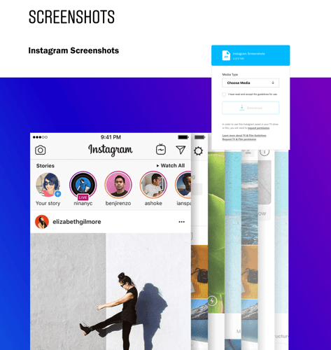
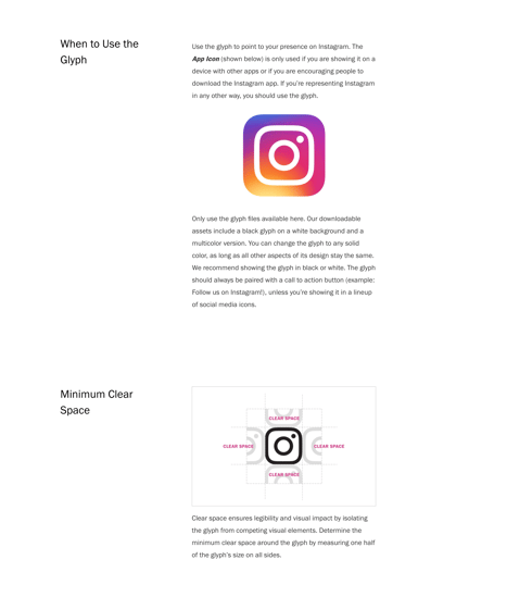
Instagram makes it simple for anyone to embed the social media giant into their own business practices. By providing templates for screenshots and live broadcasts, Instagram ensures exact formatting no matter which device it is used on. They also set very detailed instructions on how to properly place the primary logo, IGTV logo, and all of its other icons.
Source: Instagram
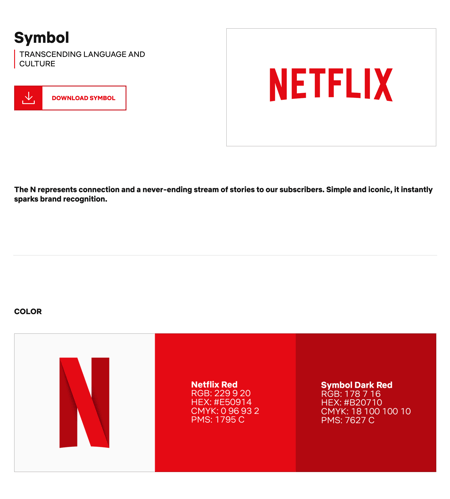
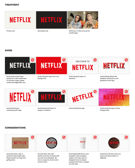
Netflix places a huge emphasis on its logo and symbol. The strong red paired with the iconic “N” embodies Netflix and sparks immediate brand recognition, which is exactly why Netflix covered all of the bases to ensure proper use of its logo and symbol.
Source: Netflix
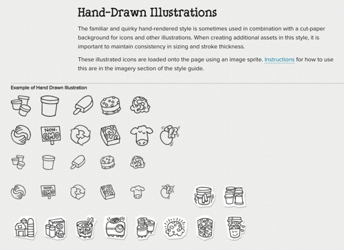
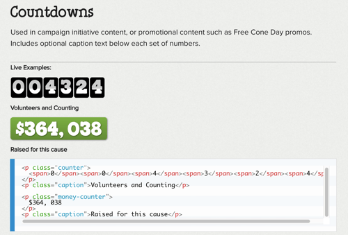
Ben & Jerry’s is a fantastic example of a creative company that emulates its unique brand assets into its style guide. Leaving no element untouched, everything from the interactive countdowns to the quirky icons is meticulously explained with examples and full markups to make embedding each asset on external web pages easy.
Source: Ben & Jerry's
| Related: Considering brand marketing as a possible career path? Learn what skills and experience are necessary to land a job as a brand manager. |
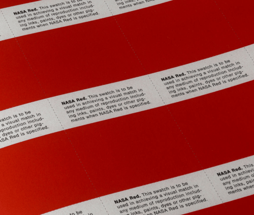
NASA's 1975 style guide is an absolute must see for any designer due to the intricate examples of specific graphics for every shuttle, telescope, and spacecraft. Would you expect anything less from the iconic space program?

Source: Standards Manual
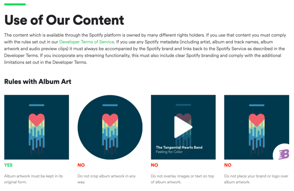
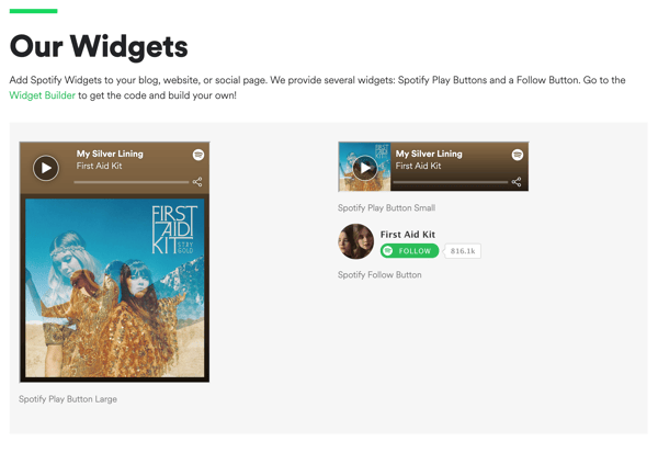
Spotify's style guide goes more in-depth than just its branded colors and logo guidelines. The brand has very specific rules when using album art and artist content, but they make it simple for anyone who wants to use Spotify music by providing easy to download widgets and even a widget builder to allow streamlined music embedding.
Source: Spotify
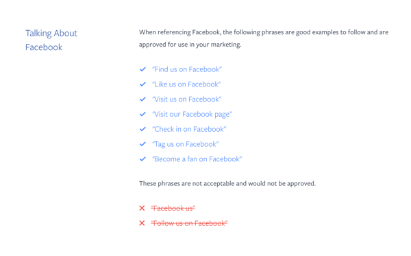
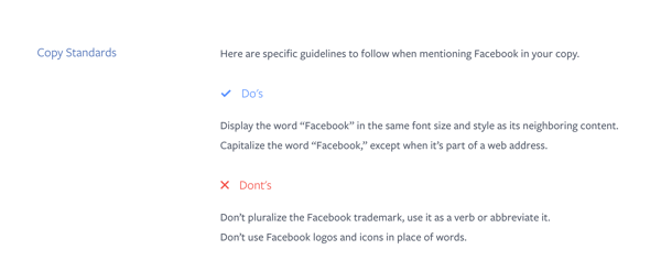
Facebook has a very straightforward style guide that outlines the “do’s” and “don’ts” when handling the brand. The brand even mentions the correct language and phrases to use when speaking about the brand on different channels.
Source: Facebook
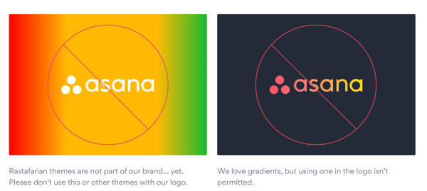
Asana uses humor to cleverly pay homage to its brand personality and bring its overall brand identity full circle. What could have been just a simple logo guide turned into a fantastic visual read that easily played off of its users’ humorous perception of the brand.
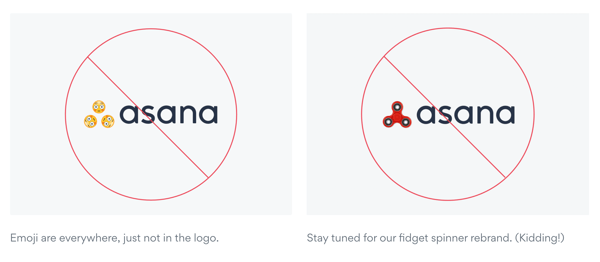
Source: Asana
If you thought style guides were just for traditional businesses, then you are probably surprised to see that even New York City has one! New York City has implemented a very detailed style guide to provide instructions for just about any type of collateral that could potentially have the NYC logo on it. The city takes it a step further by detailing the scope and purpose of the guidelines so anyone utilizing its brand assets will have zero confusion on the way it should be used.
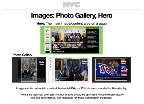
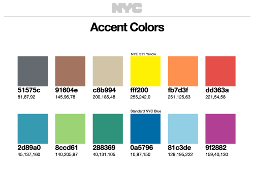
Source: New York City
Uber is one of the best examples of how a brand can successfully tell a story through its guidelines. Uber shares its brand to the public through an intricate “system” capitalizing on its nine core brand elements. The brand page shares best in class examples, as well as a “most-requested assets” section for quick downloads.
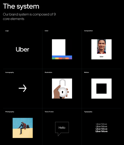

Source: Uber
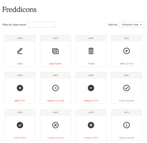
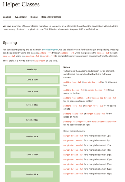
MailChimp goes above and beyond to ensure that every single aspect of its brand is thoroughly explained. MailChimp takes it a step further by including “Helper Classes” which is essentially a cheat sheet for anyone looking to quickly and easily implement the brand assets on their own web page.
Source: MailChimp
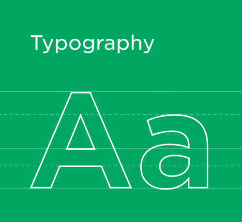
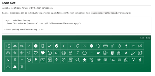
Each Starbucks graphic, logo, color, typography, and even spacing has a purpose to the brand, and the reasoning is explained in detail in its style guide. Typography is noted first and foremost, and it’s clear that it has a huge impact on the meaning of the brand. Starbucks outlines exactly how, when, and where to use each typeface, and even provides additional reading for those curious of the greater importance.
Source: Starbucks
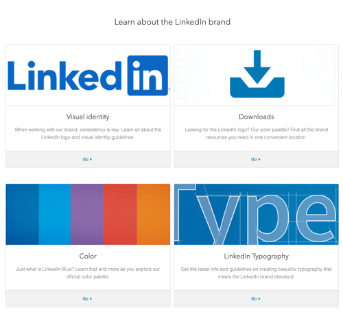
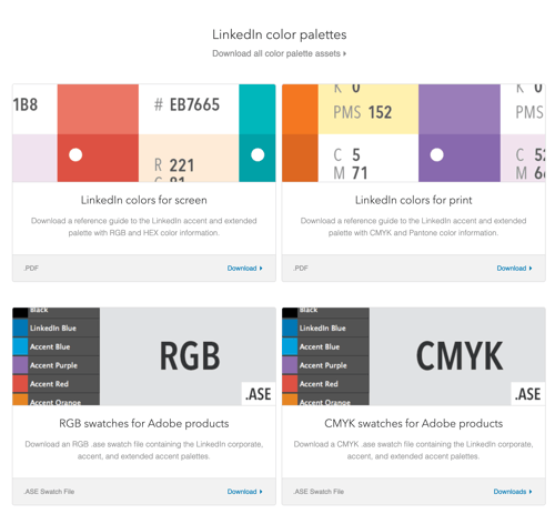
LinkedIn created a one-stop-shop for its users who are interested in learning more about the brand and its identity. The brand provides a simple .zip file that is easily downloaded for the entirety of its brand assets.
Source: LinkedIn
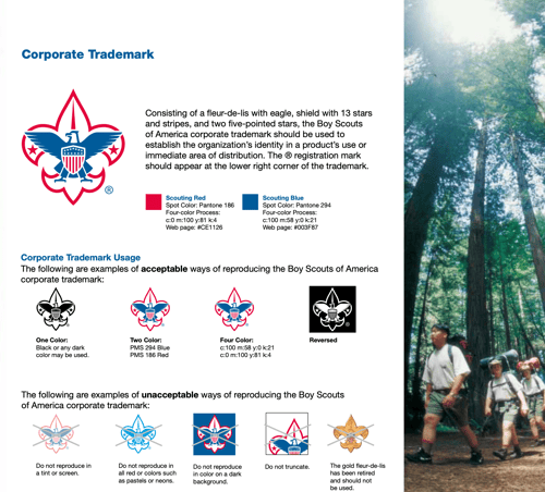
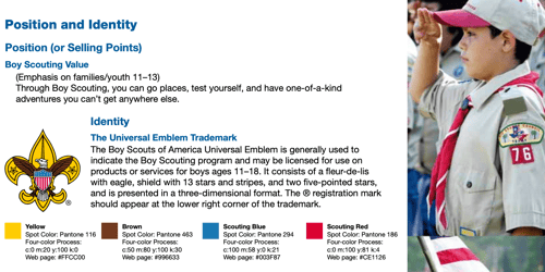
The Boy Scouts of America do a fantastic job showcasing their core values, purpose, and brand story through visuals portrayed in the style guide. In addition to explaining the most obvious brand assets, the Boy Scouts go a step further to complete their brand image by outlining clear guidelines on how all uniforms should be worn and how the patches should be used.
Source: Boy Scouts of America
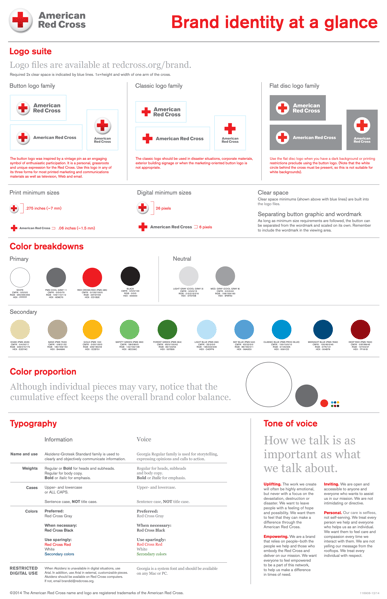
The American Red Cross is an example of a brand that effectively showcases its brand assets through an easy to read one-sheeter. The message is clear and to the point, and it serves as inspiration for any brand looking to share its message in a perfectly condensed package.
Source: Red Cross
Skype shares its brand guidelines similar to the way the platform is used: through conversation! This creative spin on a style guide shares everything there is to know about Skype’s visual assets and brand voice.


Source: Skype
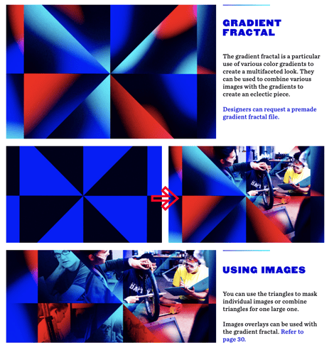
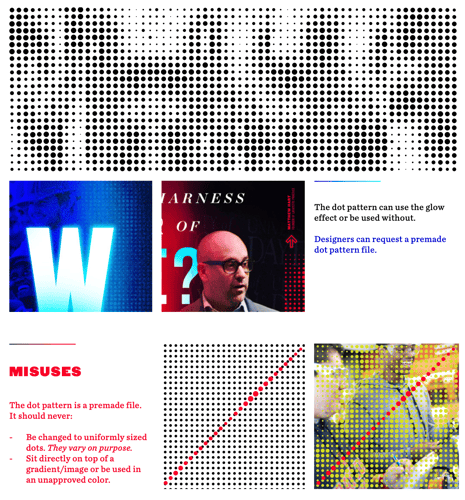
The University of Dayton proves that an educational institution can be lively and fun. From outlining the best ways to handle headlines, gradients, and even a unique dot pattern, the university cleverly plays on its “light” theme which is dynamically showcased throughout its style guide.
Source: University of Dayton
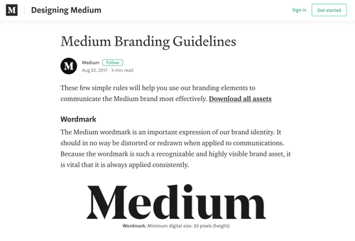
Medium exudes sleekness and simplicity. Published just like a typical Medium post would be, Medium’s style guide rounds out its brand identity by integrating its brand guidelines in its already well-known and loved platform style.
Source: Medium
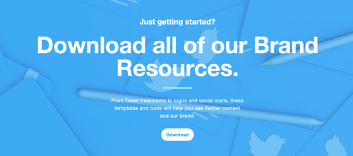
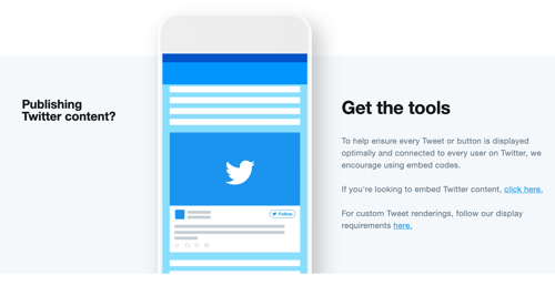
Twitter is all about getting to the point, which is exactly what its style guide does. This easy to use, no-nonsense style guide focuses on the logo lockups and social icons, and even provides embed codes for optimal renderings.
Source: Twitter
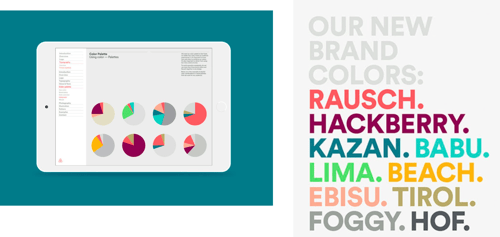
With a recent rebrand, Airbnb’s style guide tells a story of who they are as a company while bringing the brand to life. This style guide puts greater importance on the meaning and importance of the brand elements rather than each individual instruction and physical placement.

Source: DesignStudio
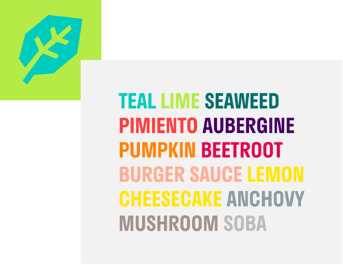
Deliveroo primarily focuses on the color and typography of the brand, ensuring that the importance is placed on its vibrancy and style. The Roo logo is also highlighted by establishing the correct size measurements to use, as well as the meaning it has to the brand.

Source: DesignStudio
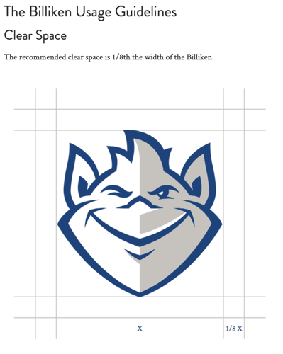
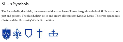
Saint Louis University portrays a very stoic brand image, which is showcased well through its style guide. Focusing on the many logos and symbols it bears, SLU ensures that no detail is missed.
Source: Saint Louis University
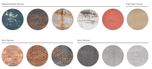
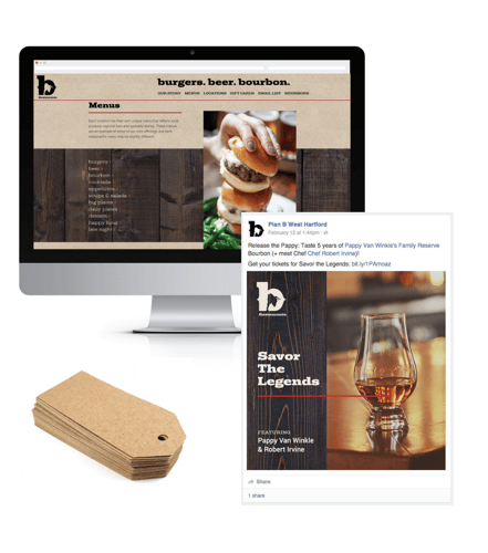
Proof that any brand, large or small can utilize a style guide, b Restaurants focuses not only on the correct way to refer to each restaurant location, but its extensive color palette and specific textures like wood, metal, brick, and stone to reflect the proper brand experience.
Source: b Restaurants
Lufthansa’s brand hub takes the creation of its brand story to the next level. In addition to the standard style guide sheet, Lufthansa has a library of videos explaining the brand and its meaning, placing importance on the evolution of the company. Each branded asset is shared through a storyboard that really drives home the style of the company.
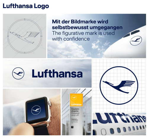

Source: Lufthansa
Bacardi’s style guide plays off its rich history and influence. Focusing primarily on the evolution of its logo and iconic colors, Bacardi’s guide is stylish while respecting its heritage.
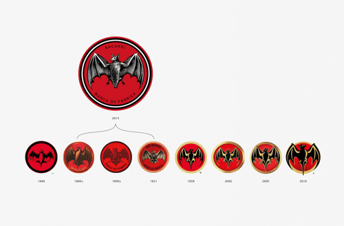
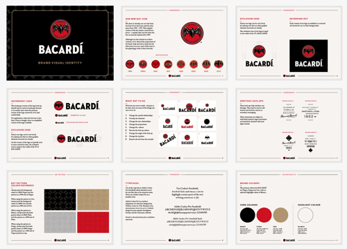
Source: Here Design
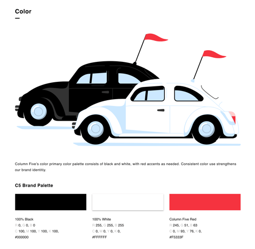
Column Five Media showcases its creativity by literally painting pictures to describe each brand asset. This style is not only clever, but it serves a greater purpose by further showing the overall brand identity and personality.
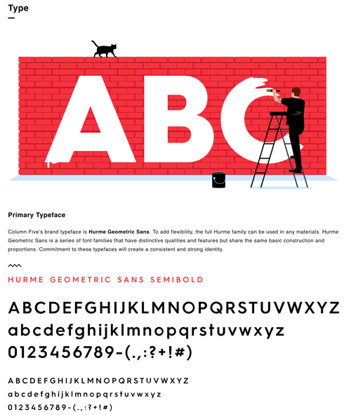
Source: Column Five Media
|
TIP: Want to ensure your style guide is impressive? Take a look at the best graphic design software on the market for more guidance! |
Your style guide is meant to inspire and firmly guide the way your brand is portrayed to the world. Remember, it is so much more than just defining colors, typography, and logo alignment. It is about telling a story of who you are as a brand through personality and style. Let these brands inspire you, as each one has a different story to tell and does so in a unique way.
Are you looking for additional guidance to build out your brand elements? Check out how to make your own font and the best tips to go about creating a logo!
Hannah is a former content marketing associate at G2. She graduated from the University of Missouri with a degree in Journalism. In her free time, Hannah enjoys running with her dog, Teddy, traveling to new and exciting places, and capturing the beautiful places she travels to with her DSLR camera. (she/her/hers)
When it comes to business, branding is everything.
 by Annisha Lashand
There is (arguably) nothing more reassuring than consistency. It makes us feel safe and it...
 by Daniella Alscher
From bad acting to boring content, training videos can sometimes get a bad reputation.
 by Mara Calvello
When it comes to business, branding is everything.
 by Annisha Lashand
There is (arguably) nothing more reassuring than consistency. It makes us feel safe and it...
 by Daniella Alscher


