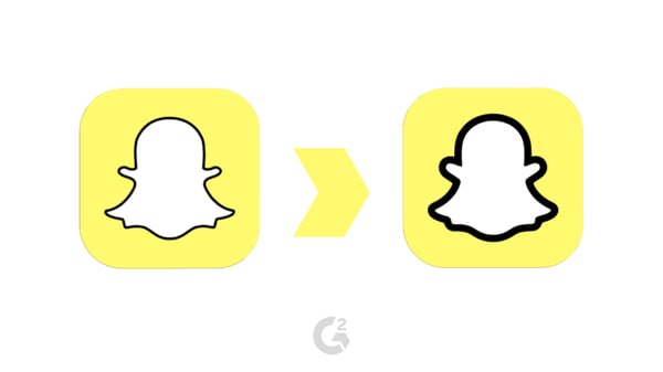
This week, Snapchat gave their logo a very slight refresh.
It didn’t go unnoticed, but the attention it’s gotten hasn’t necessarily been positive.
The new Snapchat logo
The social app, originally released in 2011, has 190 million daily users as of Q1 of 2019. But just this past week, Snapchat made a change that could make that number drop very quickly.
Why is my Snapchat logo bold?
Snapchat updated their logo in mid-August of 2019 to make their icon stand out amongst the rest of the social media icons, featuring a bolder outline of their signature ghost. It’s not a glitch, just a fresh design.
Unfortunately, a new design doesn’t always guarantee a positive reaction.
|
NOTE: Happy with the way Snapchat looks? Let others know what you think!

|
If you’re not happy, you’re not alone.
Snapchat logo design reactions
For days, Twitter has been full of comments from Snapchat users regarding their most recent logo update.

To say the least, it’s been difficult to find any positive reaction to Snapchat’s new logo design. We can’t say the same for finding the negative reactions.
Overall, people don’t seem to be too happy.
While the monetary cost of Snapchat’s new logo was likely small, there are other costs that come with a change like this one. The satisfaction of users is an additional factor that developers and designers need to take into account, and this time, the satisfaction is low – some users have threatened to delete Snapchat entirely over the new design.
The reason behind the reaction
There’s not much to analyze in this new logo; all of the same shapes and colors are still included. The only difference is the weight of the outline, and it’s definitely noticeable. If Snapchat’s intention was to grab the attention of the user as soon as they unlocked their phone, there’s no doubt that it worked.
So why is there so much backlash? Snapchat’s bold move may have been a little too bold. Instead of embracing the change, Snapchat users could be reacting negatively for a number of reasons.
First, emotional attachment.
While you may not consider yourself to be emotionally attached to Snapchat, there’s a subliminal emotional attachment to the way things look and feel to us. Their logo was familiar, nostalgic, and safe – with the change comes the erasure of those good feelings, and we have to start all over.
Second, the new logo plays heavily into the game “one of these things is not like the other”.
One of the most popular graphic design trends is minimalism in design. People are removing elements like outlines and additional embellishments and settling for less. Minimalistic designs are the opposite of overwhelming: they’re simple to understand and easy on the eyes.
Snapchat could have taken a step closer towards minimalism and removed their outline altogether. Instead, they did the opposite and stepped away from the trend, making themselves loud and very apparent on a user’s phone. Which is probably exactly what they were looking to do.

While unattractive to the masses, the bold design aligns perfectly with their marketing for the new Spectacles, which are advertised directly towards unique creatives, who dare to be bold. Could they be retargeting their audience?
The future of Snapchat
With threats from its own users regarding the removal of the app from their own smartphones, Snapchat’s bold change could send us either way. Similar to (but less dramatic than) Twitter’s new interface design, Snapchat’s new logo could quickly grow on users. On the other hand, Snapchat’s new logo could drive users away in ten seconds or less.
Only time will tell.
Not planning on getting rid of it any time soon? Take some time to become more familiar with how to use snapchat.

 by Daniella Alscher
 by Daniella Alscher
 by Daniella Alscher