February 22, 2023
 by Ayelet Mechany / February 22, 2023
.jpg?width=600&height=429&name=iStock-1354378413%20(1).jpg)
Think about buying a physical product. What would sell it better - seeing, touching, and trying it out or just hearing about it? You guessed it right, it’s the former.
Playable ads are advertising units that offer an interactive experience rather than a static, ‘agency-less’ viewing of a video or, even worse, a tiny banner at the bottom of the screen. With the rise in mobile marketing, these ads have quickly become a favorite amongst users due to the great results they bring in and the seal of approval from platforms like Facebook.
Their increasing popularity raises a question for developers of non-gaming apps - should playable ads be used for non-gaming apps? To us, the unmistakable answer is yes, and we know we’re about to state the glaringly obvious here, but we have a point!
Playable ads are a type of interactive advertisement, mostly used to promote mobile games. A playable ad acts as a demo of the game (or product), allowing users to quickly play the game directly in the ad before downloading it.
Any ad unit - a banner, a video, or any other type of ad, needs to sell your app (told you it’d be obvious).
It does so by conveying its strongest selling points - explaining how it differs from other products, showcasing the advantages, and basically giving users your product’s “elevator pitch.” A compelling 30-second applies-to-all selling speech. While not as dramatic as sharing a 30 seconds elevator ride with Bill Gates, it’s not a bad idea to treat each ‘meeting’ with your potential users with similar gravity.
To our point, playable ads are, when done correctly, the best possible elevator speech. Not only do they show the product's advantages, but they also allow users to experience it, in a sense, serve as a pre-qualifying tool, canceling out the prospect or suspect stage.
The users who go through the playable ad and carry on to install the app already have a concept of what benefits they can get out of it. This increases the retention rate and the number of users who are more likely to adopt it for the long term while effectively reducing app uninstalls.
If you’re still unconvinced, we recommend a semantic change - instead of thinking of these ads as playable ads, think of them as interactive ads. The idea behind these ads is to create interactivity, engage users and give them a necessary sense of control over their ads ‘screen time’ (choosing to play a game instead of having a video enforced on them).
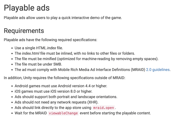
Different ad network platforms such as Unity Ads, Facebook, AdColony have their own unique requirements for designing playable ads. The specifications vary in terms of the size of the ad, the version of iOS or Android needed, the zipped folder requirement, the inclusion of a skip button in the ad, and more.
 Source: Unity
To cater to these different requirements, there are two common ways to create an ad.
HTML playable ads give developers a lot of freedom in terms of creativity. These ads are created from scratch using coding and therefore offer more control and are more engaging and accurate compared to the other format. The ads basically contain a part of the game intended for recreating the in-game experience. The challenges with these playable ads are lack of time, creativity, and knowledge of coding.
Interactive video ads use a blend of video editing and HTML. A concatenate of video footage from the game is integrated with HTML UI elements to create a slideshow of videos that give a gist of the game experience. Interactive videos are a good choice for 3D or graphic-heavy cinematic playable ads. The disadvantage of these ads is high network strain due to heavy files and lack of creativity and engagement.
To create playable ads that convert, you need three basic elements: tutorial, gameplay, and end call-to-action (CTA).
The tutorial, lead-in video, or hook is the first element to interact with the user. It has the important function of retaining the audience's attention. The tutorial should be short, simple, and intuitive. Usually, cues like looped animation and transparent text overlays are used to give a quick introduction to the main game mechanics. It should also convey that the user interacts with an ad from the get-go.
Gameplay or game demo allows users to interact physically with the ad with the help of a few taps. It reflects the game experience and gives the users an insight into the main features and functionalities. Make sure to optimize the gameplay for length, difficulty, and engagement. For non-gaming apps, this element allows users to try certain gamified features of the app.
The final element is a call to action. It should be clear, catchy, and concise. The end card encourages users to download the app, visit the website, or make a purchase by redirecting them to the destination with a click. The CTA can either run through the entire ad or be displayed at the end of the interaction.
We at Persona.ly* have been creating and promoting apps with playable ads for a while now (started in early 2015), and we’ve worked a lot on changing, testing and optimizing them. We’d now like to give you all of our secret cheat codes and playable ads best practices we’ve discovered along the way. Consider us your friendly neighborhood guinea pigs!
We’ve learned that most gaming playable ads shouldn’t take longer than 45 seconds to complete to drive the best performance. Testing it with playable ads we’ve made, we saw a CTR decrease when the ads ran longer than 45 seconds or shorter than 30 seconds - that midsection got us the best results. If your game or product is too complex for a 45 seconds long ad - think of how you can convey its essence and how you can simplify it when introducing new users to the product.
The gameplay is new to your users - guide them through the actions they have to take in order to complete the playable. They need to both understand what they’re doing and enjoy it as they play along. A common practice is using a pointer hand and a short descriptive text.
One of the most important things in a playable ad, and actually in any ad, is to show your uniqueness. You don’t want to be ‘another e-commerce app.’ If you can’t incorporate your unique features into the gameplay, think of showcasing it without creating an interactive action.
For example, if you have an e-commerce app and your uniqueness lies within your endless list of products, start the playable by running through all of the possible shopping categories, but end when you allow the users to choose between 3 to browse through, thus showing you have all of these other options, but enable interaction with only 3, to keep it simple.
Not so fast! We believe that there isn’t one practice that applies to all apps. So far, we’ve conducted multiple A/B tests with a win/loss ending and saw instances where the loss ending drove better conversion rates, but in most cases, wins ‘win.' Considering how many stages are in the ad’s funnel and the type of game - there could be a loss mid-way and then a big win (for example, in slot social casino or slot machine apps it’s a common practice).
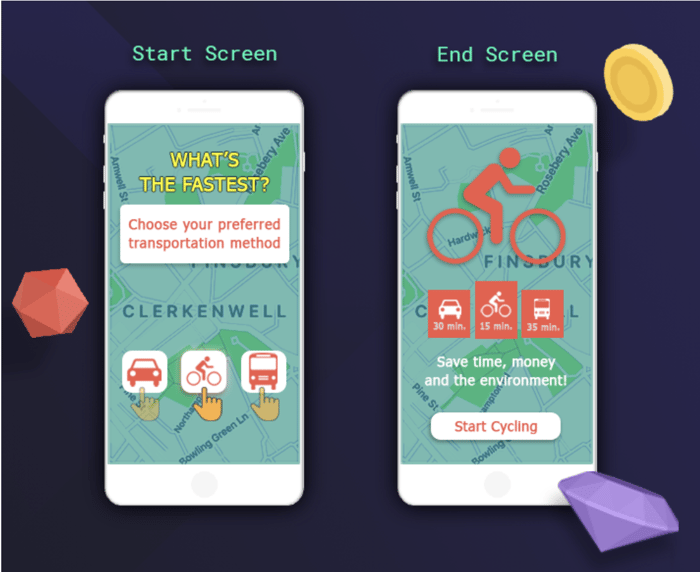
When it’s a product - it depends on how you choose to sell your app. We challenged ourselves by trying to create a playable ad for a made-up app, that offers a bike renting services. As you can see, the opening screen requires the users to choose between their preferred transportation method.

Since the users don’t initially know the product, they may choose public transportation or a car, in those instances, they will ‘lose’ (showing them how they’re standing in a crowded, loud and rocking bus or getting stuck in traffic - in both cases the bicycle will quickly pass by them). If they choose the bicycle, they’ll enjoy their route, pass by the bus and the car, thus ‘winning’ and completing the route in the fastest time.
We’re not the first to choose and show the disadvantages of other services in order to sell your service; it’s a common practice and works well in this example. Funnily enough, as we were working on this article, an Israeli ad from the public transport company came out and showed a version of the same idea (the comments about the way they portrayed public transportation were really negative).
The end-screen of a playable ad is a whole topic in and of itself, and there are different methods and ideas on how it should look. We think there should be a clear CTA (a button that is visibility outstanding - by color, border, size, etc’. ), and we recommend using creative copy - it doesn’t have to be ‘Download Now’, when it can be app-specific - ‘Start Saving’ for an investment app, ‘Travel Better’ for a traveling app, or as we showed with our bicycle app - “Start Cycling.”
Since playable ads have different stages in which users may abandon it and lose interest, you should track in-ad events and see if there’s a stage with abnormally high abandonment rates. If there is - take action and change the problematic stage. Since we don’t want to make huge changes off the bat, we use A\B testing - changing one (preferably big) thing and test to see how it affects the results.

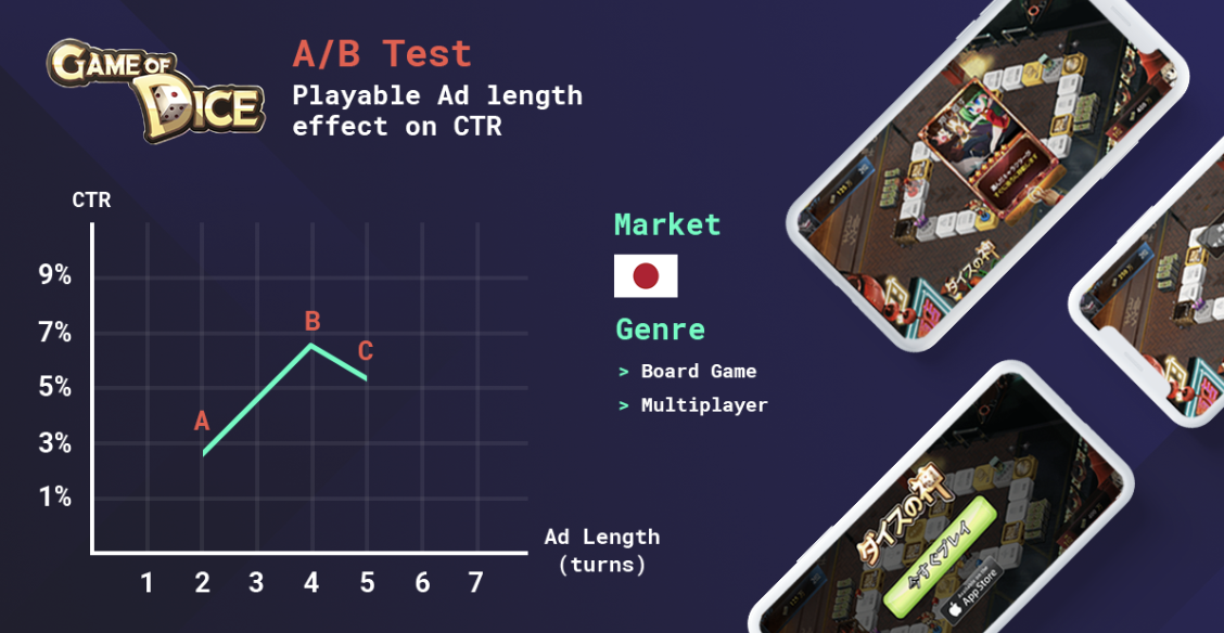
In this example, you can see the A/B test we ran for the playable ad we made for ‘Game of Dice.’
We initially started with a very short gameplay flow that only included 2 turns. When we realized the CTR was low compared to other playable ads, we added turns and started A/B testing. Four turns (that took about 45 seconds to play) brought us the best results - which also reaffirms our recommended length.
We encourage approaching playable and interactive ads with a balanced mix of playfulness and creativity, not veering off too far from what your product actually does.
Remember that while all of our conclusions were drawn from experience, every product is different and may ‘play’ by different rules. Lastly - as much as we encourage gamifying ads, maybe not all ads were meant to be gamified. If you can’t think of a great way to make it into a playable ad, don’t force it.
Do you know what the other way to reach the target audience is? Check out app store optimization to make your mobile app stand out from the crowd.
This was a guest post from Persona.ly, published in 2018. The content has been updated with new information.
*Established in 2011, Persona.ly is a mobile ad-tech that helps developers acquire engaged users for their apps using our proprietary technology, providing a full suite of services, from playable and interactive ad creation to data-driven user acquisition.
Product Marketing Manager at Persona.ly. Outside the office Ayelet climbs walls in hopes of becoming her least favorite superhero.
One of the most popular music streaming services in the U.S., Spotify is good for more than...
 by Daniella Alscher
Ad exchanges are primarily brokers for media trading on the open web.
 by Yaroslav Kholod
One of the most popular music streaming services in the U.S., Spotify is good for more than...
 by Daniella Alscher


