Staying on top of every part of a project is always a challenge, but an effective project management strategy helps prevent important tasks and milestones from falling through the cracks. One of the best ways to achieve this is through visualization, specifically using PERT charts to schedule and organize different aspects of your projects.
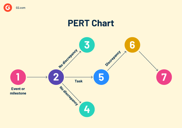
A project evaluation and review technique, or PERT, chart is a graphic that shows the entire project timeline and its individual tasks.
Like a Gantt chart, they’re a critical tool in project management, but they have their own look and they don’t usually apply specific dates like a Gantt chart would. PERT charts may also be called network diagrams, due to their usage of free form nodes that represent tasks and their corresponding dependencies.
Originally implemented by the US Navy in the 1950s, PERT charts have become crucial to project workflows across industries. Almost all project management software now comes with the ability to create digitized PERT charts to share among team members.
One of the benefits of using a PERT chart is their simplicity for the most basic projects. Only three components have to be included in a PERT chart.
PERT charts are best-suited for simple projects because the number of individual tasks and dependencies that come with more complex projects can result in a cluttered chart.
The three best reasons to use a PERT chart are when you need to:
No matter what your project is, there are five steps in the process timeline that need to occur to ensure a project’s successful completion.
Once a project has been approved, the project manager breaks down the individual tasks that need completion. At this point, the manager should assign the tasks to relevant team members to determine if enough resources are available.
Milestones that rely on another item’s completion should be linked in the PERT chart with a dependency arrow. This is known as a logical relationship. Joining them together in this way helps project managers more effectively track the tasks and their deadlines.
For more complex projects, mapping out the dependencies of tasks ahead of the project start date can save significant time. Without doing this, project delays are more likely, which can steal time from other projects or even make a project run over budget.
While PERT charts aren’t as detailed as a complete work breakdown structure, they still offer useful insight into which tasks need to be completed at various stages.
The visualization of a PERT chart comes when nodes and dependencies are created and connected to each other as arrows. The arrows represent the order that tasks need to be finished. Dotted lines denote tasks that need to be completed before moving to the next milestone, but which lack the resources to do so.
Using the critical path method, project managers study their PERT charts to determine how long each milestone will take. The main objective when mapping out the timeline of the project is to find the longest path that takes the most time. This determines the shortest overall project duration, based on three concepts.
Once all tasks have their own timeframe, the manager can determine project duration for best and worst-case scenarios.
As teams work through the PERT chart, managers update the chart in real time to close dependencies and deal with any issues that arise during the lifecycle of the project. Once all tasks have been checked off, the project should be completed and the chart can be archived for reference.
Effective project management software makes the overall completion of a project more efficient. Teams can use these tools to view task allocations, project timelines, and communicate with other members of the team about aspects of the project.
To be included in the project management software category, platforms must:
* Below are the top five leading project management software solutions from G2’s Winter 2024 Grid Report. Some reviews may be edited for clarity.
Smartsheet helps teams manage their projects, automate processes, and gain greater visibility into programs and portfolios. Organizations of all sizes and across various industries often use Smartsheet to manage portfolios at scale – all on a single, accessible from anywhere, on any device.
“The reminders set up in Smartsheet help prevent the delay for work. It is very useful in team collaboration and presenting data in an attractive format. One of the best features is that we can attach multiple files easily.”
- Smartsheet Review, Arjun S.
“When multiple people are entering information in the shared sheet, it causes incorrect data flow due and the data needs to be saved manually at each step. ”
- Smartsheet Review, Jasleen G.
monday.com provides businesses with an intuitive platform featuring custom dashboards, automations, and integrations for any type of project management. Teams that use monday.com are empowered to build their ideal workflow.
“I love how customizable the platform is. We can section staff into teams to ensure the right info is displayed to the right people – this keeps things clean and allows us to categorize the content that's applicable for different teams. The boards are also super customizable depending on what kind of information you want to display.”
- monday.com Review, Emily B.
“Their automations are also incredibly limiting, you end up needing to create massive workarounds to do something that seems fairly standard.”
- monday.com Review, Charlie L.
With Asana, teams can work on anything big or small thanks to the integrated automations and workspaces within the platform. It helps teams orchestrate their cross-functional work, from daily tasks to strategic initiatives.
“Asana has multiple features that are helpful and easy to use. I love how they are always adding new features and tools. This is a great platform for collaborating with colleagues and clients. Asana can also integrate with apps that you use daily, and the implementation process is easy. Asana can be used in several different ways, and you can customize your view to fit the type of project you are working on.”
- Asana Review, Dustin A.
“The user interface can be a bit overwhelming for a new user and also the pricing is a bit on the higher side in case of paid plans.”
- Asana Review, Garvit M.
ClickUp is an all-in-one productivity platform that allows teams to plan, organize, and collaborate using the integrated features within the tool. It plays well with Google Docs, Chat, and Goals to ensure teams are able to hit all milestones.
“As a manager it gives me an overview of all the projects that my team is working on. What's even better is that I can trickle down specifically what the details of the project are, who is the owner, what is the current status/update, and when the due date is. Teams can easily collaborate with each other, and in the comments section, members can tag each other.”
- ClickUp Review, John Epok P.
“ClickUp has prioritized the release of new features and user experience 3.0 over stability and load speeds. Although they have touted a completely new technology overhaul for 2024, there are times where the load times are awful and even require a page refresh at times.”
- ClickUp Review, Hunter N.
Notion is a connected workspace where teams create documents, take notes, share tasks, and organize tasks. It also offers AI-powered tools to manage any project from beginning to end.
“It allows me to organize my work, manage projects, and even create a comprehensive personal dashboard. I find the interface intuitive and the features extensive. Notion has become my go-to for almost all my productivity needs.”
- Notion Review, Megan W.
“Sometimes it's quite hard to set up in the first place. When I was first introduced to Notion, I found the platform quite overwhelming.”
- Notion Review, Jordan B.

If you’ve never explored PERT charts before, they can feel a little challenging to begin with. But once you find a way to make them work for you and your team, you’ll find yourself completing projects more efficiently and with greater transparency.
If a PERT chart isn’t right for your needs, learn more about Gantt charts and how to use them.


You can't start business projects without approvals from stakeholders and project committees.
 by Grace Pinegar

Are you losing the trail of your projects?
.png) by Shreya Mattoo
by Shreya Mattoo

No matter your industry, there’s likely a whole list of acronyms and jargon that relates to...
by Holly Landis