May 15, 2024
 by Murad Bushnaq / May 15, 2024

Nonprofit web design isn’t something your organization should overlook.
Your website is a digital storefront—the first impression for many potential supporters. It gives you the chance to build an online presence, spread the word about your mission, and boost supporter engagement. That is why crafting a user-friendly design and structure that reflects your organization's values and resonates with your target audience is vital.
In such cases, web design software is extremely helpful in creating and editing the front-end visualization of web pages. There’s a lot that goes into website design, though. Getting started can feel like a daunting task for many nonprofits. But fear not; this guide has you covered.
Creating a digital nonprofit marketing strategy can be exciting. However, you may immediately run into questions about which content to feature, how to structure it, and how to drive traffic to your most valuable pages. This all comes down to your content management system (CMS).
In short, CMS software facilitates the creation and modification of website content. Not every organization has the technical expertise necessary to create a captivating website from scratch, and that’s okay. Your CMS should provide you with all the tools you need to design the exact website you want without any frustration.
Moreover, a CMS designed specifically for nonprofits will help you convey your mission, drive donations, and continue fulfilling your mission quickly and easily. Investing in the right content management system is the first step to creating an effective nonprofit website. Once you’ve picked the right tools, you can center your focus on setting up the website itself.
When building or relaunching your nonprofit website, the user experience must be at the forefront of your web design strategy.
The best nonprofit websites embody all of these features and effectively attract and retain supporters online. Once you’ve done that, we can examine each of these vital web design elements closely.
Captivate users from the moment they land on your homepage with powerful imagery. Compelling visuals are a vital part of any effective nonprofit website. They’re a simple, effective way to show supporters the impact they’re making rather than just telling them. Strategically placed visuals help to further your mission by evoking emotion in readers, so make sure to feature them across your website.
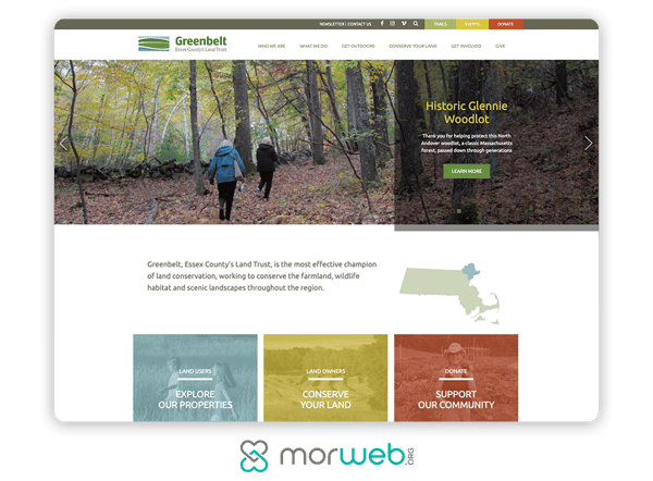
When choosing images and graphics for your site, keep in mind these best practices to maximize their effectiveness:
Choosing the right images can help boost your conversion rate, drive more traffic, and ultimately boost donor retention. After all, the information conveyed visually is more immediately understandable and can be powerfully motivating when used correctly.
Check out the best design systems software to maintain brand consistency and collaborate on projects.
A major part of user experience design is the structure of your nonprofit’s website. Users shouldn’t have to dig through your site to find the necessary information. Rather, intuitive navigation should help them quickly find what they’re looking for.
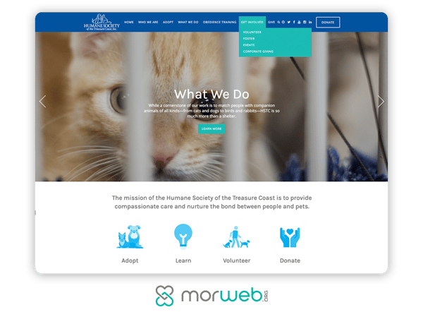
Intuitive navigation starts with a navigation bar that’s visible across your website. One popular option is to include a top or left-side navigation bar. For the best results, keep it minimal. To accomplish this, feature high-value pages that you’d like to drive traffic to (e.g., your About Us page, donation form, etc.). Then, use a hierarchical structure to indicate which pages take precedence.
When designing your navigation bar, implement these suggestions for an intuitive interface:
Once you’ve incorporated a straightforward navigation bar, simplify your interface more by incorporating calls-to-action (CTAs) and buttons across your website. Include it on relevant content, starting with a donation button on your homepage.
Remember, users visit your site for different reasons. Make sure it’s easy for new visitors to find out more about your organization, donors to find your donation form, and supporters to find volunteer opportunities and upcoming events.
If your navigation is unclear, your visitors will have a challenging time accessing content that interests them, which will also hinder their ability to engage with your organization. Ensure your CMS offers themes with built-in navigation buttons so you’ll have a much simpler time funneling users to high-value pages.
These days, mobile users make up the majority of website traffic. In fact, almost 60% of all internet access is completed through mobile phones.
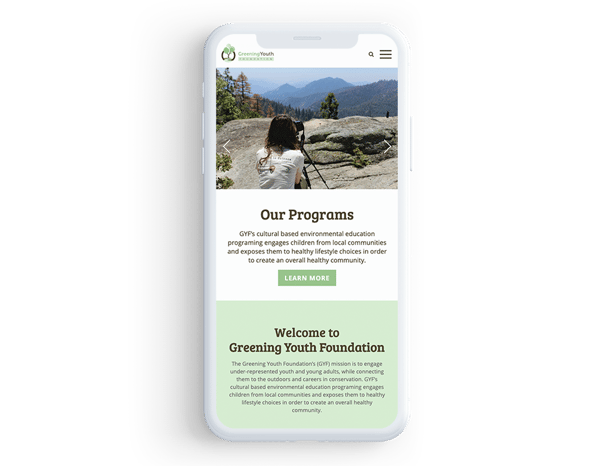
Because of this, nonprofit websites must be fully functional on all devices. Otherwise, when visitors view your site on their smartphones, they’ll be forced to zoom in and out to read your content or not even be able to access it. This can easily frustrate them, and they’ll likely leave without thinking twice.
When picking a CMS, look for these top mobile-related features:
You risk a much higher bounce rate if your website isn’t optimized for mobile users. For a positive user experience, work with a CMS that offers automatic mobile optimization. When you take a mobile-first perspective, you’ll strip your site of any unnecessary desktop-only elements.
To enhance the user experience, you’ll need to keep your site as speedy as possible. Do this by cutting out any extraneous elements. The more elements you have, the longer your page will take to load, which means you’ll risk a higher bounce rate.
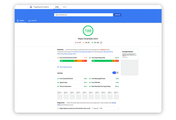
Users aren’t likely to spend more than a few seconds, let alone minutes, waiting on your site to load. With the entire web available at their fingertips, they’ll likely turn to another site to access the information they need if yours doesn’t deliver immediate results.
There are several steps you can take to improve website speed. To quicken your load time and keep users on your site, follow these best practices:
In short, keep it minimal and aim for simplicity. This will help with load time, improve navigation, limit distractions, and help high-value content stand out.
Experienced web design agencies know how to minimize load times, and the right CMS templates will help you optimize web pages. In the meantime, test your nonprofit website’s load speed with Google’s PageSpeed Insights. Then, adjust accordingly to quicken your site.
Your website needs to be visible and searchable online to increase awareness of your organization. You’ve likely heard the term search engine optimization (SEO), but do you know how to incorporate it into your web design strategy?
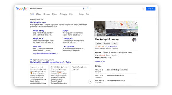
Basically, SEO involves optimizing your site’s content to help it prominently rank on popular search engines like Google. Learning how SEO works isn’t too difficult. Putting it into practice is a completely different story. To help, your CMS should offer SEO tools that help you optimize your content and rank higher on search engines. Be on the lookout for these tools:
Now that you know a few actionable tips to help you dominate the SERPs, optimize your content, increase your visibility online, and spread the word about your mission.
Building your nonprofit’s website doesn’t have to be frustrating or overwhelming. Throughout the web design process, keep the user experience in mind. To help accomplish this, invest in a CMS that simplifies the process and eliminates confusion. By keeping these best design tips in mind, you’ll create a website that best represents your organization.
If you need extra guidance, using a design guide can help you create the most effective nonprofit website possible. Soon enough, you’ll be a nonprofit web design pro!
You can strengthen donor, volunteer, and member connections with nonprofit CRM software.
This article was originally published in 2020. It has been updated with new information.
Murad Bushnaq is the Founder and CEO of Morweb. Since its inception in 2014, Murad has acted as Creative Director and Chief Technologist to help nonprofits spread their vision online through engaging design, intuitive software, and strategic communication.
As the nonprofit sector swells, and individual charities look to expand, there's an increasing...
Getting a donor is half the battle; the other half is keeping them.
 by Gerard Tonti
Life is a boomerang. What you give, you get.
 by Lauren Pope
As the nonprofit sector swells, and individual charities look to expand, there's an increasing...
Getting a donor is half the battle; the other half is keeping them.
 by Gerard Tonti


