Let's have a quiz. How many visitors who land on your website honestly do what you want them to do? You know, fill out your lead generation form, join your email list, or try a product demo, things like that. Take a wild guess. I know you might say a conversion rate that's low. But truth be told, approximately only 4 out of every 100 visitors to your website landing page convert on average. You probably didn’t go that low, did you?
Landing pages make or break your marketing strategy. They’re your first impression on people – a critical opportunity to convert visitors into leads, sales, or brand advocates.
What is a landing page?
A landing page is essentially the first page a person “lands” on after they click on marketing and advertising efforts via email, social media ads, or Google search. For example, the webpage you go to after clicking on a Facebook ad to download an app is a landing page.
Sure, you've got the best landing page-building tools, your message, and a good call to action (CTA). But it's probably not enough to make your landing page effective. So, what makes a landing page effective?
Listen. We’re not going to list 10 different features and characteristics that your landing page should have to convert more leads. Rather, we'll look at some of the best landing page designs from real companies across the web for all marketing goals.
From "hey, that's awesome" headlines to "can't say no to" offers, come with us as we uncover the design secrets behind the most effective landing pages.
Best landing page examples for lead generation
Convincing users to share their email or phone number in exchange for a resource like a webinar, eBook, or free course ranks up there with getting a toddler to part with their favorite toy. But persuasive copy, attractive visuals, and other elements do the magic. Take a look at companies acing the landing pages for lead generation.
1. Hubspot
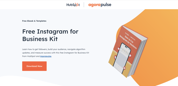
Source: Hubspot
Hubspot has several resources, including free eBooks, webinars, and courses for lead generation. The landing pages for these lead magnets are simple and effective. They typically feature a clean design, concise copy, and a prominent CTA button.
Here’s the landing page I stumbled upon when searching “how to use Instagram for business.” This page works because:
- It has a clear CTA. The page is neat. The "free Instagram for Business Kit" is prominently mentioned with the CTA "Download Now."
- It highlights a unique value proposition. The tight copy in the second fold calls attention to the free eBook's key value proposition in bullet points without overwhelming visitors.
- It’s quick. The form to download the eBook isn’t lengthy and doesn't have too many boxes to fill out. So you can download it without the frustration of typing in 20 different sub-fields.
G2 Takeaway: Keep it simple.
2. Sprout Social
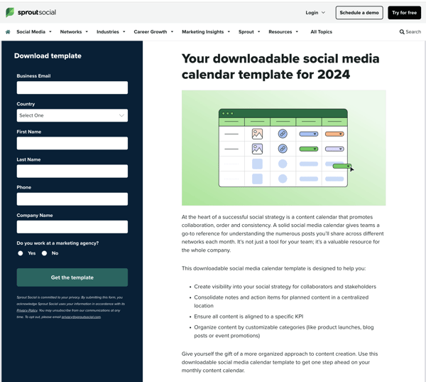
Source: Sprout Social
If you are a social media marketer, you definitely know about Sprout Social, a social media management tool. They offer a lot of free templates for marketers as part of their lead-generation efforts.
Now, you might notice that these landing pages look a little packed, but I think they work well. See if you agree:
- The "you" headline: The personalized "Your downloadable ..." has an immediate effect on readers.
- Addresses audience needs: To convert your website visitors, you need
- The way it handles audience needs: To convert your website visitors, you need to know your audience's pain points and convey your solutions clearly. Sprout Social does exactly this. Social media marketers often struggle to stay organized and plan their social media content in advance with other teams. Sprout’s downloadable template offers a free solution to that problem.
- Its clean design: Even as Sprout Social takes a storytelling route to elaborate its value proposition, it's broken down into paragraphs and bullet points for easy reading. The grid-based layout with contrasting colors that are consistent with their brand also stands out.
- Not the typical "download now" CTA: The CTA "Get the template" is more action-oriented than the typical CTA buttons and more powerful.
G2 Takeaway: Show clear value.
3. Unbounce
 Source: Unbounce
Unbounce specializes in landing page creation and optimization, so it's no surprise that its landing pages are top-notch. Theirs hits all the right design notes. Here's how.
- Best practices in action: The headline is bold. The animation as part of the hero image - the picture with text above the fold - works like magic to hold attention. Scrolling down, we read some compelling statistics from the report with captivating animations. This gives readers a taste of what will be in the downloadable asset.
- Strategic use of navigation: Interestingly, the menu with jump links on the side encourages users to either read the report, share it, or download it. While the design risks users reading the report here and not downloading it, the important nuggets from the report encourage users to spend more time on the page.
- Multiple CTAs in between for more conversions: Unbounce has also added more lead-generating options between different statistics sections to add their CTA for product trials, so that's a plus.
G2 Takeaway: Try bold headlines and design a captivating hero image.
Best landing page examples for product demos
Successful product demos are a cornerstone of converting potential customers into loyal users. But before you can wow them with a demo, you need to grab their attention and get them to sign up. These pages showcase features, functionalities, and success stories to convince visitors to experience the product firsthand through a demo.
Look at the following landing page examples that show how you can convert visitors into eager demo participants.
4. Slack
 Source: Slack
Slack, the instant messaging app, excels with this landing page example by not just showcasing the platform's benefits, but also highlighting ample social proof. Here's a breakdown of its strengths.
- The rule of three: The landing page immediately highlights the advantages of using Slack in three bullets, making it easier to understand. The phrase "See productivity in motion..." once again emphasizes the benefits and uses strong verbs to prompt users to act.
- Proof, proof, and more proof: Despite its popularity, Slack stays humble and establishes credibility by displaying logos of well-known companies that use its app. Further down, Slack displays powerful statistics touting the platform's benefits, so visitors know it's not just mere words. That's not enough social proof? They also have customer testimonials from people in OpenAI and Spotify.
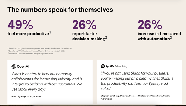
G2 Takeaway: Use social proof.
Related: Learn different ways to use social proof to boost your marketing.
5. ActiveCampaign
 Source: ActiveCampaign
ActiveCampaign is an email and marketing automation platform known for personalization. Its demo page for enterprises underscores this. Here’s what I enjoy about their landing page.
- Warm and inviting copy: The landing page starts with "We'd love to show you around," which sets a warm and friendly tone. It puts the visitors at ease and positions the demo as a collaborative experience.
- Tailored value: The emphasis on the phrase "personalized demo" reinforces the idea that the experience won't be generic. Again, the use of "your customer base," "your marketing," and "your business" when explaining the benefits also creates a sense of closeness. All these suggest that the demo will be tailored to each visitor's specific business needs, encouraging them to sign up.
- Social proof with G2 badges: If you’ve gotten badges from the world's largest software marketplace, you definitely flaunt them to your prospects. Earning a G2 badge shows you’re ahead of your competitors and puts attention on your trustworthiness among existing users.
- ActiveCampaign uses its bragging rights correctly, displaying the G2 badges it has won for different markets. It tells you that users from all kinds of businesses have found value in its product.
G2 Takeaway: If you have got G2 badges, flaunt them prominently.
Best landing page examples for building an email list
Landing pages that aim to build a subscriber list are easier to design than landing pages for lead generation or product demos because all they want is just an email address. Websites accomplish this through concise, benefit-focused content that showcases the value of subscribing, such as exclusive offers or insights. Look at the following landing page designs that make it look easy.
6. Morning Brew
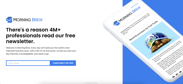
Source: Morning Brew
People who know Morning Brew really love the newsletter for its quick takes on daily business news. Its email landing page also embodies this with minimal content. I love this landing page because:
- Short and sweet: There's nothing below the fold here. One header, three lines, and a hero image to spell out why people should subscribe.
- Intriguing headline: "There's a reason 4M+ professionals read our free newsletter" is interesting to begin because it piques users' curiosity. It also acts as social proof and insinuates a sense of community among Brew readers.
- Clear value props: hen you read the copy, you know what you’re going to get – important business news delivered daily with entertainment. Three lines are all it takes to convey their message. Further, the no-cost aspect mentioned in the header and the CTA - "Subscribe for free" gives readers an added incentive to sign up.
G2 Takeaway: Create curiosity.
7. Failory
 Source: Failory
Aimed at entrepreneurs and startup founders, failory is a niche newsletter that shares stories, strategies, ideas, and news related to startup failures. Like Morning Brew, its subscriber landing page gets the message right without any complicated design. Here's what works for me on this page.
- Distinct focus: The headline "90% of startups fail.– Learn how not to." immediately grabs attention and establishes the core theme. The landing page stays focused on this concept and conveys the value of learning from failure in the startup world.
- Human touch: The line "My name is Nico..." introduces the founder, which adds a human touch and fosters connections with potential subscribers. "Join me and 40,000+ founders" establishes Nico's authority and expertise in the startup space while building trust and encouraging signups with social proof.
- Inside glimpse: Scrolling down, potential subscribers see the latest Failory issues and get a taste of what they'll receive. The interesting headlines and snippets are particularly effective at grabbing attention.
 Source: Failory
G2 Takeaway: Give your landing page a human touch.
Best landing page examples for sales
Sales landing pages have one goal: convince users to click "go to checkout." Depending on the product or service, they might have a more complex design with multiple sections to show you features, benefits, and social proof.
The overall design aesthetic should convey professionalism and trustworthiness to encourage visitors to make purchases. Here are some great sales landing page examples for inspiration.
8. Tesla

Source: Tesla
Electric carmaker Tesla pioneered selling cars online, to everyone's surprise and the traditional auto industry's chagrin, and has been extremely successful at this. So, it's no surprise that their landing pages are a shining example of how a sales landing page should be designed, especially for a high-ticket item like a car.
For starters, Tesla's home page itself doubles as a sales landing page. Here's a closer look at why this Tesla landing page sparks conversion.
- Visual powerhouse: Tesla understands the power of a first impression. The landing page explodes with high-quality images of the Model 3, Model Y, and other models showcasing their sleek design. This visual immediately captures attention and creates a strong desire to experience the Tesla cars firsthand.
- No option but to try or buy: There's zero distraction from the task at hand, i.e., to make the user buy the car. There are just two prominent CTAs - "order now" and "demo drive," targeting to convert a user into a prospect or a buyer.
- Prices upfront: All model prices are mentioned upfront, along with the name, removing the guesswork for the site visitors.
Clicking "order now" takes the user to the specific model's page. Again, this is a great sales landing page with a focused design and minimal distractions, keeping the visitor's attention on the model. Take, for instance, the Model 3 landing page.
 Source: Tesla
Once again, compelling visuals with images of the Model 3. I enjoy this landing page because:
- It's literally virtual car shopping: As you select your features and customize the car on this landing page, it becomes an interactive experience. You explore different features and the corresponding changes are reflected in the car image. This personalizes the car-buying journey for each purchaser.
G2 Takeaway: Dazzle with stunning visuals. But have minimal distractions for a great buying experience.
9. Netflix
 Source: Netflix
The streaming giant Netflix doesn't have a traditional sales landing page, but its home page excels at achieving its primary goal: convincing visitors to subscribe. Here's the breakdown of its effectiveness.
- Personalized hero image:
Netflix has customized hero banners for different countries with captivating visuals from popular shows in each region that grab attention. It's very user-centric.
- On-point features: Unlike a typical sales page, Netflix doesn't bombard users with different pricing plans and in-depth feature explanations on this page. Rather, it lists features with a copy of fewer than 20 words that address common pain points and amp up benefits.
"Enjoy on your TV" tackles a major concern about watching Netflix on your existing devices. "Download your shows to watch offline" addresses the issue of limited internet access. "Watch everywhere" emphasizes the platform's versatility and portability across devices.
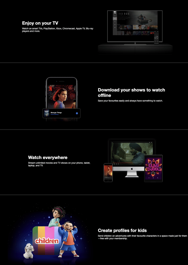
Source: Netflix
- FAQ section: There's also a strategically placed FAQ section at the end of the page that proactively addresses potential customer concerns and provides crucial information about subscriptions. It grows trust, reduces friction, and increases the signup rate by making the subscription process feel more informed and less risky.
- Only email: Most importantly, Netflix has a single-field form to start the subscription journey with a great "Ready to watch?" CTA. When the answer is yes, the subscription process is effortless.
G2 Takeaway: Keep your design user-centric and guide users through the purchase process.
10. Asana
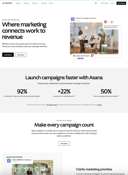
Source: Asana
Asana is a popular project management tool that helps teams organize, track, and manage their tasks. The landing page for its marketing platform is a classic example of a good software-as-a-service (SaaS) landing page because of its:
- Uncluttered design: The landing page avoids excessive use of images, animations, or text that might overwhelm visitors. Instead, the white space creates a sense of balance and allows key elements like headlines, images, and CTAs to stand out.
- Targeted content: The images, blurbs, and features highlighted on the landing page speak to marketing professionals and the target audience.
- Social proof and credibility: Statistics showing the advantages of teams using Asana, security, and compliance badges, customer testimonials from popular companies like Spotify, and industry analyst reports add to the tool's trustworthiness.
- Strategic CTAs: The landing page has CTAs placed on the top of the page and throughout to nudge visitors toward becoming paying customers.
The primary CTA, "Get Started," targets visitors who are ready to experience Asana firsthand. It lowers barrier to entry, allowing users to explore the platform for free. The "View demo" CTA, on the other hand, targets visitors who might
G2 Takeaway: Use CTAs to encourage visitors to try your product.
Best event registration landing page examples
Landing pages for event registration have a distinct flavor compared to other types. They display the event date and time, often accompanied by an agenda to showcase the value proposition. Take a look at some good examples here.
11. G2
 Source: G2
That’s right, this is our page. We’ve worked hard on it and we’re not afraid to tell you.
At first glance, our event registration page looks very simple. But this barebones look is the most common design for most event registration landing pages. Here's why this classic model works.
- Straightforward message: People who visit an event landing page want the event information upfront without having to search that hard. This landing page offers exactly that. The headline directly communicates what the event is. The date, place, and agenda are right there. The sections below the fold, "What will we cover?" and "What will we help you achieve?" describe the event's benefit, leaving no doubt about its purpose.
- Simple registration: The "RSVP for G2 Connect" stands out with a simple two-field form that makes signing up hassle-free.
G2 Takeaway: 1. Have a simple signup form. 2. Be like G2
12. Google Cloud
 Source: Google Cloud
Webinars are now part and parcel of event marketing strategies. This landing page design for a webinar from Google Cloud ticks all the right boxes by following the basics. Why does this work?
- It explains events with the 5 Ws: Like G2's landing page, the event name, time, and CTA to register all come above the fold with a nice animated hero image.
As you scroll, you see the event’s topics in bullets and the speakers’ names. The "Add to calendar" button allows you to add the event to your calendar.
- Ticking timer: The countdown timer creates a sense of urgency, a good, and only slightly manipulative, tactic to get immediate registration.
G2 Takeaway: Highlight the 5 Ws of the event.
13. Ahrefs
 Source: Ahrefs
Ahref's landing page for their Evolve event has to be my favorite by far. It uses several strategies to capture interest and drive registrations and ticket sales. I find these three aspects to be the strongest.
- All the right design notes: The bold hero graphics in orange with the blue background and the consistent use of Ahrefs' color palette reinforce brand recognition throughout the landing page. Placing key information like dates, location, and event details, along with a "Get Tickets" button that uses contrasting colors, creates a clear visual hierarchy, guiding users toward the desired action.
- All the right reasons: They offer keynote talks by 18 different search engine optimization (SEO) experts, opportunities to network with over 500 digital marketers, and pre-event workshops so you can get a headstart on networking. And the landing page highlights all of these.
- All details with transprency: All information related to tickets, early bird pricing, everything included in the fee, the event venue, the agenda, and additional workshop costs is easy to find on their landing page. Additionally, the FAQ at the end leaves no room for confusion for those who want to register.
G2 Takeaway: Go bold with your design and deep with your event details.
Best mobile app landing page examples
Mobile landing pages are designed to make the visitor download the app. Since the user ends up on this page when they’re on their smartphones, several aspects should be considered, starting from mobile-first design elements. See the app landing page examples below to understand better.
14. GitHub
 Source: GitHub
Github’s landing page for its mobile app targets developers on the go. The header, "Build from anywhere with GitHub Mobile," is eye-catching and conveys the app's core benefit. See how it stacks up.
- On-the-go functionality: The entire page emphasizes the ability to collaborate, monitor, and create using a mobile device or tablet. This directly addresses the needs of developers who want to stay productive outside of their traditional workspace.
- Visible CTA above the fold: It's always important to show important details and CTA above the fold on mobile landing pages since users scroll faster on their phones. Understanding this, GitHub has placed the "Download for iOS" and "Download for Android" buttons, making it easy for users to take the next step and download the app directly from their smartphones.
- Bite-sized content for mobile users: The content is broken down into sections with short descriptions and bullet points. Even if you have a small screen, you can still quickly scan and understand the key features. By doing this, GitHub gives users a seamless experience.
G2 Takeaway: Keep the landing page mobile-friendly.
15. Uber
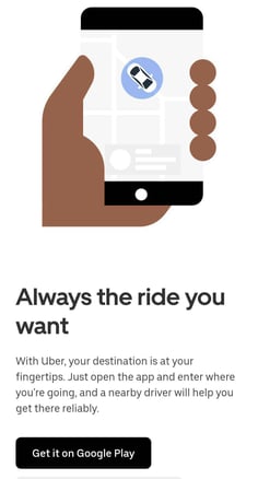
Source: Uber
Uber disrupted the cab industry by connecting cab drivers and riders with its app. It's no surprise that its landing page for app downloads reflects this focus on simplicity and ease of use. Here's what works for Uber:
- Super-simple design: Uber provides visitors with the information they need to download the app – nothing more, nothing less. The page is free of distractions. Just three lines of text and the link to download the app from the Google Play store or the App Store. This is ideal for mobile users with limited attention spans and smaller screens.
- Super-short copy highlighting the unique selling point: The page has a really short copy: "your destination is at your fingertips" and "Request a ride, hop in, and go." These phrases highlight the convenience factor, appealing to users who value quick and hassle-free transportation.
- Action-oriented design: The landing page prioritizes user action. Besides the download CTA, the conspicuous placement of the "Book a ride now" with the "See prices" button and clear input fields guide users toward the immediate action of requesting a ride.
G2 Takeaway: To win mobile landing pages, focus on clarity, short copy, and direct CTA.
What makes a landing page effective?
We’ve seen some impressive landing pages and explored what makes them work. Here's the compilation of all the best practices we learned for creating landing pages that convert visitors into customers.
- Headline hero. Craft a headline that grabs attention and instantly communicates the main benefit of your offer. Use strong and powerful words.
- Focused message. Avoid information overload. Keep the copy to the point and highlight the key features and value proposition.
- Speak their language. Understand your target audience and tailor your message accordingly. Use language and visuals that resonate with their pain points and desires.
- Mobile-first mindset. Ensure your landing page is responsive enough to give you a smooth experience on all devices, especially smartphones.
- Visual appeal. Use high-quality images, videos, and infographics to represent your offering and enhance engagement visually.
- Clear CTAs and strategic placement. Craft CTAs that are easy to understand and encourage action. Use strong verbs like "Download," "Subscribe," or "Learn." Place your CTAs above the fold, preferably visible, without scrolling. Consider using contrasting colors to make them stand out.
- Social proof and trust. Include positive testimonials from satisfied customers or showcase logos of trusted partners to build credibility.
- Data and statistics. If relevant, show impressive data or statistics related to your product or service to add weight to your claims.
- A/B testing. Don't be afraid to experiment with different headlines, visuals, and CTAs to see what resonates best with your audience. A/B testing tools help you compare different versions and optimize your landing page for maximum conversions.
- Analytics tracking. Implement analytics tools to track user behavior and measure the effectiveness of your landing page. This data will guide you in making data-driven decisions for further improvement.
Land it right/Stick the landing
We hope these landing page examples help you craft your best landing page designs. We’ve gone over many points, so take what resonates the most with your brand or product and go from there. Remember, there’s no right or wrong answer here. The key is to experiment and find out what you – and your new customers – love the most.
Learn how to conduct A/B testing to improve your marketing campaigns!


 by Adelina Karpenkova

 by Marilia Dimitriou
 by Ninisha Pradhan