If you’re like most people on Instagram, you upload photos you want to share with your followers in order to share moments of your life as they come and go.
Some users take this to the next level by planning their posts ahead of time to create a cohesive, stylized layout using the Instagram grid. You may have seen this already. Users break one photo into pieces and post them separately. In followers’ feeds, these photos may not make much sense, but visit their profile and you realize they come together like a puzzle.
Brands and businesses use these grid layouts in their Instagram marketing strategies. Profiles are more eye-catching and engaging when curating a specific theme and grid layout. Incorporating similar colors or tones shows that you care about your presence on the platform and put in the effort to think ahead.
I’ll show you some tools you can use to create your own Instagram grid layout and provide you with examples you can use to go out and create your own! This is a great option if you’ve been wondering how to get more followers on Instagram.
How to create Instagram grids
You can't create a perfect instagram grid just by sharing random photos. You'll need to come up with a strategy first, and if you want to make your profile as pretty as can be, you'll need a tool to help you as well. Luckily, we have all the tips and tricks you'll need right here.
| Tip: It will be useful to know the Instagram photo sizes going forward so your grid and posts are proportioned properly. |
Instagram content strategy
Brands use an instagram marketing strategy to convey a message on their profile grids. While they do this for the purpose of advertising, even your average personal instagram user can create a content strategy to give their profile a bit of intentional flair. Here are some tips you can use to create an Instagram content strategy with a personal touch.
Pick a theme
You probably already have an idea of the kind of posts you want to make—this happens naturally for a lot of users. If you don't, that's ok. Start by thinking of the content you want to include, and the colors within that content.
Do you want to make Instagram filters a part of your personal profile aesthetic? Do you love bright and bold colors or the sophistication of black and white photos? Take some time to think about and search Instagram for theme examples that inspire you.
Plan out posts
Variety is the spice of life—so make sure you switch it up on your Instagram profile as well. Are you great at taking selfies? How about photos of your adorable pet? Fancy yourself a foodie? Take a lot of nature pictures? Big fan of inspirational quotes? All of these things can have a place on your Instagram grid, but make sure your post remain interesting for your followers not just in the feed, but when they look at your grid as well.
Try not to post the same kinds of thing in a row. Experiment with different strategies until you find a rhythm that works for you. Your followers will come to expect consistently excellent content from you in the feed, and you'll have a great grid to show for it on your profile.
Instagram grid tools
There are a few great apps out there making it easier than ever to stylize your Instagram grid. These will help you plan and schedule your Instagram posts in addition to previewing how they will look on your profile.
Planoly
Planoly is a visual planner for Instagram. This tool is incredibly popular among lifestyle bloggers and businesses adhering to a theme on their accounts. The free version is enough for most people, but further paid plans allow for increased functionality.

Planoly also allows you to automatically break one photo into separate images for the grid and upload them together or schedule it out. Creator Brandy Pham developed the app after needing a tool to allow her to plan her Instagram grid for her jewelry brand.
Preview App
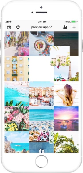
Another option is Preview App, which similarly has planning and rearranging utility wrapped in a user-friendly interface. The free version notably allows for unlimited uploading of photos and videos as well as editing tools, hashtag tools, and post analytics.

Preview App also has integration with Unsplash, allowing you access to free stock photos to fill any gaps you have in your grid layout. Either of these apps is a great option for monitoring and planning a layout for your Instagram grid.
TIP: Stock photos are valuable resource bu
While there are a number of other tools for scheduling posts and planning your Instagram grid, Planoly and Preview App have the most capabilities and are highly rated by users. Use either of these apps in coordination with a following grid template to create a cohesive and engaging theme on your profile.
Instagram grid examples
You may have seen some beautiful Instagram grids out there, but if you’re like me, you struggle at figuring out what you want yours to look like. There are a handful of ways to organize your grid in creative layouts. These can be mixed and combined for a fluid and appealing visual theme. Check these out and get some inspiration for your own Instagram grid!
Squares
Square grid layouts are generally the easiest to achieve. The most important thing to remember is to use consistent color and tone. Other than that, you can post one square at a time and not worry too much about how the images piece together.
Tiles
Grids that create a checkerboard-like tile layout use a combination of photos and graphics to create a unique feel for a profile. Generally, as long as the graphics stay the same visually, the photos can be less related than in other grid themes.
Rows
A grid using rows consists of three posts of related images or one image broken into three, six, or nine posts. This creates a very appealing look as someone scrolls through your profile. Be warned though – failing to upload three images at once can throw off the order of the posts and make everything look disorderly.
Columns
Columns are similar to rows in that the layout requires three images to create the vertical effect. Each row should appear as a sandwich with photos or graphics. This gives the appearance of columns that stretch down the length of your profile.
Borders
Applying the same border to each of your posts creates a unique effect on your profile’s grid layout. Borders of different shapes or weights can have different impacts on how your grid looks, but it’s certain to make your profile appear cleaner and more organized while highlighting the photos you wish to share.
Puzzle
A puzzle grid is perhaps the most difficult to accomplish. Each post needs to be able to stand on its own while also fitting into the larger picture. You need to design images together using graphic design software like Adobe Photoshop and then break the larger image down to different pieces that will come together as a whole.
So what now?
Using a specific Instagram grid layout can elevate your social media presence to new levels. More followers and more importantly, more engaged followers, are just one of the perks of putting an Instagram grid layout in effect on your profile.
Play around with what you enjoy best and how you can implement a creative way of portraying yourself or your business. You might surprise yourself with what you come up with.

 by Derek Doeing
 by Kristen McCabe
 by Derek Doeing