June 24, 2019
 by Kristen McCabe / June 24, 2019
I love SEO.
It takes time to learn on-page optimization, but once you do, there’s nothing like the thrill of seeing your article rank on the first page of Google.
There’s no disputing that traffic is an essential ingredient to any marketing mix. Yet, when you start building traffic, you can’t put blinders on -- you need to remember the definition of marketing.
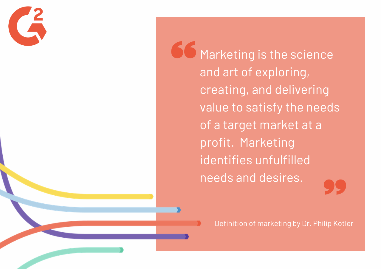
Dr. Philip Kotler, the “Father of Modern Marketing” and Professor Emeritus of Marketing at the Kellogg School of Management, defines marketing as, “The science and art of exploring, creating, and delivering value to satisfy the needs of a target market at a profit.”
If you’re not achieving that final phrase “at a profit,” you’re not conducting a successful marketing strategy. When building traffic, the first step of your inbound marketing strategy, you need to ask yourself two questions:
On our road to 1 million, we knew that conversions weren’t possible until we had traffic. Once we hit 250,000 organic visits, the day I had been eagerly anticipating arrived: Traffic was building at a steady pace, and I got the green light to turn my attention to conversions.
But, when you’ve got hundreds and hundreds of posts, where do you start?
Just like running a marathon, you start by putting one foot in front of the other. You make a training plan, then take those first few steps of your very first run. There is literally no other way to get from point A to point B.
The conversion-rate marathon follows the same path. Begin by making a plan of attack. Once you’ve got a strategy in place, it’s time to dive in. CRO ready-or-not, you can’t test what works until you add that very first CTA. Then you create a second, and a third, until you end up where we are now -- 900 and counting.
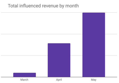
Not only do we have those 900 buttons, in six months, those CTAs have led to 90,000 clicks and $1.5 million in influenced revenue. As you’ll learn here, the influenced revenue number is continuing to grow as we hone in on our strategy and how we measure success.
|
This is part 7 of The Road to 1M Organic Visits: A Content Marketing Case Study. |
A conversion is defined as a recipient of your marketing message taking a desired action. The marketing message can be received through any channel, including your website visitors. There is a measurable way to confirm the action was taken and the conversion goal was achieved.
Examples of what a conversion could mean for a marketer include:
Given this range, how a marketer measures their conversion rate will vary between companies.
Before November of 2018, our entire focus had been to build traffic. The blog began with zero traffic and endless possibilities. The same was true for our conversion rate optimization (CRO) strategy.
To mark the shift, our conversion goal began with the easiest action a reader can take: clicking a button.
Before we dive too deep, it’s important to understand the unique opportunities we have at G2. Most companies are B2B or B2C. While our source of revenue makes us a B2B company, we also have a B2C journey.
Let’s think back to the standard sales and marketing funnel. The following illustrates the B2B customer journey. In an inbound marketing strategy, the awareness stage results from website traffic:
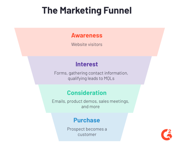
While we have this B2B funnel for revenue, G2’s platform is powered by a B2C funnel. These are the business owners and employees who read reviews, research their purchases on G2’s service and software categories, and write reviews to help their peers.
Examples of software categories include e-commerce platforms, project marketing software, and marketing automation software.
This image details the various conversion goals for our B2C audience:
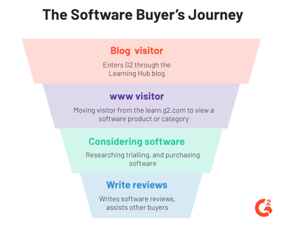
Whichever funnel you look at, the journey starts with website traffic. (Leads don’t just magically land in your lap, after all!) We began with buttons on high-traffic pages, and invited readers to learn more about the software related to the article.
“How to Edit Videos the Way the Pros Do” was one of the articles this strategy worked best. It’s not too tough to make the connection: People editing videos have an interest in video editing software.

While this worked on some articles, for others, the fundamental marketing rule of specificity rang true: We needed to better serve the search intent of each article’s reader. Someone looking for Twitter tips hasn’t yet considered the benefits of social media software -- they just want to use the platform.
So, we moved a step back in the funnel. Instead of linking directly to the category, we sought opportunities to link to middle-of-funnel (MOFU) content.
At G2, our best type of mid-funnel blog post is a software list. These lists are compiled by our research team, using verified review data. Examples include the best CRM software and best free video editing software.
This article on a forgotten Instagram password is just one which proved the use of mid-funnel content to be a successful conversion tactic.

Fun fact: The keyword research for this article began when I did, in fact, forget my Instagram password. So I knew that people reading this article would be in the same shoes. (Let’s face it; It’s impossible to do it the safe way — a different password for every login — and actually remember them all.)
Password management software is the solution to that problem we all face. But, the word “software” often has a connotation of cost, and that connotation is a barrier to clicks.
Instead of linking directly to the category page, I created a button that led to the best free password manager tools.

By adding the word “free,” taking away the fear of costs, that one button has led to over 1,100 conversions and counting. In turn, the free password manager blog post has over 550 clicks to the password management category -- CRO in action!
A/B testing is a standard part of any CRO strategy. Whether it’s your website or your email marketing strategy, it’s an easy tactic to increase click-through-rate.
Some marketers conduct all A/B tests in a thoroughly scientific manner. Every element but one is the same.
For example, a test can be as simple as a button that says "sign up," as pictured here:

Versus this button that says "Sign up now," with the intention of the word "now" to give a feeling of urgency:

While I appreciate a scientific study, I’m a marketer, not a researcher or a data scientist. A/B tests are a means to an end, and my goal is to increase clicks.
I didn’t want to lose clicks in the name of science, so I chose to test which destination destination within the category appealed to readers.
Instead of taking someone directly to a software category, such as email marketing, why not give them the opportunity to view that data in a specific way which best suits their needs?
The majority of categories on G2 display the G2 Grid, illustrating which products users rate highest based on review data.
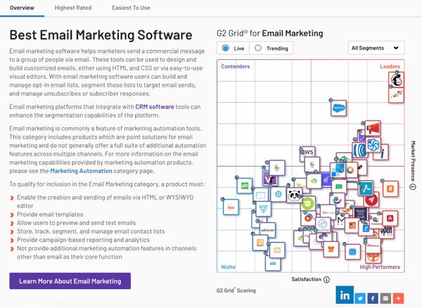
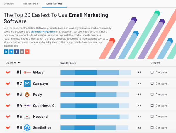
In addition, to the category overview, buyers can choose to view software in a list format -- either the highest rated or easiest-to-use software, with both updated in real time.

With these three options, we decided to test which attracted the most readers.
Several of us collaborated on the copy, and used the following text to lead to the category page with a Grid, as pictured above:
Find the best email-marketing software on the market.
Explore now, FREE →
The second multivariate copy read:
See the highest rated email marketing software →
This option was created with the reader’s knowledge of G2 in mind.
Someone who reads our blog post may never have interacted with G2 before. In this case, they don’t know we are a review platform, or are not familiar with the Grid. So, this copy leads the reader to a list with the highest rated software:
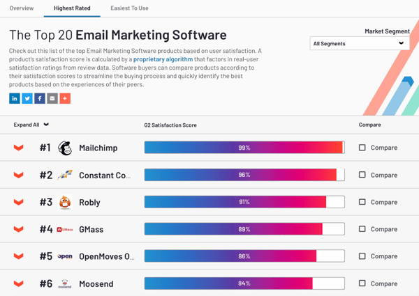
The third CTA was created with readers like myself in mind:
See the easiest-to-use email marketing software →
Yes, I work at a tech company. But that doesn’t mean I find all software easy to use, especially during the implementation stage.
Learning how to use a new platform can be one of the biggest fear factors when considering new software. This button was designed to get clicks by minimizing that fear. Readers who click this CTA variation are led to a list that looks like this:
When I began these multivariate tests, my hope was that one multivariate would come out as the obvious winner across all buttons that led to software categories.
Then, the next step I planned was moving on to the more scientific testing on the winning variation.
The results were not that simple. As it turns out, the winning variation varies based on the type of software.
For example, the invitation to “see the easiest-to-use payroll software” has a conversion rate 118% higher than “find the best payroll software.”
When it comes to event apps, “find the best” software performed 85 percent higher than variation C, and 178% better than variation B, to find the highest-rated software.
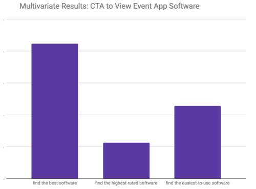
The testing will continue, but providing the option to view specific areas of the software category has had a substantial increase on clicks.
It’s no secret the text on your CTA will have a direct and immediate impact on conversion rates.
People often assume button copy is best when it’s short and sweet. However, more clicks come from more specificity -- even if that means your button copy is more than two words.
This was the advice to increase conversion rates given to me by Andy Crestodina, Co-Founder Chief Marketing Officer of Orbit Media. A Top 10 Online Marketing Expert according to Forbes, and a Top 50 Marketing Influencer by Entrepreneur, Andy advised me that it’s okay if buttons aren’t “pretty,” so to speak -- get in those extra words that show the value and relevance the reader wants.
I took his advice to heart, and backed it up with research. This isn't to say that you should ignore the design of your buttons -- you still want them to be visually appealing. But don't let the design limit you when you're writing button copy.
For example, inbound marketing agency Impact started with a button that simply said “Download Now.”
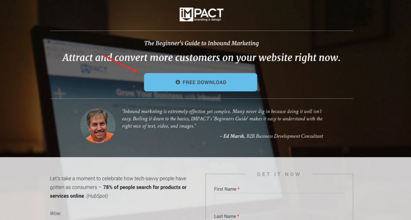
Image source: Impact
The company then tested a button longer copy demonstrating more value. The CTA you see here resulted in a conversion rate increase of 74.5 percent.

These insights had a direct impact on creating the previously mentioned CTA text:
The copy for every button is crafted with the reader in mind, with at least one multivariate to A/B test. Sometimes, the copy will remain concise, with a simple “Learn more →” to maximize clicks.
Other times, longer copy is needed to give the button the ultimate value.
Take this CTA, found on the page Why Your Brand Should Use a Social Media Calendar. The CTR on this button? Over 20%.
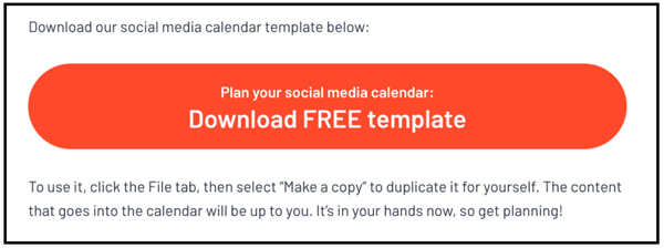
CRO depends on more than the text of the CTA alone. The button doesn’t live in isolation; everything around it matters, too. Immediately after this button, Alexa, the author of the post, shared how easy it is to use the template. Readers can visualize using it, and know it will be easy to do so.
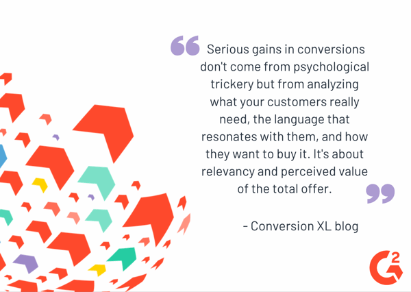
ConversionXL sums up the importance of supporting CTAs with the article copy itself with the following:
Once we had CTA’s leading to software categories in place, we were ready to explore buttons leading to other destinations on G2’s website.
At the same time, our team was growing at a rapid pace. This resulted in a number of moving pieces that needed to fit together.
During the past six months I have found myself regularly using the jigsaw puzzle metaphor.
Some of our puzzle pieces include:
Tom Fishburne, creator of the Marketoonist, best sums up what a successfully completed conversion puzzle looks like: “Reaching the right person with the right message at the right time has long been the holy grail of marketing.”
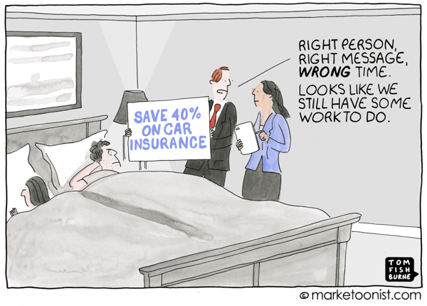
Here’s how we fit together those pieces of the CRO puzzle.
A golfer has one goal: Get that golf ball into the little hole all the way at the end of the fairway. The golf club, or tool, they use will vary based on the circumstances -- you don’t use a putter when you’re teeing off.
In the same way, the circumstances and search intent vary between articles. We are continually building out our CTAs, so every writer is armed with the tool they need. Instead of a heavy bag of golf clubs, marketers have a library of buttons and value propositions to achieve their goal.
Here are some of the value propositions these CTAs provide:
Given we have two funnels, the B2B side for revenue and the B2C side for software buyers, the action will vary based on the persona and the search intent.
However, as much as we write with one persona in mind, there are many individuals with different needs within each persona.
I began chatting with others in the marketing community, discussing the question: “Do you use multiple CTA’s on one page?”
Across the board, everyone I spoke to advocated using the same button, with the same call-to-action, multiple times on one blog post.
But I asked my question with another mindset. What if I had an article with two CTAs, each one for a different action, both of which may be valuable to the reader?
I went with my gut and encouraged our team to use multiple CTAs on one page, as long as they were valuable and relevant for the reader. And, as it turns out, those are often the pages with the highest conversion rate.
Take, for example, the Social Media Calendar article mentioned above. I shared the 22 percent CTR for the button to download a template.
What I didn’t share -- that is one of three buttons on the page. Those three buttons have led to a page conversion rate of over 40% -- almost half of readers on that page take action.
The takeaway? It’s true that the best articles are written with one, specific person in mind. That being said, there is plenty of guesswork and a whole lot of assumptions made when building out a persona.
If you have the ability to fulfill multiple needs of your reader, why not enable them to choose the route which best suits their situation?
We have a content marketing team of almost 30 people. This is a far cry from just one year ago, there were only four of us writing full time.
With that rate of growth, it didn’t take long for the challenge to become clear: How do we get the implementation of CTAs out of my head and hands, and into the minds of every team member?
We’ve found two ways to do so.
With 19 new hires in under six months, it wasn’t feasible for me to make a CTA for every person. So, our challenge was to balance:
Now that our team was built into three pods, one writer from each pod came on board to lead their pod through the why and how of conversions. We call this group the CTA team.
The fastest way to fail would be by working in a silo. Without having the voice of people who are daily living the life of a content marketing writer, our conversion strategy would be doomed. The communication the CTA team provides to their pod, and to leadership with feedback on existing processes, is a critical factor to our success.
In the same way, our goals are also achieved through the dedication of every person on our team. Some people came from a writing background, others from a marketing background. The one thing everyone has in common is a mindset of continual improvement, and a passion to support each other and achieve our goals.
Those goals are set high; and it is literally impossible to meet them without buy-in across the board. This is where our onboarding strategy proved to be so beneficial.
With so many people on our team, there is a range of interests. This works out well given the bounty of skills needed to execute content marketing across multiple channels.
This means that some people will have more interest than others when it comes to taking on conversion projects. And, as mentioned, our team has diverse career backgrounds; writers approach articles with various mindsets.
Our team’s leadership discussed a workshop to build everyone’s knowledge. But it became quickly apparent the opportunity cost was too great.
So how do we centralize knowledge, both as a reference point for the work everyone does, and as a source to continue learning for those who desire to do so?
The answer is a digital knowledge hub in Confluence.
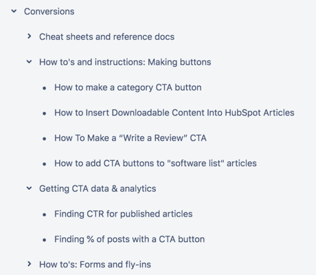
The resources shared here are still being built out, but this has already proven an ideal way to educate the team.
The workshop may still happen at some point. Face-to-face interactions will always have value. But when you need to get the right CTA onto over 1,000 posts, this has been the best way to get the right information to the right people.
It’s also been effective for those who want to take the next step.
As we continue to evolve our conversion strategy, we are growing our gated assets. Everyone on the team knows the knowledge hub is there to explore. Without any prompting, days after posting, one team member took the initiative to find and follow the instructions to create a form.
This is how we will continue building conversions in our current phase, as we shift beyond clicks into goals based on subscribers and leads.
You can’t get inbound conversions without traffic. In the same way, you can’t measure what buttons are working until you’ve got data.
Depending on your personality, digging into data can be fun, daunting, or both. I happen to fall into that “both” category.
I built buttons into categories to give me additional ways to ascertain success. The longer I spent in campaigns, the more measurements I discovered.
It is an exciting day when you see the needle move on influenced revenue. Once I saw that prospects were clicking our buttons, I wanted to know what content was influencing the deal.
Unfortunately, this is not an automated answer. It requires a few steps and a fair amount of combing through contact records. But, spending that time looking at prospect activities, the realization hit: We can measure more customers clicking on buttons; we can measure engagement with all of our content.
This led to a new step: Every blog post is added to a campaign before publishing. We have built out our process to the point this one action adds just a few seconds to the publishing cycle.
Campaigns for our blog posts are built out by the persona, giving an efficient way to see which content topics have the biggest impact on revenue.
This is one of countless wins we are still discovering.
As the process for CTAs has been built out, team knowledge has continued scaling at the standard (meaning: rapid!) pace of G2. This has opened up the next step of our CRO plan.
Instead of just clicks, we are now building out fly-ins, exit-intent pop-ups, and form fills to grow our number of contacts. These new contacts become more than leads; a submission can write reviews, join our G2 network of content contributors, and establish a relationship with writers that supports link-building.
Once upon a time, any asset was free for the taking with the simple click of a button. Today, that’s the case for some downloadable assets, but not all. We built traffic to the page, and proved demand for the asset, then added the form.
This asset alone, for free YouTube banner templates, has resulted in almost 200 new contacts in just three weeks.
To truly maximize that traffic, our CRO strategy means more than adding forms to existing content downloads.
You remember those 20 writers we hired in such a short period? The success of the hiring and onboarding process has been made evident by the amazing new team members eager to take on additional projects.
One of these has been analyzing the posts which have the most traffic, then creating downloadable assets, offering additional value, on those pages.
If you’re building a CRO strategy for your team, here are the seven takeaways you can apply, no matter how big or small your team.
The question “What worked, what didn’t, and why” never goes away. I have my wish list of questions I want to answer, and, like a kid at Christmas, the list keeps getting longer.
But it’s better to continually test and improve than rest on previous success. You don’t know what improvements (and revenue!) you may get if you don’t try.
Take it from one of my favorite content marketers, Andy Crestodina:
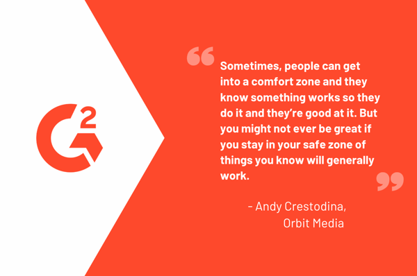
Make your own list of everything you want to measure. The moment inspiration hits, you don’t want to lose it.
Look for what has the most impact, as well as tests that are quick and easy to execute.
When I started our conversion strategy, I mapped out every goal that the Learning Hub could support. The paths to conversion are so varied, it is easy to get overwhelmed.
In the end, the only way to get results is to get started. It’s okay if the CTA copy you write isn’t perfect the first time. And, remember -- we are often our own worst critic.
The first step is creating that one button, with one test. Break your strategy down into small tasks, and then dive in.
There are some buttons I had high hopes for that fell short. For example, one team member wrote a series of articles directed towards the job seeker. When I think of this reader’s goal, it seems quite obvious: To get a job! So, it seemed straightforward to invite this reader to view open roles at G2.
I am not ashamed to say, the idea did not pan out. It was by far the lowest click-through-rate. But that’s how we learn. Looking back, it makes sense: The reader could be living anywhere in the world, applying for a job in any industry.
Trying and failing is how we make those discoveries.
Some of our buttons have uniform copy. If a writer creates a button, everything must remain the same, except for the name of the product or software category.
These buttons have standardized copy for a reason: The text is in the process of being tested, or it was tested, so we want to stick with what works. Once I know a persona will respond to “finding the easiest-to-use email marketing software,” we’re not going to stray from that value proposition.
On the other hand, some CTA copy needs to have some flexibility. Say someone wants to create a button that driving traffic to another blog post.
In this case, every content marketer on the team has the green light to create whatever copy will suit the needs of that reader. In addition to increasing CTR, it grows the ownership and education of each writer as they write conversion-driven copy.
Button language evolves with time. The first thought that comes into your head works, but it may not be what leads to the most clicks.
Unless I’m in a time crunch, I’ll always take the time to play around with text.
No matter how good or bad, start typing in a doc. Then, change one word, and see where it takes you.
It’s a little bit like playing the game of telephone as a kid: Where you start and where you finish will look nothing alike. But I promise, even 15 minutes of wordplay can have a substantial impact.
When writing copy, remember to ask yourself: What barriers will stop the reader from clicking? Do any of the words have a negative connotation? Then look for different words, or additional text that overcomes that hurdle.
Never stop asking yourself why, and what you can test next.
Our conversion strategy has been built out from the simple observation of one winning number in a spreadsheet, and the question “why did that CTA perform so well?”
I also look at spreadsheets and dig deeper into “What does this number mean, and how is this number created?” Find out exactly how your CMS measures a submission and a conversion.
And, as you continue to make discoveries, look for use-cases you can replicate.
We weren’t too far into the process when I began my weekly spreadsheets of data analysis. Over time, what I measure week-on-week has evolved. With more than 1 million visitors, and close to a thousand call-to-action buttons, the possibilities of what I can measure are endless.
Some of my analysis is built around how the team is executing CTAs. (Which, consequently, also reflects on what I’ve done well, and what I need to improve on educating writers.)
Taking the time to analyze data is critical. But, at the same time, if I spend 40 hours a week looking backwards, we’re missing opportunities to step ahead.
The items I spend my time measuring are prioritized based on the goals our team has to achieve. As the strategic thinking of our team’s content marketers continues to grow, there will be more opportunities to dig deeper into specific tests.
Our starting point in measuring conversions was as simple as measuring clicks: We wanted to know that the buttons were working, and people were taking action on our page.
We’ve built out many CTAs, and many variations within those CTAs. We will continue to test and discover wins we can replicate.
But the most exciting part goes back to that definition of a conversion. Now that we’ve built out clicks, we have other conversion metrics. To name a few, these include:
Our tactics to achieve these metrics are building with our team as we grow from buttons to form fills and fly-ins. A key part of this will be testing fields:
The mathematics will also come into play, as we compare how “winning” CTA copy correlates with submissions. The button variation that gets the most clicks doesn’t always lead to the most submissions.
Our analysis will also grow to measure the full path travelled by contacts sourced through the Learning Hub. This includes investigating which articles are leading people completely through the funnel.
Achieving any CRO goal ties back to the content strategy as a whole. Keyword research will never stop. (Nor do I want it to! I happen to love falling down the keyword discovery rabbit hole.) But, instead of traffic alone, we’ll build out assets connected to those keywords that lead to more contacts, more reviews, and ultimately, more revenue.
Conversions are tied to sales, but there are many other success metrics marketers can utilize. This is especially true for B2B companies who have long sales cycles; contract renewals only happen once a year, and there are a limited number of decision makers.
But, while the number of decision makers is limited, your number of brand advocates isn’t.
The new contacts we source through traffic and conversions lead to a flywheel of a continuously engaged community, who contribute to our blog, G2 data through reviews, and more, as you’ll discover in the final chapter on building a content community.
Kristen’s is a former senior content marketing specialist at G2. Her global marketing experience extends from Australia to Chicago, with expertise in B2B and B2C industries. Specializing in content, conversions, and events, Kristen spends her time outside of work time acting, learning nature photography, and joining in the #instadog fun with her Pug/Jack Russell, Bella. (she/her/hers)
Musicians, podcasters, and content creators often spare no expense for high-definition audio...
 by Sudipto Paul
Introduction to Audio Recording Software for Mac For Mac users passionate about creating...
 by Evan Sherbert
“You get a podcast. And YOU get a podcast!”
 by G2 Staff
Musicians, podcasters, and content creators often spare no expense for high-definition audio...
 by Sudipto Paul
Introduction to Audio Recording Software for Mac For Mac users passionate about creating...
 by Evan Sherbert


