

Whether it’s for work, fun, or research, creating charts and graphs in Google Sheets can add a compelling visual element to support your data.
Creating a variety of charts is actually quite simple, you just need the right guidance.
In this step-by-step guide, we’ll show you how to:
We’ll also finish with some tips on when to use particular charts.
When it comes to spreadsheet software, Excel has typically been the industry standard for creating graphs. However, for those working in G-Suite, Google Sheets offers a competitive product allowing users to craft up to 18 different charts and graphs.

But before any chart or graph can be made, you’ll need some data.
Depending on the purpose of your chart, this data can vary. For example, if this is a chart to measure weekly website traffic at your company, you’ll be pulling data from your analytics tool. If this is for fun or research, you might have your own original data or pull from open datasets.
| Related Content: Explore datasets you didn’t even know were publicly available. Here are the top 50 open data sources to use for your next project. |
After you have the data collected, it’s time to format it in Google Sheets so you can generate the right visualizations.
While there are 18 different types of charts and graphs on Google Sheets, there is a general rule-of-thumb when it comes to formatting data: The x-axis is to the left and the y-axis is to the right
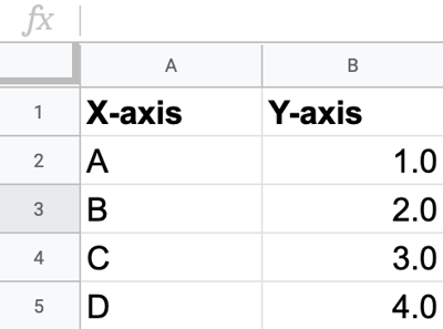
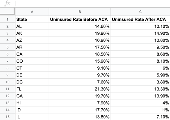
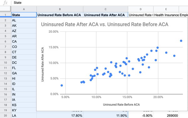
Something else to be aware of is the x-axis is almost always categorical and the y-axis is almost always numerical. For example, if we’re charting the state-by-state uninsured rates before and after the Affordable Care Act (ACA), we’d list the states on the x-axis and the uninsured rates on the y-axis.
Even when dealing with advanced charts with more than two variables, it’s best to follow the general rules of x and y-axes.
Now that we have our data and understand how it should be formatted, it’s time to begin creating visually compelling charts.
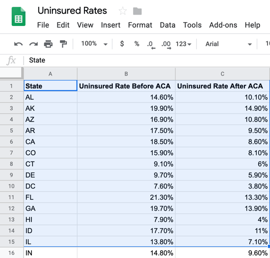
Step 1: Highlight the cells you’d like to include in your chart. In Google Sheets, this is referred to as a “data range.”
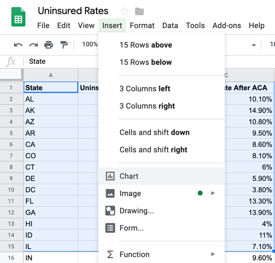
Step 2: Click on Insert and then Chart. Google Sheets will then create a chart based on the format of your data and what it believes to be the best visualization.
Step 3: We now have a basic chart, however, you may need to do some customizing to fit your requirements.
In this case, I’ll need to customize the chart so it represents all data points accurately and as visually compelling as possible.
To begin customizing your chart on Google Sheets, click the three dots located to the far right of your chart.
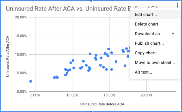
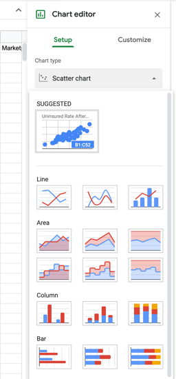
This will bring up the chart editing panel, where all customization takes place. By clicking on the drop-down menu under chart type, you’ll see all of Google Sheets’ 18 chart options.
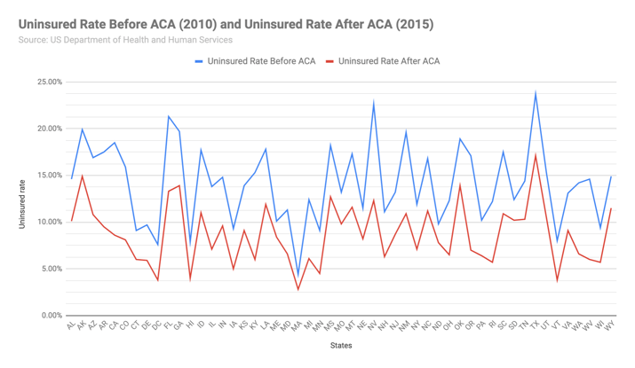
In my example of visualizing uninsured rates before and after ACA, I’m going to select a line chart since it’s particularly good at showing trends and fluctuations in volume. Here’s what my chart looks like after changing styles, editing headers, and adding a data source.
From font styles and sizes to changing line sizes and data points, don’t be hesitant to explore all the customization options in Google Sheets.
Not all charts are created equal in Google Sheets. For example, column and bar charts are great at showing categories or groups of data over certain time periods. Line charts help show trends or volume. Pie charts show data proportions of a whole.
Using the right chart under the right circumstance is imperative if you’d like your visualization to get the point across. If you find yourself having to explain the contents of the chart too much, then you might want to choose a different one.
Check out our intro guide on data visualization for more tips on developing charts and how they’re used in business.


No other industry today has seen such rapid growth quite like the tech industry.
by Devin Pickell

If you’ve been paying attention to tech news recently, you know something big is on the...
by Devin Pickell

In today’s vast digitally-connected world, it can be difficult to maintain some privacy.
by Devin Pickell