

Think about the last time you purchased something online.
Was it something you really wanted and thoroughly researched before purchasing, or did you purchase on more of a whim?
How committed you are to purchasing a specific product from a specific retailer can impact how much time you’re willing to spend slogging through a checkout process. But remember – even if you think most of your shoppers fall into the first category, there’s almost always another store that can provide them with what they’re looking for.
Your e-commerce store is doing plenty of things right if it gets a shopper to the checkout – it has inspired consumer confidence in your business and a desire for your product. However, if customers are giving up before completing a transaction, you're failing to hit the final target.
An average of seven out of 10 customers leave behind items in an online shopping cart and exit a website, quickly turning potential sales into lost revenue.
One of the most significant reasons for cart abandonment has to do with checkout friction. Every step a customer is required to take to complete a process introduces some kind of friction. And if a customer meets their threshold for friction, they will go somewhere else.
The good news is there are ways to optimize an e-commerce checkout to give your bottom line a lift. Let's look more closely at why customers abandon their carts at this late stage of the game, as well as strategies to recapture some of the revenue.
Cart abandonment occurs when customers add products to their cart and navigate away from a site without completing the transaction.
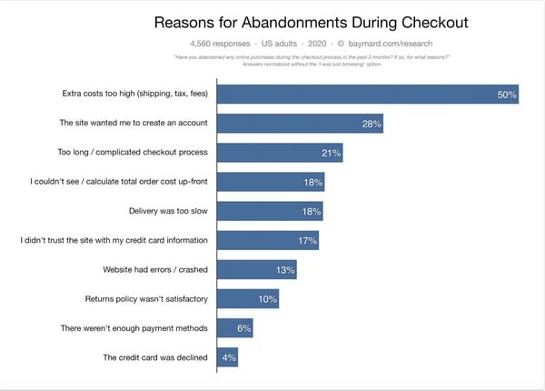
Some customers who abandon their carts are browsing and never intended to buy right away. But a landmark study from the Baymard Institute found more than 40% are discouraged by encountering some kind of friction while trying to check out.
Fortunately, an optimized checkout can increase sales by more than one-third. In fact, Baymard found 39 potential ways the average e-commerce website can be improved to keep customers moving through checkout.
The checkout process on a website can be the difference between a successful sale and an abandoned cart. Here are some common stumbling blocks that cause consumers to rethink a purchase.
Here are other reasons shoppers are quitting the checkout process before they get to the finish line.
Many of the obstacles customers encounter during checkout can be addressed by refining your checkout process to ensure the smoothest possible customer experience. Even a few simple adjustments can significantly improve results.
Let's start with three essential factors an e-commerce store must have to keep customers in the funnel through checkout.
It's crucial that the order summary is accurate. When it comes to product visualization in e-commerce, it is crucial that product images and descriptions match.
A technical glitch that results in the wrong image appearing in the order summary creates questions about what a customer is actually purchasing. Any uncertainty is likely to send them elsewhere.
Pop-ups, ads, banners, and links may work elsewhere in your e-commerce store, but once a customer reaches the checkout, your goal is to drive them to complete the purchase.
Provide the ability to edit the cart, but outside of that, be sure to remove all distractions. The focus should remain on getting through each step of the checkout process and concluding the transaction.
About two-thirds of consumers consult an online store's return policy before making a purchase. Make sure yours is clearly explained. A note about free return shipping on the checkout page, for example, may be the final enticement a customer needs to finish the transaction.
The design of your checkout depends on your business' particular needs. For instance, a financial company requires more customer information than a retailer. Keeping that in mind, let's look at some important strategies for removing friction and making the process as effortless as possible for the customer.
Asking customers to create or log in to an account to buy a product disrupts the checkout flow right from the start. Research shows that even if a guest checkout option is offered, 72% of sites don't make this selection obvious enough.
Woolrich shows customers it understands the need for a fast and painless checkout by offering the "Continue As Guest” option.
Clearly outline shipping, handling, and other fees so customers aren't surprised when it's time to pay.
Bon Bon Bon does a great job of offering a shipping estimate at the shopping cart summary stage. Customers can enter their location and review shipping options before deciding to proceed to checkout.
Research shows that 21% of customers abandon a cart because of a complicated checkout process. A visual checkout lets customers know in advance how much work they need to do to complete a purchase.
Notice how Bliss clearly indicates there are just four easy steps to buy their product: customer information, shipping, billing, and payment. It's simple and straightforward.
Bliss also carries its brand's look and feel from the product pages through to checkout for a seamless experience. Shoppers can hesitate if they're sent to a checkout that's starkly different from the pages they've just been shopping on.
Customers are slowed down when they manually enter information on a form, especially on a smartphone or tablet. Attributes like autofill can help shoppers fill in a form up to 30% faster and reduce the chances of making mistakes.
Consider using Google Autocomplete, which gives users a list of matching addresses to choose from once they begin inputting their address. It's fast and easy to click on the correct match to autofill the rest of the fields.
The average e-commerce site asks a customer to complete 12.8 form fields, but it's possible to have a checkout flow with as few as six to eight form fields.
There are simple tweaks you can make to reduce the number of form fields in your checkout. Skullcandy, for example, uses a checkbox that defaults to "My billing address is the same as my shipping address." This hides the billing fields and eliminates the need to complete the same fields twice.
Customers want to feel like their credit card information is secure and protected. While your site may be fully secured, you can assure uneasy shoppers by adding SSL seals and trust badges. Make them feel comfortable with providing their information. These visual cues increase confidence in your site security and the legitimacy of your business.
Online reviews carry as much weight as personal recommendations. More than half of consumers read between two and six reviews before deciding to trust a business. Social proof in the form of Yelp, Google, or product reviews can convince customers to engage with your company.
Di Bruno Bros. places their Google star rating in the bottom corner of their checkout. It's tucked out of the way to avoid distracting from the checkout flow, but it's a smart reminder to customers that they're doing business with a trusted company, so there's no reason not to finish the transaction.
Mobile commerce is fast becoming a preferred way to shop online. It's expected to hit $488 billion, or 44% of e-commerce volume, by 2024. Unfortunately, it seems that many e-commerce sites are neglecting this valuable subset of shoppers – cart abandonment on smartphones is much higher than on desktops.
Optimize your checkout for smaller screens like smartphones by making buttons and links larger and clearly visible. You can also make use of platform capabilities like mobile wallets for faster payment.
The checkout button leads to the last stage of the sales funnel and needs to be prominently displayed. Use a contrasting color to make sure the eye is drawn to the button, and avoiding crowding the space around it.
When a customer runs into an obstacle during checkout, the last thing they want is to wait for a reply after emailing your help desk. In fact, it's easier to give up. To keep the checkout flow moving, consider adding a live chat box that gives consumers an immediate answer about a promo code that's not working or the finer points of a return policy. If you don't have the capability for live chat, a phone line can also improve the customer's experience.
The reality of e-commerce is that 30% of all online purchases are returned, so it's important your customers know their options. Make your return policy clear on the checkout page to reassure customers about how long they have to return an item or whether return shipping is included. This helps reduce friction and nudges customers closer to clicking the final payment button.
The content of your return policy may also be important. Customers prefer liberal return policies that allow them to return a purchase if it wasn’t what they expected — and some shoppers may decline to purchase if they find out they have to pay for returns, or they might not be accepted. You will have to evaluate for your specific business what return policy is most worthwhile, considering your own costs as well as conversion rate.
Once you've made changes to your checkout, it's time to see if it's successfully reducing the number of abandoned carts.
A/B testing, also called split testing, removes the guesswork by comparing the performance of your original design (the control) to the new one (the variation). It can involve testing different content layouts, copy, or navigation items to see which convert the highest.
Using an A/B testing software, you can send random traffic to either the control or the variation and collect data to see how customers engage with each interface. The results can tell you if your new design is achieving the desired outcome of increased conversions.
A/B testing is a great way to make sure your checkout process isn’t losing you customers. Using A/B testing to optimize your checkout process can remove friction, confusion, and mistrust, and reduce your cart abandonment rate.
Abandoned carts are a significant source of lost revenue from shoppers who intended to buy from you. But you can keep from losing some of that business by optimizing your checkout process to reduce friction.
Be sure to keep customers moving forward through the checkout process by simplifying the information required, being transparent about costs, and building trust with security badges. You want checkout to be easy and feel natural across all devices (don’t forget mobile!).
Checkout is the last stage of the conversion funnel, so it's crucial to get it right so your customers don't decide to shop elsewhere.


Abandoned carts are one of the most maddening parts of running an e-commerce business.
 by Max Rice

Even if you create the best products in the world, your e-commerce store will fail if you...
 by Mitt Ray

Whether you're selling fashion accessories, upscale electronics, or consumer packaged goods,...
by Leigh-Anne Truitt


