

Metrics have long been a point of debate by agilists.
Despite the fact that agile development is empirical because of the continuous delivery of quality software, PMO offices, project managers, and clients alike still demand detailed status reporting as they would for any waterfall based project. Although business need is one reason for oversight, agile development itself contributes to a level of uncertainty that some people always want to nail down.
In an effort to buck this trend, many agilists contend that measurements should not be used at all, and that only the production of software itself should be considered the yardstick for success. The proponents of this approach contend that development teams and project managers will instinctively game the system by manipulating user stories and estimates in such a way as to produce the semblance of high efficiency and hide the real problems. However, there's an adage that states what gets measured, gets done.
The main reason this gaming occurs is that organizations rely too much on one or two metrics instead of having a comprehensive metrics solution. In this article, we’ll discuss the metrics proven to produce the best intelligence available on team performance, quality, value, and even agility. We’ll even talk about some metrics you may never have heard of, based on the latest research and most innovative case studies.
Agile metrics are used to track status, quality, productivity, efficiency, value, and even agility itself. Most importantly, they are used to inform business decisions. No matter what kind of project you’re working on, reporting will always be important to both external and internal stakeholders. Metrics can impact decisions at all levels, from product management to staffing management, and as such, they need to be accurate, informative, and unbiased. Before we dive into the metrics, we first need to establish a foundation for which all such measurements are based.
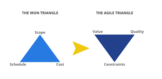
In plan-based approaches, measurements were based on the old “iron triangle” of scope, schedule and cost. Most every metric fell into one of these three categories. In the agile world, this triangle has been turned upside down. Projects are defined by delivering value and quality within certain constraints. Budget or cost is merely one of these constraints, among others, as opposed to being a primary focus for delivery.
It is important here to understand the relationship between value and quality. Many people struggle with defining value. First, there are two types of quality: intrinsic and extrinsic.
So, it’s important to understand that quality as depicted in the agile triangle is intrinsic or internal quality from the development standpoint, while value in the triangle is really a form of extrinsic quality. Understanding this relationship is important to developing good agile measures.
The following list of seventeen metrics combines the most frequently used and time-honored agile metrics with newer measures based on recent research. The key takeaway here is that any agile metrics solution should be comprehensive.
Relying on just one or two isn’t going to provide a complete picture of what is going on. The biggest mistake many managers make is focusing too much on two or three, or only one metric for their entire project. Some organizations use nothing but velocity or burn down charts.
Believe it or not, it happens. A good metrics solution should cover all three points on the agile triangle. These 17 will give you the tools to do just that and much more.
Blocked time is defined as the amount of time a particular user story – or sometimes a task – is blocked. Resolving blockers is critical to facilitating the flow of work in an agile environment, and this metric can help measure the amount of time they take to resolve. Blockers should be resolved expediently.
Increases in blocked time could mean that a user story wasn’t decomposed properly, or that there is a dependency on an outside resource that was unplanned. Blocked time can be reduced with more careful user story decomposition, prioritization and sprint planning.
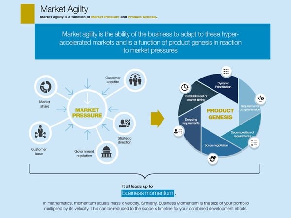
Many of the metrics discussed here have been around for quite some time. Most are focused at the project, team, or WIP (work in progress) level. However, as technology is more integrated into our daily lives and markets for those products become hyper-accelerated, organizations are seeking more sophisticated metrics that can identify market trends, gauge process improvement, predict competition, and in essence, measure agility. Business momentum is one of those. Momentum in this context can be expressed as the total story points for a release multiplied by its timeline.
As an organization becomes more agile, it gains momentum with each release. Cycle times tend to shorten and expectations around delivery grow. Business momentum can be used for market timing, or as a marker for the health of a particular product line or program. If the momentum starts to decrease, this is an indicator to management that a particular market is starting to play out and a new product line needs to be developed. Agile organizations must continually seek out new markets to remain competitive.
Code coverage is a measure of how much of the code is actually being executed during testing. This is typically instrumented and calculated as part of an automated testing strategy. The metric should provide the overall percentage of code executed during each testing phase (unit, system, etc.) as well as a total of all phases.
Code coverage should not be misused as a marker for how well a product has been tested. Rather, the goal of this metric is to facilitate test automation and monitor continuous delivery. Quality assurance measurements should include a variety of metrics, not the least of which are defect occurrences discussed later.
Sometimes referred to as a process-behavior or Shewhart chart, a control chart monitors the performance of a process to determine whether it’s under control or out of control – depending on the upper, lower, and mean control limits that have been set.
These limits are calculated by estimating the standard deviation of the sample data, multiplying that deviation by three, and then adding that to the average to create the upper limit, and subtracting it from the average to create the lower limit. The Y-axis of the chart is the number of occurrences or issues in a particular sample while the X-axis enumerates each sample. Control charts originated in manufacturing as a form of quality control and have been around for almost 100 years.
Popular with six sigma disciples, control charts can measure the failure or success of quality control or other manufacturing processes. While not popularized in the agile world, control charts could be used to measure defects found per iteration or release to identify QA testing issues, or to gauge cycle times over a series of releases to ensure that they fall within acceptable levels.
A cumulative flow diagram illustrates how much work, segmented by type, is being allocated to a team over time. Its purpose is to monitor how well work is flowing throughout the system. In this diagram, work is divided into different types, for example: to do, in progress, and done. It could also be divided into requirements, development, testing, and so on. However it is segmented, the cumulative flow diagram shows a line for each work type, with the number of work items on the Y axis and the X axis being a function of time.
Good flow is illustrated by all of these lines running in parallel. If one of the lines experiences a sharp upturn, or crosses over another, this could indicate a bottleneck. Achieving good flow is the central concept behind kanban. The cumulative flow diagram helps identify bottlenecks to facilitate continuous flow and ensure that WIP does not get out of control at any one point in the system.
Cycle time can be defined as how long it takes to produce a software release, from concept to completion. Along with lead time and velocity, cycle time is a very good high level indicator of agile health and agile transformation success. As an organization progresses in its agile journey, cycle times should gradually decrease, typically to six months or much less. Increases in cycle time, especially when observed consistently over one or two releases, should be a cause for concern and review.
Epic and release burndown charts are similar to the ever-popular sprint burndown discussed below. A burndown chart illustrates how much work remains for a given time period, or in this example, for a certain epic. In agile development, an epic is a larger user story composed of smaller user stories or chunks of work.
As work is completed, the number of user stories in the epic is gradually reduced until it reaches zero. This can be useful in cases where milestones must be reached to meet contractual requirements and bill the client. Similarly, a release burndown can track progress of work committed for a specific release. This can be used to help ensure on-time delivery or identify a need to change a deadline early.
A failed deployment is one that results in any of the following:
Obviously the failed deployment rate, displayed as a percentage of total deployments, should be kept to a minimum. Any spike in this metric should be cause for concern. Change rates and defect occurrences should be reviewed to isolate root causes.
Lead time measures the time it takes to complete a task, from the moment it is created to the point where it is finished. In short, it identifies how long it takes to get things done. Popular with kanban practitioners, this metric can help identify efficiencies to move tasks faster though the system. It can also be used as a high level metric for determining how well continuous delivery is working. Lead time, along with cycle time and velocity, can be used together to provide a holistic view of delivery performance.
A net promoter score is intended to help rate customer satisfaction. It is usually calculated based on data obtained via a survey. The goal is to find out how many customers would recommend your product. The percentage of respondents that vote “no” are subtracted from the “yes” voters to create the score.
In addition to gauging customer satisfaction, the net promoter score can help identify clients more willing to collaborate on innovative products or technologies for future releases. Such clients can become a competitive advantage as their feedback and support can help companies get new products to market before the competition does.
In the beginning of the article we discussed the agile triangle and the part quality plays in it. Quality intelligence can take many forms, but it is typically composed of a variety of defect tracking metrics. Defects can be monitored based on where and when they occur, their frequency, and severity.
One of the most popular is the defect escape rate, which is the ratio of defects found by the client to the total number of defects discovered in a release. Although high numbers of defects should be concerning no matter how they are found, it is always best to catch them before the customer does.
Sprint burndown charts provide a daily measure of the work that is completed, and the work that remains to be done in a given sprint. It compares the amount of work completed to the original estimates. Due to the empirical nature of agile development, the value of the burndown chart is quite limited.
Despite its popularity, many agile coaches are moving away from using it as much as before. It can serve as a good guide or status point for where development teams stand against their commitments, but it should be used in tandem with other metrics to get the whole picture of what is going on.
The quantity of product (number of work items) delivered to the customer per a particular unit of time is referred to as throughput. This could be measured monthly, quarterly, per release, iteration, and so on. The value in this metric is that it can be used to determine how much software can be delivered for a specific time frame. It can also be used to track the consistency of delivery from a team and organizational perspective.
Empirical analysis of historical data can be used to forecast delivery performance. The more historical data available, the more accurate the projections are likely to be. Most crucially, this metric can also be used to forecast revenue, given that the value of delivered feature functionality is well understood in financial terms. In order for this metric to work, the definition of “done” must be well-defined. Only software delivered to the customer meets this requirement.
In the beginning of the article we discussed how value consists of extrinsic quality, or the perception of the product from the end user. How does the product impact the client’s business? Good agile metrics are based on outcomes, and in the business world, that typically translates into dollars and cents. Just as we assign story points to each user story as a way to estimate the work it takes, we can also add value points as a relative measure to indicate what the end user is getting when the work is done.
One way to do this is with a burn-up chart that illustrates the number of value points accumulated as each story is completed. Value points can be assigned to each story or feature based on customer perception as the acceptance criteria is being created. The expected revenue (or money saved) for the client on the project can be divided by the total number of value points in the release.
For example, if there are 200 value points in a project and the customer is expected to gain 1 million dollars in revenue, then each value point is worth $5,000. The sum total of each story and their accumulated value can be illustrated in the burn up graph. Although the actual impact of the product may not be apparent until it is released, this method can provide compelling financial intelligence for management and clients alike.
Velocity is probably the first metric most of us hear about after being introduced to agile development. Although arguably the most popular agile metric, it is also the most misused. Sprint teams are notorious for gaming velocity because it is so heavily relied upon for reporting their performance. Velocity is defined as the quantity of software produced in each iteration, or sprint. This quantity is usually expressed as story points and the software produced must be a functional production ready slice of code.
Teams often game velocity by manipulating the size and estimation of user stories, or by decomposing work horizontally, instead of vertically, by creating stories for database changes, front end work, middleware, and more. to eliminate dependencies on others and get credit for completing work. The problem with this approach is that those kinds of user stories are really tasks, and although the teams get credit, business value for the customer has not been delivered.
Gaming velocity can be prevented by using a host of other metrics as a check and balance against each other. All too often organizations rely solely on velocity or a very small set of metrics instead of a larger suite of measurements to form a PPM, program and project management solution.
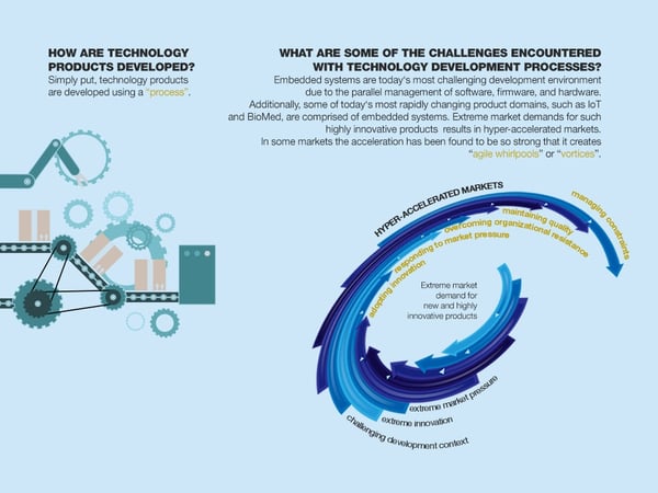
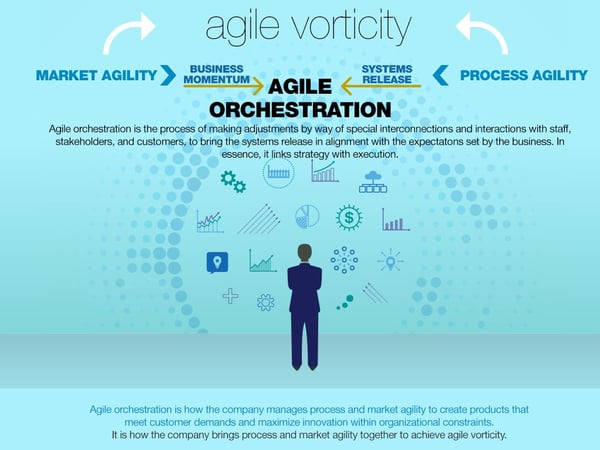
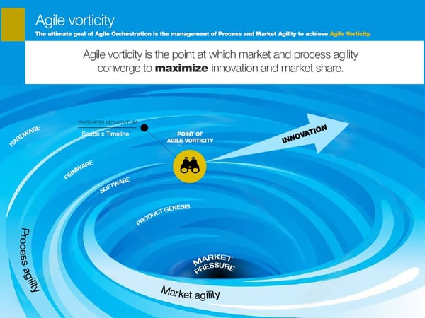
One question that many agilists and project managers struggle with is “how agile are we?” In fact, the search for the answer to measuring agility itself has been the holy grail of agilists everywhere. Agile vorticity is a new measure that does just that. Based on over 10 years of case study research, agile vorticity was developed through a sophisticated qualitative method called grounded theory.
Using a comprehensive set of measures, the agility of both the marketplace and organizational process can be measured against each other to determine their vorticity, or point at which they converge. Zero vorticity means that the agility of the organization is matching up with the market. High vorticity means that the market is moving much faster than your organization or teams, and therefore there’s a lot of work to do. The infographic below demonstrates this relationship using a whirlpool thought experiment to illustrate today’s hyper-accelerated markets.
A work item could be defined as a package of work, usable feature, or as it would be in most agile contexts, a user story. The clock starts ticking on a work item’s age as soon as it is first conceived. Tracking the age of work items, whether they are in progress or sitting in the backlog, can help identify issues with requirements.
If a work item seems to be getting older than its kin because it is being pushed off from one sprint to the next, there could be an issue with decomposition. Maybe it needs to be redefined or better understood? Work items that sit in the backlog for extended periods may need to be culled or redefined.
Continuous backlog grooming is critical to sprint planning and prioritization. A growing number of aging requirements in the backlog could mean trouble with how the requirements are being developed and decomposed. Poor requirements management is one of the primary causes for failure in agile transformations.
Badly written requirements can make prioritization and estimation extremely difficult, resulting in out of control technical debt, low feature utilization, and financial loss. Developing well understood, prioritized, high-value requirements is very much an art form and poorly understood by even the best of agilists. Indeed, it is arguably one of the biggest blockers to agile transformation success.
In this article we’ve established the foundation for agile metrics, the need for a comprehensive solution, and 17 recommendations to build one. Whether you use all of the measurements discussed or only a subset, it is important that any solution consider the audience for the data. Some metrics, such as velocity, are best kept within the scrum teams. Other metrics such as agile vorticity and business momentum are designed for executive or product management respectively.
Always be sure to fully understand and communicate accurately what the metrics are saying, and follow where the data leads. One way to drive and support good metrics is with a robust agile framework.


Running marketing campaigns is the main way that businesses can both communicate with their...
 by Daniella Alscher

Image optimization is an important step to achieving a better ranking, no less important than...
 by Angela Ash

Logo recognition is related to object detection, a computer technology linked to computer...
 by Elena Vinokurtseva