

Ever try describing a color to someone? “It’s kind of like mustard, but warmer? Not quite gold, but not lemon either?”
If you’ve ever had a conversation like that, you already know how impossible it is to get everyone to see the same color in their head. And in design, that kind of miscommunication isn’t just frustrating, it can wreck timelines, budgets, or worse: the final product.
That’s why Pantone exists.
Pantone is a global color standard system that assigns unique codes to specific shades for accurate color reproduction across industries. Designers, printers, and manufacturers use Pantone colors to ensure brand consistency in physical and digital formats through the Pantone Matching System (PMS).
Before Pantone, each printing company had its own color guide, and colors were printed differently based on how each ink company interpreted them, rarely matching the designer's intent.
In 1963, Pantone (meaning “all colors,” combining pan and tone) created the first color matching system. Thanks to this system, graphic designers can see exactly what “yellow” would look like on paper and provide the printer with the Pantone number to ensure they get what they want.
Today, Pantone’s color libraries are built directly into most graphic design software, allowing designers to choose Pantone shades digitally and maintain perfect consistency from screen to print.
The Pantone Matching System (PMS) is Pantone’s global framework for taking the guesswork out of color. Instead of vague labels like “sky blue” or “sunset orange,” PMS gives every shade a precise code that assists in color matching and identification. The majority of the colors for graphics are assigned a three or four-digit identification number followed by the letters U, C, or M. These letters represent paper stocks “uncoated”, “coated”, or “matte”, respectively.
With these variations, designers and users can see what their chosen color would look like on each of these different kinds of papers. Some colors don’t look different at all when placed on different kinds of papers, while others look worlds apart from one another. If you’re using a Pantone color, make sure that you specify which version you’d like to be printed by including the appropriate letter.
The system now includes about 9,758 total colors, each created by combining just 13 base pigments in exact formulas.
Source: Pantone
When a company decides on its desired color(s), it can send its logo or asset designs to a printer along with the primary Pantone number to ensure that its materials are printed in the exact color it wants.
Style guides are one of the best ways to ensure that employees in the same company consistently use the same elements throughout their marketing materials and website. Pantone numbers can be included in a brand’s style guide so that employees who want to design additional materials can use the accurate colors to remain consistent with the original designs.
For some companies, color is more than design; it’s brand equity. That’s why many of the world’s most recognizable names have worked directly with Pantone to create or protect their own signature shades.
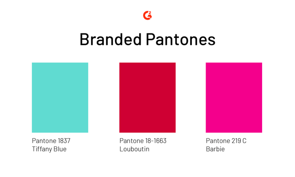
Commissioning a custom shade isn’t cheap, but for these brands, the payoff is substantial: instant recognition, emotional association, and total control over one of the most powerful tools in design — color.
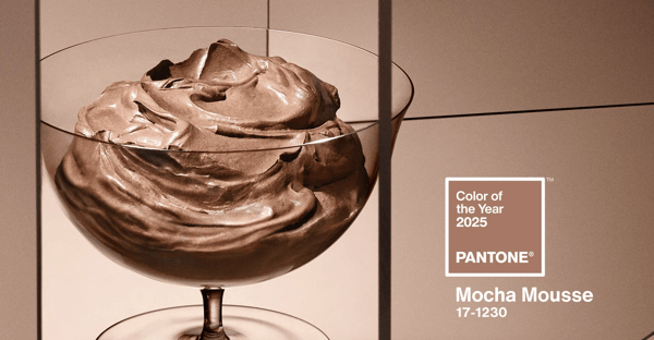
Since 1999, the Pantone Color Institute has picked a Color of the Year, a single shade chosen to reflect the cultural mood and creative direction of the moment. The decision comes from months of trend research across fashion, design, art, tech, and global events.
To see how Pantone captures the spirit of each year, here’s a look at the last three Colors of the Year:
Source: Pantone
Designers don’t just work in one medium. A logo might appear on a glossy brochure, a web banner, and a product box, all using different color systems. That’s where Pantone, CMYK, RGB, and HEX come into play.
CMYK uses four plates (cyan, magenta, yellow, and black) to print out the desired color. CMYK color mode is what traditional, in-home printers use to print a wide range of colors.
However, the desired color has a chance of coming out a little differently each time it prints, depending on the calibration of the printer. For example, the green you intended to print may come up a little lighter than expected on some occasions.
If one copy of a document is being printed, this inconsistency doesn’t make much of a difference. But for a brand printing 10,000 business cards for their employees, “close enough” won’t cut it.
Pantone takes the uncertainty out of the whole process. Pantone doesn’t combine any colors during the printing process; it is the color being used in the process. It’s much purer than CMYK, and the difference is noticeable.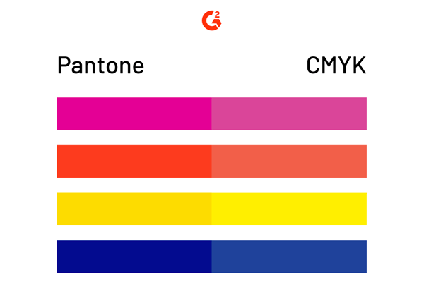
Pantone base inks are carefully mixed first to create the intended color, then put onto one plate to be printed on a special machine that has to be prepped for each job. Calibration no longer becomes a problem because there are no other plates to calibrate with.
Pantone printing is best for large projects with consistent, pure colors while CMYK printing is better for a mixture of different printing jobs.
RGB (red, green, blue) and HEX are digital-only systems, built for screens. Every pixel you see on a website or app is a combination of RGB light values, with HEX being a shorthand code for those numbers.
Here’s the catch: screens aren’t standardized. A red might look slightly warmer on your phone than on your laptop. Pantone helps by offering conversion guides, translating a spot color (say Pantone 186 C) into the closest RGB or HEX equivalent, ensuring digital assets look as close as possible to printed ones.
| System | Best for | How it works | Consistency |
| Pantone (PMS) | Spot printing, branding | Pre-mixed inks | Extremely high |
| CMYK | Multi-color print jobs | 4 inks layered on press | Medium (varies by run) |
| RGB | Digital screens | Light values of red, green, and blue | High (device-dependent) |
| HEX | Web, CSS, HTML | Encoded RGB values | High (device-dependent) |
Use tools like Pantone Connect or Adobe’s libraries to get reliable Pantone to CMYK/RGB/HEX conversions.
Pantone may have started in print, but its influence now extends deep into the digital world. Modern designers rely on Pantone not just to match inks, but to keep brand colors consistent across every touchpoint, from packaging and websites to social media and digital ads.
In digital design, Pantone serves as the anchor, the reference point that ensures on-screen colors match the physical brand palette as closely as possible. Because screens use RGB and HEX, which are light-based systems, Pantone provides official conversions so designers can reproduce print-accurate shades on digital platforms.
Here’s how a typical workflow looks:
And it’s not just graphic designers using it. UI/UX teams, motion designers, and product developers depend on Pantone to keep colors aligned across hardware, packaging, and interfaces.
Pantone isn’t just for print; it influences the colors we wear, the spaces we design, and the products we use every day. Across industries, it provides a universal language that keeps color consistent and emotionally resonant.
In fashion: Designers use Pantone’s Fashion, Home + Interiors (FHI) system to ensure fabrics, dyes, and materials match perfectly across global production. It also drives trend forecasting. When Pantone announces a seasonal palette or the Color of the Year, those hues often appear on runways and in retail collections soon after.
In interiors: Interior designers use Pantone to create cohesive color stories across spaces. Paint brands, furniture makers, and decorators align with Pantone palettes to coordinate wall colors, upholstery, and accents, ensuring that “sage green” or “terracotta” look the same from catalog to living room.
In product design: Manufacturers rely on Pantone to specify exact pigments for plastics, metals, and coatings. Whether it’s a blender in Illuminating Yellow or a phone in Very Peri, Pantone ensures the same hue appears across every production line and every market.
Got more questions? We have the answers.
Yes. Convert Pantone shades into HEX or RGB values for digital use. Tools like Pantone Connect or Adobe’s color libraries generate accurate equivalents so your web colors align closely with printed materials.
Pantone creates a universal reference system that standardizes color reproduction across printing, textiles, plastics, and digital media. Whether you’re matching paint, fabric, or packaging, the Pantone code acts as a single source of truth for color accuracy.
Use Pantone Connect, Adobe Illustrator, or Photoshop. These tools automatically provide the closest digital equivalents for on-screen use. Just remember: perfect one-to-one matches aren’t possible because light and ink behave differently.
Absolutely. Pantone acts as the color baseline for consistent brand identity across packaging, web, and app design. It bridges the gap between physical and digital experiences.
Pantone color books (or swatch guides) give designers and printers a physical reference for how each shade will look when printed. They’re essential for checking vibrancy, contrast, and finish before a project goes into production.
Pantone is more than a color system; it’s a creative equalizer. By giving designers, printers, and manufacturers a shared language, Pantone turned color from a matter of opinion into a measurable standard.
Whether you’re designing packaging for a global brand or building a website for a local startup, Pantone ensures the shade you choose is the shade everyone sees. It bridges the gap between ink and light, between imagination and reality.
From Tiffany Blue to Barbie Pink to the annual Color of the Year, Pantone continues to shape how the world experiences color, one hue at a time.
Ready to bring your colorful ideas to life? Explore the best graphic design software to find the right tools for creating, matching, and managing your brand palette.
This article was originally published in 2019. It has been updated with new information.

Yesterday was sunny and 85 degrees. Today, it’s a cold, windy, and rainy 54 degrees.
 by Daniella Alscher

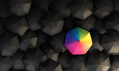
Standing out from the crowd is a great feeling.
by Daniella Alscher

I still remember scrolling through my feed last year and realizing how fast the visual world...
 by Soundarya Jayaraman