February 7, 2023
 by Mara Calvello / February 7, 2023

Gone are the days when companies would push a product to an audience. Now, products are personalized to the needs of users. This practice guarantees that your target customers will love the product you pitch to them. Similarly, building a website on a user-centered design is sure to deliver a superior user experience (UX).
From the color scheme to the design of the logo, a lot goes into designing a website or application. While businesses ensure to work with the best prototyping software or wireframing solutions, they often forget to keep in mind user interactivity. Ultimately, the finished product is for a potential customer. So it’s crucial to consider what your website looks like from their standpoint.
Creating a user-centered design (USD) involves putting users at the center of every phase of the design process. By assessing users’ requirements, objectives, and feedback, businesses create personalized experiences that deliver highly functional products.
When users are involved in the design thinking process, the goal changes from closing sales to adding value to the user experience. Designing a good website or product is not about aesthetics but how functional they are for the end user.
Seeking continuous feedback from users will ensure that your product remains relevant in the long run. Making last-minute changes to your product will cost you far more than making initial changes in your process. And implementing a user-centered design process will ensure you make what your audience wants right from the beginning.
While the user-centered design process depends on your target audience and the industry, some universal principles should be at the core of your strategy.
Exploring new design avenues requires repetition and learning. Don’t be afraid to start over when discovering new things about your target audience. Make sure to focus on iterating your design process to find the best way to create your product.
The entire concept of user-centered design is based on putting the focus of your design on users. So make sure to involve them right from the beginning. Otherwise, you might find yourself on the wrong path much later in the process, and changing things up then might get complicated.
While having a successful product is significant, focusing on your users' pain points is more crucial. Without identifying and fixing their problems, you can't use the user-centered design methodology without identifying and fixing their problems.
Collecting user feedback throughout the product lifecycle will help you create the perfect user-focused product. You can also involve your internal team or UX design service providers for additional input.
There are four elements in the user-centered design framework:
It is good to have innovative features and tools for an attractive website. But the ultimate goal of enforcing user-centered design for your website is to enhance the user experience. By keeping users at the core of your design, you can understand their needs and preferences in terms of using your product.
Today, the average website user is more resourceful than ever, so the demand for user-specific content is highly relevant for growing an audience. Below are some tips for creating a user-centered design for your website.
If you're refreshing your website, use digital analytics software to examine data from different web pages. Which blog post has the highest bounce rate? Which one has the lowest time on site? Think about why the user isn't engaging with your content and how you can improve it.
Maybe your product pages with low-time on-site need enhancing by adding video content. Or perhaps, the menu on the homepage needs reorganizing to suit user preferences. The answer may not be as front and center as you think, but subtle changes can significantly improve user experience.
When designing a website, it's crucial to target the correct demographic. And for that, you need to know your audience better. Try tapping into data like your user's age, gender, race, disabilities, and household income.
Let's break down how you would design based on age. It might feel weird to think of children as website users, but they are. How many children have you seen in restaurants playing on iPads as their parents enjoy a quiet and uninterrupted conversation? So, in such cases, your web user interface should include bright colors and easy-to-understand shapes and sounds. It should also include simple fonts and typography that match your brand.
On the flip side, maybe your audience comprises adults or senior citizens unfamiliar with technology. In this case, go big or go home! Use larger fonts and white space to avoid a web page that is too packed. It is also in the designer's best interest to make the most of images, eliminate the need for reading and improve their browsing experience.
One of the finishing touches of your website design should be adding CTAs. Think of them as the cherry on top of the banana split, i.e., your website.
A suitable CTA can increase your website's click-through rate (CTR) and boost traffic on other pages. For instance, your homepage can include a "Sign Up" button so users can subscribe to your email newsletters. Or a "Read More" button at the end of the featured article to access more content. Or a clickable banner promoting your next event or webinar with details on signing up.
Regardless of what the CTA conveys, remember to consider its placement and number on each page. You don't want to bombard the user with pop-ups unless you want to see your bounce rate skyrocket!
Have you ever gotten direct feedback from your customers regarding your website? You may have heard that content loads too slowly, the page needs to be mobile-friendly, or that the links are hard to differentiate in your content. Whatever the feedback might be, consider that when designing your site and its pages.
YouTube is the perfect example of this. Users streaming videos wanted to scroll through recommended videos and read comments without pausing. YouTube listened and redesigned its page to make it possible. As a result, YouTube is likely to see a boost in the comments posted and the click-through rate on recommended videos.
Since 60.9% of web traffic comes from a mobile device, you must acknowledge how your website looks on a smaller screen. So, when designing your website, consider factors like - is the menu easy to navigate? Are the forms easy to type in? Are the pop-ups easy to close?
A great example of this is the mobile Airbnb site. Like the desktop version, the mobile site is straightforward to use with a clean design.
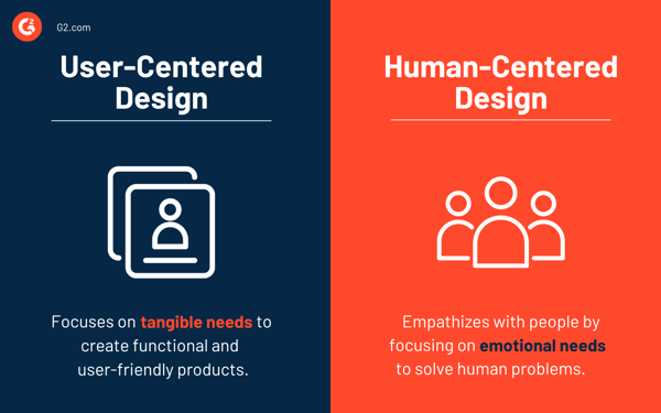
The terms "user" and "human" are often used interchangeably. In the design world, both strategies share some similarities but differ in many other ways.

While both approaches target people, human-centered design (HCD) is a problem-solving approach that empathizes with people to produce innovative solutions. User-centered design is more specific in nature and targets distinct user traits and demographics.
A user-centered design takes individual users into consideration to produce results that are user-friendly and accessible. In contrast, a human-centered design puts humans in focus to yield products that remedy social problems.
Don't focus on finding customers for your products - design products for your customers.
Make users the central focus of your design process to plug the perfect solutions. Once you establish your target audience, creating a website around their needs will be easier. After all, what is your website, and more importantly, your business, without users?
Enhance the people element of your website by learning more about human-centered design and how it impacts the user experience.
This article was originally published in 2019. The content has been updated with new information.
Mara Calvello is a Content and Communications Manager at G2. She received her Bachelor of Arts degree from Elmhurst College (now Elmhurst University). Mara writes content highlighting G2 newsroom events and customer marketing case studies, while also focusing on social media and communications for G2. She previously wrote content to support our G2 Tea newsletter, as well as categories on artificial intelligence, natural language understanding (NLU), AI code generation, synthetic data, and more. In her spare time, she's out exploring with her rescue dog Zeke or enjoying a good book.
One of the most outdated phrases in the professional lexicon is, “It’s not personal, it’s...
 by Harper Lieblich
When you visit a website, what’s the first thing you notice?
 by Mara Calvello
One of the most outdated phrases in the professional lexicon is, “It’s not personal, it’s...
 by Harper Lieblich


