February 27, 2019
 by Matt Warren / February 27, 2019

Transactional emails are much more than simple thank you messages and order confirmations.
Each one sent is an opportunity to build loyalty and garner more sales. But doing them right isn’t as simple as it might seem.
A transactional email, also known as a ‘triggered’ email, is an email that’s sent to a user after a certain action has been triggered.
For example, when a user purchases something online, they’ll receive an email containing a confirmation that their order has been received via a transactional email software integrated into an application.
The purpose of a transactional email is to reassure the customer that the action they’ve taken has been successful. Not sending transactional emails will leave your customers confused, getting in touch with support to answer questions left by the lack of communication.
Customers expect to receive these emails and will open them more than any other kind of email. In fact, transactional emails have eight times more opens and clicks than any other kind of email and can generate six times more revenue.
So, it’s essential to your business strategy that you’re utilizing these to their full potential.
There are a lot of transactional emails you can send to customers, but these are the six that you should perfect:
The order confirmation email confirms a customer’s recent purchase. Buyers often anticipate receiving these, as they reassure buyers that you’ve received their order.
These are the most successful kind of transactional email.
According to Chamaileon, they have:
Confirmation emails should be sent out as soon as the order is received. They should include an order number, a summary of the purchase amount, any available tracking information, and customer service details.
Other things to include are:
This confirmation email from ASOS is a good example of how to summarize all the important information:
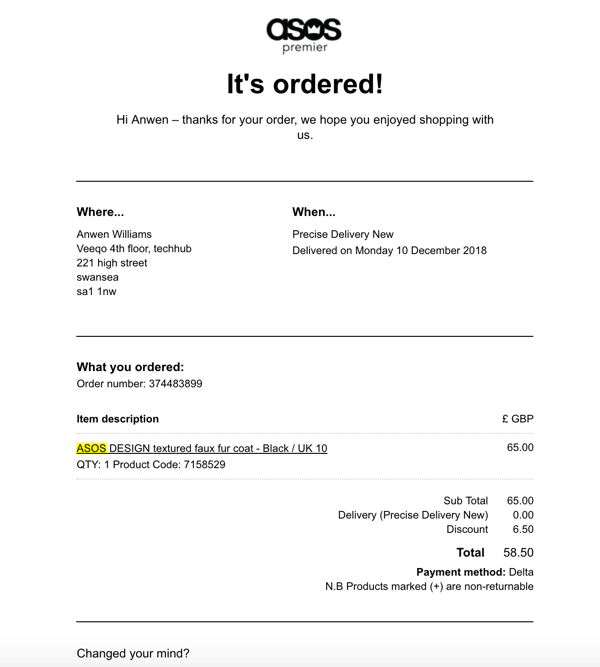
From a quick glance, the reader knows the order has been successful, where the order is going to be delivered, when they’re going to receive it, a breakdown of the items ordered, and how it was paid for.
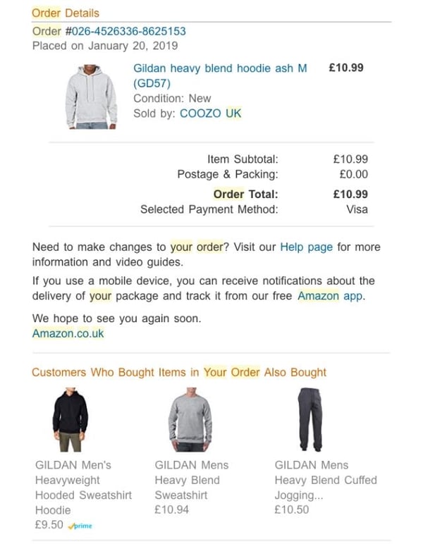
You can even encourage an impulse purchase by up-selling a couple other products to the customer – showing some other frequently purchased items like Amazon does below:
The account confirmation email is an important email that sets the tone for the customer's entire lifecycle.
Sending the first email is an opportunity to make a good first impression, get the customer feeling enthusiastic about your brand, and highlight the steps the customer should take next.
This email should be sent immediately after sign up, giving clear next steps and showing them what they can expect from you.
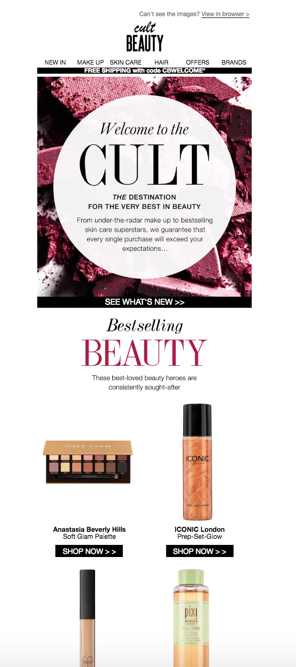
Cult Beauty uses the welcome email to tempt the customer into a purchase in two ways.
First, it provides a code for free shipping on the consumers first visit, followed by a summary of the brand's best selling products - making the next steps easy for the customer:
Everyone likes to receive a notification when their item has been shipped.
This email is a great opportunity to:
Make sure the first thing the customer sees is relevant information about their shipment. Hold off on diving into a sales pitch early on in the email. Customers become quickly frustrated if they can’t easily track their package.
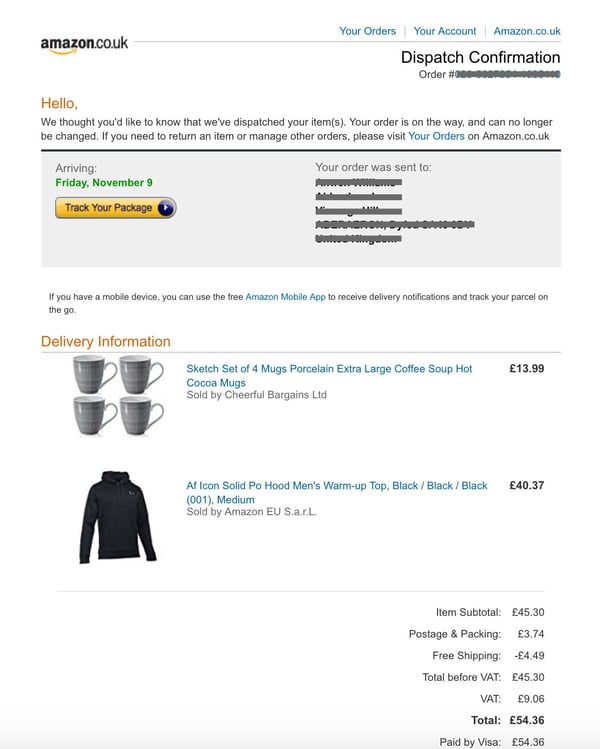
This Amazon email contains all the relevant information a customer wants to see – with quick links to their account and orders, and a clear option to track the shipment:
A separate confirmation of delivery is also a strong way to further establish trust.
Make sure to:
A customer feedback email is a solid way to show your subscribers that you care about their opinions and showcase it as a public product review.
These emails must provide an effortless process for the readers, setting out clear instructions and a very clear call-to-action (CTA) button.
Make sure you provide sufficient context about the kind of feedback you’re looking for – especially if it has been a while since the customer has made the purchase.
Some information to add in:
This email from Missguided is a perfect example:
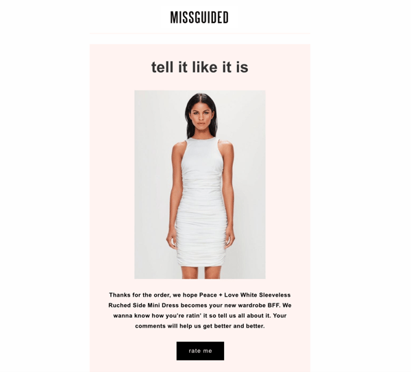 It includes a large image of the item purchased and clearly asks for a review.
There’s also only one CTA button on the page, so there's no confusion regarding the purpose of the email.
People start things and get distracted. So, it’s guaranteed you’ll get some people who add items to their carts and then abandoning their purchases.
Setting up automatic abandoned cart emails is a great way to pull these people back to your site to complete their orders. Plus, these emails have a typical open rate of 44 percent.
Emails should state your intention clearly. For example, telling the customer to “check out now” or “complete your order.”
Consider:
MAC Cosmetics send reminders of products that fall to shopping cart abandonment. Highlighting free delivery as an incentive to complete your order, as well as offering live chat.
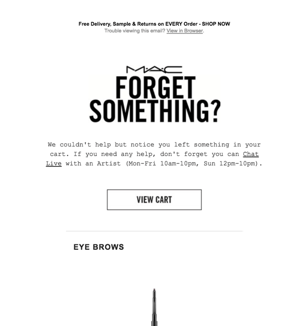
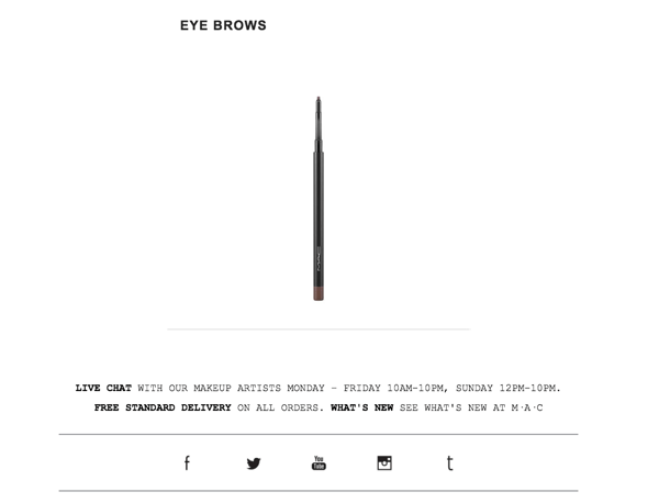
It then goes on to highlight the items left behind with clear, quality images:
The password reset email is sent to users as a result of a user requesting a new password.
These emails are an opportunity to be helpful and informative, taking customers through the next steps. Reset emails need to be timely – when customers reset their passwords, they want their new ones there and then.
This email from Booking.com is straight to the point, and it is very clear about the next steps that need to be taken:
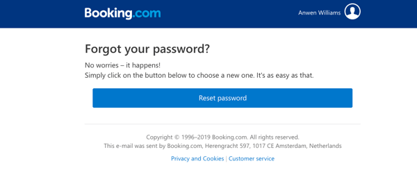
The CTA button stands out, and there is a link to customer service beneath if needed.
Transactional emails will vary from brand to brand, but below are seven best practices to include when utilizing transactional emails for your company.
Getting the timing right when sending a transactional email will significantly increase the chances of it being opened and read.
Sending an email too soon can seem pushy and be unappreciated, and sending too late after the triggered action can risk losing your customers' interest completely.
Emails like password reset, double opt-in, and order confirmation should be sent immediately. Shipping and delivery updates should be sent as soon as possible, and the general rule for the abandoned cart is within 24 hours of abandonment.
Simple and direct email subject lines trump fun and quirky when it comes to transactional emails. Adding a little personality to a subject is fine – so long as it doesn’t take away from the clarity of the email content.
Finding a balance when constructing the subject line is key. On the one hand, you want to clearly communicate the content of the email. On the other hand, you want to hold enough back so the receiver still needs to open the email to find what they’re looking for.
Return Path found that 61-to-70 characters work best, while Campaign Monitor stated that a personalized subject line is 26 percent more likely to be opened. It’s also worth noting that 56 percent of brands that used emojis in the subject line had a higher unique open rate than those without.
Your business is run by real people, so your emails should come from real people too.
Avoid robotic, auto-generated emails totally devoid of personality. Always make sure replies go to a real inbox that’s regularly checked.
Sending an email from a no-reply email is the fastest way to give your customers the impression that you don’t want to hear from them. Plus, allowing customers to respond will reduce the chances of any future emails going to spam due to increased rate of engagement.
Personalizing the body copy in emails can increase the click-through-rate by as much as 14 percent.
As little as addressing the customer by their first name gives the email a friendly feel. If you have extra data on the customer (like their time zone), you can tweak the time stamps to better tailor the email to them.
With more information and a better understanding of your customers, you can create smarter and more helpful emails.
For transactional emails that have more room to play around with, you can include customized content in your users emails. For example, blog content aimed at ways to use a product a consumer recently purchased or including an invite to jump on a call if they recently downloaded information about your software.
Transactional email design is said to be one of the most overlooked aspects of email, says email marketing statistics.
Transactional email copy should be clear and easy-to-read, and tailoring the design can help this.
To help design your emails to aid this, you should:
Transactional emails are known to perform far better than marketing emails, which is why it can be tempting to include promotional content in your transactional emails.
By rule, promotional content should be kept to a maximum of 20 percent of the email content - some transactional emails you can get away with this better than others.
Including promotional content in customer feedback or password resets is obviously a no-go. But shipping or order emails leave more room to play with.
For example, Amazon include a ‘customers also bought’ section at the bottom of the dispatch confirmation. But Dollar Shave Club does a better job of cross-selling products before the original item is shipped – making it easier for the customer to add in more.
The kind of promotional content you include in each email should also be thoughtfully placed. Discount codes and free shipping in order confirmation emails is probably not a good idea - why include free shipping when the customer has just paid for shipping?
Most emails are opened on a mobile device – 68 percent, in fact – while 73 percent of customers move across multiple channels during their shopping journey. So, making sure your emails are optimized for both desktop and mobile is essential.
Most email marketing software can help by offering mobile-friendly templates – but if you’re building emails yourself, make sure you test these thoroughly (not just by sending them to yourself).
Make emails more mobile-friendly by:
Transactional emails are arguably the most important emails to get right in your e-commerce email marketing strategy.
You’re establishing and nurturing relationships with current customers and people very close to becoming customers. In both cases, you have to ensure you're seizing the opportunity to increase traffic and revenue.
Make sure to nail these basics while always A/B testing to find the best fit for your business. Do this, and you’ll soon reap the rewards.
Matt Warren is the Founder & CEO of Veeqo – a platform that handles inventory, orders, and shipping for omnichannel retail brands, allowing them to grow quickly while guaranteeing customers the epic experience they deserve.
Let's start off with a fun fact.
 by Fara Rosenzweig
You don’t need me to tell you mobile phones are everywhere. You may be reading this on your...
 by Lauren Fram
Text marketing campaigns are a great tool for businesses as they seek to connect with their...
 by Matt Baglia
Let's start off with a fun fact.
 by Fara Rosenzweig
You don’t need me to tell you mobile phones are everywhere. You may be reading this on your...
 by Lauren Fram


