CSS animations are a great tool for adding interactions or layering content on a web page, but not understanding the rendering pipeline of browsers can lead to creating jittery animations that end up doing more harm than good for your page’s user experience.
The rendering pipeline can generally be broken up into a couple of steps. The first step is scripting, this is where your JavaScript is executed and any changes to the DOM will be made. The next step is styling, where CSS rules will be applied to elements based on stylesheets loaded on the page and the rules of specificity. After styling the layout is calculated and generated, this involves calculating the sizes and spacing between elements. Painting occurs after the layout is calculated and pixels are arranged and colored in to set up what the end user will be seeing on their screen. The final step is compositing, the elements on a page can be seen as layers stacked on top of each other, so the browser calculates what order these layers should be in in order to display the final page to the user.
Knowing the pipeline becomes important in creating animations because parts of the pipeline are dependent on each other, and affecting one step will cause subsequent processes to be rerun again. More specifically, changing the layout will require the paint and compositing steps to be run again, and repainting an element or page will require compositing afterwards. The only step in the pipeline that doesn’t generate any further downstream processes is compositing. This means that if you want your animation to be smooth as possible, your animation should only be targeting the final compositing stage of the pipeline to prevent additional dependencies in the pipeline from having to rerun.
When trying to strictly work in the compositing realm transform and opacity will be your best friends. Transform is a great replacement for CSS that utilizes positional attributes or size attributes such as left, right, top, bottom, width, height, etc. When shifting an element’s position you are potentially forcing the browser to recalculate the layout, and you can imagine during an animation where these attributes are continuously changing over the duration of the animation this can lead to frames taking longer to calculate. By using transform and opacity you’re able to work in the realm of layers and simply manipulate the ordering or position of layers on top of each other and prevent the browser from having to recalculate any layouts.
Current browser tools provide a lot of power and insight into how your page is being rendered. For example you can take a look at this codepen - https://codepen.io/iamklin/pen/oNNNXBR. When you click ‘Go’ and watch the images of cars move towards the bottom of the screen it may seem smooth and that the animation is fine the way it is but the browser can help to bring up any inefficiencies. In Firefox bring up the developer toolbar and click on the ‘Performance’ tab.

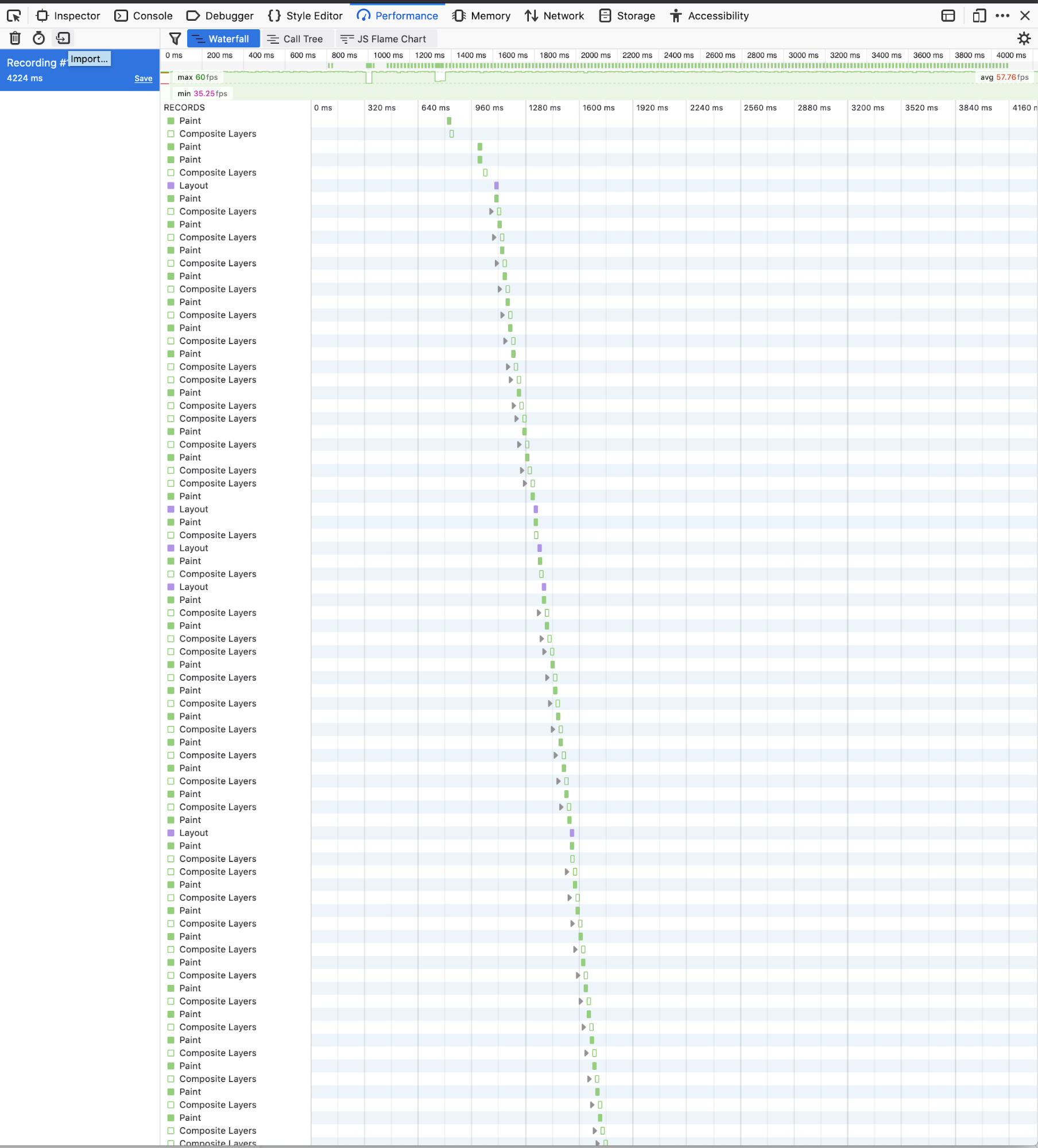
Refresh the page, click ‘Start Recording Performance’, and click the ‘Go’ button once more. You should now see a waterfall chart of the various processes that took place in the browser while you were recording. Scrolling through this list you can see that there are many `Layout` events followed by ‘Paint’ and ‘Composite Layers’ events.

This makes sense since we’re animating with `margin-top` which will cause the browser to recalculate the layout of the page as the margin of the cars change. What if instead we were to animate using `transform` instead and attempt to isolate our impact on the rendering pipeline?
This codepen contains the same scenario, but with the cars animated using `transform` instead - https://codepen.io/iamklin/full/zYYYGEM. Go through the steps from above with this new code.
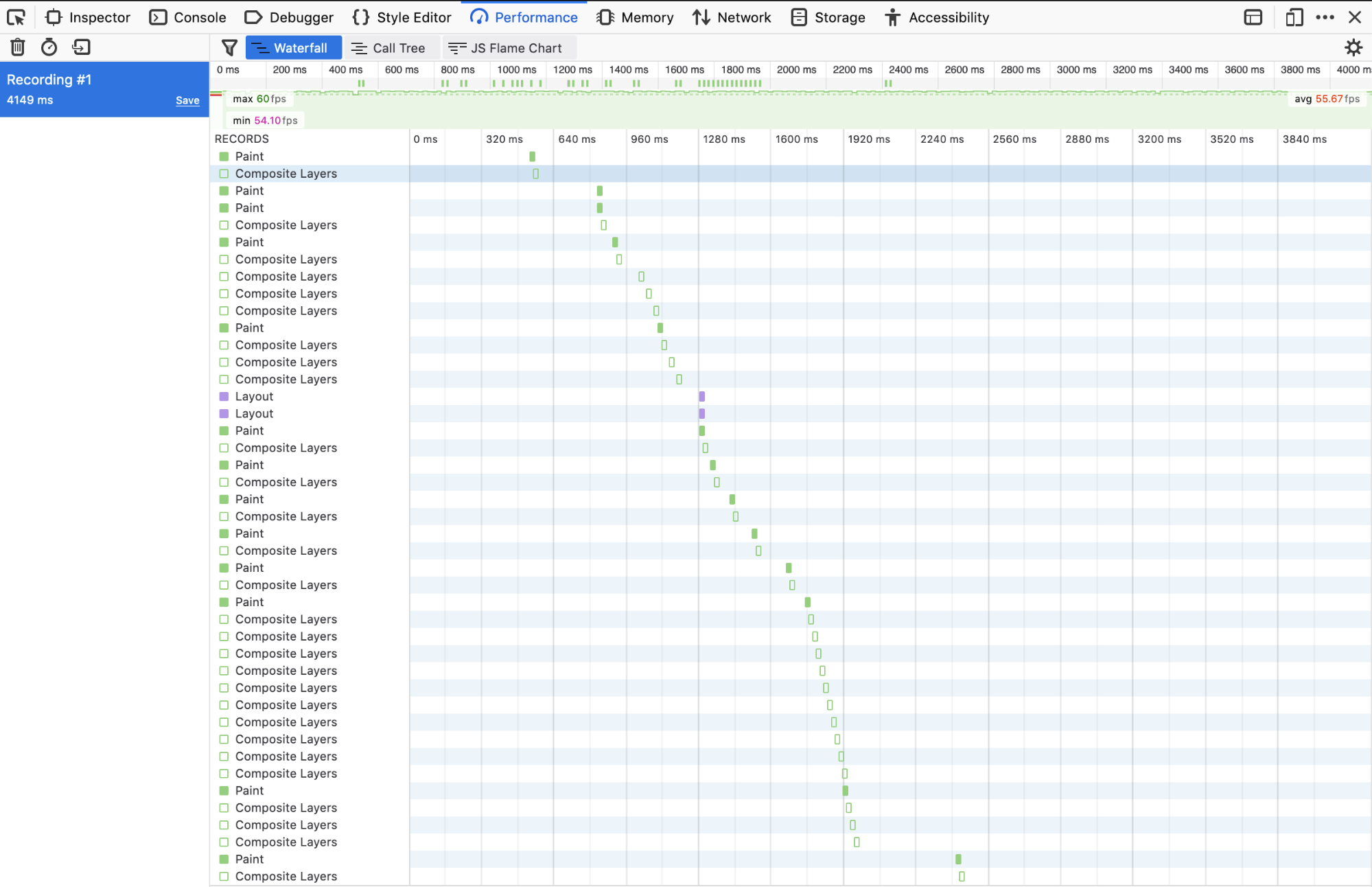
You should see in the new waterfall chart that there are significantly less `Layout` events now, and thus fewer `Paint` and `Composite Layer` events.

This example shows how much we can reduce the work of the browser by just changing a few CSS properties we are animating against, and making small tweaks like this across a web application can significantly improve the user experience as a user interacts with your site.
A lot of the time when we style our web pages, we reach for what will get the job done quickest and think that if it looks good then the code is good. However this type of thinking can lead to a finished product that could create poor user experiences and counter balance any optimizations you may have made in other areas of the page. You may be able to load the page quickly from the server, but if chains of expensive CSS rules or a length rendering pipeline are present on the page, the user will still have to end up waiting for the page to fully render. I hope that knowing a little bit more about how styles and rendering are done in browsers will help you to conduct more performance checks on your web pages and know what to look for and why it’s happening.
.png) by Kevin Indig
by Kevin Indig
.png) by Kevin Indig
by Kevin Indig
.png) by Kevin Indig
by Kevin Indig