If you’re someone like me, you enjoy mixing things up every now and then.
For example, when I first started at G2, I stuck with the conventional seating option of a charcoal-colored office chair made out of tightly-wounded mesh.
About a month in, I switched over to a more modern seating option – a three-legged orange stability ball made out of softer mesh.
The theme here is having the liberty to explore new options when you’ve outgrown your current one.
Slack, one of today’s most commonly used team collaboration software, has given the same liberties to its 8 million-plus business users. Slack allows its users to completely customize the aesthetics of their workspace however they choose.
| TIP: Connect with people outside your business by joining these public slack communities. |
Slack Themes
To begin customizing the design theme of your workspace, you’ll need to navigate over to the left-hand dashboard where your channels and direct messages are located.
How do I personalize Slack?
You can easily personalize your Slack themes by going to the preferences tab of a given workspace and selecting sidebar. There, you can choose from a series of pre-selected themes or enter a custom hex value.
The top of this dashboard will have both your workspace name and your Slack username. Click in the general area and a drop-down menu should appear, find the option “Preferences.”
The Preferences menu has many different tabs, ranging from notification settings to accessibility options. Our focus is on the “Sidebar” tab.
Scroll down until you’ve reached the themes for your Slack workspace.
For those who are relatively new to Slack or have never tinkered with the preferences, I’m guessing your first reaction is “Wow, I wasn’t even aware this was here.” Look no further, endless design themes await you.
Pre-designed themes
Slack has six pre-designed workspace themes for you to choose from:
- Aubergine – This is the default theme you’ve been using since first joining Slack. Fun fact: Aubergine is the color of an eggplant.
- Hoth – For the Star Wars fans out there, this all-white design theme represents the icy planet seen in The Empire Strikes Back.
- Monument – This design theme came to Slack in 2014, and features a sharp contrast of turquoise and light orange.
- Choco Mint – You can probably guess which theme Slack was going for with this one. Mint green and chocolate brown.
- Ochin – Some consider Ochin to be Slack’s dark mode for those who enjoy working with the lights off.
- Work Hard – Similar to Choco Mint, however, the brown is swapped for charcoal and the mint is swapped for a yellowish-orange.
Colorblind themes
In 2015, Slack quickly realized that some of its everyday users may be colorblind and have difficulty with the default themes. So, along with the six designs we see above, Slack also introduced sidebar themes for all types of colorblindness.
- Protanopia and Deuteranopia – This Slack theme accommodates users with reduced sensitivity to red and green hues. These are the most common types of colorblindness.
- Tritanopia – This Slack theme accommodates users with reduced sensitivity to blue and yellow hues. This is the rarest type of colorblindness.

Custom Slack Themes
For users who don’t want to be confined to any of the pre-designed themes, Slack introduced the option to fully customize your workspace.
There are eight components of the left-side dashboard you can customize:
- Column BG – This is the main background color of the sidebar.
- Menu Hover BG – This color will only show when hovering over your Slack workspace name at the very top of the sidebar.
- Active Item – Whichever channel or direct message is clicked on will show this color.
- Active Item Text – The text color of the active item.
- Hover Item – When hovering over a channel or direct message instead of clicking it, this color will show.
- Text Color – The main text color of your Slack workspace.
- Active Presence – This is the colored dot directly left of someone’s Slack username, notifying the workspace if they’re active or not.
- Mention Badge – For every channel or direct message notification, this is the color that will appear in the sidebar.
To change the color of any of the eight sidebar components, you have two options.
The first option is to enter the hex color code. This code is a hashtag # followed by six numbers and/or letters. Since there are just over 16 million different hex color code possibilities, you might want to consider the second option.
Instead of memorizing a hex color code, Slack allows users to simply click on the color box and select a color via drop-down menu. It looks something like this:
Custom codes
There is one final option for customizing your Slack workspace. At the very bottom of the sidebar options, you can copy and paste in color values to change workspace themes immediately.
I asked a few teammates at G2 Crowd what some of their favorite designs were from this custom theme website. Here’s what they had to say:
Holly Hunt, Content Marketing
“Okay, I have two. Kawaii, not sure I would like it (would have to give it a try for a few minutes) but I find the white background intriguing and the soft pink highlighting relaxing and a bit fun.
Then there’s Drund. I like how the colors pop on the dark background and the highlighting and number notifications are sharply contrasting colors.”
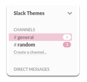 For Kawaii, copy and paste this series of hex color codes into the text field: #FBFBFB,#FBFBFB,#F9C6D6,#5D5759,#8EEADB,#5D5759,#F0A2B8,#F0A2B8
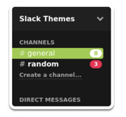 For Drund, copy and paste this series of hex color codes into the text field: #181818,#202020,#99CB3F,#FFFFFF,#202020,#FFFFFF,#99CB3F,#F7124E
Kristen McCabe, Content Marketing
“As a lover of pink and all things with bright, happy colors I was so excited to discover how many colors and themes are available on Slack. It was a tough choice; some of the thumbnails I loved but they turned out to be too bright (even for me!) when previewing the colors.
KKBOX was a top choice for the fun contrasting colors that didn’t hurt my eyes. In the end, I went with Slack.com; I like how the notification number is a different color, helping me recognize new messages and mentions right away.”
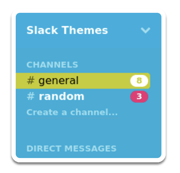 For KKBOX, copy and paste this series of hex color codes into the text field: #00AED8,#00AEDF,#C5CC13,#000000,#FBB040,#FFFFFF,#2DEBAE,#EE2B74
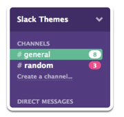 For Slack.com, copy and paste this series of hex color codes into the text field: #573D82,#453068,#3FBA91,#FFFFFF,#453068,#FFFFFF,#3FBA91,#FF3E88
Jordan Wahl, Content Marketing
“I want to say Big Red because ‘Go Badgers’ (Jordan is a Wisconsin Badgers football fan), but WillowTree - Dark is my favorite!”
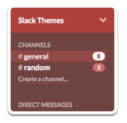 For Big Red, copy and paste this series of hex color codes into the text field: #754242,#BD3737,#9C4444,#FFFFFF,#434745,#FFFFFF,#99D04A,#DB6668
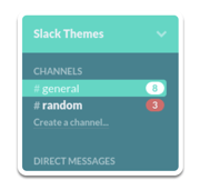 For WillowTree - Dark, copy and paste this series of hex color codes into the text field: #308390,#1BD9C4,#1BD9C4,#FFFFFF,#40C1BB,#f0f0f4,#1bd9c4,#DB6668
|
TIP: Receive timely alerts on subscription price increases, unused products, duplicate charges, contract renewals, vendor security breaches, and more directly from Slack when you're a G2 Track user.

|
A Slack theme for everyone
Whether it’s a theme to match your mood, a theme to ease up on your eyes during late-night work sessions, or a theme you simply think looks cool, there’s a Slack workspace theme for everyone.
Feel free to explore as many color combinations as possible to find the workspace theme that best suits you!
Ready to learn more about Slack? Check out the top free Slack apps to make your work life easier and more efficient.
 by Devin Pickell
 by Ugi Djuric
 by Joydeep Sen Sarma