We have entered an era where the visual internet is no longer what it used to be.
The once-revolutionary H1, H2, paragraph text, and one single image placed to visualize your story, is now a saturated format. We now want responsive storytelling with full-size photographs, parallax scrolling, and maybe a few data-heavy animations to top it all off.
Not only do we want to be convinced by the words of the stories we are told, but we also want them to be brought to us in the most interactive, exciting ways. Naturally, publishers and brands are experimenting with formats to engage their audiences.
Good visualization should be sound, meaning the design should be appropriate for the information it describes. It should be useful, enabling the viewer to derive meaning from it – and it should have an aesthetic appeal that attracts the viewer’s attention and provides a pleasing visual experience.
Visual storytelling is not a new concept. In fact, it has been around since people took pigment to stone and drafted stories on cave walls. However, scrolling stories, visual storytelling in its modern, scrolling form, has most definitely advanced due to factors such as technology and visual storytelling tools.
By definition, visual storytelling is the use of images, videos, infographics, presentations, and other visual elements, to craft a story. It is a way to draw attention to content in the age of infobesity.
What is scrollytelling?
Scrollytelling, a term that combines ‘scrolling’ and ‘storytelling’, is a way to dynamically tell multimedia stories that unfold as you scroll. It's a good way to engage and actively keep your audience in touch with the story being consumed.
Scrolling gives the reader a sense of control, exploration, and discoverability. The scrollytelling format is often, but not limited to, used by commercial departments and content studios for branded content, long-read editorials, native advertising, content marketing, brands conveying their message through storytelling, and even in reports.
Typically, creating a scrollytelling format is done using a landing page builder. These tools can build web pages designed to drive visitors to a specific conversion goal and can make the scrollytelling design come to life.
Research by Microsoft suggests that scrolling has become a pervasive and powerful technique used in data-driven storytelling. The most innovative stories out there employ scrolling in creative ways, and advancements in web-based visualization technology continues to cultivate this dynamic, online scrollytelling format.
Scrollytelling examples
There are many innovative scrollytelling examples on the web, some more memorable than others. One of my first memorable encounters with published scrollytelling was The Wall Street Journal’s Cocainenomics, a highly interactive advertisement for the Netflix series Narcos, which outlined the story behind the Medellín cartel.
Fast Company said it featured all the reporting, graphics, photos, and videos you would expect from an elaborate interactive piece calling it "pretty damn interesting editorial snack".
Another great example of Scrollytelling users may be familiar with is featured on the Apple Watch Ultra landing page. On this website, each section has plenty of motion with visualizations of how the watch was made, interactive diagrams, and animations to see the design from all sides. Readers interested in the Apple Watch Ultra aren't overloaded with product specs, but each detail is highlighted with concise verbiage.

Source: Apple
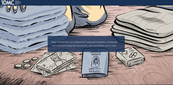
The Internal Displacement Monitoring Center put the storytelling in scrollytelling with their piece titled The Road Was Long: A Voice From Ukraine. Here, a woman named Kristina shares her story about being displaced from Kharkiv, a city in eastern Ukraine, to Lviv, a city in western Ukraine. As readers scroll, new illustrations appear with haunting quotes from Kristina and her husband throughout their experience in the war.

Source: IDMC
An interview with a Scrollytelling expert
So what does it mean to digital production teams when there is rapid development in concepts like Scrollytelling, technological advancements, and a higher level of interactivity expected from the viewer?
To gain an even deeper understanding, I asked Nelly Gocheva, Global Editorial Director of T Brand Studio International, an industry pioneer who has won many awards for their Scrollytelling efforts, a few questions about what Scrollytelling has meant for their digital production team.
Q: What has the emergence of ‘Scrollytelling’ meant for the digital content team at T-Brand Studio?
A: We’ve been using the format since the early days of T Brand Studio, as by the time we launched, The New York Times’s newsroom was already quite used to 'scrollytelling'. It can facilitate the page navigation and simplify the user experience without compromising the interactivity of the creative and overall engagement.
It’s especially helpful with long-form articles or generally builts where you need continuous scrolling. This is where different scrollytelling techniques come handy – for example it can activate an animation, automatically play a video, or can move the reader through different steps or segments of a data viz.
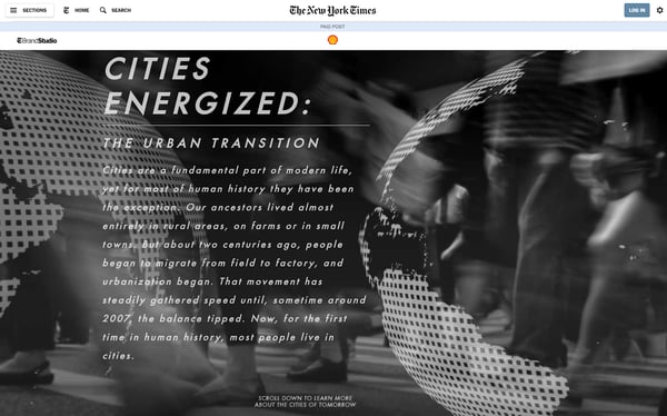
Below is a favorite early example of 'scrollytelling' where the scroll is incorporated in the continuous transition of the content and specifically data.

Q: What changes have you noticed in the skillset of digital producers since the Scrollytelling format has become a high-drive business model? What talent and resources should one look for in order to deliver high-quality Scrollytelling?
A: I think the design and development should go hand-in-hand from the very beginning of the ideation process, as they can’t function separately. Therefore, to me, it’s crucial to work with a designer or creative lead who is aware of the possibilities (and restrictions) of dev and execution and respectively, you need a developer with design sensibilities.
At the end of the day, you want to ensure a seamless user experience with a sleek design and this can’t just happen in silos.
Q: The information age has fundamentally changed how we consume content. What advice would you give to new and up and coming 'scrollytellers' and digital content teams? Is more interactivity always better, or 'less is more'?
A: I’d say the level of interactivity – or the complexity of it – depends on multiple factors. For example, are you creating a mobile-first experience, or are we talking desktop – as people interact with content differently on different platforms and devices.
But at the core of it all is the story you’d like to tell, what is your content strategy, target audience etc... And from here, you can decide on the creative execution, formats and level of interactivity, if any. I'm a true believer of the good old ‘form follows function’.
Design and development, a love story
Scrollytelling can be a mighty visual storytelling tool if done right. As this format is becoming more omnipresent, technology and digital content teams have to adapt. The best examples of scrolling stories are crafted through collaboration between content creators, designers, and developers.
The perfect match is where design and development intertwine. With the right team, resources, and technology, scrollytelling could be a scalable, exciting affair. There's no doubt: with the endless effects and creative outlet a scrollytelling format can offer, it can be sound, useful, and beautiful to its many stakeholders.
If you're interested in experimenting with such high-level means of digital production, you need to start with the proper web design software. Find the right one for your needs and waste no time getting started.
This article was originally published in 2019. It has been updated with new information.
 by Anastasia Masters
 by Devin Pickell
 by Devin Pickell