
As a B2B SaaS buyer, or even just an everyday software user, you've experienced the following points of friction before:
Those thoughts have gone through your users' heads, too. They prevent your users from achieving the desired outcome with your product. If you don’t help your users succeed in the things they set to accomplish, they will soon abandon your app and never use it again.
It sounds drastic, but there are a few simple checks you can have in place to patch the leaky bucket.
Don Norman once said: “Negative affect can make it harder to do even easy tasks: positive affect can make it easier to do difficult tasks." This timeless axiom – as relevant when talking about architecture as it is when talking about SaaS – sums up one of the two main reasons for SaaS churn: friction.
Here's another model from the world of behavioral psychology:
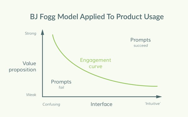
A strong value proposition or an especially intuitive user experience are both forces to reduce friction, but simply assuming you have both in place will result in weaker growth than running product experiments and actively stamping out friction.
In this article, we'll look at these simple checks as product marketing campaigns. This is more of a useful mindset than simply looking at it as a UX change or a problem to fix with your support department because it gets you thinking in terms of selling rather than just educating. Let's get started.
If your app needs a new user to install a snippet, download a mobile app, give permissions, or do anything more than just enter a username and password, then that's more friction than was expected. You can see this pattern at work every day on social networks and on the mobile apps you’ve downloaded. Platforms like Facebook and YouTube bombard you with push notifications, pop-ups, and other requests.
Some unsolicited notifications interrupt the user flow and distract from the core experience of the product:

While other prompts like full-page takeovers and aggressive content blocking alerts force a daunting decision from the user out of nowhere:
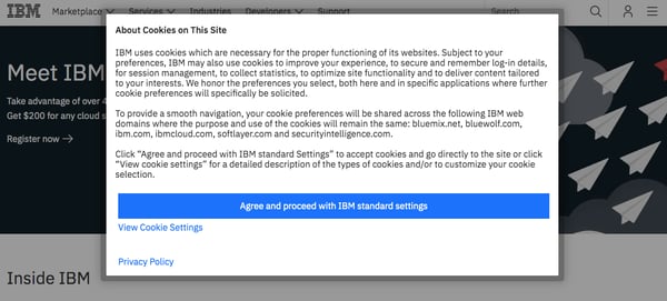
Although the underlying intentions with these messages are good, presenting the user with a wall of text is overwhelming and will cause the user to leave early in the signup process.
In a survey carried out by Clutch, 72% of respondents thought an app onboarding process should take 60 seconds or less. Instead of hitting users with irrelevant permission requests and choices right off the bat, you should focus on building uninterrupted onboarding experiences that help your users achieve the required outcome fast.
Let users ease into your product before asking for anything. Break your onboarding process between the signup and the required user outcome into multiple steps. Identify the steps that are critical for your users to experience value with your product and remove all other steps from the initial onboarding process.
To streamline your onboarding, you can also prime less critical notifications in the background and display these prompts at a later, more relevant time. This advice follows the principle of “just-in-time” for any work needed from the user.
To protect users from the annoying barrage of irrelevant requests, Chrome recently rolled out a quieter UI for notifications that doesn’t get in the way of the user experience.
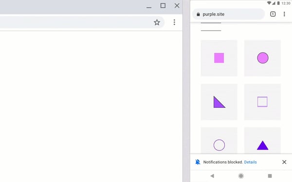
Taking example from Chrome, you can implement subtle UI patterns in your product such as banners, or slideouts that let users continue with their workflow and only take action when ready.
Sometimes friction is a necessary evil; for example, when additional signup steps are critical to a user’s success and must be completed immediately before proceeding with the onboarding. Assuming the friction is unavoidable because the app has certain dependencies or requirements, the next best thing is to manage it.
According to Clutch’s survey, 82% of users want clear reasons behind apps’ information requests.
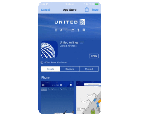
United Airlines' mobile app alienates new users with tons of unnecessary friction by asking for location and push services access without providing even a single peek at the app or any word as to why users would grant permission. With essential information like that missing, most first-time users will likely deny access to the app.
Educating users as to why they need to do something in your product before presenting them with the screen to take action is one of the easiest ways to improve your onboarding flow and build retention within your product. By communicating the benefits that a user will unlock once a feature is activated, you provide a clear reason for the friction and increase the overall perceived value of your product.
In the example below, contact management platform Contacts+ clearly demonstrates the value users get with notifications (first-access to limited promotions, for example.)
Another example of permission priming done excellently is the email app Spark that leverages the common people’s tendency to prefer avoiding losses; in that case, missing important emails.

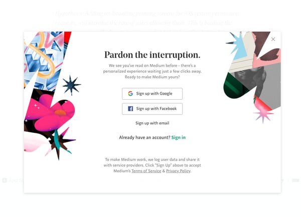
On desktop, Medium focuses on the core value of signing up for their platform by stressing the “personalized experience waiting just a few clicks away.” This call to action is perfectly timed, as they show it only to return-visitors.
Upon first login, most products are boring. Usually, the first thing you see is an empty state where your data will live. Most apps are simply a way for a user to store information, like an Evernote notebook or Trello card. There’s no content specific to you when you enter the product for the first time.
This first-time interaction with a product can prove confusing, especially for a new user. To tackle this challenge, most successful platforms pre-populate the initial state of the app with common, editable examples or offer a library of templates to inspire new users. These examples often leverage best practices and display the range of use cases the platform could solve for the user.
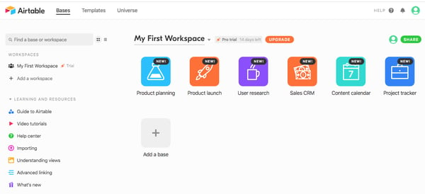
For example, Airtable populates a new user's account with a bunch of helpful bases that demonstrate the whole array of features of the platform, from simple to advanced.
Similarly, resume-building tool Enhancv prompts the user with the option to start with an industry example or import their LinkedIn profile when creating their first resume, ensuring a frictionless onboarding process from start to end.
/Copy%20of%20Draft%20SaaS%20Product%20Marketing%20Campaigns%20that%20Build%20User%20Retention-3.webp?width=600&height=560&name=Copy%20of%20Draft%20SaaS%20Product%20Marketing%20Campaigns%20that%20Build%20User%20Retention-3.webp)
Another effective way to nurture new signups without changing the way your app works or doing a complete overhaul of your UI is to send each new user a sequence of onboarding emails or in-app prompts. The goal of these message is to concisely convey a common usage example with a benefit and best practices that reveal your product’s features.
For example, Typeform sends a beautiful visual email that inspires users to choose from their expanding library of survey templates.

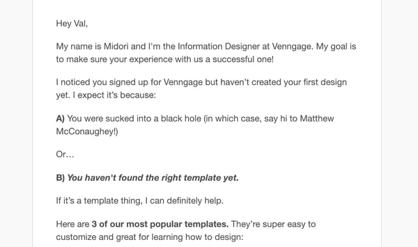
Another great example is from Venngage, who nudge inactive users back to the app by emphasizing the easiest way to get going: choosing one of the three most popular templates.
Your app probably does a lot of things and boasts a broad set of features. Promoting all of the bells and whistles of your product might seem like a good idea at first, but the key to high engagement on these onboarding emails is to trim the messaging and provide a personalized experience instead.
Use progressive segmenting as a part of your in-app signup process to group users by goal, job title, use case, and more. With these data attributes, you can craft targeted email campaigns for each segment and send the most relevant examples and use cases.
As Mike Dunn from Mace & Menter shared, asking your users what they want is the difference between saying ‘here’s everything you can do’ and asking ‘how do you want to use our service?’
Headspace, for example, does an excellent job of building a personalized experience for its users around their main pain:

A key part of reducing your churn is analyzing common reasons users choose competitors over you. It’s sad to see someone go, but it’s critical that you talk to your former customers to collect feedback and gather insights on which competitors your audience is comparing you to and why they prefer their product over yours.
You can automate this process by creating a trial expiration and customer churn questionnaires for the users that fail to convert within the trial window and for customers who cancel their subscriptions, respectively. You can launch an in-app survey to all expired trialists that lists the most common objections and competitors.
Once you gather enough feedback, you want to evaluate if the data is valid or the users have failed to see value in your product.
Outcompeting alternative solutions with feature parity might not be something you can fix quickly without investing significant efforts and resources. However, you can easily improve your churn rate and promote retention within the segment of users that have failed to take advantage of your product.
To do that, you need to show the right value to the right users at the right time. Below we’ll explore each component in more detail.
Right users are the potential users that sales have identified as evaluating competitor X, or (if it's obvious which competitor 80% of users also look at) all users. It’s important to know which users are evaluating which competitor, so you can address the right objections with the right audience.
Next, you want to target these users at the right time, when they’re most likely to read and act upon your messages — at their peak activity. By leveraging customer data and product activity insights, you can send targeted messages inside your app in the form of a modal, tooltip, or chatbot.
Lastly, you need to send the right message. If users are comparing you to a cheaper alternative, there’s no point in mentioning your price as one of your benefits. Even worse, you don’t want to introduce potential customers to a competitor that they’ve never heard about by listing every single alternative. The key is to write messages that address the major concerns of your users and give the users reasons to choose you over the competitor they’re evaluating.
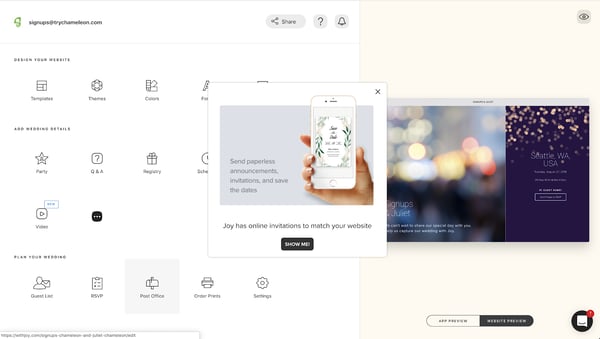
For example, wedding website builder Joy shows an in-app modal to introduce users to one of their competitive selling points straight away – online invitations that match the style of your website.
Building retention within your product is an active and continuous process that requires multiple iterations and a thorough understanding of your customer’s pains. Through the right combination of growth mindset, timing, content, and channels, you can make your users successful and ultimately reduce the churn of your product.
Looking for more inspiration? Check out G2's complete guide to branding to help you grow your user retention over time.
 -->
-->


This is the last of five articles that make up The Newcomer’s Guide to Category Design.
 by John Rougeux

Cost per acquisition is one of the most important marketing metrics you have to take into...
 by Valentin Radu

This is the second of five articles that make up The Newcomer’s Guide to Category Design.
by John Rougeux
/Copy%20of%20Draft%20SaaS%20Product%20Marketing%20Campaigns%20that%20Build%20User%20Retention-4.webp?width=600&height=486&name=Copy%20of%20Draft%20SaaS%20Product%20Marketing%20Campaigns%20that%20Build%20User%20Retention-4.webp)