

You don’t need to be a trained designer to know when something looks off. Maybe the text feels too small, the layout feels crowded, or your eye doesn’t know where to go first. On the other hand, some designs simply work. They’re clear, balanced, and effortless to navigate. That’s not about luck or instinct. It’s the result of applying a few fundamental design principles.
There are seven main design principles: emphasis, balance, contrast, repetition, proportion, movement, and white space. These principles guide the arrangement of elements in a composition to create visual harmony and effective communication.
Whether you're crafting a logo or building a website, these principles are what turn a layout from messy to memorable. And if you’re using any kind of graphic design software, knowing how to apply them will take your work to the next level.
Understanding design starts with knowing the difference between its two core foundations: elements and principles. They work together, but they play very different roles.
The elements of design are the core visual ingredients that make up any composition. Whether you're designing a logo, a poster, or a website, these are the raw materials you shape and combine to bring your ideas to life.
The main elements include:
The principles of design are guidelines for arranging visual elements in a way that feels clear, balanced, and purposeful. They help you decide what should stand out, how to create flow, and how to organize everything so your design makes sense at a glance.
The most widely used principles include:
Mastering these principles enables you to move beyond guesswork, ensuring that every design decision feels intentional. We'll now delve into these elements in detail.
Every design needs a clear starting point, something that draws the eye and signals what matters most. That’s the role of emphasis. It helps create a visual hierarchy by making one element stand out, so viewers aren’t left wondering where to look.
Emphasis is created through contrast, size, placement, or the use of white space. A bold color can make an element pop, a larger scale can signal importance, and empty space around a focal point can make it impossible to miss. The goal isn’t just to make something louder; it’s to direct attention with intention.
But emphasis only works if you use it selectively. Highlighting everything means you highlight nothing. Strong design knows what to feature and what to let fade into the background.
Example: On a landing page, emphasis is often used to draw attention to a call-to-action, such as “Get Started.” It’s placed near the top, styled with a bright color that contrasts with the background, and surrounded by white space, all to ensure your eye is drawn to it first.
Balance is what gives a design its sense of structure and calm. It’s the principle that helps distribute visual weight across a layout so that no part feels too heavy or too empty. A balanced design feels stable and intended, like it won’t tip over if you stare at it too long.
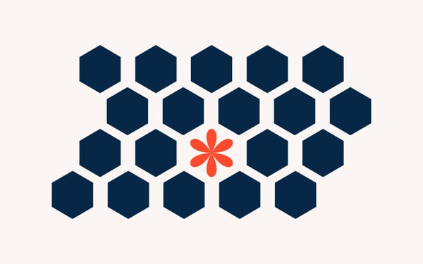
There are a few ways balance can show up. Symmetrical balance is when elements are mirrored on either side of a central line, like a formal invitation or a classical painting. It’s clean, traditional, and safe. Asymmetrical balance, on the other hand, uses different elements on each side, such as a bold image on one side, balanced by several smaller text blocks on the other. It feels more modern and dynamic, but still harmonious. There’s also radial balance, where elements radiate out from a central point, like a flower, a wheel, or a mandala.
Balance doesn’t mean everything needs to be perfectly even. It just means the parts of your design feel like they belong together and that one side isn’t unintentionally overpowering the other.

Example: Imagine a magazine spread with a large photo taking up the left page and several columns of text on the right. Even though the content is different on each side, the design still feels stable. That’s asymmetrical balance, and it works because the elements are thoughtfully sized, spaced, and positioned to hold visual weight evenly.
Contrast is what brings a design to life. It’s the principle that creates the difference between light and dark, large and small, bold and subtle, so that each element stands out and serves a purpose. Without contrast, everything blends together. With it, your design becomes clear, dynamic, and engaging.
Contrast can be created in many ways. The most common is color: black text on a white background is easy to read because the contrast is high. However, contrast also becomes apparent in size, where a large heading paired with small body text creates a clear visual hierarchy. Shape, texture, font style, and spacing can all contribute too. You can contrast a modern sans-serif font with a classic serif to create visual interest, or pair geometric icons with soft, rounded imagery to balance structure and warmth.
Importantly, contrast doesn’t just add style; it improves usability. Strong contrast makes content easier to scan and read, especially for users with visual impairments. It also helps guide the eye, showing users what’s most important at a glance.

Example: Think of a pricing page. The recommended plan is often highlighted with a bold background color, larger pricing text, and a brighter call-to-action button. That contrast in size, color, and emphasis makes it stand out from the other tiers, drawing attention exactly where the designer wants it.
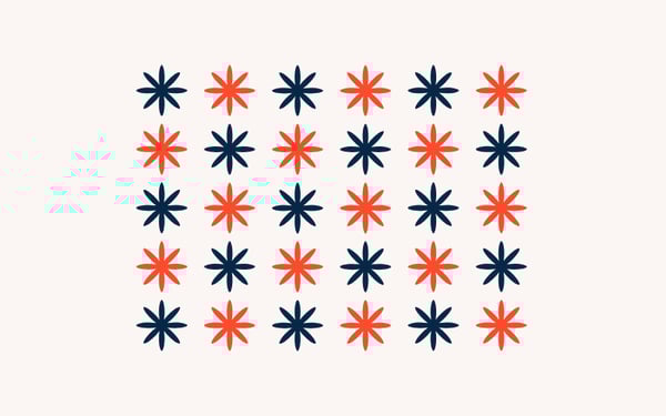
Repetition is what ties a design together. It’s the principle that brings consistency and rhythm to a layout by repeating certain elements, such as colors, fonts, shapes, or patterns, across a project.
When repetition is used well, it creates a sense of cohesion. The viewer knows what to expect and where to look. It’s powerful in multi-page or multi-screen experiences: a website, for instance, might maintain a consistent navigation style, button shape, and color palette throughout, helping users navigate from page to page without confusion.
Repetition doesn’t mean every element has to look exactly the same. It works best when balanced with variation. Think of it like a song, the chorus repeats, but the verses change. The repetition builds structure, and the variation keeps things interesting.
Example: In a brand identity system, repetition shows up in every piece of collateral: the same logo placement, the same font used for headlines, the same icon style across social posts and ads. This repetition builds recognition and trust. The moment someone sees it, they know it's your brand.
Proportion is the principle that helps you decide how big or small each element should be in relation to others. It’s not just about scale, it’s about meaning. Larger elements draw more attention, while smaller ones play supporting roles. When proportion is used well, it creates a clear hierarchy and a sense of order.
In most designs, you’re working with limited space, a screen, a poster, a product label, and every inch matters. Proportion helps you prioritize. Headlines are bigger than body text for a reason. Product images often take up more space than descriptions because they do more heavy lifting. In more complex layouts, such as dashboards or landing pages, proportion helps keep things readable and navigable.
Poor proportion can throw a layout off balance or confuse the viewer about what to focus on. But when everything feels sized with intention, the whole design becomes easier to absorb, even before a single word is read.

Example: On a product detail page, the main image is often the largest item on the screen, followed by the product title, then the description, and finally the fine print. That descending scale isn't random; it reflects what matters most to the user, using proportion to create a visual hierarchy.
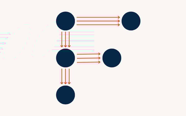
Movement is the principle that controls how a viewer’s eye flows through a design. It’s not about animation or motion, it’s about creating a visual path that leads people from one element to the next, in the order you want them to experience it.
Effective movement helps you tell a story or communicate a message clearly. You can create it through the placement of elements, the use of directional lines, contrast, or even repetition. Designers often rely on natural reading patterns, like the Z-pattern or F-pattern, especially in web and interface design, where users are scanning more than reading.
Movement is essential for usability. Without it, viewers feel stuck or disoriented. With it, you’re giving them momentum and structure, helping them navigate content effortlessly.
Example: On a homepage, a user’s eye might start at the logo, move to the headline, then drop down to supporting text, before landing on the call-to-action button. That sequence isn’t accidental; it’s a carefully designed flow, with size, spacing, and alignment all working together to guide the journey.
White space, also known as negative space, is the empty space around and between elements in a design. It might seem like nothing, but it’s one of the most powerful tools a designer can use. White space gives your content room to breathe, creates focus, and improves readability.
Despite the name, white space doesn’t have to be white. It can be any color, background, or texture, as long as it serves as a visual pause. Designers use it to separate elements, group related content, and prevent clutter. It also plays a key role in building hierarchy: the more space around something, the more important it feels.
Used well, it helps simplify complex layouts and creates a sense of elegance and professionalism. Without enough of it, designs can feel crowded, chaotic, or overwhelming.

Example: Take a minimalist product page from Apple. You’ll see plenty of space around the product image, clean margins around text, and just one bold CTA button. There’s very little on the screen, but because of the white space, every element feels focused and easy to digest.
Absolutely, but only if you know what you’re doing.
The principles of design are tools, not laws. They exist to help you create clarity, structure, and impact. But once you understand how they work, there are moments when breaking them can make a design feel more surprising, emotional, or memorable.
Intentional rule-breaking often appears in high-impact advertising, protest posters, or editorial design, where disruption is part of the message. You might exaggerate the proportion to make something feel overwhelming. You might deliberately ignore balance to create tension. Or you might crowd out white space to amplify a sense of chaos or urgency.
The key is intention. If you break a principle to serve your concept, your audience will feel it. But if it’s just a happy accident, or worse, a mistake, the design will fall apart.
Example: In a poster promoting an art exhibition, the designer might intentionally crowd the headline against the edge of the page, break the grid, or skew the alignment to reflect the experimental tone of the show. It feels a little “off,” but that’s the point. The broken rules match the message.
Below is a quick refresher reference sheet for the principles of design.
| Principle | Purpose | How it's applied | Watch out for |
| Emphasis | Directs attention to what matters most | Scale, color, white space, placement | Emphasizing too many things at once |
| Balance | Distributes visual weight evenly | Symmetry, asymmetry, radial composition | Uneven layouts that feel off or chaotic |
| Contrast | Creates clarity and visual interest | Color, size, typeface, spacing | Low contrast makes content hard to scan or read |
| Repetition | Builds consistency and cohesion | Repeating fonts, colors, icons, or styles | Overuse can make a design feel dull or stiff |
| Proportion | Communicates importance and hierarchy | Larger = more important, smaller = less | Inconsistent scaling weakens the message |
| Movement | Guides the viewer’s eye through the layout | Layout flow, visual paths, Z-patterns | Poor flow confuses or loses the viewer |
| Whitespace | Improves clarity and focus | Padding, margins, breathing room between items | Too little = cluttered; too much = disconnected |
Got more questions? We have the answers.
There’s no single “most important” principle; it depends on the goal of your design. However, emphasis is often key, because if nothing stands out, the message can get lost.
Good UX relies on clarity, flow, and hierarchy, all of which are driven by design principles such as movement, proportion, and white space. They help users find what they need quickly and feel confident interacting with the design.
Start by analyzing existing designs, websites, posters, and packaging, and identify where principles like contrast or balance are used. Then apply those ideas in your own work through small projects or design prompts. You can also explore free tools and beginner-friendly design software on G2 to experiment hands-on.
Absolutely. Many self-taught designers use principles instinctively by studying and practicing. Formal education can help, but consistent application and feedback matter more than credentials.
Hierarchy isn’t a standalone principle in most discussions, but it’s the result of using emphasis, proportion, and contrast together. It’s a key outcome of applying those principles well.
Ask yourself: What draws attention first? Does anything feel off-balance? Is there clarity and focus? Reviewing your work through the lens of each principle is a great way to catch issues and improve your design.
Good design doesn’t happen by chance; it results from intentional decisions. The seven principles of design act as tools for addressing real challenges. Whether you’re aiming to attract attention, simplify information, or build trust, these principles help you achieve it.
When you understand how to use emphasis, balance, contrast, repetition, proportion, movement, and white space, you gain the power to design with purpose. You move from decorating to communicating.
And the best part? You don’t need to be a trained designer to start using them. You just need a sharp eye, some practice, and the right tools.
Ready to put these principles into action? Check out the top graphic design software on G2 to start designing smarter and with more confidence.
This article was originally published in 2019. It has been updated with new information.


May 7th is National Packaging Design Day — mark your calendars!
 by Daniella Alscher
Can taste be taught?
 by Dawson Whitfield

Before fonts, filters, or Figma, there were cave walls. From charcoal sketches deep in...
 by Holly Landis