
/iStock-1074246634.webp?width=2000&height=1333&name=iStock-1074246634.webp "iStock-1074246634")
There are thousands of fonts available for download, but none of them have their serif on the angle that you wish they did.
Why not make your own font?
Designing a unique, personalized font is a great way to make your company stand out from the crowd while giving you additional design experience to add to your skillset on your graphic design resume. You can even sell your custom font online and make a little extra cash.
Writers can get awfully technical when discussing font design online, but if you’re a beginner, that conversation can be overwhelming. Where do you start?
Creating your own font requires patience, originality, consistency, and a purpose.
There are plenty of classes taught at universities or online that can take you through the font design process step-by-step, but if you’re looking for a crash course in font design without getting too technical, class is in session.
Learn the basics
Write up a brief
Know your ABCs
Create a typeface
Prototyping
Presentation graphics
File types
Most normal people don’t just sit down and plays a game of Monopoly without reading the instructions first. You, a normal designer, should do the very least you can to get this right: take the time to learn about typography.
And there’s a lot to learn; typography terms, typography software, and typography trends are just some of the important subjects to get your hands on. These concepts can quickly become complicated, and it’s best to become as familiar with them as possible before beginning your design.
While the research can be time consuming, it pays off. You’ll use the knowledge you gain as you create your first font, along with the ones you create in the future.
Like any design, your font will have a purpose. What is it?
While this question seems abstract, writing a creative brief will help make the answer clear.
Does this font have a personality that matches your brand? Is this font exclusively used or will you sell it online? Will this font work in many environments, or is it meant for something specific? Is it going to be strictly used online or will it be printed?
Answering these questions can help you determine some of the characteristics that your font should have while eliminating any unnecessary attributes that you were initially thinking of including.
For example, if your font is one you’d like to be using for body text online, it should probably be a sans serif font (the best font type for online readability), designed in black, and won’t need to be scaled too largely.
In kindergarten, you learned that there were 26 letters in the alphabet. There are also infinite combinations of the numbers zero through nine, as well as some common punctuation. When you’re designing your font or typeface, don’t leave any of the essentials out.
Some programs provide designers with font templates, which are printable tables that give a space for each character that will be designed. Designers can draft right on these sheets and scan them into a font editing program so that they have a clear reference of what to vectorize.
The word “essentials” may mean something different for you than it does for me. For a native English speaker who is designing a font for English speakers, those 26 letters are the only ones that need to be designed.
But if the audience you’re designing for uses accents, unique punctuation, or only reads Greek, your essentials are going to look different. Make sure that you do some thorough research on the character variations you’ll be designing for your audience so that nothing is neglected or forgotten.
Font design has never been easier! Download these FREE Font Design Templates and get started today.
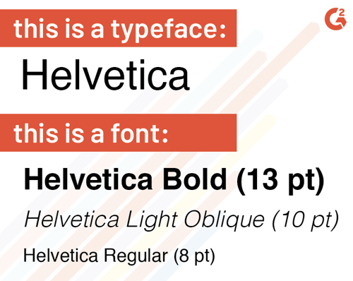
If you’ve made the decision to design a font, why not take things a step further and design a whole typeface? The words typeface and font are often used interchangeably, but there’s a difference.
Essentially, fonts are the different weights, widths, and styles within a typeface.

For example, Helvetica is the typeface made up of fonts like Helvetica Light, Helvetica Bold, Helvetica Italic, and so on, in an infinite amount of sizes.
Designing your own typeface can give you and others who choose to use it a few easy options when it comes time to exercise those font pairing skills.
Once your essential characters are designed, don’t forget that you (and others) will be combining them to make something meaningful. Unite some of the characters you’ve created into words and sentences to make sure that each character flows neatly into the next.
| Some words and phrases to test out: The quick brown fox jumped over the lazy dog Typography Roger, hungry, ate 236 peaches & cantaloupes in 1904! |
Testing your characters out with one another is a great opportunity to pay special attention to the kerning and tracking of your font. Whether you’ve drafted on paper or with font design software, experiment and test out different spacing options until you’re satisfied.
| DEFINITION: Kerning is the amount of space between two characters, independent from any other characters. Tracking is the consistent amount of space amongst all of the characters. |
In kerning and leading, there’s no magic number of points to set between your characters – instead, determine what looks good to you. If the spacing between letters is too tight, it will be difficult to read. If it’s too loose, one word will blend into the next without any clear distinction.
Prototyping can be done on paper or with a font design software of your choice.
If the font you’re designing reflects natural handwriting, it would make the most sense to do it by hand.
Designing a font or typeface on paper allows you to have more control over your lines and curves. Adjustments to glyphs can be made without much of a hassle, and notes can be jotted down as quickly as your mind comes up with a new concept. Designing fonts on paper first allows you to compare and contrast old and new designs in one spot.
Other designers prefer to go digital. Although digitally designing anything offers a little less control, the benefits that come with this route can outweigh the detriments.
For example, different programs provide texture options that you wouldn’t be able to create with normal #2 pencil. Additionally, scaling is much easier to do digitally, and editing and undoing actions is faster (and cleaner) than using a rubber eraser.
FontLab Studio is a font editing tool with separate applications for both Windows and Mac. It’s been used by some of the major font foundries in the world, allowing for both the creation and modification of fonts and typefaces.
Glyphs is a Mac-only font design software. The program provides tools specific to font and typeface design and boasts the title of number one choice for multilingual font development. The website provides online courses and quick tutorials to make font creation as simple as possible.
FontBase is a free font management app for Windows, Mac, and Linux. Designed for designers, by designers, FontBase has an interface that is easy to use and provides designers with features that they didn’t even know they needed.
You’ve spent all of this time on your font (or typeface) and found a final product that you’re happy with. It’s time to flaunt it.
If you’ve designed it for a client, for the world, or even just for yourself (but you want to make your friends a little jealous of your skills), the presentation of your font contributes to the success. Just like wrapping Christmas socks in a gold box with a bow, the presentation of your font can be the icing on the cake and add to the customer experience.
Source: UXfree
Create a graphic backdrop that aligns with the inspiration behind your font and contributes to the overall mood that it gives off. This is a great opportunity to use color psychology to your advantage. Display your font by giving an example of what each letter looks like, or write out the name of the font with the font itself.
If you’re planning on selling this font online, we’re going to have to step away from creativity for a moment and get technical. The more file types you provide a buyer with, the better. There are a couple of popular formats that you can export from your software and upload to the market to make your font accessible.
.TTF stands for True Type Font. These files are developed by Apple but can be used on both Mac and Windows platforms. Fonts downloaded with this file type can be resized without losing quality and look the same on both the screen and on paper once printed. This is the most common font format used by both Windows and Mac platforms.
.OTF files are files saved in the OpenType format that was designed by both Adobe and Microsoft. Fonts downloaded with this file type can be resized without losing quality.
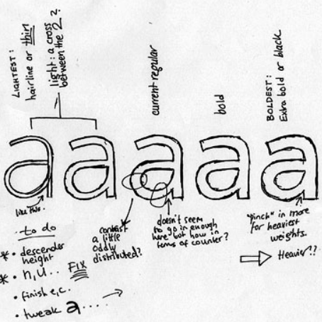
The more undoing and erasing you do while you make your own font, the more you learn about the process. There is no such thing as a mistake in drafting, only happy accidents that can quickly be fixed before finalizing your font and sending it off into the world.
Designed your own font, but not sure what to do with it? Read more about how the professionals get over their creative blocks so you can do the same.


Knowing the difference between two things that are very similar can feel trivial.
by Daniella Alscher
The words "typeface” and “font” don’t look the same. They don’t sound the same. They don’t...
by Daniella Alscher
Claustrophobia: the fear of being in a small space or room without the ability to escape.
by Daniella Alscher