
Fidget spinners aren’t in anymore.
You just bought your first one? That’s awkward.
Now, more than ever, it’s important to stay up-to-date with all of the latest trends, fads, and crazes in society. There’s no excuse not to - the internet has you covered.
There are trends in fashion, in the media, on social platforms, and, of course, in design.
It’s absolutely necessary that a brand stays relevant to their customers. One of the ways this can be done is by revamping all of those brand elements your company has - including your logo.
Whether your business has been around for centuries or was born yesterday, we’ve compiled a list of some of the biggest logo trends in 2020 that you’ll want to take part in.
With our screens getting bigger, then smaller, then bigger again, it’s becoming increasingly difficult to design a logo as a “one-size-fits-all”. It’s hard to say whether responsive design is really a trend or a necessity, but while we’re at it, we thought we’d at least make you aware that it exists.
Responsive logo design is essentially designing for scalability.
When a designer creates a logo, they need to think about how it will appear on something as tiny as a smart watch and as large as a billboard design. That logo won’t necessarily look the same across all mediums.
Source: Canny Creative
When designing a logo for responsiveness, the simpler the better. Complex details can easily get lost in translation when the design is shrunken down. No matter how simple your design is, you should also be designing for flexibility. Think about legibility, reduction of detail, and, if your company has been around a while, doing away with the wordmark altogether.
Baggy jeans, turtlenecks, overalls, and fanny packs have made a comeback in recent years. How? I don’t know.
What I can tell you is that retro isn’t just reappearing in fashion. It’s in design, too.
Essentially, it’s a throwback, just not too far back. Think old-school computers, abstract illustrations, funky fonts, and a vibrant color palette. Think about the carpet in a bowling alley and wacky thrift store sweaters. Can you see it now?
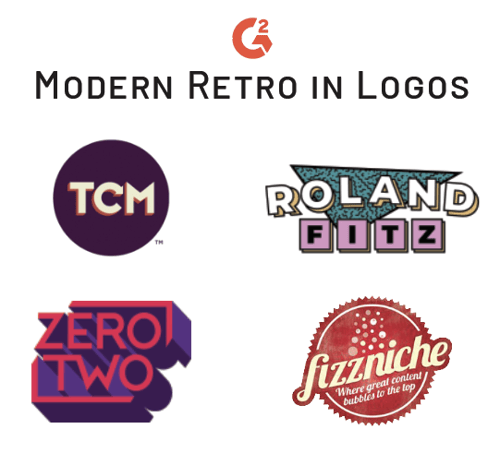
Source: Roland Fitz, FizzNiche, ZeroTwo Creative, TCM
Wild geometric patterns, bright colors, and spazzed out typography are fun elements to add to your design, but they’re not for everyone. If you’re going to take this approach to your logo design, be careful to do it in style. Don’t suffocate your design with neon and squiggles - just a touch of modern retro is enough to encourage viewers to associate nostalgia with your brand.
TIP: Learn the best logo tips for brainstorming new designs.
Trends often come and go, but this one isn’t leaving any time soon. Minimalism design, especially in a logo, is simple, unique, and powerful. They say less is more - and it is.
Minimalism is especially big in the tech industry right now. Just look at the logo evolution of big tech brands - minimalism provides complex business with the opportunity to simplify themselves. Fashion logos are also beginning to simplify themselves.
Minimalism is the essence of simplicity. In design, it means using straightforward, flat shapes, bold, legible typography, and basic color schemes. The less detail in your design, the better if you’re trying to achieve a minimalist effect.
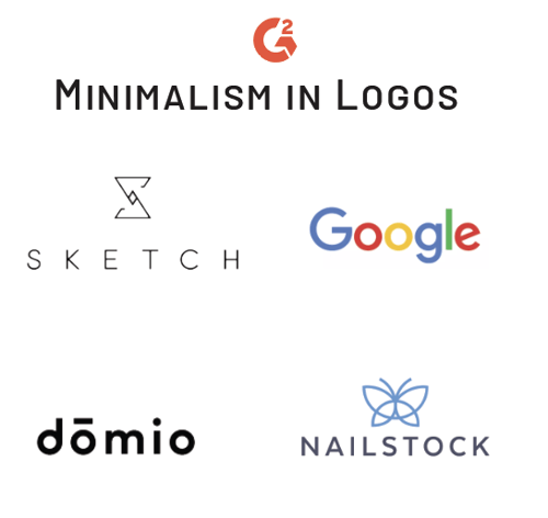
Source: Paulius Kairevicius, Sketch, domio, nailstock
Remove any extra elements in the logo. Focus on what’s absolutely necessary; if the type of logo you’re creating is a wordmark, focus on the typography and refrain from adding any additional components that could further complicate your design.
In between the lines of minimalism hides negative space. Negative space doesn’t just mean the white space around your image anymore - sometimes, the negative space is the image.
Negative space refers to the area of an image that surrounds an object. Often, negative space helps to further define the boundaries of the object or of the positive space and assists in bringing balance to a complete image.
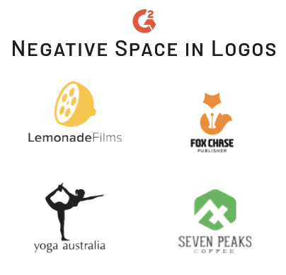
Source: Roy Smith Design, Vasvari, cucuque design
Negative space in design has been around for a while, so it’s time to really step up your game.
Don’t take any space for granted. Get clever with the room you have to add a double or even triple entendre to your design. Look between those lines and make something of it. Make it fresh, make it new, and make it mean something.
Using negative space in your logo not only makes for a powerful image, but creates more of an interactive experience for the viewers who find your little “needle in the haystack”. People will be dying to share with their friends, making the job of your marketer a little easier.
TIP: If you’re looking to make your logo a little more three-dimensional with negative space, think shadows and depth.
Sometimes, oversimplification doesn’t go so well with a brand. One way to spice things up with a simple logo is with the addition of a gradient. Gradients were present before 2020, but they’re still very apparent. Instagram kicked this trend off with their rebrand in 2016, and it’s showing no signs of stopping.
A color gradient, also known as a color progression or color ramp, specifies a range of colors that blend together from one color to another without any abruptness.
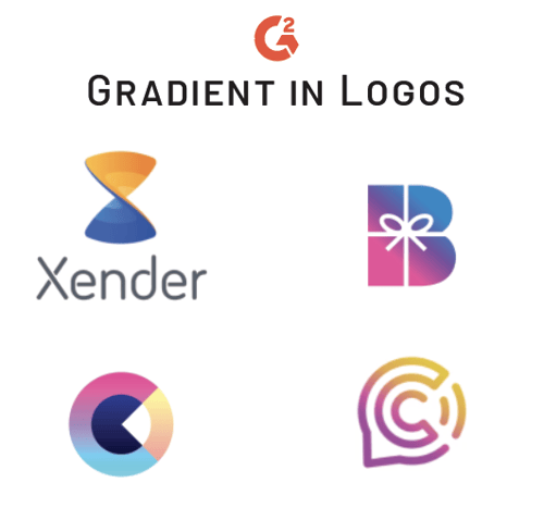
Source: Xender, Bundle, Claire Boscher, Chatter
Don’t get too crazy with your gradients. They’re most effective when applied subtly. Make sure the colors that you choose to blend into one another mean something to the business you’re representing and mingle seamlessly.
|
TIP: Use color schemes for a flawless blend.
|
If you’re a designer, you know more layers means better design. We’re not talking hundreds, here. Overlapping adds complexity and dimension to a logo, which is great for companies that have a more intricate message or service to offer.
Placing elements on top of one another can create a unique, collage-like effect in a design. Overlapping can encourage interaction or dominance among elements.
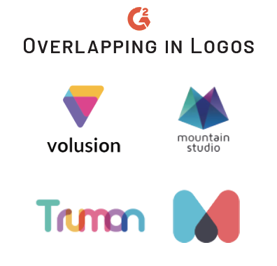
Source: volusion, mountain studio, Aaron Taylor-Waldman, Rosie Manning
Mess around with the transparency of the different icons and letters in your logo. This trend doesn’t stand alone - overlapping brings out more geometric shapes and additional negative space for you to play around with.
Flat vectors have been trendy in graphic design for a while. Easy to look at and fun to create, these gorgeous, shallow graphics are easy to morph into a logo.
But more depth creates more authenticity.
Flat 2.0 design, also known as semi-flat design, is the creation of flat vector images with the addition of subtle shadows to add slight shape to the flat design. Adding this to a logo can broaden the horizons of a brand’s identity by giving off a more sophisticated, modern feel.
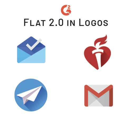
Source: American Heart Association, Inbox by Gmail, Gmail, Webski 2.0
Flat design 2.0 is just shy of being flat design. Instead, it borders on 3D with raised or sunken elements that give your brand a quickly-adapting vibe. Giving your logo a semi-flat effect makes it pop right off the page and looks especially strong on the web.
Changing up the style of your logo is an exciting way to give your brand a boost. Keeping up with the trends makes you feel like less of a grandma and more like one of the cool kids.
Proceed with caution, here.
Just like people should have stayed away from mustache tattoos, it’s important to remember the context of your changes. Are the updates you’re making to your logo still in line with what your brand stands for?
Be smart, be thoughtful, and be trendy.
You’ve finally updated your logo. Have you thought about how often you should update your website?


It’s the most wonderful e-commerce time of the year.
 by Anastasija Rokunova
It seems like technology doesn’t stop for anyone.
by Daniella Alscher
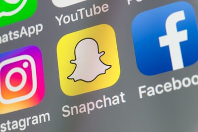
This week, Snapchat gave their logo a very slight refresh.
by Daniella Alscher
