Getting an ad click from your target audience is an exhilarating experience.
The ad click reassures you that all the hard work you spent targeting audiences, segmenting lists, and identifying keywords paid off. That same exhilarating feeling, however, can be short-lived if your post-click landing page fails to engage visitors and their relationship with your brand doesn’t proceed beyond the ad.
To continue your visitors’ journey past the ad and toward a conversion, it is necessary that they land in a place that engages them.
So, how do you create an engaging post-click landing page? We’ll discuss this in the sections below. Before we get into that, though, let’s start with a quick definition.
What is a post-click landing page?
A post-click landing page is what its name suggests, the dedicated page you land on after you click an ad. A post-click optimized landing page is a web page removed from your website’s main navigation that is message matched with the ad and relevant to a visitor’s post-click experience.
To accomplish all three, your page must connect with your audience on an emotional level. It should communicate benefits of your product or service and have a conversation with them via the page elements. Meaning, it should tell consumers how your offer is helping them get closer to pleasure and further away from pain.
The following best practices are recommended for landing pages to engage audiences and persuade them to convert.
|
TIP: Ensure your landing page is easy to build and optimize with tools designed to make creating landing-pages easy, efficient and effective.

|
How to increase page engagement from ad to conversion
Increasing page engagement can be done with a few simple steps.
Faster loading pages
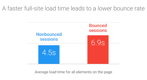
This is absolutely imperative because if the page doesn’t load fast enough for people, nothing else on this list matters. Users don’t have the patience to wait around, and they won’t see what is on your page.
Data collected by Google and SOASTA shows that 40 percent of users leave a page that takes longer than three seconds to load.
Three seconds — that’s all the time you get to keep someone’s attention from the time they clicked your ad until they decide to stay or bounce back. So, if your landing page fails to load during this time, you just wasted an ad click and potential customer.
Page load time is one of the strongest reasons of page bounce, but there is solution. Consider creating accelerated mobile page (AMP) landing pages. They load nearly instantly (often under one second) and, by doing so, automatically lowers page bounce rate.
Persuasive, message matched headlines
The headline is the first thing the visitor sees when arriving on a landing page. Ensuring that the headline has the same message portrayed in the ad comforts visitors that they’ve arrived at the correct place.
A compelling landing page headline:
- Is empathetic toward your visitors’ problems
- Describes how your product or service is going to help them solve their problems
With that, there are four approaches you can take:
- Start with the question: Start your headline with the phrase “How To,” and then introduce your offer as an answer to their question.
- Tell them what they’ll get: Headlines that feature the word “Get” allow visitors to visualize what they’ll receive if they stick around and click the call-to-action (CTA) button.
- Use curiosity: Use the curiosity gap to create headlines that encourage your visitors to stay on your page and learn more about your offer.
- Offer ease and speed: Headlines that offer visitors’ easy and speedy recoveries from their problems work well for engagement.
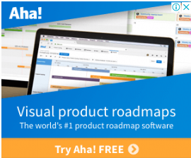
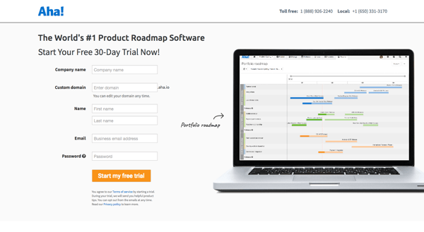
Aha’s landing page and display ad have message matched headlines. Both the ad and landing page say, "visual product roadmaps," "try Aha! for free," and mention the service being the world’s No. 1 product roadmap software:
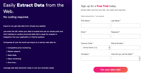
 Import.io’s landing page headline tells visitors how easy the tool makes it for them to extract data with no coding required.
A compelling and neatly arranged copy
Your post-click landing page copy needs to deliver what the page headline promised, and it should do so in an organized, neatly-packaged way, as to make it easy for visitors to read.
The copy should explain how your product or service will help make their lives better, solve their problems, and put an end to their pain. It shouldn’t merely tell visitors what your service does.
People don’t buy products, they buy better versions of themselves, and your landing page copy should clearly explain why clicking the CTA button is the correct path to answering their problems.
The most common methods to organize copy is with subheaders, bold typeface, bullet points, and italics. Any combination of those helps direct peoples' attention to items you want them to focus on.
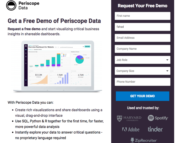
To demonstrate, the Periscope landing page features copy arranged in bullet points and tells visitors what they can achieve with the service. Had this copy been written in paragraph form, visitors would be less engaged because they wouldn’t understand those points are key to understanding the Periscope platform.
Engaging, relevant media
Images, GIFs, videos, and animations can all be engaging and help keep visitors engaged so they don’t bounce. Landing page media serve two primary functions on the page:
- They help explain the product and, of course,
- Add visual appeal.
The media you include on your landing page should have the following basic characteristics:
- Be relevant: It should be connected to the offer. Are you offering an eBook? Add a visual of the eBook cover on the landing page. Don’t just add an image because it looks good if it has no connection with the offer.
- Visually appealing: It should be high quality and not a cheesy stock photo. Only include images that can help visitors realize the value of your offer, and interactive content is always a plus.
- Shouldn’t affect page load time: Be mindful of the media’s file size because the bigger the file size, the slower the page load time. For media, page speed is much more important than eye candy images or a demonstration GIF.
The Intercom landing page features an animated background, images, and GIFs to showcase how its service works. 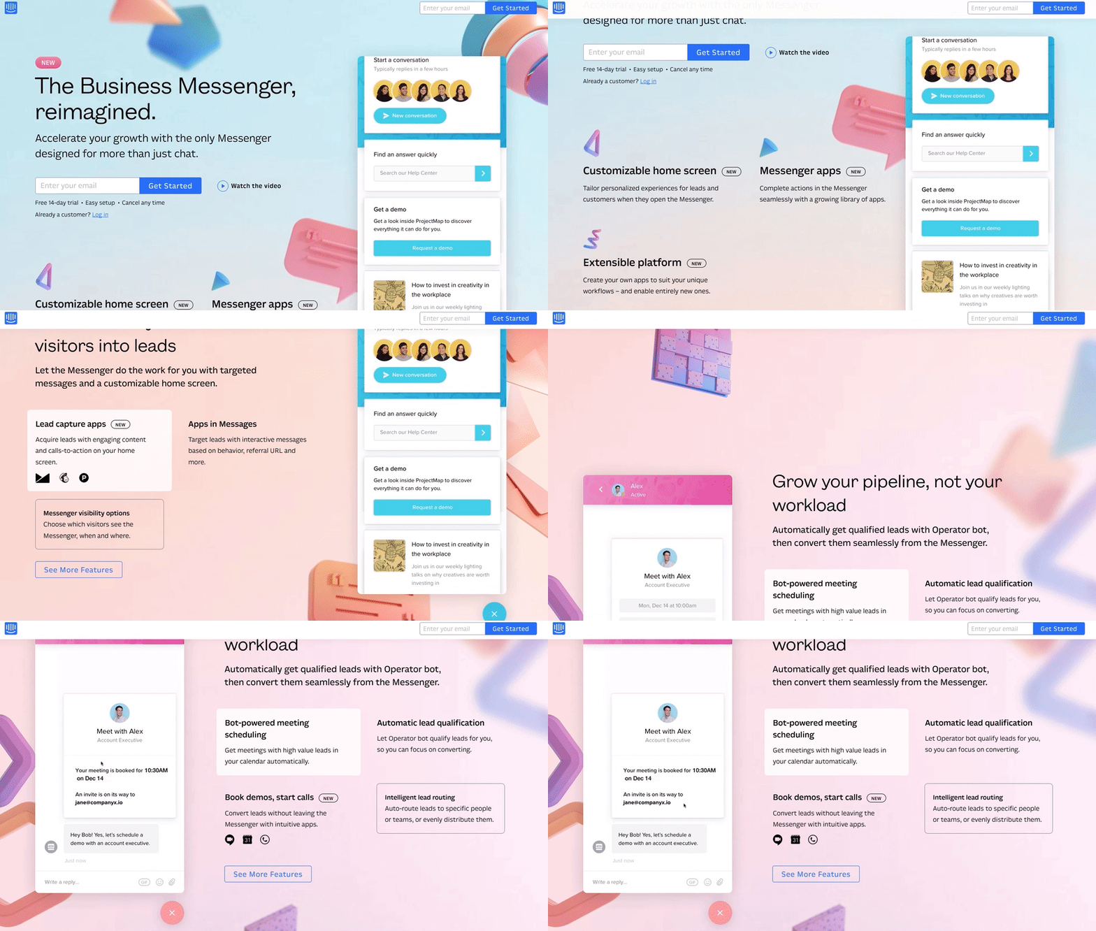
Frictionless form
One of the primary purposes of a lead capture landing page is to collect user data. When you properly design your form, you make it easy for visitors to submit their information, leading to more conversions.
However, because the lead capture form asks visitors to input their information, it can cause friction in the conversion process. To ensure that your form remains friction-free and visitors complete it, make sure it:
- Is placed strategically on your landing page: This is not related to the “fold” per se. Rather, it is more about positioning the form so you can adequately explain your offer first, then request they convert. This way, you decrease the chances of visitors abandoning the page due to friction and anxiety.
- Has properly organized form fields: Make it easier for visitors to complete the form by labelling form fields.
- Includes offer compatible form fields: Webinar registration pages and eBooks are typically higher in the funnel, so it is more appropriate to only request a visitor’s name and email address. A product demo, on the other hand, is further down the funnel and closer to a sale, so asking visitors for more information is acceptable. The further the user moves down the funnel, the more form fields you can add.
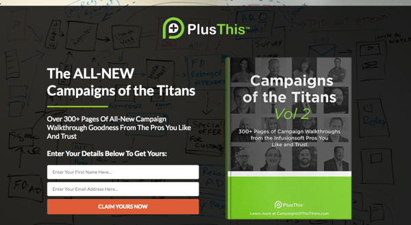
PlusThis’ free guide landing page has the appropriate amount of fields. The page is only asking for the visitors' names and email addresses in exchange for a free eBook.
An engaging post-click landing page brings you closer to conversions
An ad click is only one part of the conversion equation. To make sure users continue their journeys with your brand, you need to connect all your ads with post-click landing pages. Doing that gives you the best chance to capture their attention and engage them enough that they fulfill the conversion goal.
One final way to create an engaging experience is to review heat map analysis.
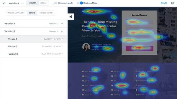
Heat maps allow you to see how visitors interact with landing pages, including tracking what is being click on, how far are people scrolling, and what page elements are drawing the most attention? This analysis can help you answer all three questions, and you can use the data collected from heat maps to run informed tests on your pages using A/B testing tools.
Creating a page that loads fast, has a compelling headline, organized copy, engaging media, and a frictionless form brings you closer to getting conversions and moving users farther down your marketing funnel.

 by Lou Burton
.png) by Shreya Mattoo
by Shreya Mattoo
 by Stephen Jeske