Big data is intimidating.
The sheer volume of big data means that organization, preparation, and cleansing is an overwhelming task for any business. If companies are able to successfully harness all of their data, they are at an advantage and can strive for true digital transformation. With tools like Hadoop, and other big data processing and distribution tools, companies can begin to not only store massive, unstructured data sets, but also prepare them for analysis.
How to Simplify Data Visualization
Big data analytics is a complex task that requires highly skilled analysts or data scientists. These analysts have to be able to both prepare and pull unstructured data into an analytical environment and derive insights from it. That means combing through every type of data imaginable, from finances to sales to time-series data and using data visualization software to present that information.
Data scientists are able to extract insights from this sea of information and turn it into business-critical initiatives. The role comes with a great deal of responsibility. One of the required tasks is explaining data insights to leadership, management and decision makers.
Most C-level or management teams do not have an in-depth knowledge of big data analytics solutions, so translating can be a challenge. That’s where data visualization and presentation play a key role in collaborating with team members and improving businesses.
Don't overcomplicate complex data
It may seem like an oxymoron, but the best way for a data scientist to explain actionable big data insights is in simple terms. Keep the information bite-sized and easily digestible, even if the material is complex.
This might not seem challenging, but when you are dealing with terabytes, petabytes, exabytes or my personal favorite, zettabytes of big data, keeping the information and visualizations concise is not simple. But it is necessary.
Decision makers and leadership teams do not have time to try to understand complex data. That’s why being able to break down big data into simple, interactive data visualization is key. Everyone can understand it, make decisions based on it and turn it into actionable, business-critical information.
In summation, don't do this:


Charts courtesy of LivingQlik
Instead, make it easy to understand in just a few moments.
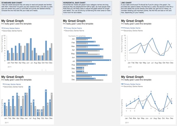
Cole Nussbaumer, author of Storytelling With Data, breaks down a template for simple charts below:

Highlight impressive trends and correlations upfront
The whole point of big data analysis is to find previously unknown correlations, trends and patterns. So when presenting to leadership teams, impress them with something they don’t know. Find correlations that cross departments.
Is there a marketing campaign that impacted product supply, leading to shortage or a surplus? Did a shortage of warehouse maintenance workers result in a breakdown in production?
These correlations are insightful and business can take action based on them. Businesses can learn from this information and change processes moving forward. Inventory managers can better prepare for marketing campaigns. Human resource teams can hire maintenance workers based on anticipated machine breakdown to maximize production.
This is the benefit of big data mining and understanding historical data. Highlight this information upfront.
Don't explain how you got there
Understanding data analysis processes is very complicated, which is why companies are willing to hire data scientists (and pay them the big bucks). They want to understand the outcomes of big data analysis, not necessarily the process that lead to the insights.
Therefore, when presenting to management, do not go in depth about your process. Most people will not understand a word that is said and they will check out, which is the last thing you want when explaining business-critical insights.
It is good to have that information somewhere, but in the final presentation, it’s not necessary. If someone has questions, send them a follow-up explaining exactly how you got the data.
Being frustrated by this is understandable; data scientists might work tirelessly for weeks on end writing code, building models and organizing data all to find a single insight. Do not worry about emphasizing the work; everyone will know that hard work was done to get there. Simply explain the outcome
Benefits of successful data science
By following these three steps, data scientists can help companies become data-driven organizations. This is progress toward ultimate digital transformation. Being able to use data to guide decision-making is a huge opportunity for businesses. These simple steps are easy ways to ensure that buy in is consistent as businesses grow and develop.
Looking for tools to help you visualize data?
Compare hundreds of data visualization tools & software options with thousands of reviews on G2 Crowd.
 by Devin Pickell
 by James Riddle
 by Devin Pickell