

What’s the marketers’ mantra? Increase conversation rates at all costs.
To do so, you need to set yourself apart from other websites. How? With a killer call-to-action (CTA) button. It’s one of the most important tools for a marketer to get those clicks and increase conversions.
But there’s a catch – you need to capture the eyes and interests of users in three seconds. That’s how long it takes users to see a clear call-to-action button on nearly 50 percent of websites live now.
Does your call-to-action button stand this test? If you’re not part of the lucky 50 percent, don’t fret – even the largest companies struggle with their CTAs.
You’ll see great brand examples of what works and what doesn’t. These examples will show you how to build an effective strategy to implement for your own CTA button. Let’s get you closer to increasing your conversions and on the path to an extreme makeover for your CTAs.
You might have a great CTA – colors, power words – but it’s still not converting. You’re wrecking your brain trying to grasp what’s holding it back. Let’s start with the first major error: nestling a CTA behind a landing page with a massive navigation menu.
That’s a bad move. Make sure your CTA is the first image your customer sees.
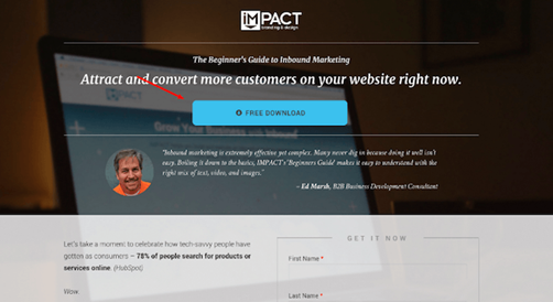
It’s a trap Basecamp fell into some time ago:
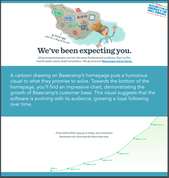
Struggle to see the CTA? That’s because there isn’t one front and center on the home page. They are sure to not to pass the three-second rule. Down go the conversion rates. The team at Basecamp took notice.
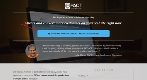
Here’s what they have now:
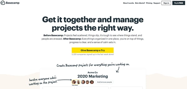
Center and clear – well on the way to increase their conversions. Perfect placement of your CTA can lead to an 83% increase in revenue. Cash in on this with a simple placement on your homepage.
|
TIP: You can't place a CTA on your landing page without a strong landing page as a base. Find the top-rated landing page building software on the market to help you get on track.
|
The best call-to-action buttons do one thing: simplify matters for users.
What does this entail? Too many choices will overwhelm your audience. Don’t let it backfire on you and decrease conversions. Offer the user one choice or you’ll lose out quickly.
Take a look at this example from Mozilla:
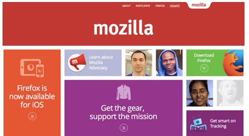
Are users really going to Mozilla to buy clothes? No, they come to the site to download Firefox and nothing else. But notice how the Firefox download CTA is nestled between too many other options? Not to mention it looks exactly like the others.
Here’s the makeover Mozilla went with to overcome these mistakes:
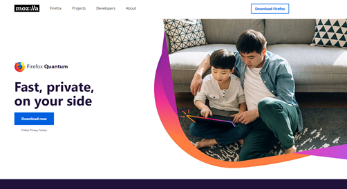
See the difference? One colored call-to-action button in blue and one in white at the top right-hand corner. You can’t miss it. Make sure your CTA keeps it just as simple.
What are you selling again? If users are asking this question, then you’re doing something wrong.
There are times when it’s difficult to show what your product is from a homepage. Think CRM software. But other times? The product should sell itself.
Take a look at this CTA example and see if you know what product they are selling:
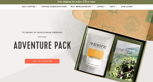
“Join the adventure” – must be a travel agency, right?
Wrong, it’s coffee – not a safari. You don’t want users asking if they came to the right website. The packaging shows coffee, but what hits the eye is the adventure text and the picture of a landscape.
Here’s how they changed it around at Verve Coffee:
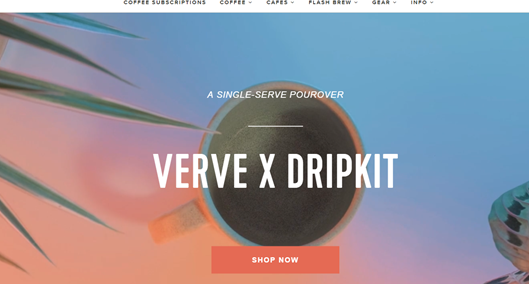
Much better, right? Off the bat, you see a mug of coffee, and a simple CTA that tells you shop now. The user knows they are in the right place and the only option they have is to click on that CTA.
The first step in convincing a user to purchase or download a product is to catch their attention. What better way is there than splashing some color on your CTA?
A colorful CTA is a good way to tell the user, “hey, eyes over here”. Just make sure the colors aren’t contrasting with one another or you’ll divert attention elsewhere.
Take a look at what Spotify had as their landing page some years ago:
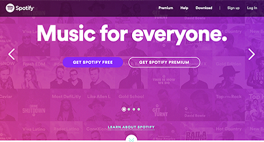
Not bad, right? It grabs your attention, stands out from the background, and is a nice color overall. But the coordination clashes with the background somewhat.
The team at Spotify realized this and their new design hits every color checklist perfectly:
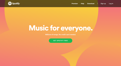
With an infinite amount of color coordinators, gradients, shadows, fonts, and borders, the possibilities are endless. Just make sure it pasts the eye test: the color grabs your attention, stands out, and doesn’t clash with other colors.
|
Related: Read about color schemes and discover how they affect your CTA conversion rates, time on page, and more.
|
CTAs should be bold, colorful, and simple. This limits your ability to personalize your copy. You think you should use only strong, action words, but think about the impact your copy can have. It should be meaningful to the user.
For instance, sales emails where there is a clear and singular call to action increased sales by 1,617%. Generic copy on a CTA won’t cut it.
Just take a look at this example to see how mundane it can be:
Would conversions increase if you personalize the copy? Well, after one month of A/B testing, iMPACT saw a 78.5% increase in conversions after they personalized their CTA button.
Here’s what the new version looks like:
Simple but effective. When you personalize, you make the copy meaningful. Think about what you’re trying to sell and the value you’re bringing to the customer. Make it relevant to the service and convincing to get that click.
Directional cues are there to help you nudge your audience to look somewhere. In this case, it’s getting them to notice your CTA even more. They should appear on pages of your website that don’t have any competing elements or a lack of focus.
Take a look at what happens when a directional cue is flawed:
What exactly is he glancing at? Is it the “Request a Demo” CTA that is hidden in the corner and clashes with the background? The gaze and body position are visual cues that seem to direct attention away from the yellow CTA.
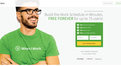
When I Work had a cool fix, though:

The model is nudging the visitor toward the site’s copy and toward the primary call to action. Do the same when you’re implementing your vision and directional cues.
Boosting conversion rates is difficult, but call-to-action buttons are powerful tools to help. To capitalize on these returns, make your CTAs simple, colorful, well-placed, and personalized. It’s a sure way to catch the attention of your users and to get that click. You can get even more creative. Say, use a dynamic QR code as a CTA.
CTAs can only do so much for your website, but they definitely do a lot. See how G2's Learn Hub reached – and surpassed – over 1 million monthly in organic traffic, and how we utilized CTAs to help this happen!


Position your brand for success.
 by Hannah Tow

Imagine if every visitor who discovered your website turned into a paying customer.
 by Hannah Harrington

Brand ambassadors are real people who love your brand, who want to see your brand succeed, and...
 by Jessica Huhn