

On a subconscious level, red reminds us of stop signs and the urgency that goes with them.
Blue reminds us of clear, open skies and the comfort of nice weather.
Black reminds us of absolute darkness, along with the fear and allure of the unknown.
Colors affect us all deep down — the same depths responsible for our gut reactions, purchasing behavior, and problem-solving skills. So, ignoring colors in branding and marketing is a missed opportunity.
Using graphic design software and some advanced techniques, you can leverage color psychology to turn a profit and go green with your bills.
Color psychology analyzes the impact of colors on human behavior and emotions. This study is used in marketing and design fields to understand and influence the customer’s decision-making, with the intent of improving conversion rate.
Color psychology is a powerful tool for shaping consumer behavior and improving the conversion rate. It prompts customers to notice a brand,
Let’s start with the fundamentals of color theory. Perhaps due to frequent associations or maybe even part of our human evolution, colors evoke specific emotions, moods, and atmospheres in whoever views them.
While subtle and almost imperceptible, color psychology can still create a lasting influence on a person’s thinking, especially if viewed repeatedly, as with branding.
A color’s psychological connotations change according to where—precisely—it falls on the rainbow, otherwise known as a hue. A bluish-green has different properties than blue and green alone. Plus, it is slightly different than greenish-blue. Then there are tints (a color’s hues mixed with white) and shades (a color’s hues mixed with black), creating lighter and darker versions of colors.
Hue, tint, and shade can all shift a color’s meaning, making the choices for your own company infinitely customizable.
Let's take a look at the meanings of primary and secondary colors.
Now that you know what each color means, you can go about finding the best ones for your business.
Optimizing the colors for your business begins with knowing what kind of business you want to be perceived as and to whom you’re appealing.
Do you want your brand to come off as assertive and appeal to a younger audience, or are you looking for a quiet dignity that appeals to older professionals? Depending on your circumstances, certain colors are better than others.
If you don’t yet have a clearly defined brand strategy, you can simply make a list of 30+ adjectives to describe your brand.
Write a list of words like “modern” or “free-spirited,” considering both the ideal personality of your brand as well as the type of people you’re communicating with. You may feel a pull toward traditional and sophisticated, but if you’re targeting younger age groups, something more energetic would serve you better.
You also want to research how everyone else in your industry is using colors. If your competitor’s product packaging is predominantly green, you can either follow suit and enjoy the same benefits of green, or you can choose a color no one’s used before to stand out on the shelf. It depends on your marketing strategy.
To see an extensive study on how brands in different industries use color with real examples and data analysis, check out the psychology of color by 99designs. There, you’ll also find an interactive tool that will recommend a primary color for your brand after you input your brand’s desired traits.
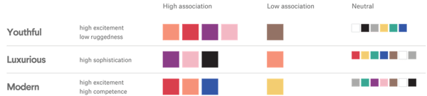
Source: 99designs
Perhaps one of the reasons business owners don’t take color psychology seriously in business is they underestimate how often they can use it.
Color has a broad range of applications in branding and marketing that affect most aspects of business:
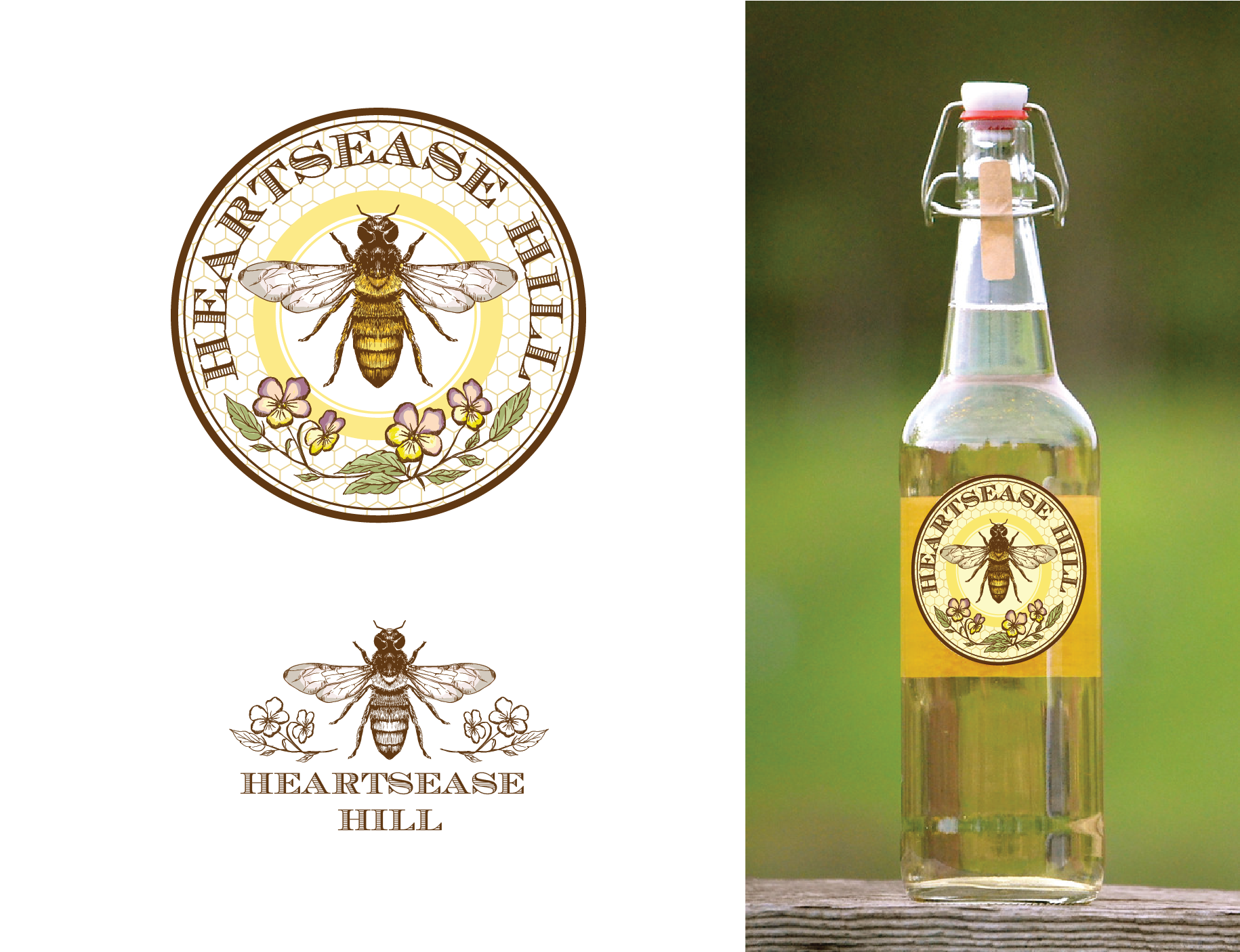
Caption: Logo design by 99designs designer Agi Amri.
No matter which colors you choose, it’s important to stay consistent across channels. That means if you operate a store and a website, both should have the same color scheme.
Consistency is integral in applying color psychology to business: every time a person sees the same colors regarding your brand, it strengthens the associations. To optimize their effects, you should use the same colors wherever you can.
Color is powerful. As a way for influencing brand identity, attracting attention to ads and products, increasing brand awareness, and communicating directly to your customers, the right colors should be interwoven throughout all your branding and marketing endeavors.
You can change your entire image and even your customer market just by reevaluating your color choices. As great as your personal favorite color is, it may not be the most strategic.


Beyond stock and loans, companies have another tool to raise money: corporate bonds.
 by Maddie Rehayem

While legal requirements vary by location, when it comes to offering your employees paid time...
 by Jen Meza

Has anyone ever told you they “owe you one”?
by Maddie Rehayem