
Our society seems to think that handing out little pieces of paper with our names on them are a great way to make a first impression.
If you design your little piece of paper the right way, it can be.
Business cards began emerging around the 17th century. Viste biletes, or visiting cards, would be handed to servants at the homes of hosts to announce the impending visit of an important guest. These cards were elegantly designed, as they represented the identity of the distinguished guests.
Today, business cards serve the same purpose: a way to introduce yourself to someone new. They’re a great thing to bring to a networking event, tuck into a relevant book at the library, post on a public bulletin board, or to hand out at a few job fairs.
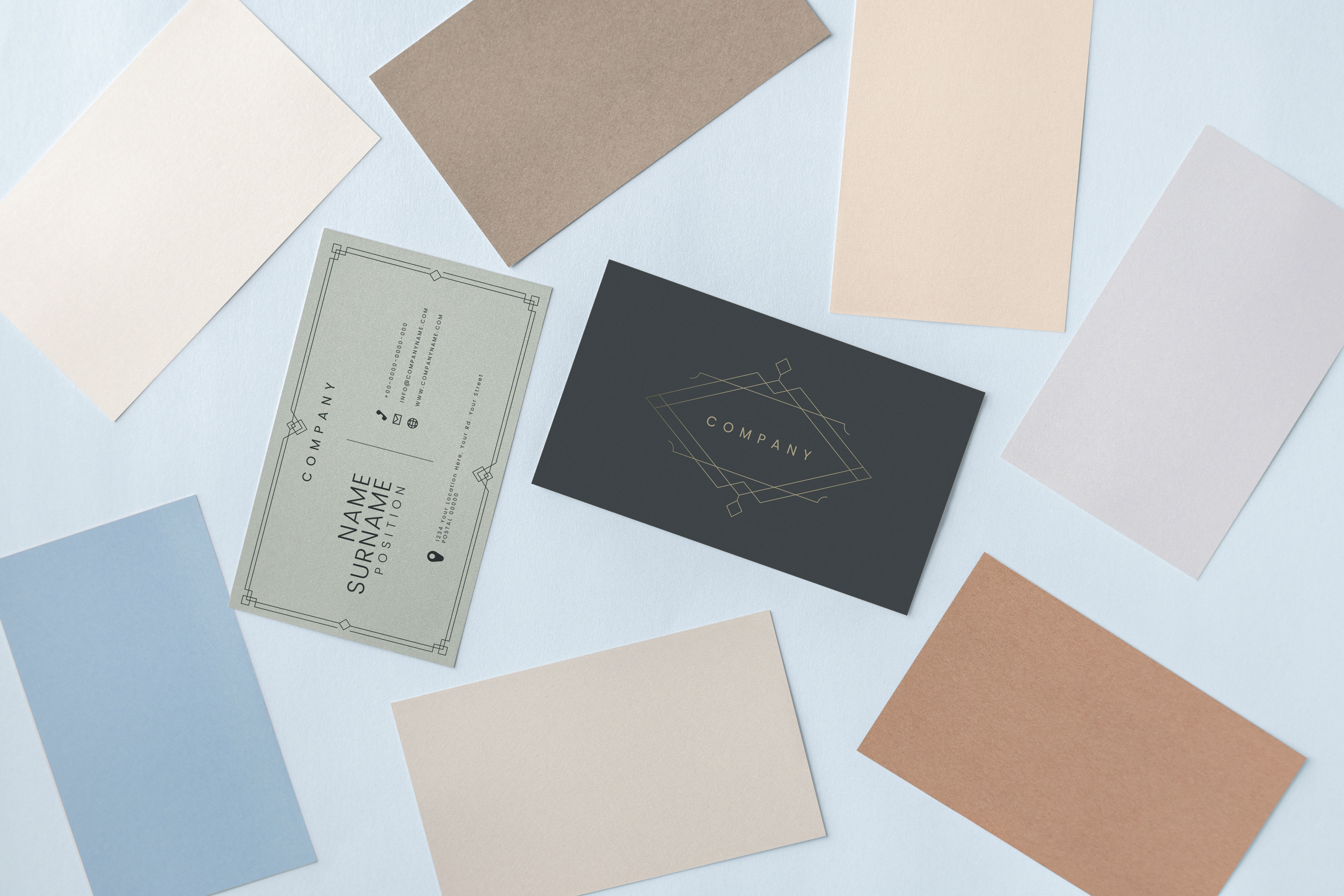
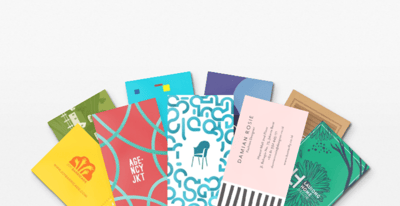
Business cards can range from the traditional black and white 3.5”x2” to something like this:
Source: Pandora
But before you get into anything too unique, it’s best to make sure that you’ve got the basics down. In this article, we’re going to go over everything you should include in your business card to make a great first impression.
You could just slap your name on a rectangle and be done.
Or, we could think this through. Designing a business card can be a fun project, but it’s also a great way to get yourself thinking about who you are and what you’re providing for others. Knowing what your brand is will be a fantastic step towards designing a business card that perfectly embodies what it represents: you.
There are some things to keep in mind as you design your business card In order to give someone a good, comprehensive image of who they’re meeting.
Let’s get started:
Here is where I’d usually give you a picture of all of the different options you could choose from when it comes to deciding the shape for your business card. That image would take forever to load on your screen.
From the simple, sharp-cornered rectangle to a business card with a hole in the middle, the options are endless when it comes to the shape you choose for your business card.
Rectangular business cards are the standard, and there’s nothing wrong with choosing that. We’ll talk more about sizing those in the next section.
Round-cornered are different in appearance and in function. Yes, they’re business cards, too. But they hold up a little bit better than square cornered business cards because their edges don’t fold over as easily. The rounded shape is also a little more friendly-looking, as they literally take the edge off of the card. Source: Solopress
While the standard shape of a business card is rectangular, that doesn’t mean you have to conform.
Square business cards are one direction to take. They’re compact, they’re elegant, and they’re super cool. If you choose to take this popular route, be sure to draw a mockup to double check that all of the essential information will fit without looking squeezed in.
Source: Solopress
Circular business cards are another great way to make an impression against the standard rectangle. It’s also an opportunity to start playing with your brand, product, and that shape. Do you bake cookies? Pizza? Sell tires? Coach basketball? Take advantage of that here!
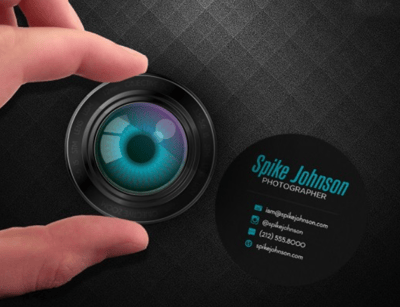
Source: CodeKnows
Alright, so we’ve covered the basic shapes: rectangles, squares, and circles. Very exciting. Want to ramp it up? Think die cutting.
Die cutting a business card is cutting it up like a cookie cutter to create the exact shape you want. Stencil out your name, shape your card like a dinosaur, make it look like someone took a bite out of it. Creativity has no limits here.
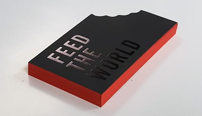
Source: Oubly.com
None of these options cool enough for you? Check out some unbelievably unique business cards for more inspiration.
When deciding the shape of your card, think about how you want to come off to those that you’re handing it to. Let your card reflect the job you’re doing. The further you stray from the square cornered business card, the more modern and youthful you’ll likely come off.
A business card is something that should be able to fit into your pocket. Not that tiny front pocket on women’s jeans; nothing fits in there. But it should be able to easily fit in your palm.
Professional designers can get a little crazy with their shapes and sizes (as seen above) but if you’re not sure where to start, at least be familiar with some of the standard sizes.
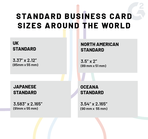
If you’re planning on making a traditional business card, these are a good resource. If not, at least reference them as you’re beginning to think about your sizing.
Whatever size you choose, there are some things to look out for so that your printing process can go as smoothly as possible. There are three elements to bear in mind as you’re designing:
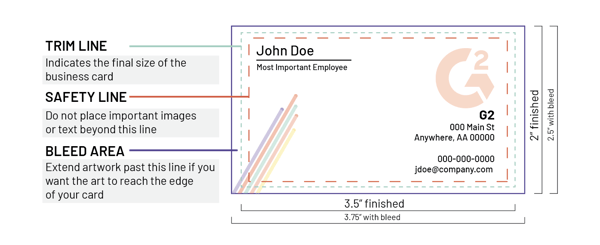
Safety line: anything outside of this line is at risk for being cut when your business cards are being trimmed after printing. Any essential elements such as text or images should be kept within this line.
Trim line: the trim line indicates the actual size that your business card will be.
Bleed area: this part of the card is what will most likely be removed. Don’t place any important elements in the bleed area. However, if you want parts of your image to go to the edge of your card, extend them as far out as possible to make sure that there is no gap between the image and the end of your card.
There is no exact measurement for these safety elements because the amount of space given depends on the printer and the tool being used to trim down the card after printing. Therefore, the bleed can be any width, but ⅛” (3.175 mm) is standard.
If you’re handed a plain business card, you’ll probably think the person that handed it to you is plain, too. Let’s not go there.
 Source: Purple Deck Media
Hopefully, you’ve designed a logo to have at your disposal. You should probably include this on your business card! Logos are a way to translate your values and identity into a visual for others to recognize. It’s widely believed that the logo should be the spotlight of your business card, but that doesn’t mean you can’t include other images.
Remember that you’ve got at least two sides to mess around with. Some people take advantage of this by using one side to strictly display their logo, while the other side can provide the essential information. Some people include their logo on both sides, with one version being a little less “loud” than the other. Logos can go in the top right, top left, bottom right, bottom left, or right in the middle.
Source: crowdspring
No matter where you place your logo or how many times you place it, make sure it’s on your business card at least once!
When you meet someone spontaneously at a networking event and want to give them your information, what information do you give?
Hopefully, the reasoning behind this doesn’t need to be explained.
If you work for yourself, you can leave this off. If the company you work for has a name different than your own, it’s important to differentiate.
Forgetting to include this may prompt the receiver of your business card to become confused about exactly what it is you do. Even if you think the shape of your business card makes it obvious, others may not feel the same way. If your business card is in the shape of a camera, what exactly is your job? Do you take the photos? Edit the photos? Manufacture the physical cameras?
Leave no stone unturned here.
The entire reason you’re giving someone a business card is so they can get in touch with you later. Your phone number should be the one that is easiest to reach you at, and the email you provide should be one that you’re checking constantly and consistently.
Include your URL if it’s a nice, short one like www.mywebsite.com. If your URL is something like www.mywebsitenameisridiculouslylongandshouldntbeonabusinesscard, maybe consider investing in a URL shortener.

Adding your web address is a nice invitation for people who want to learn more about you do to check you out and makes it convenient for them to do so.
If your name is John Smith and they try to Google you, they may never find your website. It’s best to just provide that for them.
Social media isn’t just for personal use, anymore. It’s become an essential tool for businesses if they want to be successful. When including your social media handles, be strategic. Include the ones where you’ll want to be connecting with customers, clients, and prospects.
Promote the channels that you’re most active in, and the ones that have the strongest presence.
Now take all of the above information, make it pretty, and put it on your business card.
I think we all know what a poor font choice looks like. If you don’t, see below.
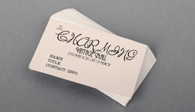 Source: PrintRunner
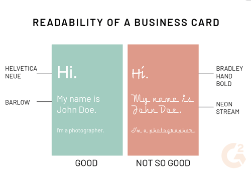
Working with typography can be tricky. No matter what your profession is, a business card is probably not the right place to step outside of the box when it comes to the font you choose Make sure the text is not only easy to read, but is pleasing to the eye.
Sans serifs are the easiest to read because they’re the simplest. Their lines are clean and straight, without any extra “decoration”.
Serifs are the next simplest, but have a little decorative bar at the end of each letter, which makes it a little less easy to look at.
Script and specialty fonts should be used rarely. These fonts tend to be extremely difficult to read and can be unpleasant to look at. Unless it aligns with your brand, it’s best to avoid these on a business card.
If you feel that the font you’re using is a little dry, spice it up. Play with the hierarchy, italics and bolding, as well as kerning.
When it comes to sizing, a good rule of thumb is to use type no smaller than 7-8 point to ensure that the words are legible. Maximum font size depends on your design and hierarchy; some people use 15 point for their name and take it down from there.
Don’t exceed 2 different fonts for your business card. You only have so much room, and overdoing it can be overwhelming and unattractive. If you choose to use 2 fonts, consider using a tool like Fontjoy for some assistance.
Hopefully a little visualization can help you see what happens when you get a little too excited about typography. Keep it simple, stupid.
Choosing the right color might sound easy, but there’s a lot that goes into doing this correctly. The colors you pick for your business card should be relevant to the brand you’re representing. Keep color psychology in mind as you’re deciding on these colors. How do these make you feel?
Source: Printerous
If you already have a pre-existing brand color scheme, keep that nearby. Choose colors for your text and your card that go well with one another and stick to your brand. Play with contrast and make sure you don’t have light text on a light background or dark text on a dark background.
Color mode is also something to pay attention to as you’re designing. Designing in RGB means you’re designing in a mode that represents how the colors will appear on a computer display. Designing in CMYK means you’re designing in a mode for printing color images.
Because you’re printing these business cards, you’ll want to be designing in CMYK color mode.
From the pictures above, it’s easy to see that there is absolutely no best way to go about designing a business card. But there is a right way. Your business card should be treated as an extension of you: make it interesting, make it exciting, and make it different. Whoever gets their hands on your business card will be sure to give you a call.
Read more about brand marketing to make sure you’re handing your business card to the right audience.


As brands compete for attention, understanding the power of graphic design has never been more...
 by Prajnadip Pal

A teacher crafting lesson plans.
 by Sudipto Paul

It takes about five seconds for users to form an opinion about a website and decide whether...
 by Vinod Janapala