When thinking about the design of your website, how do you ensure it evokes the right message and gets the point across?
You do so by choosing the best typography for your company and its brand. If you pick the right typography for your website, your visitors will easily be able to read the content on every page.
If you pick wrong, you may end up watching your bounce rate skyrocket.
Interested in learning more about choosing typography for your website? Just keep reading.
How to choose typography for your website
Like choosing the best images for your website and knowing how to use video on your website, a lot goes into the look and feel of your website. When it comes to graphic design, typography is the art of arranging the type, or the content, on your site.
As you choose different font color, size, and overall design, it adds to the comprehensive vibe of your site and the content on each page. Unsure of which direction to go with your typography? Keep these five tips in mind as you choose the best fit for your site.
1. Don’t use too many fonts at once
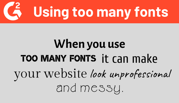
There’s no denying that there are a lot of options when it comes to picking a font for your website. Google Docs alone has a staggering 450 font choices, so it may be tempting to pick more than one for your website.
But… don’t. Using more than two different fonts can not only mess with the structure of your website, it will also make it look unprofessional.
In this case, less is more. To remain on-brand and to keep the message on your website consistent across all pages, choose one and don’t look back.

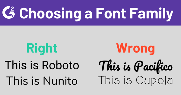
If you do choose more than one font, make sure the two font families compliment each other. Roboto and Nunito complement each other. Pacifico and Cupola do not.

2. Coordinate the typography with your brand
The actual font you decide for your website needs to go hand-in-hand with your brand’s identity. Let’s breakdown some examples.
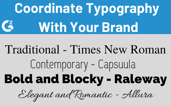
If your website is going to have a traditional vibe, stick to the basics and what you know already works. This would be fonts like Verdana, Georgia, or Times New Roman.
On the other end of the spectrum, maybe you wish to create a website that has a more contemporary, minimalistic, or progressive tone. For this, choose fonts with clean designs and fewer qualities that resemble handwriting, like Capsuula or Infinity.
For something that gives off a strong and defined look, choose typography that is bold and a little blocky. The boldness of these fonts can give off an impression of strength and definitely makes a statement. Go with a font like Raleway or Matiz.
Creating a website for a bridal store or a company with a romantic or elegant vibe? This is when you’ll want to choose fonts that look handwritten with a lot of curves and loops. These would be fonts like Allura and Dancing Script.

| Related: Have you heard the news? After 35 years, Helvetica finally got a refresh. Learn more about Helvetica Now! |
3. Be aware of spacing
No one likes reading a line of text that seemingly goes on forever. On a similar note, a giant block of text in a never-ending paragraph isn’t exactly pleasing on the eyes. To make your content easier to read, be aware of the number of characters used in each line. For maximum readability, stick to 60-70 characters per line.
Web designers don’t just design for desktop. Think mobile! How will your site look on a smaller screen? When it comes to character count, consider about 30-40 characters per line for a mobile device. Since we must also design for a website being viewed on a mobile device, consider how your site will look on a smaller screen. For mobile devices, consider about 30-40 characters per line
Another simple way to make sure your content is easy to read is by adding enough space between each line. In typography, the space between two lines is called leading, or line height. When you increase the leading, you are increasing the vertical space between your lines of text.
A good rule of thumb for leading should be about 30 percent more than the character height for optimum readability.

4. Avoid writing in all caps
Writing in all caps is for when you’re texting a group of friends about the series finale of your favorite show… not for your website.
Using text that is all capitalized is fine if you’re using acronyms or logos, but when the message involves actual reading, don’t yell at your website visitors with text in all caps. Most readers won’t get to the end of the statement you’re making.
5. Keep color contrast in mind
You don’t want to give the visitors of your website a headache as they try and read the text on a page. When deciding on a color for your font, don’t make it too similar to the background of your website. So, don’t pick a light gray font color to be used on a white background. Or dark gray lettering on a black background.
It may seem like common sense, but always test the color choice you have selected on real users on varying devices. It’s also in your best interest to limit how many colors are being used at once and avoid any colors that are too bright or neon so you can avoid any eye-strain from your visitors.
Get your typography on point
When you do, the words on your website will be as beautiful as images and as eye-catching as videos. A lot goes into choosing the best typography for your site, but you’ll know when you’ve nailed down the vibe you’re looking for. Choose wisely!
Interested in learning more about website building and graphic design? Check out the five basics of website building and how to take your graphic design skills to the next level.

 by Mara Calvello
 by Mara Calvello
 by Mara Calvello