

You see 5,000 advertisements a day.
That’s a big number, but it’s true. They’re on TV, you pass by them on your commute, you read them as you’re flipping through a magazine, you scroll past them on social media. When you think about it, it’s kind of alarming.
If 5,000 ads a day is accurate, that means someone sees 1,825,000 in one year.
How many of those ads are people really seeing? Are the right people seeing yours?
Companies use advertising to draw their audience toward their product or service. Brands can’t just paste their name on every billboard and call it an ad. Or they can, but that might not be super effective.
This equation should be at the forefront of every advertiser’s mind. Understanding who you’re advertising to is crucial for an effective ad. But it’s only half of the equation.
Graphic design drives advertising. It’s what catches our eyes and often draws us to the brand in the first place. A design has the ability to emit emotions from the viewer and then tie those to a brand. When an advertising agency does it right, those advertisements can be very powerful.

Remember how we talked about seeing 5,000 ads a day? Here are a few things to bear in mind if you’re trying to make your ad worth remembering.
Color consciousness
Keep it simple
Set it in motion
Wreck repetition
Make it weird
Say no more
Color is compelling. You know that. In advertising, color can carry a lot of weight. When you’re across the street from a poster advertisement, which colors would make you want to get closer?
Using the right color in your advertisement can help it get noticed, which is the first step in acclimating your audience to your brand.
Playing with color in design is a game of strategy, not of chance. While we’d all like to make our advertisements wild and neon (very eye-catching, no doubt), it’s important to understand the psychology of color in business to be sure that you’re conveying the right message and encouraging action.
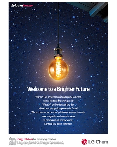
Source: LG Chem
This advertisement by LG Chem has a couple of colors working for it. According to color psychology, blue represents trust and wisdom, while yellow represents energy and intellect. These colors make perfect sense for an advertisement that’s promising to move towards cleaner energy for the planet.
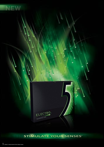
Source: Ads of the World
Two colors are in play here: green and black.
According to color psychology, green represents nature and freshness, which works here with the rain drops while tying into the way that mint makes someone feel: fresh.
Black is associated with power and elegance, making this ad for a pack of gum look like much more than what it really is. Not just a pack of gum.
A sexy pack of gum.
Like, really simple.
In a world full of complexities, simplicity is very, very attractive. Taking advantage of minimalism in your advertisements draws the eyes of many. Don’t believe it?
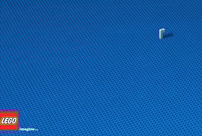
Source: FCB
This ad from LEGO is titled “Imagine…”. It uses a ton of negative space, but there’s a reason for it. It prompts the viewer to construct something of their own.
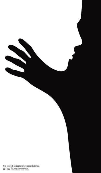
Source: McCann
This advertisement for the Support Centers Union for Victims of Sexual Assault in Israel cleverly uses white space and line work to create an optical illusion and further push the message they want viewers to remember: Two Seconds to Spot.
No doubt it takes a really clever designer to pull this off. But that’s you, isn’t it?
Does a print ad have to be stagnant?
According to physics, yes. According to the magic of graphic design, no.
Using movement in an advertisement can add a surprising, additional element to a design. Movement in print ads suggests speed, direction, and focal points without physically moving at all.
This can be done with a few elements of art: lines and curves, texture, and space.

Source: Graphic World
This print ad for Coccolino is definitely making some moves.
The use of water makes the image literally flow from left to right. The imagery used from left to right also brings the viewer from the problem of dirty clothing to a solution of fresh fabric as soft as the clouds.
The way things run across the page encourages the onlooker to view all of the content, ensuring that they don’t miss a single drop.
You want your ad to stand out from the crowd. Why not make it literally stand out from the crowd?
Our eyes are attracted to patterns because they’re reassuring and comfortable; we know what to expect. When something breaks that pattern, it catches us off-guard.
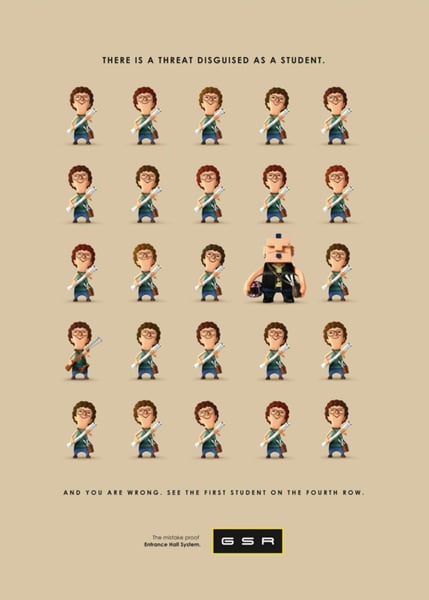
Source: SPR
Brazilian security company GSR breaks the pattern of repetition twice here. They advertise their security systems as catching even the smallest of threats. Yes, the fourth man in the third row stands out. You don’t need a security system to see that.
But look at the hands of the first student in the fourth row.
This concept is extremely effective, thorough, and memorable.
Have you ever seen something so strange that you’ve had to look twice?
While it’s offensive to look twice at a funny-looking person, it’s excellent to look twice at a bizarre advertisement. Be warned, this is dangerous territory. You don’t want to overdo it. But the closer you get to overdoing it, the better.
Remember when Airheads blew up people’s heads up for a commercial? What about the KIA hamsters? You probably haven’t seen either of those in a while, but you know exactly what I’m talking about.
Being weird sticks. That’s exactly what you want here.

Source: ZANE Zhou
You’ll never forget this.
You’re welcome.
If you’re designing for a big brand, you might be able to get away with this: toss the text out the window. It’s one of the biggest power-moves a company can make. It’s risky, but that’s part of what makes it effective.
It makes viewers ask questions, look longer, and it’s a great topic of discussion for a dinner party.
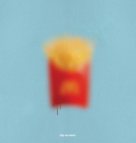
Source: TBWA
Talk about power.
Designing a great advertisement is no simple task. You have to understand your brand, your audience, and your boundaries.
There’s a lot to play around with here! An effective ad design is one that really stands out from the pack. It’s your job as the designer to get creative and make it happen.
Print advertising is neat. Take a leap of faith and learn more about all of the other types of advertising out there.


Good artists borrow; great artists steal.
by Daniella Alscher
Writing a summary of one thousand pages is hard enough – how are you supposed to summarize...
by Daniella Alscher

As brands compete for attention, understanding the power of graphic design has never been more...
 by Prajnadip Pal