Thinking of launching your own app? Here’s what you should know before you start.
The hardest part of app development isn’t completing the project, it’s getting people to use what you’ve spent time and money creating. Here are the facts about app churn: 21 percent of users abandon an app after their first use, and a study from Statista found that 71% percent of global mobile users admitted to deleting an app 3 months after download.
That’s not good news for companies planning to launch an app. App abandonment and churn are real, and it’s critical that companies take notice early on so they can better prepare and minimize the after-effects.
We’ve already identified the problem, so how do you ensure that your app gets the love it deserves and doesn’t fizzle out after a few months?
The best way is to look closely at apps that have experienced such failures in the past and learn from them. At MindSea, we’ve had plenty of clients approach us after their initial failed attempts at launching an app. There’s plenty you’ll need to know about how to make an app, the cost, and the process if you’re hoping to pull off your app launch successfully.
Working in app development has been insightful to say the least. My team and I have learned a lot from these app debacles – and I want to share a bit of those insights with you today.
So, without further ado, here are the 5 top reasons why so many apps fizzle out and what you can do to ensure that yours doesn’t experience the same fate.
A few mobile apps are doomed from the very start. Why? Because they make the cardinal mistake of designing the app without the user in mind. A lot of it happens when companies don’t spend enough time on user research.
Because these app owners haven’t uncovered the “real” needs of their users, the app design they develop doesn’t appeal to their users. These apps often lack the right features, solve unrelated problems and as a result, wind up getting deleted.
The app development process should prioritize user research—it’s a non-negotiable. One of the best ways to implement this is to implement a ‘user-centered design’ philosophy.
What is user-centered design, you ask?
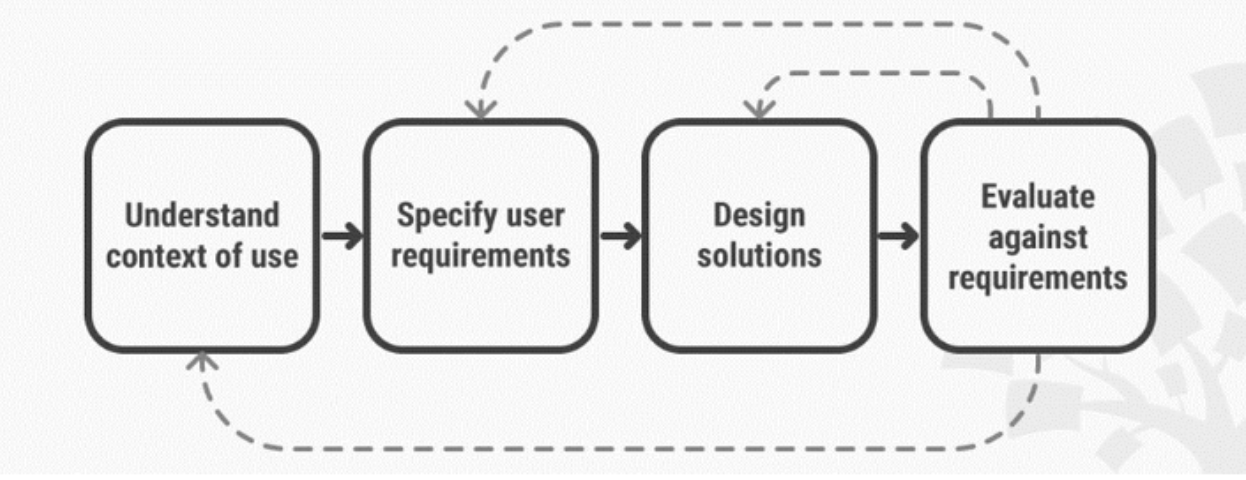
A good definition of User Centered Design or UCD is, “an iterative design process in which designers focus on the users and their needs in each phase of the design process. In UCD, design teams involve users throughout the design process via a variety of research and design techniques, to create highly usable and accessible products for them.”
 Image source: Interaction Design Foundation
This method ensures that the app idea, that you want to bring to life, matches your user’s expectations and satisfies their needs from the beginning.
Peanut is a great app that comes to mind when I think of UCD. The app connects moms, but Tinder-style. Users can swipe up and down and, if they wave, it’s a match! This app offers features and functionality that its users love.
A New York Times article quotes Katie Cox, a mother of two young children who works in marketing in Dallas. Katie said the game like quality of the app was part of the reason she joined.
 Image source: Dribble
The positive response, from moms like Katie, show us that the Peanut app did its homework well. While designing with the user in mind is one part of the story, the second part deals with user testing.
Even though an app may have been designed with the user in mind, and it checks all the boxes, it’s necessary that app owners and companies invest time in beta testing before rolling out the final version of the app to a larger audience.
User testing allows you to find spots that have been missed and or needs fixing. This is the approach our team uses when we build any of our apps. Like Trans Canada Trail, for example. Through this exercise, we realized the need for providing offline access, social sharing tabs, and a trail activity tracker.
One of the possible reasons for low app adoption is a poor onboarding process. If the learning curve is too steep, chances are that your app will be deleted sooner than expected. That’s because onboarding is the first true interaction that a user has with your mobile app.
Whether it’s a lack of social integration, lengthy sign up forms, or a lack of clarity on how to use the app— you’re risking frustrating the user. Moreover this initial frustration makes the user believe that this is the same difficulty they’ll be experiencing once they actually begin using the app. Bummer, right?
Duolingo is a good example of a mobile app that offers excellent onboarding to its users. In a post where she dissects Duolingo’s onboarding process, Talisha Payton, shares how this app hooked her from the beginning.
“I don’t use a lot of apps. When I do, it is usually a very short lived phase in which I end up deleting or abandoning it within a couple weeks.”
So what’s so different about Duolingo onboarding? Well, Payton adds:
“The process is seamless, no scrolling, just one tap per screen and not too many options and you are well on your way. You get to experience a whole lesson before they ask for any information and when they do it’s the easiest process ever. This app is great because it gets you right into the lessons. After downloading, you are in the app learning a language and feeling awesome within a minute.”
There’s a lot in this app that owners can learn from Duolingo’s onboarding. The key to their success is putting the user first. Everything Duolingo has done with their app focuses on the best use for the user. This is what data-driven app design looks like.
By using one or more of these tricks, you’re not only ensuring that your onboarding is top notch, you’re also setting yourself up for success. If your users experience a pleasant onboarding, there are less chances that they’ll uninstall the app.
There’s more that goes into app design than just the way it looks. Creating a user experience that is easy to navigate, intuitive to use, and designed with the user in mind is vital to the success of your app. There are many aspects that app owners need to consider when thinking of the user experience, but let’s look at the ones that most people get wrong.
A sloppy navigation can mean many things, and we’ve all experienced this at least once. Having to tap multiple times to reach the desired destination, confusing on-screen prompts, menus that are too small or too large— these are all examples of a poor navigation flow. It’s the user’s biggest enemy as it prevents them from getting to their goal swiftly and easily.
While adding a search tab should be a no brainer for app makers, it’s surprising how many app owners miss adding this basic functionality into their mobile apps. Imagine an e-commerce app without a search option or a food delivery app that doesn’t allow user to find what they are looking for.
Yet another factor that impacts UX is the poor use of fonts and icons. Bad typography can impact readability and poor use of icons tend to confuse the user.If your user is having a tough time understanding what your app is trying to communicate, there’s a higher chance they’ll stop trying and move onto an app that makes it easier for them. Don’t let your hard work go to waste over poor design.
Have you found yourself tapping at the screen when you should be swiping, or continued tapping on an icon that won’t respond? Chances are you have. Unresponsive gestures are a big issue that app owners should focus on. It not only frustrates the user, it also makes your app look unprofessional.
The presence of any of these is bound to spoil the experience for the user. User experience should be simple and seamless, and making it that way should be a top priority for app owners and companies because this factor is what differentiates a good app from a bad one.
Imagine this: You’re invited to a party and no one speaks to you. Or you start your new job and there’s no one to train you. You’d be weirded out, right?
Of course you don’t want someone glued to your hip at the party or hovering over you during your work day, but you’d still appreciate regular check-ins from your host and support from your boss.
The same is true for people who sign up for your app—you’ve got to engage with them! You’ve got to reach out, touch base, remind them of your app and what it has to offer.
Remember, a download is merely an expression of interest and does not guarantee that the user will continue engaging with your app. And there are millions of free apps to download (including your competitor’s). If you don’t do your part to stay top of mind with your users, someone else will easily swoop in and capture their attention.
Engaged users are more likely to buy from the app (in-app purchase), refer it to their friends and family, and share feedback on features and new updates when prompted. Engaged users are also loyal users and are more likely to continue using the app. The two easiest ways to keep the user engaged is through push notifications and in-app messages.
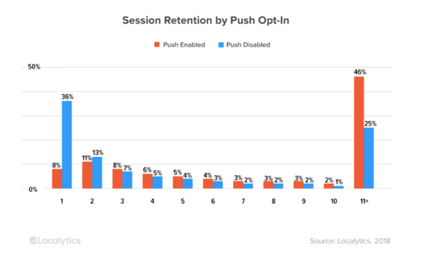
The same research by Localytics, referenced at the top of this post, mentions that only 8% of users abandon apps on the first session if push is enabled, and nearly 50% of users will use an app 11+ times if they opt in to push.
 Image source: Localytics
In-app messages, on the other hand, work equally well to boost retention. Localytics have some amazing data around this tactic as well. Their team found that apps, which send in-app messages, show 2–3.5x higher user retention and 27% more people opening their app, than apps that do not.
But here’s the thing with in-app messages and push notifications—most companies who use them tend to go overboard with them. That’s why it’s suggested that app owners and companies use them strategically, without spamming and annoying their users.
One of the biggest fiascoes that we witnessed last year was the Cambridge Analytica <> Facebook data scandal. The scandal caused people to take a deeper look at how Facebook protects the data of its users. Millions of people were left vulnerable with their data exposed, and nobody was happy about it.
Pew Research conducted a study after the scandal broke and found that just over half of Facebook users aged 18 and older (54%) adjusted their privacy settings in the 12 months prior to the survey, 42% took a break from checking the platform for a period of several weeks or more, and around a quarter (26%) deleted the Facebook app from their cell phone.
The newest app on the block—FaceApp, is also facing backlash. Though by the time of this publishing there will likely be a new app facing a similar scandal. That just goes to show that trustworthiness can make or break the success of your app.
Users will delete your app if they can’t trust it and they make no apologies for it. With data privacy at its peak—there’s no denying that app owners and companies need to pay special attention to the information that they keep and ask for from a user.
Be transparent. Explain exactly why you’re asking for that information from your users upon sign-up, and they’ll be more willing to give it to you.
With so many apps gunning for a user’s attention today, there’s only so much you can do. But doing nothing is worse than doing something. To ensure that your app stands a chance at long-term survival, you need to make sure that you’ve at least got the basics covered.
Ironically enough, there’s not an app for that. However, there are plenty of companies and services that can provide expert help, such as the tips I’ve outlined in this article.
Enlisting the help of a mobile app development company can help ensure your app doesn’t languish away in the iTunes or Google Play store.
Reuben Hall is CEO at the mobile design and development studio Mind Sea, where he helps startups and innovative companies envision and build the next generation of mobile apps.
How do you determine the success of a mobile app?
 by Chris Ciligot
It’s been over a decade since the first apps were introduced to the world in Apple’s App...
 by Chris Ciligot
(This article is part two of a series on the benefits and approaches to app prototyping. See...
 by Dave Kearney
How do you determine the success of a mobile app?
 by Chris Ciligot
It’s been over a decade since the first apps were introduced to the world in Apple’s App...
 by Chris Ciligot


