
Have you ever completed a jigsaw puzzle?
I’m talking about a real challenger, maybe 500 or 1,000 pieces. They take days, weeks, even months to finish, rendering a dining table useless until completion.
Although there are hundreds of pieces, each is equally as important as the other. Whether it’s the straight edge corner piece that ties the shape of the puzzle together, or the middle piece that completes the front door of a house, all of these pieces are vital to creating the full picture.

Misplacing even one of the many pieces that make up a jigsaw puzzle ruins the whole experience. After working so hard on something for so long, you want the satisfaction of placing the final piece, of really finishing the job you started. Knowing that your passion project will go without completion is a huge disappointment to puzzle connoisseurs all over.
When you consider this in the context of how to make a website or making a blog, it’s much the same. You spend days, weeks, even months working to build your perfect website. You utilize a chunk of your business budget to create this incredible user experience, hoping it leads to customer satisfaction and increased consumers or visitors.
When creating a website or undergoing a site redesign, there shouldn’t be any pieces left behind. The various aspects should fit together like a jigsaw puzzle, eventually compiling the perfect picture.
When learning how to design a website, you want to create the optimal user experience. To do so, go through your site piece by piece and make sure you have these key elements. The following features are purposeful elements of a website that users have come to expect and will leave a lasting and positive impression on all those who navigate your way.
The home page is where most first impressions are made. It’s a user’s first look at who you are and what you’re about. Don’t mince words here. Be concise and effective with your communications, and make it a quick place for users to understand your business.
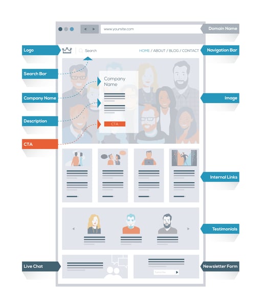
The URL for your website that appears in the navigation bar. This is the address where visitors are able to find you, or the address they are taken to after search leads them to your site. Domain name creation is one of the first steps to website creation, and you cannot have a functioning site without one.
Make the domain simple and easy to spell so visitors may find you without trouble. If your ideal domain name is taken, think outside the box and get creative. Domain names are registered for brands, so you will either need to find an unregistered domain or acquire a domain that is owned by someone else.
Your company’s name should appear pretty high up somewhere on the homepage, reassuring visitors they’ve come to the website they were looking for. Users should not have to scroll to find your company name.
Some users know exactly what they want from your site, and just need help navigating to that page. Including a search bar on your homepage, and every other site page, allows visitors to take control of their site experience.
Logos should also appear high up on the homepage. Logos are small, easy-to-remember graphics that create a link in a customer’s brain between your company and that image. While they may not always remember your company name, they may recognize you by logo.
A short description or company tagline should appear somewhere near the company name or logo. This is especially true of smaller businesses whose work is not so easily understood. A short phrase that outlines who you are and what you do will set the scene quickly for first-time visitors.
Whether to the side or across the top of the page, a navigation bar should be positioned to empower users to explore your site and find their desired products or information.
A CTA, or call to action, can be anything from “create a login,” to “book a demo,” to “get on our mailing list.” It’s a convincing plea to users, begging they take some kind of action on your site that would involve later contact, and it is often coupled with some sort of incentive.
Your website should be accompanied by some sort of header image or body image to provide visitors with a visual. These visuals can be ads for your new spring line, or a graphic designed specifically for your site. Images help retain attention as they are easier to process than an overwhelming amount of text. Images can be a slideshow or video; any visual media is better than a page of plain text.
| Related: Learn how to pick the best images for your website. |
The purpose of a website isn’t just to get people to your homepage. Rather, use your homepage to spur visitors to other parts of the site. Advertise relevant spring styles, or provide links to recent blog posts. Internal links get users to stay on your page longer, which increases the odds they’ll become a customer.
Consider including some of the wonderful things users and/or previous clients have said about you on your homepage. Review sites such as Yelp or G2 Crowd have a plethora of data from which to pull. If you don’t have enough data, seek out administrative rights to your company profile and ask users to write customer reviews. In the meantime, consider reaching out personally to people and asking if they don’t mind saying some kind words to be included in your testimonial section.
|
TIP: Claim your G2 profile today to start getting more reviews that you can use on your site to highlight your happy customers! |
More and more, websites are utilizing live chat software as an opportunity to get in touch with site visitors and provide top-tier customer service. If you are using a live chat tool, make sure users are prompted to converse after they’ve been on the homepage or other internal link for a certain period of time.
Although newsletter forms can really be located anywhere on your site, they should start on the homepage. A lot of orgs will opt for a pop-up that encourages visitors to sign up for the email newsletter in exchange for an incentive, such as a discount. Newsletters can be set to appear as visitors are hovering over the X button, prompting them to action before they close out the page.
The footer sits at the bottom of each page, providing links that help visitors navigate to popular site pages.
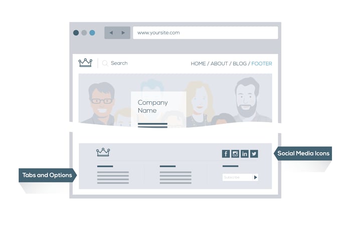
At the very bottom of your homepage, and every page, should be a hyperlinked list of places where visitors commonly wish to navigate. Examples of these site locations are the blog, press stories, the company’s “about” page, careers, customer support, FAQ pages, and whatever other site-specific links are pertinent to your users’ experience.
The power of social media marketing cannot be overstated. In order to get visitors over to your Twitter and Facebook pages, include social media icons on the homepage, or on the footer at the bottom of each page.
An about us page leads visitors to learn more about your organization. Although many of these elements can go on the homepage, you may prefer a page dedicated to users who wish to learn more about the organization. This can be a great place for a company to utilize brand storytelling.
Tip: "Is there an interesting anecdote about how the business started? Share it. A good story puts a human face on what might otherwise be a sales pitch or impersonal About page," advises Susan Greene, a copywriter who helps companies create better web pages. "Facts are important but stories get remembered and help you connect with your customers."
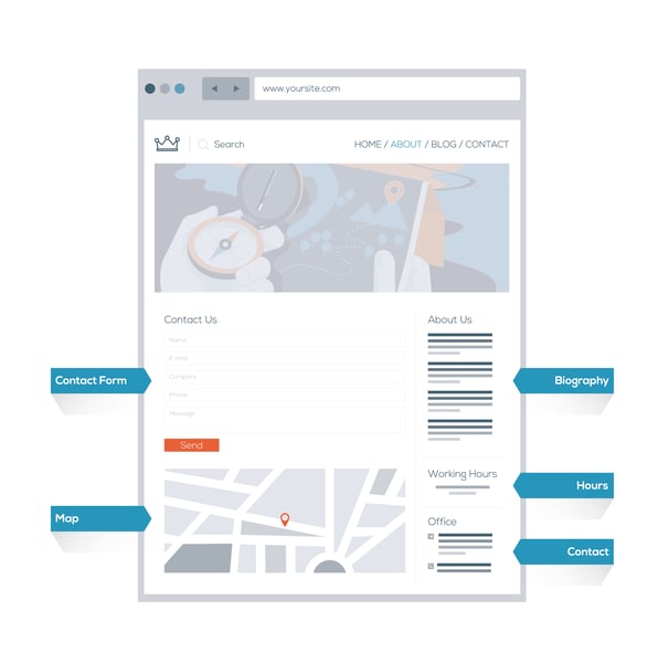
A map and address leads users to your office or store location. This helps them understand where to find you. A larger company with multiple storefronts may also include a search for users to find a location nearest them. A smaller business just needs to include the one or two addresses it has.
If you have a physical storefront, or if you’re only reachable at certain times, include this on your about page. Having hours clearly listed helps people know when you’re more likely to answer their calls or process returns.
Contact information gives users a way to get in touch with you. Include a phone number and potentially a support or informational email address on your about page. This way, anyone who has further questions or who is experiencing issues with your product or service can make contact quickly.
A contact form is another way of making your company available to users. Contact forms gather an individual’s information while giving them a message box where they can voice their concerns.
A biography for your organization and its founders helps visitors better understand who they are doing business with. People love familiarity and feeling good about where they invest their time and money. A company bio can brighten up your about page with some storytelling and personal anecdotes.
The other internal links on your site will vary largely depending on what you’re selling and what tactics you enact to drive traffic. Below are some examples of internal pages and the types of features you’d need to include in a website update to make them successful and navigable.
A team and/or careers page is a marketing tool to show visitors who works at your company, what they’re interested in, and who you could work with if you were also to apply.
Employee pages are often sorted according to who does what, meaning they’re listed in terms of who works in marketing, sales, research, etc. These pages include headshots or other team photos, with the employees’ names and titles. Teams will vary depending on how your organization is broken up and what teams you have.
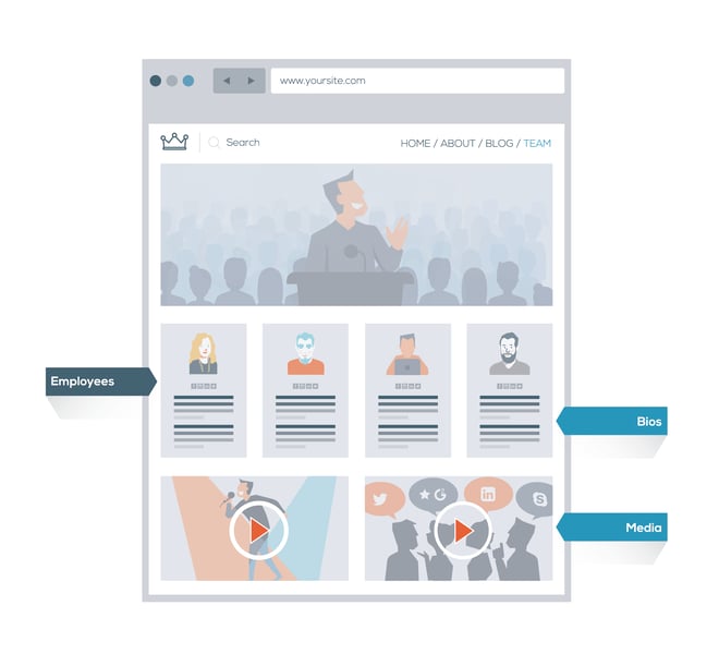
Team biographies show the diversity of your organization in regards to their interests, backgrounds, and modes of thought. Including short bios for employees gives everyone a chance to make their own personal impression on the people coming to your site.
A lot of companies will include a video component to their team or careers page that includes interviews with real employees. This serves as great marketing collateral for when your company goes on a hiring spree. Video components also improve SERP rankings.
If you’re a SaaS company, you’ll likely want to include a features page to show visitors how you stand out against your competitors.
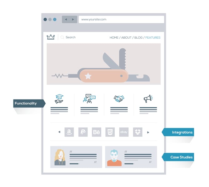
This is, quite literally, just a list of features your product has. What can it accomplish for other professionals? Be sure to organize features according to the specific categories they fall under. If your software product can update and organize customer contact information, list that under a contact management category.
Users are always wondering if a certain software tool is compatible with something they already use. Including integrations on the features page is a good way to address these questions early, as well as increase traffic to your website by including the names of popular tools.
Case studies allow visitors to explore how your product or service has benefited the customers before them. Case studies are unbiased and have the data to back up the claims. Learn how to write a case study to help convert your business website's visitors into qualified leads.
Blogs are great for any organization wishing to bring traffic to its site through unique content, or wishing to provide regular updates through published posts. Even if you’re not particularly a blogger, having a blog on your site can still gather attention.
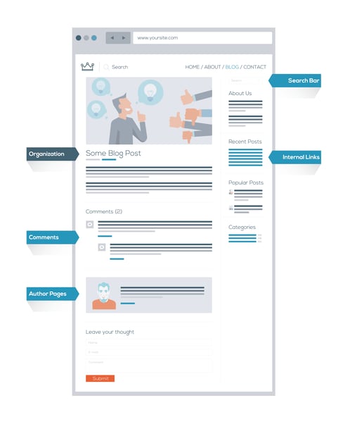
Blogs can be organized in a number of ways, but it matters that they are organized. Readers and visitors should have a clear understanding of how your blog is broken out and how they can find the content most relevant to their interests.
We spoke earlier about having a search bar located on every page, but having one on your blog page is perhaps the most pertinent, as matching keywords can lead your visitors to locate content.
Readers occasionally want to know more about the professionals writing blog posts. By adding a hyperlink to blog bylines, you can navigate readers toward that employees’ bio. This creates familiarity with certain writers, potentially encouraging readers to return specifically for their content. These also can establish credibility for authors with relevant experience.
Blogs are meant to be conversation starters, are they not? Including a comments section after blogs allows readers to participate in a forum-like discussion that shows how engaging your content is.
If a visitor is interested in your blog, it’s possible they would be interested in a different blog of similar devices. Take this opportunity to include a bar or list of recommended content that could potentially keep them on your site for longer.
These pages help visitors find answers to questions that have been asked before. This reduces your team’s need to respond to the same questions repeatedly, and also makes visitors feel more self-sufficient.
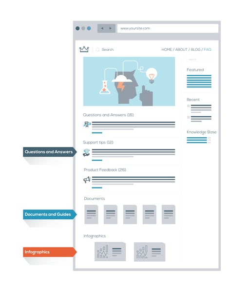
Questions are the building blocks of a forum. Once questions are asked, other people can start to offer up their answers and truly begin a community of shared knowledge. Organize the questions and answers of your forum or FAQ by topic, much like you organized your blog. As with the blog, make these questions searchable.
Every company has set guides and processes, and customers benefit from that documentation as well. Consider making customer-facing documentation and making that available in your knowledge base.
Infographics explain a big concept in a small picture. If your company has infographics that explain processes or data, make that available through the knowledge base.
Everything we’ve discussed so far has been customer-facing, which is helpful in creating a wonderful user experience. But what are some of the elements you should consider on your end, in the control room?
We’ve certainly gone more in-depth on this topic in the business website ultimate guide. But for those of you just looking for a quick checklist of things to consider, the following will get you off to a good start.
A content management system (CMS) helps organize and retain all of the content that is on your website. Even if you take a post down after its related event or holiday, you can store it within the CMS should it be needed again later.
Many CMS platforms have hundreds of customizable add-ons for any use case. For example there are countless popular Wordpress plugins for e-commerce stores.
SEO software tools help you word content in such a way that it attracts the most visitors possible. Keyword optimization helps you utilize the words other people are searching so as to lead them directly to your website.
Analytics tools help you understand who is coming to your site and how much time they’re spending on it. This kind of insight is great for analyzing the effectiveness of certain pages or content for the purpose of changing failing strategies.
Similar to a domain name, websites cannot function without a host. If you’re using a website builder, you won't need to worry about a web hosting provider as your site is probably hosted through them, and you don’t have to worry about finding a host externally.
On the back-end, your website should offer you the option of adding meta descriptions to content and updating its title. This is useful for improving SEO, as adding in certain words in the meta description will make your site appear in certain searches.
Among multiple sources, a few things are clear:
There are certainly more elements to consider, but there’s no need to bog you down as you’re just getting set up. The aforementioned thoughts and advice should get you started on what we hope will turn into a beautiful, functional and successful website. You can then begin to consider web design trends and overall user experience to breathe life into your business website's essential features.
It's all about making a website that will get you in front of as many potential customers as possible, and then making it as easy as possible for those people to find what they're looking for.
Before you move on, learn about SSL certificates and how to get an SSL certificate to secure your business website.
Grace Pinegar is a lifelong storyteller with an extensive background in various forms such as acting, journalism, improv, research, and content marketing. She was raised in Texas, educated in Missouri, worked in Chicago, and is now a proud New Yorker. (she/her/hers)
What if you could create a booking website that saves time, reduces manual work, enhances...
 by Sujay Pawar
A few years ago, I decided I wanted to have a space to share my ideas, stories, and insights....
.png) by Tanuja Bahirat
by Tanuja Bahirat
Nonprofit web design isn’t something your organization should overlook.
 by Murad Bushnaq
What if you could create a booking website that saves time, reduces manual work, enhances...
 by Sujay Pawar
A few years ago, I decided I wanted to have a space to share my ideas, stories, and insights....
.png) by Tanuja Bahirat
by Tanuja Bahirat


