Paintings and potraits have always known to be tell-tales for everyone.
The splash of colors, minute hand strokes and intense expressions are a doorway to the artist's mind. The better a portrait can connect with a person, the more likely it is to exhibit a fondness with them. Same is the concept of visual storytelling.
To distinguish your brand from a hoard of competitors, switching to a visual storytelling practice is a wise move. You could be selling one single product or a range of products, But, connecting the dots between them in a way that entices a consumer who feels a "fear of missing out" could do wonders for your brands.In other words, carving your brand out like a painting for the people.
Crafting engaging graphics and flowcharts with graphic design software can put your brand in a spotlight, while promoting your product in the best way possible in the market.
Let's look at how visual experiences can be created and what steps can your teams take to work together to transform your content.
Visual storytelling is a process of leading a consumer through a brand journey by building engaging content and graphics through content channels like website, email, flyers, banners, traffic advertisements, newsletters and other PR sources. The whole concept sits on creative branding where the product is plugged in naturally and organically into the marketing strategy,
Visual storytelling doesn't imply a brand push or push sales. It is solely the creative eye of the brand that leads them to align their end objectives with the talent of their teams. Also, it isn't important to always let a picture say a thousand words. Gathering your teams and ideating on newer ways to empower your customers, bring attention to product core and optimizing marketing spend all are end goals of a good storytelling strategy.
Visual storytelling is important because it can help your audience understand complex subjects in an easy way. Not everyone learns the same way, and providing different visuals to help explain a concept is a great way to improve comprehension.
Plus, when it comes to creating marketing graphics for your audience, it helps when those visuals appear to have a bit more back story than imagery with less thought put into it.
Visually storytelling doesn't have to push the value proposition of your product. It simply means creating a good customer experience where you foresee a demand. Adding specific elements to your website that makes you content more personalized and let your voice be heard in the market. Customers can learn in a language that they best understand. Meeting them where they are through creative imagery can build your foundation better and help you gain word of mouth.
Let’s look at it this way. Taylor Swift is famous for using her visuals, whether it’s a music video or a promotional photo or graphic to tell another story. There are hidden meanings everywhere. While that doesn’t mean your brand needs to be digging as deep as that to create subliminal messages in your marketing graphics, it does help to explain why audiences love a good visual story.
Before you run off to create a visual story in your next ad campaign, let’s go over some basic rules of being a good visual storyteller.
Visual data storytelling isn’t like your show and tell days in grade school, when you’d show off an object from home and explain what it is and why you brought it. Instead, your visual should be doing the telling all on its own.
There are so many ways to let your visuals run the show. Find relevant stock photos, replace short text headings with icons that convey their meaning, incorporate data visualizations to demonstrate stats and figures, and more.
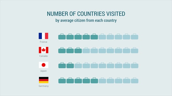
Take a look at this pictogram below:
Source: Visme
While text is used in the title to let viewers know what the photos mean, the rest of the story is told in visuals. We can see from the contrasting suitcase colors the approximate number of countries the average citizen has visited. Consider other ways you can incorporate visuals into your creations, whether it’s a video, graphic or presentation.
Your audience should understand the setting or the message of your visual because of the context your subject is in. This can range from anything like the colors you choose – after all, colors have different meanings – to the filter you use on a photo.
This is already perfectly done in settings like comic strips, as we see below:
 Source: Smithsonian magazine
The context is obvious. The character is sitting in her home throughout the first two windows, then the setting shifts to outside. Consider this same concept in any type of visual you’re creating. You want the context, whether it’s the setting or a feeling your audience should grasp, to be easily understandable.
Whether your piece of content is a video or an animated graphic, the way each element moves can tell a story all on its own. What moves first? Is someone pointing or making a gesture to an area of the screen? Incorporating movement into your imagery is the perfect way to provide a visual narrative for your audience.
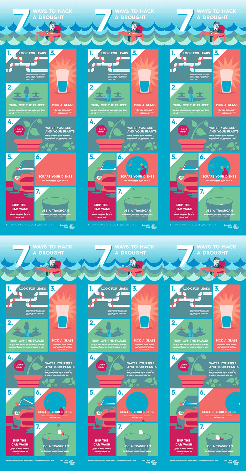
Take a look at this animated infographic to get an idea:
Source: Column Five
Each point within the infographic has its own animated elements, so that as you read through, from point one all the way to point seven, each small section tells its own story.
You can even make use of guestographics by citing third party publisher content on your site or cataloging your infographics or animations to guest websites for traction from other people audiences (OPA).
Visual hierarchy shows a viewer what they’re supposed to look at first, second, third and so on. In a graphic or cover page, this means the heading should be in the largest font, with each subsequent subheading in a gradually smaller font.
Take this blog header for example:

Source: Co-schedule
The first thing you look at is the header in the largest font, then the subheader in the smaller, italicized font, then finally the button. That’s exactly what you need to keep in mind when creating visuals with a story. The order your audience looks at each piece of text or imagery within your content depends on both size and placement.
This is easy if you’re creating a video or presentation, but requires a bit more finesse if you’re just creating graphics for an ad campaign or promotion. You want your visual story to have a beginning, a climax, and an end. There needs to be conflict. Rising action and falling action.
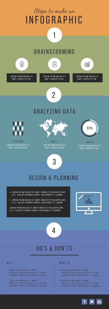
This is how you tell a good story, and your visuals need to do the same:
Source: Visme
It’s easy to follow a storyline in an infographic like the example above, especially when walking your audience through a step-by-step process. Make sure that the flow in your visuals is obvious so your viewers know the proper order to digest your information.
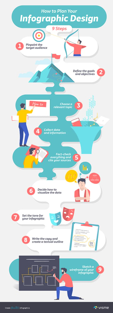
While you can have fun with inanimate objects and icons, people relate to people. Using real people in photos or videos, or even incorporating illustrated characters into a graphic design, is a great way to connect with your audience.
Source: Visme
The above infographic incorporates several characters making actions within the design. This helps to relate more to the viewer as they’re able to see these concepts being done by characters.
If you use stock photos within a slideshow or even as blog post graphics, opting for stock photos that have people in them are also much more powerful than stock photos without.
Back to our Taylor Swift example, every audience loves a good metaphor or hidden meaning. Think about how you can use visual tropes instead of creating clear cut context and settings.
This is an example from one of Taylor Swift’s music videos where she creates a visual trope alluding to a scene from the popular movie Wolf of Wall Street.

Source: YouTube
See the resemblance? She’s making a statement by building a comparison to this iconic scene from a popular movie. Creating references to pop culture within your graphics can help give your audience a greater understanding of what you’re trying to say without actually using any words.
While creating hidden meanings and visual allusions can give your story new depth, you don’t want to lose sight of your overall goals and objectives in your visual narrative. Focus on the point, the subject you’re trying to teach or the product/service you’re trying to promote.
This is especially important in advertising visuals. You don’t want to cram a ton of different ideas, products or services into a single ad visual. Rather, your visual should focus on a single entity, like in this example below.

Source: Digital Marketer
While Yeti sells various types of coolers and similar products, this ad visual focuses on a single product, their thermoses. This helps to avoid overwhelming ad viewers and will entice clicks from people who are interested in the featured product.
In the end, the entire point of using these visual storytelling techniques is to creatively teach your audience something. If you create online courses, blog content, or ad campaigns, you want to help your audience learn something new.
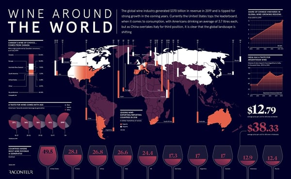
Take a look at this graphic below all about wine around the world:
Source: raconteur
If someone sits and digests all of the information within this graphic, they’re going to learn a thing or two about wine. For example, many people might think Italy would be the biggest money maker in the wine world, but they’re actually in fourth place.
Whether you include data visualizations like in the example above, use photos or icons to convey your point, or create flowcharts and illustrations, you want to make sure you’re teaching something through your visuals.
There are a number of visual storytelling examples that have won the crown of being the "most relatable brand" in the market. By coupling a sentimental connection with the target audience and picturizing it through homepage, advertisements and newsletter, they have gained the peak of customer conversions and became marketing ninjas of their own niche.
Let us look at around six such examples where the brand has built a permanent recall with ace visual storytelling and customer marketing.
Starbucks has taken the visual story telling game to a whole new level. By leveraging gamification elements into their website, televising coffee bean brewing process in roasteries and rolling out loyalty cards and priority cards, Starbucks aims to be the largest coffee chain in the world by giving an ace treatment to the consumer.
Further, Starbucks provides in-cafe amenities to the customer, as you cannot get anywhere else other than it. The soothing shot of calming Jazz music, hi-speed wifi, washroom amenities and good number of charging ports makes it a comfortable workspace for employees. Starbucks employs gamified gifs, minimalistic website marketing and a luxury feel through their digital platform to set themselves apart from the rest of the crowd. Indeed, the brand has employed creative visual storytelling tactics in the most clever sense to not appear as a "pushover" and connect with coffee drinkers around the world.

Source: Starbucks
From spearheading a Nike Runner's Club to building a customized audience interaction platform to organizing marathon runs, Nike hasn't left stone unturned in showcasing their value to the audience. The marketing strategy of Nike isn't just limited to responsive website graphics, infographics, blogs and call to actions. They have went a step ahead and created a niche for themselves in the athleisure category. Nike is now the topmost choice of every athlete, is a coveted sponsor of sports championships and has uncountable stores around the world. Nike's creative team have made it a point to not woodpeck the basic features of their products, unlike any other athleisure brand. The brand promotes healthy and active lifestyle, positivity and good mental health so that their customers can trust the brand and buy their products.
Nike has one of the greatest website lead generation numbers in the world. In February 2023, the number of users that visited the nike platform was 149.78 million. The monthly user growth shot up to +0.63%, making it one of the most successful global sportswear brand.

Source: nike.com
Organic India is the perfect example of "leading through storytelling". The brand shares heartfelt stories, testimonials and the process of nitpicking tea leaves from the massive tea farms of North east India directly on the main website in form of carousels, short videos, gifs and high resolution graphics. Organic India's products can be purchased directly from their homepage, with a detailed description of the ingredients mentioned for the consumer's interest. Whether you want to purchase a black tea, red tea or oolong tea, heading over to their main website is all the heavylifting a consumer needs to do as Organic India packs it's organic marketing strategy into a fantastic user experience.

Souce: Organic India
Pottery Barn is a renowned name for apothecary furniture. The brand was incepted in 1949 by Paul Secon and Morris in manhattan. Since inception, the brand's message has been dedicated to depictions of still life, like antique tables, cages, vases, bedding, bath, rugs, decor items and home aesthetics. Pottery Barn's focused on showcasing handwoven work of artisans, carpentry, hardwood species like Oak, Mahogany and Resin and the instances of a beautiful home through their website. Building such aesthetic experiences through website and giving users a sense of homely touch through content distribution channels enabled Pottery Barn to be an exquisite marquee in the home decor and furniture category.

Source: Pottery Barn
Apple is the brain child of Steve Job and Tim Cook and has ceded to the throne of "world's best electronics and gadgets company". Apple's products are manufactured very cleverly, with a private supplier network to source best of the best electronic components and assemble each of them at the main plant located in the Silicon Valley, California.
Apple has mastered the marketing strategy for their products like Iphone, Ipad, Airpods, Apple pencil and Apple watch by providing personalized brick and mortar assistance to consumers and superlative industrial design standards for products. Apple's marketing and creative teams focus on building customer retention and white glove experience for customers through most anticipated product features, responsive graphics and eye-catching videos and visuals to the customers. Apple has the largest mobile market base in the whole world.
Further, Apple has a multilingual website to translate product based content into regional dialects for every demographic across continents so that they resonate with their offerings.

Source: Apple
When you first set your foot in the market, your customers are not aware of you. Building the right creatives and understanding market perception is the first step that would enable your brand to create it's foundation and gain some relevance. Visual storytelling is not just about fancy words and images, but more about the sentiments that you share with your consumers.
Learn how you can take your graphic design basics to work and illustrate brand visuals for your customers.
This article was originally published in 2020. It has been updated with new information.
Chloe is a Content Marketing Manager at Visme, an online graphic design software. She loves to write about digital marketing and design and find new ways to engage audiences through content. Chloe is based in Charleston, SC, where she loves exploring her city with her son.
From your logo and color scheme to fonts, imagery, and layout, visual branding shapes a...
.png) by Devyani Mehta
by Devyani Mehta
Your brand is more than just a logo; it's the story you tell and the connection you make.
 by Ashley Lipman
As a designer, you spend most of your time worrying about other people’s brands.
 by Dawson Whitfield
From your logo and color scheme to fonts, imagery, and layout, visual branding shapes a...
.png) by Devyani Mehta
by Devyani Mehta
Your brand is more than just a logo; it's the story you tell and the connection you make.
 by Ashley Lipman


