
When it comes to graphic design, there are a lot of elements to think about — color, layout, graphics, white space, etc.
However, there’s one element that often gets overlooked that is without a doubt one of the most important: typography.
Typography is an essential part of using design as a way to deliver key messaging. But what exactly is typography? What are the design principles you need to know to use it effectively? What are the current trends in the typography space — and how can you use them to lend a modern and timely feel to your graphic design in 2020?
Let’s start with the basics. Before we dig too deeply into typography trends and resources, let’s take a moment to cover what typography is.
|
TIP: Find the best typography to suit your needs using web font marketplace software.
|
Typography is the way you choose to lay out text in a design, including size, style, and overall appearance.
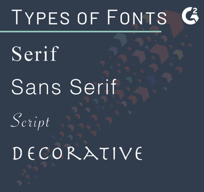
The first important element of typography is typefaces and fonts. The typeface and fonts you choose for your design can make a huge impact on the overall look and feel, and it's important you understand the different font types and how they can change the way your design looks. For example, using a classic serif font is going to lend a completely different influence to a design than something graphic-based.
When choosing typefaces, it’s important to consider what message you’re trying to send with your design.
Are you putting together an annual report complete with charts, data, and company information? Using a more whimsical typeface like Comic Sans would feel completely out of place; you’d be much better using a classic font like Helvetica, which is a better fit for the business-related content.
| RELATED: Have you heard the news? After 35 years, Helvetica finally got a refresh. Learn more about Helvetica Now! |
On the flip side, if you’re making a brochure design for a children’s clothing retailer, the more whimsical typeface would feel much more cohesive and on-brand.
Another key element of typography is text hierarchy — or, in other words, the way you lay out text as a way to illustrate importance. Leveraging text hierarchy is a great way to call attention to the most important parts of your messaging — and to make sure key information isn’t lost in the overall design.
As a general rule of thumb, you always want to make your most important text the largest in order to call attention to it in the design; the smaller the text, the less likely it is your viewer is going to read it.
For example, if you were designing a landing page to drive sales for a new product, you’d want to make key messaging (like the product name, price, and important details) the largest — and use smaller text to communicate the less-important details (like your return policy).
The most important thing to remember about typography is that whether it’s the main focus or a background element, your text is part of the overall design — and leveraging font and text hierarchy are key elements in creating a design that feels cohesive, effective, and makes a visual impact.
While font and text hierarchy are the two most important elements of typography — and the two you really need to understand to get started — there are still plenty of other terms and principles in the typography space that would be helpful to know.
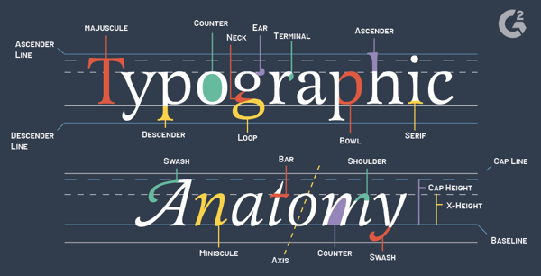
Here’s a preview of some important typography terms:
The bottom, invisible line where text, letters, and characters sit.
The top, invisible line that acts as an upper boundary for text, letters, and characters.
The height of a certain font’s lowercase letters (with the exception of ascenders, like the letter h, or descenders, like the letter p).
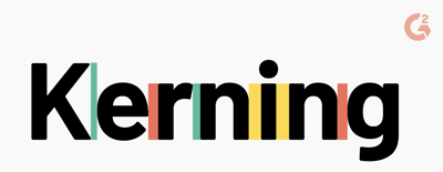
The amount of space between letters in a block of text (sometimes referred to as “letter spacing”).
The vertical space between each line of text.
An adjustment that either extends or lessens the space between two letters or other characters.
So, now that you know the basic elements, terms, and principles of typography, let’s talk about how to put them into action — or, in other words, the basic typography rules to keep in mind when creating your designs.
(Source: Runyu Xia on Medium)
Too many fonts can get visually overwhelming. If you want your designs to be cohesive, choose a maximum of three fonts — one for the header text, one for the sub-header text, and one for the body text. (Using one or two fonts is also fine.)
If you’re going to use more than one font in a design, make sure each is distinctive enough to stand on its own. Choosing two fonts that are too similar — and are too challenging to differentiate from each other — can come across as a mistake instead of a deliberate design decision. Remember, font pairing is an art and a science.
We already covered the importance of text hierarchy, but just to reiterate — it’s important to use text hierarchy to convey importance in your designs. Text hierarchy dictates how the viewer is going to receive the information in your design. So, if you have an important piece of information, make sure it’s larger than the other text in your design and easy for your viewer to identify.
Tracking, leading, and kerning have a huge impact on the final feel of your design. For example, having a significant amount of space between letters is going to create a completely different look and feel rather than grouping letters closely together. Make sure the way you’re spacing your typography — both between letters and between lines — fits with the overall design aesthetic you’re trying to create.
If you're thinking about taking advantage of these basic typography techniques, whether you choose to make your own font or use one that already exists, take a look at some of the font trends that are set to dominate the typography world in 2020:
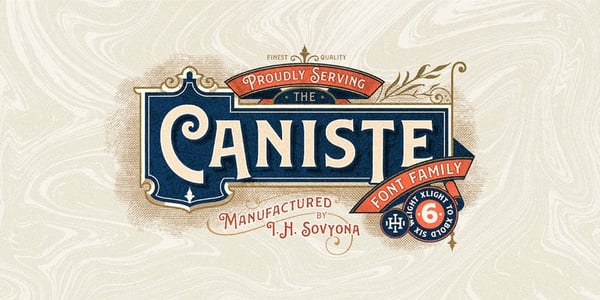
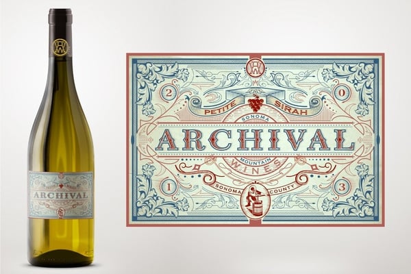
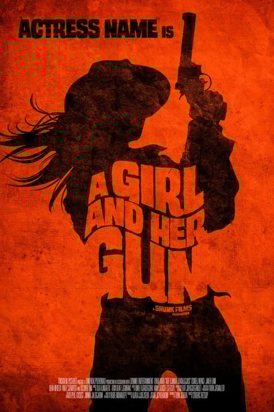
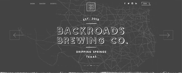
Nostalgic throwbacks are having a major moment in fashion, television, interior design, and pretty much everywhere else — including typography.
Vintage fonts that evoke a sense of nostalgia are going to be everywhere in 2020. This trend is surprisingly versatile; nostalgic fonts can be used as part of a type of logo design, illustration, packaging, and really any design you want to lend a nostalgic, but modern, feel to works.
(Source: Ilham Herry)
(Source: Sign²in)
(Source: Ramandhani nugraha)
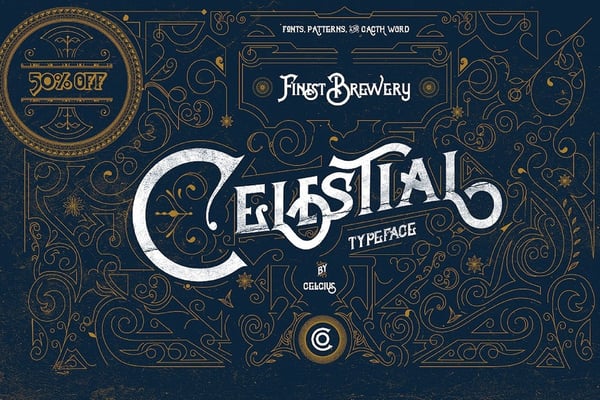
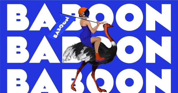
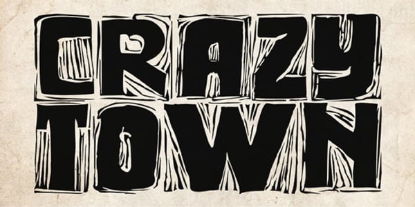
Sometimes, less is more. But sometimes, more is more — and that’s definitely the case with one of 2020’s biggest typography trends: extra-loud (and bold) fonts.
Bold, loud, in-your-face fonts aren’t for everyone — but if you’re looking to create a design that’s going to leave a lasting impression, consider them a definite go-to.
(Source: I n f r .)
(Source: Sagmeister & Walsh)
(Source: estyr37)
The key to using this trend effectively? Let the font take center stage. It’s such a loud and bold choice, you don’t want to throw in too many other elements and visually overwhelm your audience.
(Source: Stan Kurkula)
(Source: Un Barco)
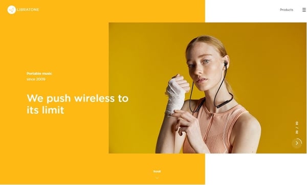
(Source: Libratone)
Bold is going to be big in the world of typography in 2020 — but that doesn’t mean there’s not a time and a place for a more subtle approach.
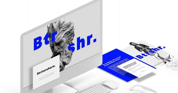
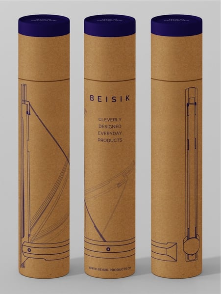
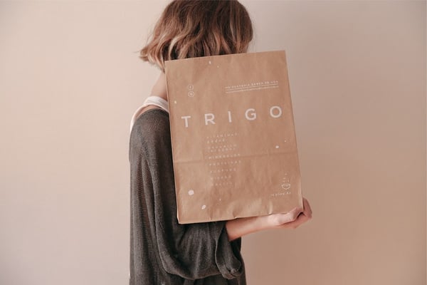
Minimal sans serif fonts are pretty much the opposite of the extra-loud trend. They’re simple, classic, and lend a sophisticated feel to designs.
The plus side of this trend? These fonts are extremely easy to use, and, when you use them effectively, they can make a major impact (despite their minimalistic design).
(Source: simplest™)
(Source: Pixelo Designer’s Website and Vladimir Fedotov)
(Source: Viita Titan and Marc Berenguer)
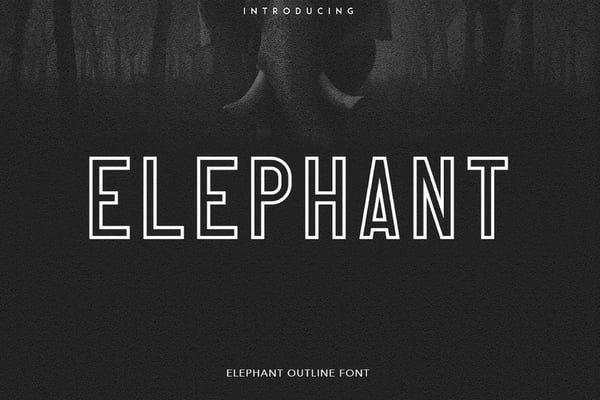
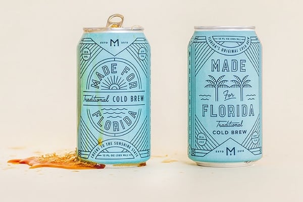
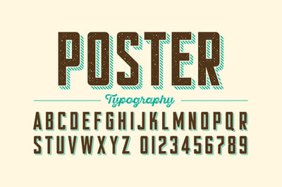
The modern, industrial feel of outline fonts lends a clean look to designs — and that clean look is going to be a huge trend in the upcoming year.
Outline fonts (which are exactly what they sound like — fonts that are primarily outlines with blank space within each character) are extremely versatile; depending on the font and how it’s used, it can feel rustic, modern, classic, or whimsical. It’s all about the execution. So, once you hone in on what kind of look and feel you’re going for, you can find the outline font that brings that aesthetic to life.
(Source: Free Stock)
(Source: Wintrygrey)
(Source: Amit Jakhu)
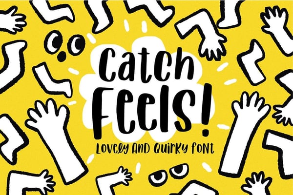
You can play it safe and stick with a tried, true, and classic font – but if you want to step outside the box and dare to be different, 2020 is the perfect time to do it.
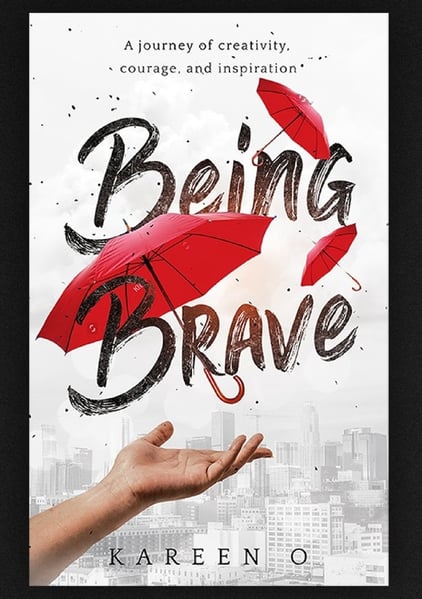
Quirky, offbeat, and playful fonts are set to be a huge trend in 2020. People are drawn to these fonts — despite their somewhat rough or clumsy appearance — due to the charm and lightness they add to designs.
If you’re looking to bring a little lightheartedness and fun into your designs in the upcoming year, this is definitely a trend you’re going to want to take advantage of.
(Source: Nika Nekrasova and Lukyan Turetsky)
(Source: Meella)
(Source: Sam Parrett)
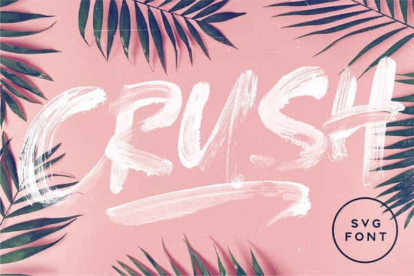
On the same vein, you can play it safe with fonts that are clean, straight-laced, and to the point — or you can get messy, a font trend that’s going to be big in 2020.
Think of this trend as the punk rock of the typography world; it's messy and effortlessly cool, in-your-face, bold, and graphic. This trend isn’t for the more buttoned-up designers out there — but for those who want to lend a hard-edge to their designs, this is definitely going to be a go-to.
Now that you have a handle on typography basics — and what typography trends are going to be everywhere in 2020 —let’s talk about resources for putting those basics and trends into action.
If you’re looking to add some new fonts to your design arsenal, there are a number of free font databases out there with thousands of fonts to choose from.
If you’re looking for something completely original, you can also hire a designer to create a custom font. Not only will this give your designs a one-of-a-kind feel, but they can also help to strengthen your branding.
Typography is a key element in good design.
Now that you know the key elements of good typography — and the trends that are going to be big in 2020 — all that’s left to do is get out there and start designing.
Ready to put your typography skills to the test? Learn about the best free graphic design software you can download right now. Or, if you're building a website, check out the best typography for websites.

When thinking about the design of your website, how do you ensure it evokes the right message...
 by Mara Calvello
Knowing the difference between two things that are very similar can feel trivial.
 by Daniella Alscher

There are thousands of fonts available for download, but none of them have their serif on the...
by Daniella Alscher