February 13, 2019
 by Brea Weinreb / February 13, 2019

Discuss web design long enough and the words “raster” and “vector” are bound to come up. You may not know what they are or what the difference is between them, but you can already tell that they’re rivals.
The short answer is that they’re two different approaches to graphic files formats. SVGs, EPSs, and PDFs are vector graphics, while JPEGs, PNGs, and GIFs are raster graphics. But that just scratches the surface. What exactly is the difference, and more to the point, when do you use each?
Since you’ve already about vector graphics, below I'll tell you everything you need to know about raster graphics: what they are, why they’re different from vector, and when to use each one.
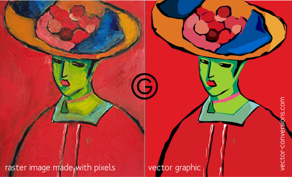
Raster graphics, also known as bitmaps, store image data as fixed pixels. These pixels, which each represent a single color, are fitted onto a grid (or a “raster” proper, which is where the name comes from). Take a step back, and all those colored pixels form a clear image, just like a mosaic.
Higher definition graphic design images require more colors, which require more pixels, which require more storage. The size of an image file, then, is determined more by the amount of pixels than the image’s dimensions: a screen-sized low-definition image has less data than an Ultra-HD profile picture.
High resolution images use smaller pixels, and so have more pixel density — a value known as either DPI or PPI, for “Dots Per Inch” or “Pixels Per Inch.” (The terms are interchangeable.) Raster images with high DPI use smaller pixels, so they can fit more colors in the same space. For a frame of reference, high definition photos are 300 DPI or more, while standard definition photos are around 72 DPI.
However, keep in mind that when putting these images on the web, browsers consider only the final dimensions, not DPI. The reason pixel density is important for web design is that images with higher DPI look better at large sizes than those with smaller DPI. So, if you want a high-resolution hero image background that covers your entire screen, start with a high DPI image. Vector graphics, on the other hand, are not restricted by DPI, one reason they’re great for web design — as we explain more below.
There’s a myth going around that all web images are reduced to 72 DPI automatically, but that’s been proven false. It’s from a long time ago, when screen displays weren’t as sophisticated as they are now.
How many pixels you use and how you organize them allows for some flexibility in image compression, or making image files smaller while retaining as much quality as possible. The video below shows just how effective pixel imaging can be at lower resolutions.
 In addition to JPEGs, PNGs, and GIFs, mentioned above, raster graphics also consist of BMPs, TIFFs, and many other more specialized formats.
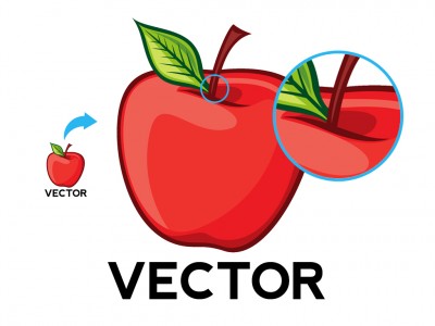
Without repeating ourselves, we’ll give a brief overview of vector graphics. While raster graphics store image data as pixels, vectors store it as equations. Each “point” in a vector graphic corresponds to a master x-y axis that keeps everything in order, so a fresh image is generated at each new size. As such, vector graphics don’t use DPI or PPI because those values change based on the image’s dimension.
Why go through all the extra effort when raster graphics can do just fine? Because vector graphics are scalable. Vectors retain the same resolution no matter the size because the pixels are not fixed, they’re dictated (or calculated) by the image dimensions. A vector graphic always looks its best, no matter whether a thumbnail or a hero image.
 That’s the main difference between rasters and vectors. Raster graphics are not scalable; they begin with a preset number of pixels and that number never changes. You can shrink the number of pixels using an image compressor, but then you’re creating an entirely new file. In other words, if you want the same image to appear at different sizes, you would need multiple raster images as opposed to just a single vector.
But that’s not to say vectors are superior to raster; both have their own strengths and weaknesses to consider. As we explain below, it’s all about using the right formats at the right time.
For starters, some images can only be raster and some can only be vectors. The most common example is photographs, which can only be raster images (or at least originate that way). Vectors are computerized images, so you can’t really use a “vector camera” to capture real-world images.
Moreover, once a photograph is taken, you can’t improve its resolution (although you can compress it). The pixels you capture with the camera are all you have. Think about it: you can’t go back and add real-life imagery to the picture once it’s been taken. You can manipulate the image or add photorealistic computer graphics, but those aren’t the same as just taking a better photo.
That means you should decide the image’s final use before you even take the picture, if possible. Determining the ideal resolution and file size before snapping the shot could save you a lot of headaches later on.
Between raster and vector graphics, use raster when you need high-quality, pixel-perfect imagery without a concern for file size. Raster graphics are superior when it comes to color usage; the more pixels you add, the more lifelike the image. That gives raster graphics more capability for capturing blends, shading, lighting nuances, and gradients. However, always keep an eye on your file size — more quality means more data.
Take product photos, for example — their quality can make or break an ecommerce store. Online vendors want their photos as realistic as possible so the customer can make a more accurate judgement of what it’s like in person. But all those photos for all those products can take up a lot data space, so it's best to use the right compression format and extension, explained in the next section.
Conversely, vector files are more utilitarian in most other aspects besides photorealism. Their benefits are numerous: vector graphics have smaller file sizes, are easier to edit/modify, and they can scale. For web design, those are all huge pluses. Smaller file sizes means faster loading times, and scalability is more or less essential for good responsive design. If you want your logo to look sharp on both desktop and smartphone screens, use a vector graphic.
It’s also worth mentioning that most fonts are designed in vector formats. This gives them the adaptability for whatever size the user needs.
 For raster vs. vector graphics, the rule of thumb is to use raster graphics when image quality is the top priority, and vector for everything else.
But given the popularity of photographs in web design, sites usually end up with an assortment of both. A common analogy is painting vs drawing; rasterized images can create complex imagery with blended colors like painting, whereas drawing is faster and more convenient for simple shapes at any size.
Interestingly, some vector formats implement rasterization. For example, SVGs, one of the most used vector formats, can contain rasterized components within. If you’re skilled enough with an image editor, at times you can even vectorize a raster photograph. Just keep in mind the image resolution can’t get better than the photograph you start with.
Of course, the ultimate decisions goes beyond just vector vs. raster graphics. If you’ve decided you need a raster image, you still have to choose the best file type — JPEG, GIF, PNG, etc. — with each having their own strengths and weaknesses to consider.
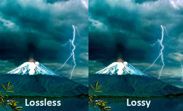
Before we run down the best uses for each, it helps to know what you’re looking for. Let’s go over some of the terms with this Stack Overflow thread. Specifically, you should know how the image is compressed (lossless or lossy)...
 Aside from the type of compression, consider how the file type manages color (indexed or direct)...
The main raster graphics extensions below each blend the types of compression and color palettes in their own way. Choose the best one for you on a case-by-case basis, depending on your priorities.
Joint Photographic Experts Group is the most common raster file type, and one of the most common image types on the web. Its strength is its malleability — you can reduce the quality to shrink the file size, or bulk it up for impressive, realistic graphics. JPEGs are best as a file-size compromise for high-quality photographs and other graphics: they reduce the file size compared to lossless formats, but the direct color palette still offers enough quality to look great.
Portable Network Graphics, 8-bit. The first and lower-end type of PNG uses lossless compression for better image quality than JPEGs, but is held back by its indexed color palette. In most cases, other files formats are better, except one: PNG-8 works best for web graphics that don’t have their own background and will be overlayed over others. For example, if you want to superimpose a custom header image over your existing web page background, use PNG-8.
Portable Network Graphics, 24-bit. With lossless compression and direct color palettes, PNG-24s are capable of even better image quality than JPEGs, but have larger file sizes. These work best when image quality is your top concern and you have some breathing room for how fast your site loads.
Graphics Interchange Format. For static images, GIFs are rarely the best choice. Because of lossless compression their file sizes tend to be big, but the indexed color palette reduces the image quality as well. Where GIFs truly shine, though, is animation. If you want a video clip that’s quick (within a few seconds) and don’t need sound, GIFs are the best choice.
 BMP [Lossless, Index or Direct]
Bit Map Picture. BMPs are a bit outdated and are best avoided. Sure, they have high image quality, but it’s not worth the gigantic file sizes. We’ll mention them here because they still come up from time to time, but for the most part the newer file formats are better.
Tagged Image File Format. Like BMPs, TIFFs are best avoided for web images. Their specialty is in how well they recover quality after manipulation, making them a good choice for digital artists and print publishers. However, their giant file sizes make them detrimental for the web by increasing loading times.
Don’t think of it like raster graphics vs vector graphics. More often than not, raster and vector complement each other. With different specialities, it’s more about choosing the right tool for the job. Hopefully, this article helps give you a discerning eye, so you can choose the best possible image file type for every occasion.
Ready to learn more about design? Learn about the best free graphic design software in 2019.
Brea Weinreb is the community manager at 99designs, a marketplace for graphic design.
You design something that looks perfect on your screen, then it falls apart everywhere else....
 by Holly Landis
We’ve all seen the trope on crime TV shows: a detective stares at a blurry security image and...
 by Brynne Ramella
Graphic design is the art of visually communicating ideas to inform, engage, or persuade an...
 by Jordan Wahl
You design something that looks perfect on your screen, then it falls apart everywhere else....
 by Holly Landis
We’ve all seen the trope on crime TV shows: a detective stares at a blurry security image and...
 by Brynne Ramella


