February 28, 2023
 by Piper Thomson / February 28, 2023

A specter is haunting the face of the iTunes store — the specter of bad podcast cover art.
Even in such a fundamentally auditory medium, the package in which you present your show in a podcast hosting platform is a critical part of whether or not it gets the attention it deserves.
In the hectic maelstrom of modern life, there's an overwhelming amount of content competing for attention. A good cover acts like a filter and enables listeners to quickly identify relevant and interesting content. By applying some basic principles of good design, you can escape the quotidian traps of boring podcast cover art.
Podcast cover art is the image that represents your podcast on different directories and platforms. It typically includes the title, relevant graphics, and names of hosts.
Podcast cover art is different from the Podcast logo. A logo is a cover art component that represents your podcast in places beyond directories, such as merchandise and other promotional materials.
A good podcast cover art is essential for attracting potential listeners, brand recognition, and brand recall. It is the first thing someone browsing the directories sees, and first impression matters. A visually appealing cover art makes your podcast stand out and look more credible and professional. Well-designed covers set the right expectations by conveying exactly what the podcast is about.
An important point to note here is that you shouldn't change your podcast cover art frequently. It may come off as lacking focus and unprofessional and cause your listeners used to the old cover to overlook the new release. When required, make subtle changes that maintain your brand identity and yet give the podcast a refreshed look. A good cover art should be adaptable to different formats like thumbnails, banners, or social media posts, ensuring consistency.
Understanding the principles of design will go a long way in helping you make something you can be proud of.
Now, full disclosure: I am in no way a design expert or a professional, something I supplement with some very talented friends and colleagues. Luckily, you don’t need to be a professional designer in order to make great podcast cover art! This article will equip you with the tools you need to create excellent podcast cover art.
Good design has a set of principles that should be taken into consideration in order to grab your target audience’s attention. These aren’t rules; they're more like guidelines.
You can’t make good podcast cover art if you don’t know what “good” looks like.
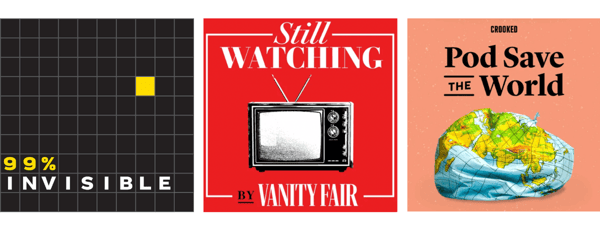
One of the best ways to figure out how your podcast should be presented to the world is by observing popular podcast cover art on your favorite directory; it might have slipped by your eyes up until now, but take some time to critically engage with the art for some of your favorite shows. Notice what works, what doesn’t, what you like, and what you don’t. Each of these covers has something that helps it stand out while still adhering to some of the same basic principles.
It’s a common misconception to think that drawing too much from existing work will somehow turn you into a derivative hack. This push to create truly “unique and original” work is Sisyphean garbage and should be discarded at the earliest possible convenience, preferably through vigorous defenestration or a strongly worded letter.
Innovation necessitates context. Context gives us our unique taste and sense of artistic style, both of which are crucial for every part of the creative process. It’s when these learned systems of knowledge are combined with your subjective perspective that unique creations begin to manifest.
Before you can start drawing up your new podcast cover art, you need to make sure you’ve carefully considered the title of your show. Think of the title as the axis around which the rest of your cover art will revolve; it conveys the most direct information to your reader, and the rest of your cover needs to follow these semantic cues. One of my favorite podcasts, Dr. Death, invokes a very strong sense of dread, horror, and mystery, while Motherhood Sessions has a soft, safe feeling that is well-aligned with the concept of “motherhood."
Tip: In order to develop a harmonious podcast cover, consider answering:
Different people are looking for vastly different things in the content they consume. Be careful to choose a title that conveys the content of your show so as not to mislead your audience.
One of the important elements of a podcast cover is the typeface and font you choose to convey the message of the written elements of your cover. While the only hard rule is that it must be legible, this is also an important consideration for making sure you send the right signals to a prospective listener, not only through how the typeface looks but how it’s placed over the cover. Check out visual hierarchy for more information on this.
Remember that there are a few different aspects of podcast cover art that require typographical finesse. Alongside the main title, you should consider how the network, hosts, or other information should be conveyed.
Color is one of the most important and clear ways to convey a particular mood for your podcast cover. Returning to the example of Dr. Death, the use of black and white helps to instill a specific feeling in the audience, in this case, mystery and suspense. If used properly, color psychology can create powerful images that will stick out in the observer’s mind and help draw them into your orbit.

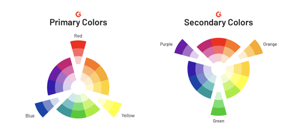
Furthermore, a basic awareness of color theory can go a long way towards helping you make informed decisions not only about what colors will convey a fitting emotion but look good together in the same space.
The final component of podcast cover art is the image you choose to represent your show. Now, before I go further into this, it bears noting that sometimes the perfect image is no image at all! That’s a valid choice, especially if it aligns with what you want your cover art to convey.
If you do decide to use an image, make sure to take into account how it can change the structure of your cover art. Generally, the trend for podcast cover art is to use fewer words the more images or complex background designs you employ.
Something to be aware of when making your podcast is the different ways it could be used in the future.
If you’re like most podcasters and starting a show that’s meant to stand on its own, then you need to make sure the cover art you choose has the flexibility to look good both on someone’s smartphone as well as the focal point for whatever auxiliary online presence you choose to provide. This could be anything from a dedicated website to a twitter page, and as such, the cover art you choose will be the heart and soul of the brand you build for your podcast.
If, however, your podcast is associated with a larger organization such as the marketing department of a tech firm, you want to make sure your cover art accurately represents the pre-established parent brand. Choosing related images, logos, and colors are all excellent ways to make sure you’re conveying a clear, consistent message to your audience and reinforcing a positive association with the product or service your company provides.
Back in podcasting antiquity, the minimum artwork size was a piddling 300 x 300 pixels. To think such small dimensions could contain the majesty of a full podcast cover. It boggles the mind.
As phones and tablets continue to get larger and pack more powerful screens, your cover art will need to adapt along with it. Make sure to use a high-resolution image.
The table below lists specifications for iTunes, Spotify, and Google podcast cover art.
| Specs | iTunes | Spotify | Google podcast |
| Size | 3000x3000 px | Atleast 640 px (LxB) | 3000 x 3000 px |
| Format | JPEG, or PNG | TIFF, JPEG, or PNG | JPEG, or PNG |
| Resolution | 72 dpi | Highest possible | High |
| Ratio | 1:1 | 1:1 | 1:1 |
| Color space | RGB | sRGB | RGB |
Podcast cover arts come in a variety of designs, from minimalist to intricate illustrations. Take a look at some examples of good podcast covers that stand out from the crowd and effectively represent the podcast content, tone, and target audience.
American comedian Joe Rogan hosts the podcast "The Joe Rogan experience." The cover art is simple, bold, readable, easy to recognize, and features an iconic image of Joe Rogan. It precisely tells you that you're in for some laughs, appealing to potential listeners. It also stands out among other cover art, due to its circular shape, opposite to the common rectangular layout. Lastly, the cover art has been consistent over the years, which helps establish brand recognition.
It is a though-provoking podcast on the design and architecture of everyday objects that often go unnoticed by Roman Mars.  The cover art features the podcast's name in a simple yet bold manner using easy-to-read typography and color combination. The small yellow block element used in the cover art captures the essence of the show and makes it easier for the listeners to recognize the subject matter at a glance. It is a good example of simple and effective cover art that conveys the right message.
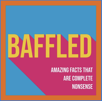
It is a comedy podcast hosted by Dan, Conor, and Mark. The artwork features the name of the podcast and a small description in a colorful and straightforward way. The cover art is simple, vibrant, readable, and easily understandable, very much suited for a lighthearted show. The content of the podcast is effectively conveyed using the tagline in white, which perfectly balances with the simple design.
When crafting the perfect podcast cover art, make sure you’re using all the different elements of design to create something that will jump out of the podcast directory at your potential listeners. By these principles, with user intent and the core idea of your content, you can easily create something that will be representative of your show and its brand.
Now that you're aware of everything that goes into making great podcast cover art, consider some of the best graphic design software to help you turn your vision into an attention-grabbing reality!
Piper is a former content associate at G2. Originally from Cincinnati, Ohio, they graduated from Kenyon College with a degree in Sociology. Their interests include podcasts, rock climbing, and understanding how people form systems of knowledge in the digital age. (they/them/theirs)
Most people are familiar with the role of real estate agent, but what about the person who...
 by Izabelle Hundrev
Whether it’s a home or a commercial property, selling real estate is no simple feat. That’s...
 by Izabelle Hundrev
The speed with which AI entered our lives is phenomenal.
 by Sagar Joshi
Most people are familiar with the role of real estate agent, but what about the person who...
 by Izabelle Hundrev
Whether it’s a home or a commercial property, selling real estate is no simple feat. That’s...
 by Izabelle Hundrev


