Forgettable branding can make or break an event.
Don’t get me wrong - branding alone won’t get people in the door, but it does have a significant impact on your event and the experience your guests walk away with. An event marketing strategy without a strong foundation in branding and design can quickly fall flat.
In September 2019, G2 hosted its first-ever one-day-only conference, Reach. In just under 8 months, we built an event brand from scratch, launched an event website, and hosted a full-fledged sales and marketing conference with over 500 attendees and 14 incredible speakers.
So, how did we do it all?
How we created the Reach brand
For our first-ever G2 conference, we knew we had one chance to get the branding and design right. We had a clear vision for Reach; it would be an opportunity to create a space where our audience of buyers, vendors, and investors could come together to connect and get inspired. One of our core company values is to help businesses reach their potential, and we wanted our first conference to encourage our audience to do exactly that.
Our foundational ideas for Reach were strong, but now it was time to execute on them. Our creative team was put to the challenge of executing and creating an event brand that conveyed the essence of G2, but was compelling enough to stand on its own. We wanted to create something unforgettable.
Let’s start at the very beginning.
Background and agency partnership
When we started working on Reach, the creative team at G2 consisted of myself (the creative director) and one copywriter. We were in serious need of some help when it came to the actual design of the event.
To help kick off our efforts, we ultimately decided to partner with emc3, an event marketing agency based out of London. Their team had experience working on large-scale events for other big players in the B2B space, such as HubSpot and Drift. In addition to having a fully built-out design arm of their agency, emc3 was also able to help us with event logistics, securing sponsors, and managing speaker assignments.
Initial brainstorming sessions
It was clear to us that we were going to create a separate brand for Reach - which is common for conferences nowadays. What we didn’t want to do is turn the event into a G2 sales pitch. Although Reach is G2’s conference, we wanted the event brand to be able to have its own unique meaning and identity.
This brought on a separate challenge: how could we create a brand that was connected to G2 without being overtly self-promotional?
To add insult to injury, we had no speakers lined up during this phase of the event planning process, which made it difficult to define our brand promise. The vision was to create a conference that was forward-thinking, authentic, and foundational.
The hard part was translating those ideas into an actual design.
Creating brand elements
During our initial brainstorming sessions, we came up with the brand concept of a blueprint and a wireframe. Simply put, these are often two foundational elements for something to be built (i.e. a building or a website). After countless sketches and re-designs, we decided on the final Reach chevron logo, which pulls inspiration from the original G2-branded chevron but with a twist.
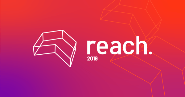
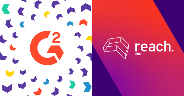
Next, we explored a range of colors that were on the same spectrum as G2’s brand colors but differed slightly. We finally went with a bright purple and orange, which we manipulated to create an ombre effect.
Below, you can see the Reach and G2 brands side by side.
The website launch
Time (or lack thereof) was our biggest blocker going into the next phase of event planning. In June of 2019, we hired Laura Weiss as our lead brand designer. She was vital in re-working our initial brand assets and finalizing them in time for the website launch.
The pressure was on. The event website was the first time most people would be learning about and interacting with Reach, so it was imperative to make sure the branding was consistent and impactful. The finished product debuts the Reach brand front-and-center. It’s simultaneously bold, vibrant, and simplistic. Our G2 logo is present but takes a backseat to the rest of the design.
The finale
After developing the brand assets and official website, it was time to bring the digital elements to life in a physical space.
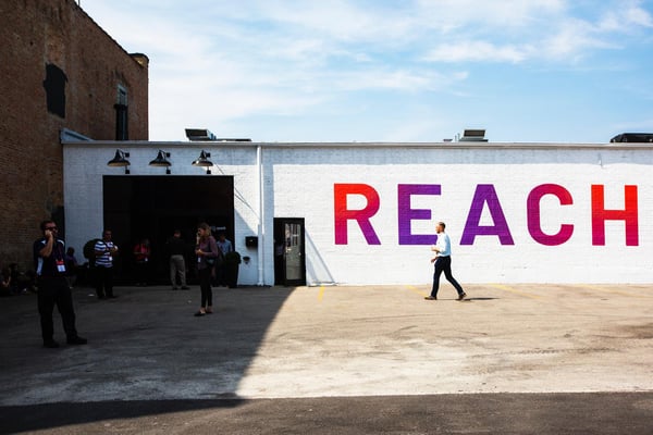
“Once we had finalized our brand elements, the next step was walking around the venue to see what walls and other areas we would have access to. From there, we were able to start thinking about how we can flex those brand elements into something that goes beyond a digital experience and occupies physical space,” says Weiss.
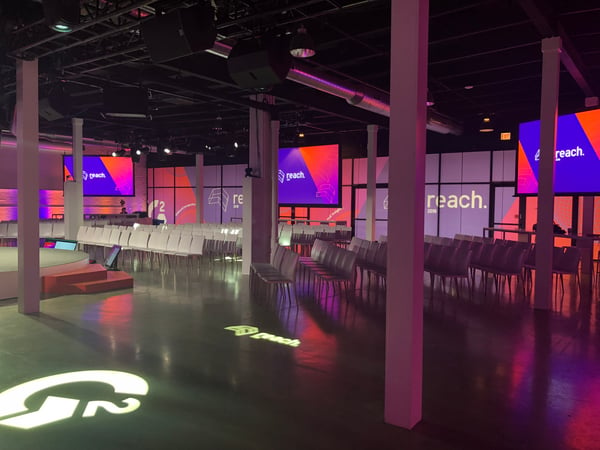
We aimed to mirror the online personality of the event as best we could inside the venue. In the spirit of Reach, we felt inspired to go as big with the in-person brand assets as we could. The walls within our venue were mainly white, so we blew up our logo and covered any open space with the chevron. It was important not to miss any little details – everything from the ID badges, ticket booths, merchandise, and even the tissue paper used for lining the lunch food was branded.
See you in 2020!
Creating a recognizable brand takes time. Luckily, Reach 19 is the first of many more conferences from G2. For future events, we intend to continue building a community around authenticity and inspire our network of sponsors, speakers, and attendees to reach their potential. Our first conference was a crash course for all of us in event branding and design, and we look forward to seeing how the Reach brand evolves over time.
From myself and everyone at G2, we hope to see you at Reach 2020!

.png) by G2
by G2
 by Hillary Fortin
 by Lyndsey Hrabik