
Website conversion rate can be a huge pain to a lot of founders and SaaS companies.
For all industries, on average, the website conversion rate is around 2.35%, while the top 10% of websites have a conversion rate of 11.45%. A vast majority of websites are in this middle of 2 to 4%. But what if someone told you that you could blow up your conversion to more than 15 or 20%?
That would mean that you’d be in the top 5% of the highest-converting websites.
In this article, we’ll show you five actionable ways to improve the website conversion rate by our own findings, results, and techniques.
We’re working on three different projects: lemtalk, lemlist, and lempod. Over the years, we experimented a lot with our websites and conversion rates. In the end, we’re getting on average 15 to 25% conversion rates on all projects separately. That’s not bad at all since usually that’s around 500 to 1000 new trial users each month.
So, here are the five ways that helped us boost our own website conversion rates, and how they can help you find similar success.
A lot of people is thinking that more “amazing” your site is, the better conversion rates you can have. Based on my personal experience while working for various SaaS companies, that’s not true. Of course you shouldn’t have a website that looks so ‘90s, but you also shouldn’t have a website that’s full of animations, different colors, and so on.
Too much noise is just as bad as no innovation.
Instead, simple and clean landing pages have a tendency to perform the best. There is a clear reason why simple landing pages are better than complicated ones. Landing pages that have a lot of animations will interrupt the user’s experience and will make them lose the focus on your website.
Simple landing pages are focusing your website visitors on the content itself, not the design. Thus, website visitors will be able to learn more about you, your company and your product.
Here are two examples so we can understand this better:
/5%20Actionable%20Ways%20to%20Improve%20Website%20Conversion%20Rate-1.webp?width=600&height=242&name=5%20Actionable%20Ways%20to%20Improve%20Website%20Conversion%20Rate-1.webp)
As you can see, the website isn’t just slow because of these numerous animations on the homepage, but it’s also unclear and not so easily understandable. This kind of website knows frustrates the user, affecting their experience.
Here’s an example of the new design we recently made for lemlist:
/5%20Actionable%20Ways%20to%20Improve%20Website%20Conversion%20Rate-2-1.webp?width=600&height=229&name=5%20Actionable%20Ways%20to%20Improve%20Website%20Conversion%20Rate-2-1.webp)
As you can see, there are animations, but they’re synchronized with the content itself and they’re not interrupting the user experience. Don’t over complicate your websites. Simple, clear and understandable landing pages are everything you need. Animations and weird UX experiences will only push your website visitors away.
Most websites we browse contain illustrations, which were a huge trend a couple of years ago, but not anymore. In other words, they’re still trending (since a lot of people are using them), but they’re not effective as they were one or two years ago.
The main reason for that is because no one will remember your illustrations. All of them look the same.
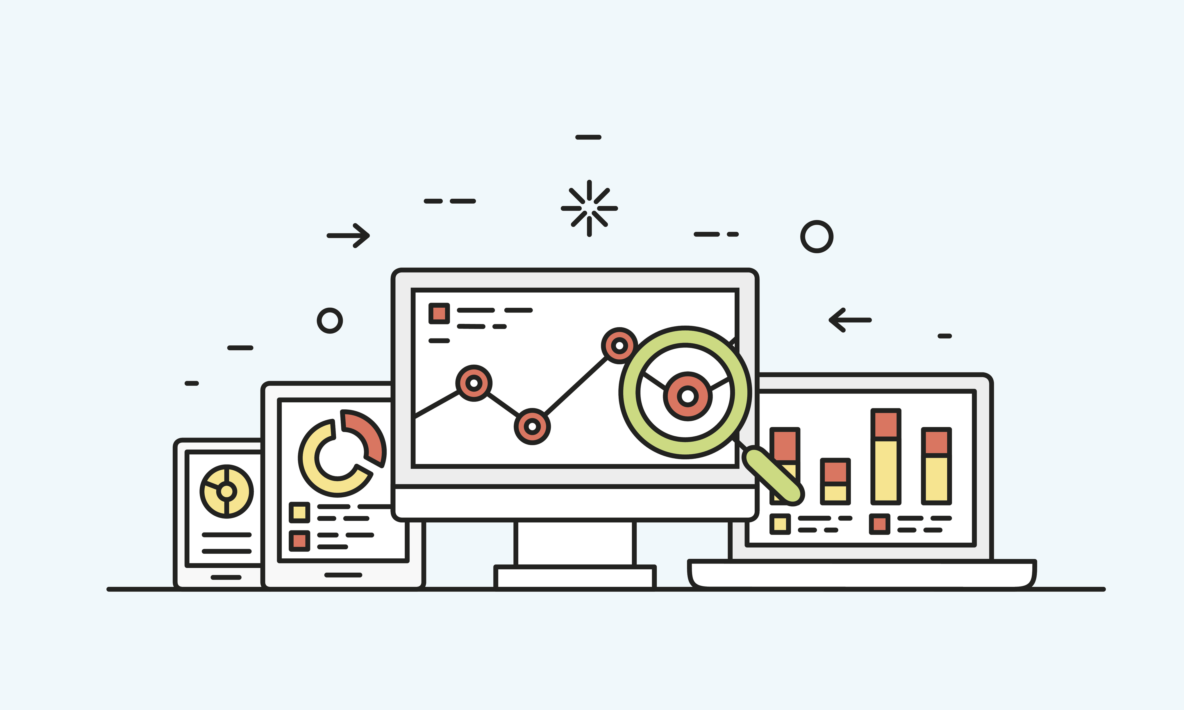
Just take a look at this one:
Every second website uses the illustrations with graphs, charts and “hockey-stick growth”.There’s nothing unique there. On the other hand, there’s something that’s better than illustration and that brings more results (in terms of website conversions).
GIFs are something that’s working really great for us on all three projects:
/5%20Actionable%20Ways%20to%20Improve%20Website%20Conversion%20Rate-3.webp?width=600&height=312&name=5%20Actionable%20Ways%20to%20Improve%20Website%20Conversion%20Rate-3.webp)
As you can see, lempod - one of the LinkedIn marketing tools, is using GIFs on its landing pages to drive attention and explain how the product works.
You know that old quote an images speaks a thousand words? Well, the updated version is a GIF speaks a thousand words.
The reason why GIFs perform so great for us is because they’re explaining the product better than both images or illustrations. To be more precise, after we started using gifs on lempod’s landing pages, our conversion rate jumped for around 50%.Before, we were getting around 120 weekly users. After we included GIFs, for the same amount of website visitors, our user growth jumped to around 250 to 300 per week.
Illustrations and vectors on websites speak nothing about you or your products. However, GIFs can perfectly explain how your product works and what benefits it brings. Thus, website visitors will be more likely to signup for your product.
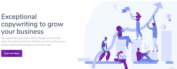
This is probably common mistake number one a lot of websites and companies make. Here’s one of the most important things I learned in business while acquiring customers: it’s never about you, it’s always about them.
Thus, you should align your website content strategies with that. Many startups and enterprise companies usually speak about themselves on their websites. But never (or very rarely) do they speak about their customers – especially in the “hero” sections of their landing pages.
Hero sections are one of the most important parts of your landing pages that should be correlated with your target audience.Usually, when someone takes a look at your hero section, that’s the moment when they decide whether they should or not move forward and scroll down.
Here’s a bad example of one hero section on Magnitude's homepage:
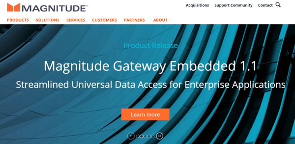
What does this even mean? As someone who has never tried Magnitude before but am interested in their product, I cannot see from first sight if this product for me or not.
This copy explains nothing. But copy that speaks about the customers, their problems, and their needs, has a tendency to perform better in terms of conversion rate.
Let's take this as an example:
Here’s how we at lemtalk position our product to the right audience. This hero section speaks about both our target audience and the benefits they can get.
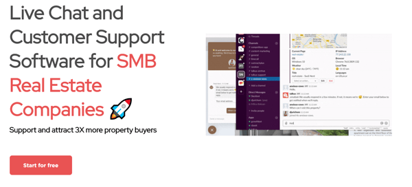
Another mistake I’ve seen is speaking about the features, not the benefits.Everyone has features. Just take the live chat products for example. Almost all popular live chat tools have automatic messages or push notifications. To be honest, it’s nothing special. But what can be special is how you present and show your features to your target audience.
So for example, at lemtalk, under the features section, we could have easily written: “Push notifications," but instead, we wrote:
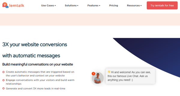
Do you see the difference? Here we’re talking about the benefits, not the features. In all, don’t speak about yourself, speak about your customers. Don’t speak about your product or your features, speak about the benefits your potential users can have if they go with you.
In the era of automation, chatbots and robots, we have a tendency to forgot that all of us are humans, especially if you’re on the buyer/user side.
Talking with chatbots on the websites became so “normalized” that very often we find ourselves thinking that people behind other companies are bots as well. I know this sounds silly, but it’s true. After we added a certain human touch on lemtalk’s website, we saw an increase of 10% in our conversion rate.
To illustrate this better here’s an example:
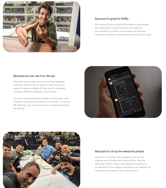
This is a section “Why choose lemtalk” that’s placed on every landing page on the bottom. As you can see, there’s a bunch of our images. The first paragraph explains how lemtalk is great for SMBs, and what’s a better picture for that than the image of our CEO smiling and offering you a handshake?
You can also see the group image of our entire team at the restaurant during one of our team meetings. What was the exact influence of these images on the overall website conversion rate, I don’t know since we included them with a bunch of other things as well, but a lot of new trial users told me that they loved these images and how funny we are.
Another great example of using the human element on the website comes from Venngage:
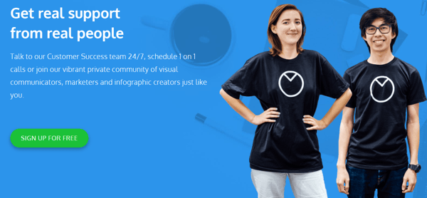
As you can see, Venngage showcases their support reps with a certain dose of human element. Everyone would prefer to talk with real people, not bots. Right?
|
Related: The human element is important on your website just as much as it is in other professional aspects, like recruitment. See another way to bring the human element back into the world of recruitment and how some of those tactics can be applied here, too!
|
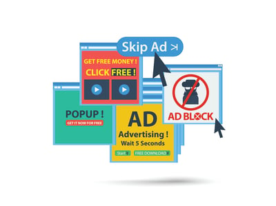
Over the last couple of years, a lot of people have underestimated the power of pop-up ads. Everyone thinks that pop-ups are just frustrating the user experience and that they’re bad for their websites.That’s true in some ways. For instance, if you don’t know how to use pop-up ads the right way, you’ll definitely end up frustrating your site visitors, making them leave.
But if you use pop-ups in the right way, you can end up with improving your conversion rates by 5 to 10%. That’s the reason why using some of the best pop-up practices is important.
For example, exit-intent pop-ups are triggered whenever someone tries to leave your website. If they already have an intention to leave it, then why shouldn’t you take advantage of that and trigger your pop-up whenever they want to leave? It’s the last chance for you to convert them (in a lot of cases), so you have nothing to lose.
A great pop-up needs to satisfy 3 things in order to perform well:
|
These three things are mandatory if you want to convert more people with pop-ups.
Let’s see an example of a high-performing pop-up:
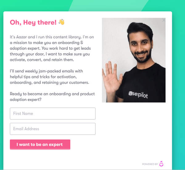
This is a pop-up from Userpilot, a user onboarding software. Since they’re talking a lot about user experiences and user onboarding in general, they decided to collect emails and educate more people.Let’s discuss what’s great about this pop-up.
When I talked with Aazar, he told me that this pop-up had a conversion rate from 10 to 12%. Not bad at all since a lot of pop-ups can’t go past more than 3 to 4%.
| Related: Learn how to make pop-ups for different customer segments to customize the pop-up experience for your user personas. |
As you can see, CRO marketing and optimizing your website for conversion rates isn’t rocket science. You just need to be creative and to think outside the box, like when you’re doing LinkedIn Growth Hacking for example. You need to think about the creative ways to promote and talk about the benefits of your product; otherwise, your website will be the same like every else on the web, and your site visitors will leave it and forget about you two minutes afterwards.
Some of the best practices to skyrocket your website conversion rates are:
| Don’t have a complicated landing page design with a lot of animations. Simple landing pages are everything you need. |
| Forget about illustrations. They speak nothing about you or your product. Instead, gifs can be a great way to showcase your product and the benefits of it. |
| Stop speaking about yourself. Speak about your customers. No one cares about you, they only care about them and how can you help them to solve their problems |
| Focus on the human element. In the era of bots and automation, human element is what binds us together. Everyone would like to see photos of your team smiling. |
| Don’t underestimate the power of pop-ups. If used in the right way, pop-ups can definitely blow up your conversion rates and help you acquire more customers. |
Now you have the top tricks and tips to improve your own website conversion rate, too. See more ways to build the highest-performing website possible, complete with extra insight to make your page stand out from the rest, all free from G2.


Pop-ups. Everywhere you go on the web they...well, they pop up.
 by Greg d’Aboville
Growth begins when you figure out how powerful the tools you’re using are.
by Ugi Djuric

An advertiser’s story often begins with having a product that needs to be sold, and organic...
 by Daniella Alscher
