The landscape of modern workplaces requires all employees to function as information workers, even those who started in wholly business or technical tracks.
Markets are saturated with technology services and applications, so organizations work to stand out through their thought leadership, customer experiences, and professionalism. These requirements put the heavy lifting for design, writing, user experience, and social media on team members who lack the skills, the confidence, or both.
It could be that nothing sounds scarier in those situations than being assigned design responsibilities when you’re not a graphic designer, conjuring up old images of elementary school art class saying “But I can’t draw” to the teacher. The great news is, you don’t have to draw well or have a degree to apply basic human concepts to your designs, quickly.
I'm not a graphic designer, but I'm a creative director who finds, edits, creates, and delivers all sorts of visual communication. I rarely start from scratch and most designs aren't uniquely my own, but they meet the needs of the audience and deliver a far better product than text alone! I’ve learned a lot from other graphic designers, learning experience designers, and branding pros over the years to develop and refine my own tips for speeding up graphic design from concept to delivery.
To get started, start searching for inspiration that fits your brand guidelines. One is to gather assets directly in your company, which could include a full brand kit with logo specifications, color palettes, font families, imagery preferences, and writing styles. Along with the brand expectations, you can also revisit materials already published to further understand the flow and feel of your company’s design.
This effort saves you time in two ways. First, if you find out your company never uses stock images with people, especially if they’re looking directly into the camera, you won’t waste time considering including those images in your designs. Second, everything you create is going to have to align with the brand standards anyway, so you save time by understanding them upfront.
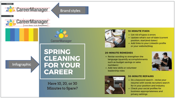
Here’s an example from some of the current work I do for our CareerManager blog. I used our color palette to create a gradient background for an infographic.
The second exploration for inspiration comes from the web. There’s no limit to what you’ll find. You can search graphic designers’ creations at sites such as Behance or Muz.li. Filter items using the word “brand” or by searching for specific color combinations. Depending on the type of asset you’re designing, you can also filter results for landing pages, icons, and mobile apps.
Using Muz.li’s inspiration search section and filtering by landing page, I found an assortment of samples that use a variety of colors and icon styles. Some use sketched images of characters, others stick to simple shape icons, and others use photographic elements. Looking at these resources helps you uncover patterns, imagery and layouts that can inspire meaning and show professionalism, and you can get to these insights much quicker by looking at real-life examples.
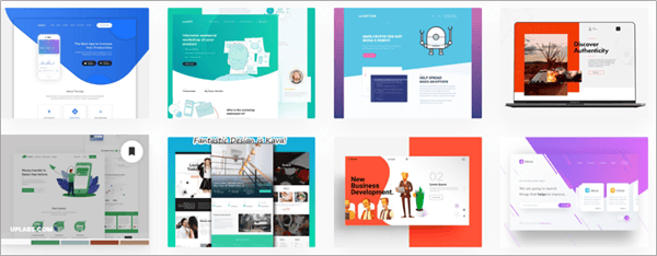
Muz.li Landing Page search on 11/1/2019 – even just showing 8 examples, you find color palettes ranging from blues and greens to reds, and shows imagery with illustrated characters, photography of nature and of people, and straightforward app and device icons.
You can also search sites where you can purchase imagery, modify, and give credit to the original creator. Some of the most common are 123rf.com, Shutterstock, and Creative Market, for example. But don’t forget the free image sites like Pexels, Pixabay, Unsplash, and Undraw.co. If you find imagery from these sites, they are royalty-free.
As someone who personally designs a lot of online interactive experiences and training programs, I source a lot of free templates from Articulāte’s eLearning Heroes. I then put my unique spin on them, modifying color palette to fit a brand guide, or rounding edges on squares to soften the look.
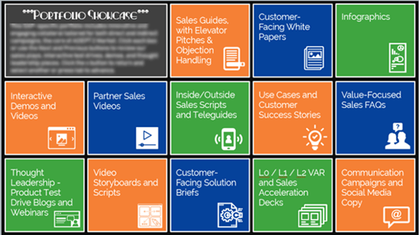
Here are some example templates I found in the Articulāte community uploaded by Piotr Peszko and David Tait. My company wanted an interactive “flip card” style to display portfolio categories and work samples. Seeing how other people visualized boxes and used interactive clicks/animations, I saved a lot of time by not trying to start from scratch trying to visualize something innovative. It also gave me starting assets so I didn’t have to draw, copy/paste, and animate every item myself.
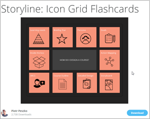
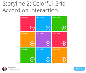 User-uploaded templates are a great starting point
Here’s the end result after applying the company color palette and selecting my own icons/fonts.
Now that you’ve gathered inspiration, it’s time to share your ideas with other project team members and stakeholders. If you have access to your end users, get feedback directly from them, too! You need to validate that your concepts fit into brand standards, and that your design implementations are visually pleasing, usable, and maintainable for your organization.
It’s best to provide a few variations on the designs to show people early on in the process. The worst thing is to fully design a product or publication only to have just one “final” that uncovers insights such as no one liking the design or that the intended functionality doesn’t work. You don’t need to create an entire prototype with every design; create small variances in design elements, such as hard edge rectangles vs. softer rounded edge rectangles or white icons with colored backgrounds vs. colored outlines around icons with no color fill.
I can’t stress enough that getting early buy-in and validation on the creative direction are critical to speeding up the design process and guaranteeing a viable final product. I’ve been a part of teams who thought they just knew what a client or their internal team wanted based on prior project experience and positive relationships. With one client in particular, I was part of a team who was asked to create videos to support sales teams as they worked to sell or upsell specific products. Rather than doing the proper upfront due diligence, we just gave them one prototype.
We thought they wanted a whiteboard drawing and animation style with simple, hand-drawn sketches. And we weren’t given any budget to create or purchase graphics. So I drew some on my iPad as a proof of concept and placed it in the storyboard, mentioning that we’d redo them to look more professional if they signed off on the initial idea. These simple sketches are shown below.

A rough set of sketches I designed as a sample proof of concept based on
project requirements that weren’t refined enough before we recommended only one style.
They really despised it. I mean, disliked it so much that it felt like the trusted advisor role we’d built with them over 2 years was going to go up in smoke because of poor judgment to bypass best practice in the process.
And then we had to scramble to pull something else together. In the end, some of the designs and animations they liked went against some design preferences/standards we tended to follow ourselves. That didn’t matter. We did what we should have in the first place, delivering what the client wanted and by not wasting time by assuming.
If you’re given a budget to work with graphic resources, great. If you aren’t initially given any budget, but you’re on a tight timeline and need to ensure quality in the imagery, you might be able to convince the team to use some funds for design assets. I sometimes have budget, and other times, I just purchase on my own and apply to my taxes as a business technology expense.
Whether I’m spending the company’s or my own money, I’m strategic in how much to spend and on how many items. I try to find one designer’s work that I know will fit the specific requirements of the current, but can also be useful in future projects. Over time, you’ll develop and refine skills as a designer using various graphic design software applications and applying colors and shapes effectively. You may find you have enough assets to work with rather than having to purchase additional resources.
I select to download the EPS files so I can modify shapes and colors in Illustrator without losing any quality and so I can export with transparent backgrounds. For the final products, I always give credit to the original creator when I use the modified assets in materials (and the way I use these items follows licensing protocols to not use the designs to make sales on my own products) with a caption.
Here’s an example showing an end product in the context for my audience. The first image below is an infographic design from ponsuwan, downloaded from 123rf.com.
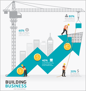
I was creating a short video with “build success with your content” as the theme. I changed the color scheme of the image to fit my brand, removed some elements, and sliced it into parts so that I could animate one after another.
A lot of people are overwhelmed by the idea of having to draw or design, but it’s faster if you stick to simple shapes. The great news about simple shapes and icons to represent people, technology, nature, and more are easily interpreted by people. When I feel like I’m overthinking a design, or just know what my initial brainstorming is going to require more complex design skills than I have, I refer to books such as Show and Tell and the drawing series of Make a World. By referring to these resources, I go back to basics, seeing standard shapes everywhere that I can use.
When I refer to these drawing exercises, I start drawing by hand on paper. I know a lot of graphic designers who start this way, with analog sketches. Much like taking notes by hand helps you retain and connect more information, drawing by hand connects your brain to the meaning and metaphors that can tell stories in your designs. Yes, even if you’re like me and can’t really draw!
Don’t throw out styles that one team doesn’t like. It can be tempting to toss out bad ideas, but I often save them in files with a specific context written at the beginning, such as "character infographic style for AI and machine learning.” By saving “starts” or designs that you like even if others didn’t, you continue to build that portfolio that helps you design quickly and with high quality.
Everywhere you look, you’ll find the inspiration that you can use to tell meaningful stories and help users solve problems with your products. You can build a collection of design assets, practice designing on paper, with basic shapes, on developing more advanced concepts. And you can modify work you find elsewhere so that you’re not always starting from scratch.
Care to learn more about graphic design? Check out our knowledge hub with over 50 free resources to help you refine and perfect your creative processes.
Jill Martine is a creative director who knows how to write and design to help people do things better, with a focus on design and experience. She has spent 14 years in technology consulting creating experiences based on real stories and scenarios, making them meaningful, engaging, and actionable. Her passion is thinking about how an end user solves problems and how to create role-based opportunities for them to apply skills to their jobs. She has a Master’s degree in Technical and Scientific Communication from Miami University of Ohio and a BA in Communication from the University of Northern Iowa.
Brainstorming swag bag ideas for your next event? You’re not alone.
.jpg) by Patrick Doolin
by Patrick Doolin
If you think about it, visual content is the secret ingredient in transforming text-based...
 by Kai Tomboc
Backlinking is a tried and tested way of boosting your SEO rankings.
 by Amna Bajwa
Brainstorming swag bag ideas for your next event? You’re not alone.
.jpg) by Patrick Doolin
by Patrick Doolin
If you think about it, visual content is the secret ingredient in transforming text-based...
 by Kai Tomboc
.jpg?width=400&name=iStock-635930508%20(1).jpg)
