When you visit a website, what’s the first thing you notice?
Whether it’s the use of imagery, an engaging video, or a fun font choice, chances are it’s the look, feel, or design of the site.
With that being said, how do you know which web design elements are the right choice for your company and its brand? I know there’s a lot to consider, but keep reading to find out,
Interested in learning something specific about web design? Jump ahead to:
You’re not alone in feeling overwhelmed by all of the possibilities and routes to take with web design.
If you’re interested in website building and have gotten to the design stage, it’s time to get creative. Not sure where to start? Let’s dive in.
If a picture is worth a thousand words, chances are you’re going to want to choose the best images for your website. Especially when you consider that 51 percent of B2B marketers prioritize creating visual assets as part of their content strategy.
With that in mind, how do you go about knowing you’ve chosen the right images that convey the message behind your brand? First, start out with top-quality images, preferably ones with large pixels and a high-resolution. Next, make sure they’re relevant to your brand. A great example of this is how Pandora, a brand that sells jewelry, uses product images on its website to spark interest in their products.
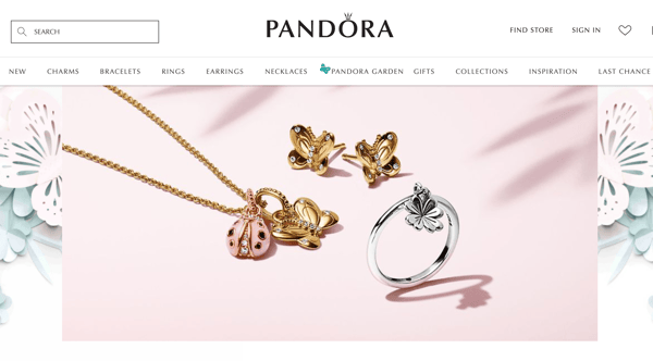 Source: us.pandora.net
Next, consider images that get a customer, or the site visitor, to do something specific. This would be an image that doubles as a call to action. For instance, Starbucks knows they have a menu that changes all the time, with new and exciting variations and ways to get a caffeine fix. Because of this, they have made it easy for you to decide which espresso is right for your Monday morning commute.
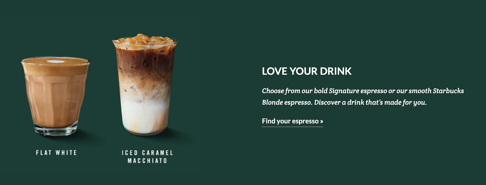
Source: Starbucks.com
The images on your website should also get a point across. Is your product all-natural? Say it with an image instead of a block of text that a customer most likely won’t read anyway. Is your website selling a product, like clothes or eyewear? Another great example of using imagery would be to showcase real people wearing your product so your customers can envision themselves wearing it, too.
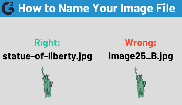
Once you’ve added these images, don’t forget about SEO! Make sure the name of your image can be crawlable by search engines. Avoid using punctuation, spaces, and underscores in the file name. On a similar note, make sure the alt text of your images describes what they are showing.
In addition to eye-catching images, knowing how to use video to get a message across is an absolute must. There are many ways that you can choose to use video, one being a homepage background video. In this case, the video should have a clear message, show how your company solves a specific problem, or explain the ways you stand out from the competition.
You can also use case study or testimonial videos to showcase a specific story, instead of using paragraphs of text. This makes the message more authentic, especially since 55 percent of people pay close attention when consuming video, which is more than any other type of content.
For example, here at G2 we use real customer video reviews as a way to be more transparent and helpful to those looking for the right software for their company.

Video is also a great way to display your products. From showcasing a video of a model wearing specific clothing items to a video of a recently revamped hotel room, videos can enhance the experience of a website visitor.
To sum up, videos on your website should tell a story, keep a customer engaged, and build trust in your brand. Also, make them fast to consume, as the customer’s attention span isn’t as long as it once was.
It’s clear that images and videos can be used to get your point across when you don’t want to use text. But, what if you do? In this case, make sure to select the best typography for your company and its brand.
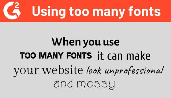
There are some simple rules to follow as you go about your website’s typography. First, don’t use too many fonts at once, as this can be hard to read and look unprofessional.
Also, make sure to coordinate the typography with your brand and its identity. Is the vibe traditional, contemporary, rugged, or elegant? There is bound to be a font choice that fits the tone of your site.

In addition, be aware of spacing. Your site users aren’t going to want to read a never-ending line of text. Additionally, a giant block of text in a long paragraph isn’t exactly enticing, either. For maximum readability, try and stick to 60-70 characters per line on desktop and 30-40 characters for a mobile device.
Other good tips to keep in mind are to avoid writing in all caps, unless using acronyms or logos, and to make note of color contrast. You don’t want to give website users eye-strain, so always test the color choice on varying devices.
A great way to engage with site visitors is to use calls to action (CTAs). A call to action is a button or a link that tells the viewer to do something, or take action. They should be eye-catching and have a message that effectively tells a user why it should be clicked.
One method for incorporating CTAs is for lead generation. Have an email newsletter you’d like customers to subscribe to? Check out how Quay Australia promises 10 percent off your purchase if you enter in your email address. They even changed the button from a generic message like “submit” to “get my 10% off”.

Source: quayaustralia.com
CTAs can also contain a form for a customer to fill out, which is a two-step process: taking the time to fill out the information and then clicking the button to submit. To ensure you don’t lose the customer along the way, make the form enticing and tell the customer why they should fill out the form in the first place. For example, Madewell explains the insider perks that customers will have once they click “Sign up.”
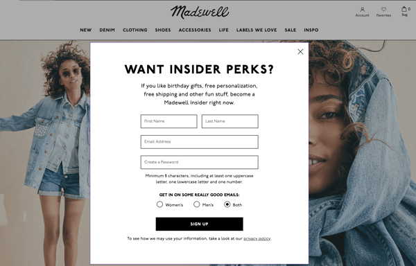 Source: Madewell.com
Other forms of CTAs your website can have are “Read More” or “Learn More.” Draw the reader in with a few sentences of an article or press clipping and then use this CTA to take the reader to the actual page. If you’d like blog readers to share your posts on social media, consider social sharing CTAs. And, if your brand has a webinar or conference coming up, event promotion CTAs are a great way to get people interested.
At this point, it’s clear that a lot goes into the design of your website, but through it all, it’s important to keep the wants and needs of the user as the primary focus. This method is called having a user centered design for your website, which means having an understanding of the people you’re trying to reach and designing from their perspective.
To do this, first examine the data of each page on your website. Which blog post has the highest bounce rate? Which one has the longest time on site? Consider why the user is or isn’t engaging with that specific content. Secondly, design your website for your specific audience, or demographic. You wouldn’t design your site for children the same way you would for senior citizens.
Another way to accomplish this is to listen to the feedback from your customers. Maybe they’ve said that certain pages takes too long to load or they have difficulty accessing areas of the menu on mobile. Whether the feedback is positive or negative, take it all into consideration.
Don’t just take my word for it. When I asked the experts in website building and web design what tips they wanted to share, they had a lot to say! Their web design tips are bound to provide you with new insight regarding how you can take your old and outdated website into something fresh and trendy. See how you can implement some of their tips for your website.
|
Related: For the tools to create, edit, and update your web pages, check out the best web design software on the market, brought to you by G2!
|
Whether you’re artistic at heart or dipping your toe into the world of web design for the first time, the bottom line is to have fun with it. Think outside the box when it comes to the design of your website. If it doesn’t work, you can always go back and choose a different font, swap out an image, or upload the next viral video.
Interested in reading more about web design? Discover some web designer tips from the professionals.


"People ignore design that ignores people." - Frank Chimero
by Mara Calvello

Nonprofit web design isn’t something your organization should overlook.
 by Murad Bushnaq

Rome wasn’t built in a day, and chances are, neither was your favorite website.
by Mara Calvello
