Claustrophobia: the fear of being in a small space or room without the ability to escape.
While we’re not all diagnosed with this, it’s probably fair to say that the majority of us don’t look forward to getting into a cramped elevator full of people, or sleeping on the top bunk when the ceiling is just a little too close.
We all like to have a little elbow room; as it turns out, letters are like us in that way.
For designers and non-designers alike, there are a lot of typography terms to keep track of; even the word “track” means something different in the world of typography. But let’s focus on one thing at a time. We’re here to learn about kerning.
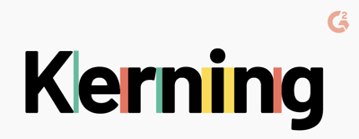
Kerning is the adjustment of space between two characters (letters, numbers, punctuation, etc) to make for a more visually appealing result.
It doesn’t matter if the font you use has been designed by someone else or if you make your own font - kerning is a must if you want your design to come out picture perfect.
Kerning is an important part of typography - so important that it’s getting its own article. Before we get into kerning practices, there are some other terms and definitions to keep in mind.
Spacing is the amount of space between characters.
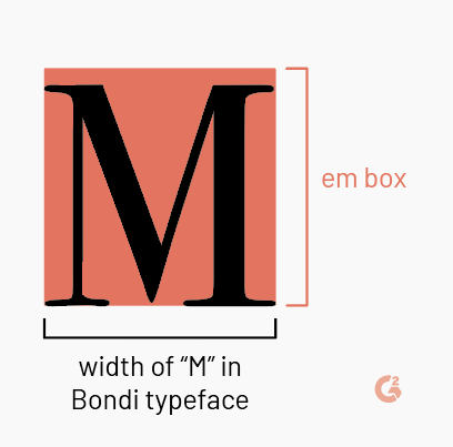
Kerning is the process of adjusting that space between two characters. Adjustments are typically made in increments of 1/1000 em.
Em is a unit of measurement for the width of printed materials. It’s equated to the width of the letter M in the typeface being used for the particular project.
Got it? Great. Let’s keep moving.
There are two main types of default kerning that a majority of graphic design software tools provide: metrics kerning and optical kerning.
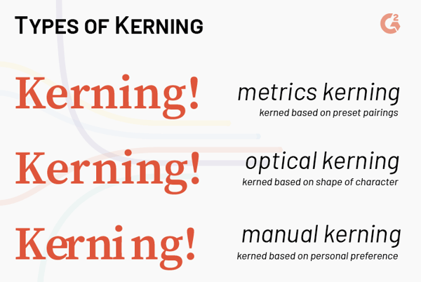
Metrics kerning is automatic kerning done by the graphic design program that is built into the font itself in a kerning table. The kerning table assigns standard values to kerning pairs that are often problematic, such as “WA” or “Ta”.
Optical kerning is also built into the font. Instead of referring to a table, optical kerning uses an algorithm to determine kerning based on the shape of the characters. For fonts downloaded from the internet whose creators may not have taken kerning into account, optical kerning solves that problem.
You can also take care of the kerning yourself.
Manual kerning is exactly what it sounds like. DIY spacing is sometimes your best bet if you have a specific idea in mind, like showing what bad kerning can do. Designers who take this route undoubtedly have the most amount of control over their kerning. We’re going to continue this article with advice regarding manual kerning.
Some glyphs won’t give you any problem and will be easy to kern no matter what character they’re next to. They’re well behaved. Then, there are the ones that won’t stop whispering to their partner in class and are constantly causing trouble. Kerning is difficult with these characters for several reasons. Here’s the lineup:
Slanted characters: A, K, V, W, Y
Characters with arms or cross strokes: F, L, T
Letter combinations: W + A, V + A, T + lowercase vowel, F + lowercase vowel
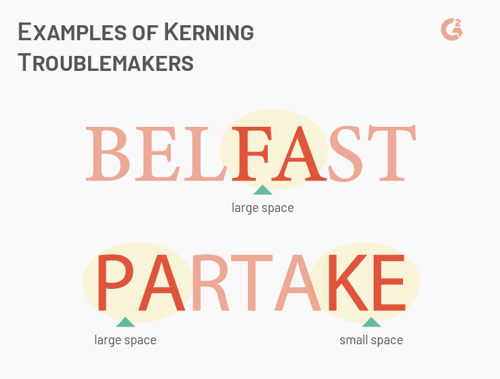
When manually kerning, pay special attention to these particular letters and combinations. Some may try to sneak away from you by appearing in the middle of a word. The kerning between the problematic letter and the character to its right might look fine, but make sure to check the left.
There’s no mathematical formula to help you make sure that your kerning is perfect every time. It’s almost entirely based on eyeballing, but there are some tips to help you along the way.
The way you look in your profile picture on your phone probably isn’t as bad as the way you look when your face is projected onto a flatscreen TV for a Skype meeting.
The same goes for kerning. Part of the reason that metrics and optical kerning works for a paragraph is because the font size is typically too small to notice kerning errors. It’s not until the words are on a billboard or storefront that the mistakes are noticeable.
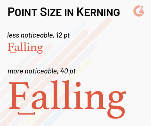
With this knowledge, know when to kern. It’s not usually necessary to do this for large blocks of text, but headers, banner images with text, and titles should be given special attention.
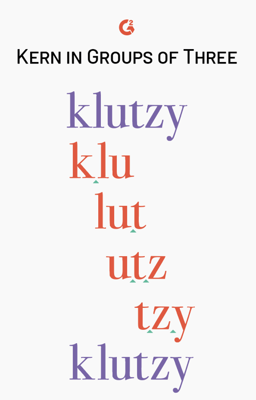
Kerning words like “bagels” and “free” aren’t too bad, but if you’re looking for a quintessential word that can be overwhelming to kern, that’s it: “quintessential”.
To make this word (and other lengthy ones) feel a little less daunting, try breaking it up into groups three characters for a better kerning experience. Take the first three letters of the word, kern, and then shift over one character until you’ve reached the end of the word. This will help break down this seemingly endless task into more digestible bites.
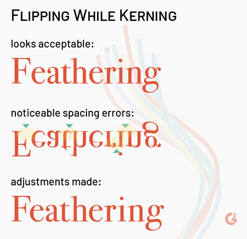
It’s often been said that one of the best ways to make sure you’re kerning properly is to flip the word upside down. How could this possibly help?
Instead of looking at the glyphs as recognizable characters, flipping them makes everything lose its meaning. Letters and numbers simply become shapes, making it easier for you to focus in on the task at hand. Pretty smart.
Typography is more than just kerning. Designers should choose their typeface and font as well as adjust their leading and tracking before even thinking about kerning. Kerning should be treated like touching up a photograph - make all of the large adjustments before the minuscule ones. This isn’t to say that kerning isn’t important - there are some steps that need to be taken before you get there.
Kerning, like most skills, isn’t mastered after one shot. Practice on your own projects and ask for the opinions of others. Use the tips above while you’re eyeballing and see what looks and feels right for you. Others will usually agree.
If you’re not currently working on a project, there’s always the internet. Kerntype is an interactive, online kerning game where players can attempt to achieve aesthetically pleasing text by dragging letters around to reach appropriate spacing. The solution you determine is compared to a real typographers solution, and a score is given depending on how close you came to them. Give it your best shot.
...when it’s done right. When it’s done wrong, it can ruin not only the type, but the overall reputation of a brand. Kerning is all about consistency, balance, and what feels right for the viewer. It’s powerful stuff.
Kerning plays a special part in the logo design process.

Writing a summary of one thousand pages is hard enough – how are you supposed to summarize...
by Daniella Alscher

Freelancers are like the hunter gatherers of graphic design.
by Daniella Alscher