While not all of us can be graphic designers, that shouldn’t stop you from wanting to learn about the latest in graphic design.
Plus, the multitude of DIY graphic design tools makes it easier to create eye-catching visuals. This article takes a closer look at one of the popular graphic design trends – the duotone effect.
With the duotone effect, you can wow your audience with just a few strokes and clicks. You might be wondering what the duotone effect is and what makes it so appealing. More importantly, how will you be able to utilize it in your design work?
Read on to learn about the duotone trend in design, its merits, and how you can use it in photography, marketing, branding, and more.
Let's break down the definition of the duotone effect in layman's terms for the non-graphic designer.
The duotone effect is the use of two contrasting colors to create a dramatic and visually pleasing effect in designs. Thus the name duotone. It may sound hip and new, but it has been in use for a while.
The duotone effect was first predominantly used when photography was taking its first baby steps. It was used in sepia photographs to brighten up grayscale pictures.
It was also widely used in the 1960s and 70s for record covers and movie posters to cut costs on paint and print out product in larger quantities. By using contrasting colors, artists were able to create a psychedelic effect with their work.
Fast forward to now, and you’ll notice that the duotone effect is far more versatile. Apart from photographs, they can also be used for user interfaces, infographics, comic books, paintings, posters, and book cover design. They’re also perfect for brands and small businesses who want to stand out from their competition.
As a result, the duotone effect has grown in popularity in the past few years. Whether you’re an information designer or a book cover illustrator, it always pays to know how to use the duotone effect in your work. Currently, many designers use Photoshop to create the duotone effect.
Here are some examples of how the Duotone effect is used by established brands and companies.
Spotify is one of the most established audio streaming services in the world. And like its public image, Spotify’s use of the duotone effect is equal parts fresh and hip.
In the example, Spotify’s iconic green color acts as a background. It highlights the fonts in a bright white, with a slight greenish tinge for a neon effect.
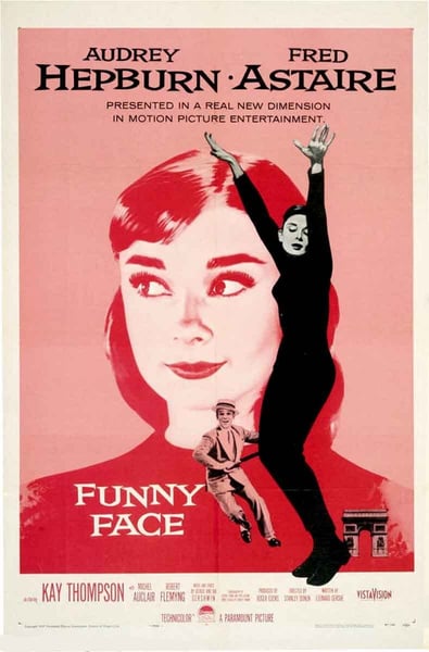
The duotone effect is not just limited to websites. You'll also see it action on movie posters, such as this beautifully rendered poster of the cult classic film Fight Club.
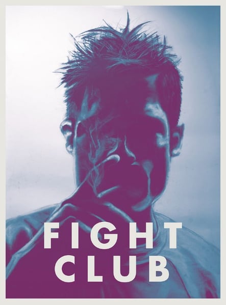
Its use of well-defined shadows and colors gives it a noir-like effect and intensity.
Adidas is the largest sportswear manufacturer in Europe. Its footwear and other sports apparel are well-known for its state of the art design and innovation.
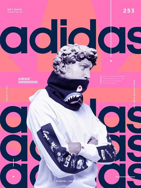
The same can be said for the use of the duotone effect in their ads. In the example, the designer superimposed the image of a Grecian statue, and used a duotone pattern at the back. Using duotone gives the picture a bold aesthetic statement.
As a website covering martial arts and combat sports events, this duotone illustration by Fightland perfectly captures the spirit of combat.
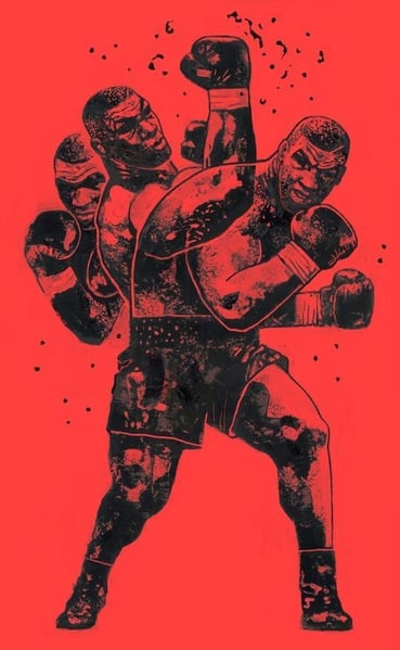
The designer used a red background to give off a sense of intensity and power. The details of Mike Tyson’s body are shaded in to give a charcoal sketch effect.
Lipman Burgon & Partners is an established financial advisory firm. And like any financial firm, the company should exude a sense of legacy and grandeur.
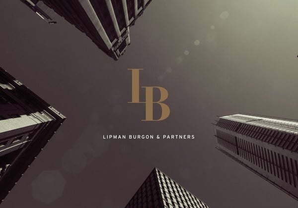
The designer captured this by using a grey gradient effect, and by coloring the Lipman Burgos branding in gold. This makes the branding stand out, capturing the viewer's attention.
Whether you are designing a website or starting out with product photography, the duotone effect is a handy design style to know. However, if you don’t know how to use it properly, your work may come out flat and unattractive. So if you want to make an appealing duotone image, use the following tips and tricks.
Although duotones are limited to only two colors, this does not mean that you can just choose the colors willy nilly. You can use only two colors so you should make them count.
Ensure that the two colors complement one another. This is where your eye for design comes in. Figure out which colors blend well together and which ones come out meh. If you mix pink and another bright color with the same hue, like peach, imagine what it would look like. It’ll likely look unappealing because they have a similar color pallette.
Next, your chosen image should work well with the duotone effect. Before you start applying the duotone effect, convert your selected image to grayscale form.
This will make it easier for you to spot and highlight the color contrast on your image. A sharp color contrast between the dark and bright parts of your pictures is equally important.
Don’t limit yourself to just one medium. Although photographs were the first medium where the duotone effect was used, don’t limit yourself to only photographs. Use illustrations and other images to add zest to your design. The more artistic mediums you use, the more multifaceted your work will be.
Be adventurous and dabble in a bit of experimentation. Although tip #1 recommends that you should be mindful of your colors, balance it out with creativity by testing various color schemes.
You should also take the mood of your image into consideration. What does your image convey? Is it sadness or happiness? Victory or defeat? By taking the overall mood of your pictures into account, you will be able to choose the most compatible and effective color combination for your duotone image.
Another way to experiment on your color combinations is to use dual shades of contrast colors to get a more dynamic effect. It will also give your images a more distinctive and polished look.
The duotone effect is a subtle yet effective design style, and can be used to spruce up an otherwise dull image.
In truth, the beauty of the duotone effect is in its simplicity. You don’t need to add myriad images to make an impact with your audience. Neither do you need to go overboard on the illustrations. The key aspect of the duotone effect is how you use the contrast of the colors to make your images more appealing and capture your audience’s imagination.
Keep learning about other creative graphic design elements when you check out G2's free graphic design hub – a wealth of information with over 50 pieces of content for your learning pleasure!


Events are a great way to network, but often we struggle to keep in contact with the people...
 by Tesni Patching
Mixed reality apps (MR) are taking the internet by storm.
 by Jose Bort

Not every "for-rent" is a "homecoming."
.png?width=400&height=150&name=Radbil%20Headshot%20(1).png) by Sam Radbil
by Sam Radbil