
Running low on creative energy every time you’re about to start on an infographic project?
Curious why no one’s paying attention to your content? Then maybe you need to transform your information and raw data into beautiful, engaging infographics. We all know what it feels like when your proverbial creative well is about to run dry and you’re clueless where to tap for your next source of fresh ideas.
Let's discover some new ways to create content for infographics that will please your audience.
The following brainstorming approaches for infographic design and ideation will help you consistently come up with original infographic ideas. As a fringe benefit, you will also get more engagement to your infographic at the same time because they are customer-centric rather than product-centric.
It's standard advice to know your audience. However, it makes more sense if you seek to understand them instead of just knowing them. But how do you get to understand them better?
Ask your audience with questions that go beyond the surface. Go beyond the typical demographic data, and ask questions that explore past and present experiences, meaning, stories, and understanding what a successful outcome is like to them.
For example, if you're a cannabis shop owner, you're probably considering infographics for brand awareness. Let's consider chronic pain sufferers as one of your core audience.
Instead of learning more about their age, gender, household income, and educational attainment, ask questions that explore their feelings or thoughts about their chronic pain experience and using cannabis for relief.
As an example, let’s work through some of the following exploratory questions:
| What were your experiences like with other treatments for chronic pain relief? (question exploring past experience) |
| What's it like living with chronic pain? What's your day like? (question exploring present experience) |
| What is “painful” to you? (question seeking meaning) |
| What's chronic pain relief to you? (question on what success looks like to them) |
| What are your concerns or doubts before trying out pain relief products such as cannabis? How do you make decisions when buying a product or service for chronic pain relief? (questions exploring their thought process when choosing a product or service like yours) |
With these questions in mind (and answers from your target audience), you’ll quickly realize that you can create infographic content addressing these questions.
The following infographic “Does CBD Oil Show Up in a Drug Test?” is a good example. It addresses the question “what are your concerns or doubts before trying out cannabis products?” The infographic acknowledges doubts or apprehension felt by chronic pain sufferers who are considering CBD oil for pain relief.
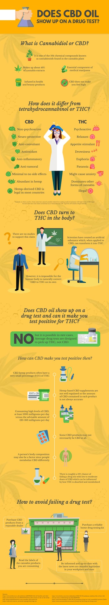 Infographic courtesy of Testclear
Your action plan: Talk to at least five people who fit the criteria of your target audience persona and ask them questions beyond demographic data. Plan for an infographic based on the answers you’ve gathered.
Story mapping is a method for arranging user stories to create a more holistic view of how they fit into your overall user experience. Meanwhile, a user story is a short, simple sentence told from the perspective of your users and customers.
When writing user stories, use this simple formula by Mike Cohn, co-founder of the Scrum Alliance:
“As a [type of user] I want [some particular feature] so that [some benefit] is received.”
Here’s an example:
“As a yoga instructor, I want to be able to create custom yoga routines for my students from my phone so that I don’t have to carry my bulky laptop with me when I’m on vacation.”
Author Donna Lichaw identifies three types of user stories in her book: origin story, concept story, and usage story.
Now you’re probably thinking: user stories are for product design and development. What does it have to do with infographic creation?
For a start, let’s put the spotlight on usage stories. According to Lichaw, a usage story is the story of someone using your product or service - step by step.
Here’s an excerpt from her book:
A usage story can take place over a period of seconds, minutes, days, weeks, or years. They help you figure not what a customer should think about your product or how they find your product, but how and why he will use, experience value in using, and continue to use your product in one sitting over time… Just as with concept and original stories, your usage stories can be based on real data or sketched out as a hypothesis.
When mapping your usage story, use the guide questions illustrated in the following infographic:
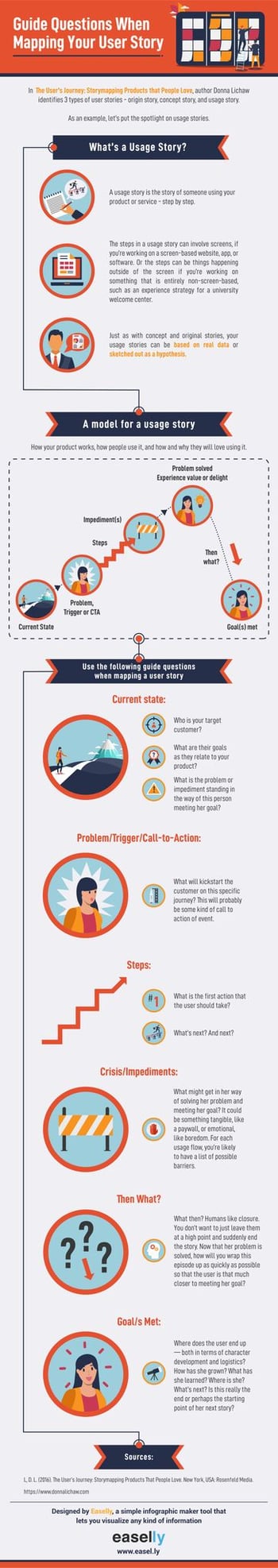
As an example, let's map the usage story of the user story statement that we earlier wrote:
| The problem? A yoga app for teachers and practitioners had low engagement rates and repeat usage numbers. As a result, the product design and marketing teams decided to work together in figuring out how to improve these numbers by mapping a usage story. |
| Current state? A yoga app for teachers and practitioners have low engagement rates and repeat usage numbers. |
| Problem, trigger, or CTA? After downloading the app, the app's welcome message "Create and share custom yoga routines right on your phone in minutes!" greets the user. |
| Steps? After tapping the welcome message, the user is introduced to the yoga pose library. |
| Impediments? The user thinks that the yoga pose library is cool, but he wants to add his own set of short videos. He wants to make his routines more personalized by doing the yoga poses himself, and adding music he has curated. |
| Problem solved/experience value or delight? Another CTA button or microcopy in the app says, "Want to add your videos or music?" The user is pleased to know that he can actually do this! |
| Then what? At this point, you discovered that your app doesn't offer the "next step" to keep the user engaged in your app. What happens after the user uploads his video? |
| Goals met? User clicks "home" and is taken back to the home page with a link to the library of yoga poses. Instead of using your app, he feels that it's easier to record a video of him doing yoga and upload it on YouTube for his students to see. |
With these findings, the product design team gets to work in adding a feature where the yoga instructor gets to upload videos and build their own library of yoga routines.
Meanwhile, the problems identified after mapping your user journey are perfect opportunities for you to use as new ideas for infographic creation.
For instance, you can create infographics highlighting different routines such as yoga for beginners, yoga for chronic pain sufferers, yoga for pregnant women, or yoga for new fathers.
Afterward, highlight these infographics in your app for the yoga teachers to use as a quick guide when creating their routines.

Your action plan: Gather people in your team for an hour or so of customer journey mapping. Pay attention to user problems or challenge when mapping user journey. Afterward, create infographic content around these user roadblocks.
You’re probably familiar with outlines when creating content, whether it’s for a blog post or for an infographic. An excellent alternative to outlines when brainstorming new ideas for an infographic is the zero draft.
Think of the zero draft as a brain dump exercise. You can either do it alone or with your team. Here’s a quick look at the process with “yoga” as a topic example.
Here’s an example of a visual case study about yoga. It was such a broad topic, so we created a zero draft, went through the process, and narrowed down our list to the following questions:
From these questions came the following infographic about yoga.

Your action plan: Organize a zero draft exercise with your team. If pressed for time, set timer for an hour or so.
If you notice, these brainstorming exercises have one thing in common: they're all about getting to know your customers intimately by shifting your perspective to theirs.
Don't just create infographics for the sake of creating one. Your audience will almost always have questions needing answers and problems requiring solutions. Sharpen your skills in figuring them out, and you'll end up with fresh, new infographic content that will outperform boring, dull visual content marketing every time.
Feeling inspired by the above infographics? Get your thinking cap on and browse the top-rated graphic design software on the marketplace today!


In 2019, on average, 99 percent of consumers check their personal emails at least once every...
 by Victoria Taylor

There have been many articles written about utilizing GIFs in marketing.
 by Steve Rado

For a long time, the marketing efforts of major brands had one big thing in common: they were...
 by Andrej Kovačević