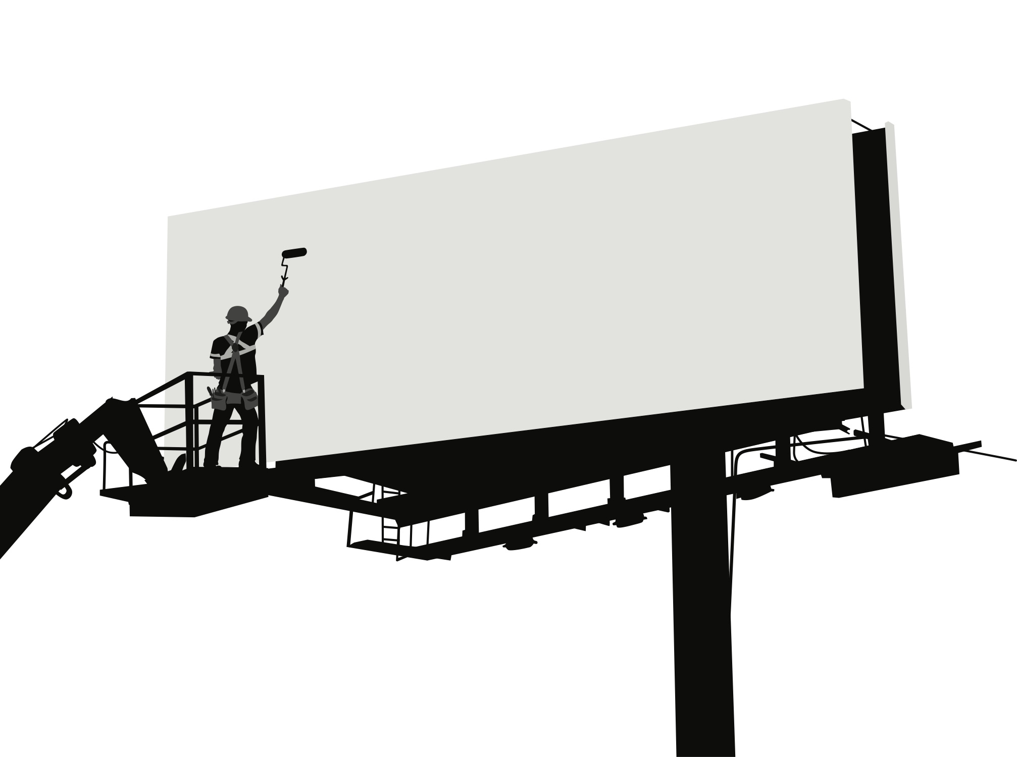
Billboards are irrelevant.
That’s what some people might think. Today, we’re much more absorbed in the things that light up and that we can hold in the palms of our hands.
But people still drive every day; it’s the only time when our phones are down and our eyes are up. While you’re listening to a podcast or jamming out to some music, your eyes are darting between the road and … billboards.
In advertising, billboards fall into the category of out-of-home advertising (OOH). OOH is one of the five traditional media platforms, along with TV, radio, magazines, and newspapers, while digital advertising is non-traditional.
According to the Out of Home Advertising Association of America, all traditional advertising is projected to decline. Except for billboards.
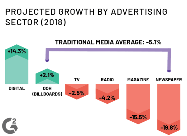
Data courtesy of Magna
Surprisingly, billboard advertising is on the rise. Yours can be just as effective as anyone else’s, as long as you design it well.
People don’t have a lot of time to look at billboards while they’re on the highway, but that doesn’t mean that they don’t look at all.
It’s important to make the most of the time and space that you have as you’re designing a billboard. Here are a few ways you can do that.
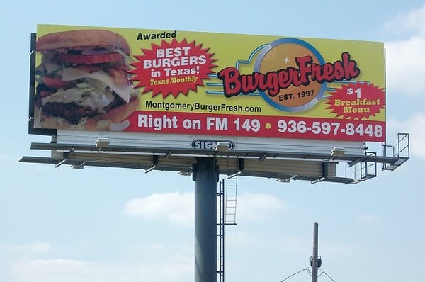
A billboard holds the attention of drivers and passengers who are cruising at 70 miles per hour for maybe six seconds. This means that, as a designer, you have to ensure that these people see, understand, and remember what the brand is trying to say.
Why does the brand you’re designing for want a billboard in the first place?
Is it to encourage people to visit their brick-and-mortar? Provide the address? Or on which exit the store is located?
Is it to be able to recognize the brand next time they see the logo? Make that logo the focal point of the billboard.
Whatever the reason may be, make sure it’s clear, and make it the focal point.
If you have too many goals in mind, your billboard will end up looking something like this:
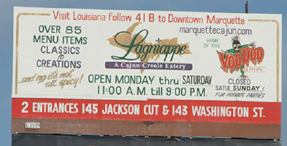
Source: The BLU Group
What did Lagmappe want?
Maybe it was for passersby to remember their logo, or maybe it was for them to remember that other logo. Maybe it was for drivers to visit their entrance to their location - wherever that location is. Maybe it was to visit their website.
It’s a real mystery.
The billboard above uses too much color, too many elements, and too much information. Onlookers can’t know what’s most important, will become overwhelmed, and, ultimately, remember nothing.
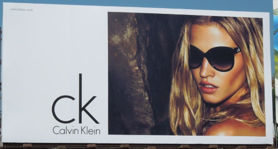
Source: Daily Billboard
This billboard is much easier to look at. Calvin Klein gets it.
The designer provided onlookers with a logo and a picture. CK is asking for brand recognition.
That’s it.
What’s the upshot here? All in all, make the viewer remember what’s important and make what’s important look great.
A majority of billboards are trying to say something, and designers often use words to get the job done. Before you start typing away, here are a few things to be wary of.
Words are put on a billboard for people to read, not for decoration. The easier a font is to read, the more likely the viewer will understand the message. Avoid curly fonts and thin fonts to ensure that the message is readable.
Spacing letters t h i s f a r a p a r t makes it almost impossible to read, and the same goes for pushing letters tooclosetogether. When placing your text, make it so that each word stands alone and serves its own purpose, otherwise known as kerning. Work with a copywriter to ensure you’re font design aligns with his or her vision of the words coming to life.

When designing a poster or a print ad design, sizing up your text is easy because everything is scaled on your computer screen and printer.
Sizing text for a billboard is a different story.
Billboards come in many shapes and sizes, but the ones you see on the highway are likely a standard bulletin size, which is 48 feet by 14 feet.
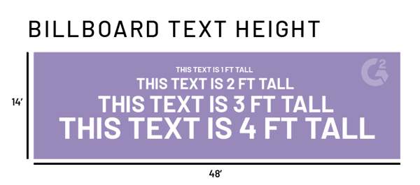
If the words are important, don’t be afraid to go big. Not only does it make it easier for the viewer to read, but it gives people driving by a longer time to check out what you’re trying to say.
Here’s exactly how long they have:
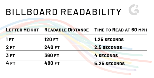 Data courtesy of: Meadow Outdoor Advertising
If you’re still not sure what size font is the best, try the arm’s length test. Once your graphics and copy are (somewhat) set in stone, print out the draft to be the same size as a business card design. Hold the card away from you at arm’s length and see if the message is clear to read. If it’s not, you have some tweaking to do!
You don’t have much space (or time) to get the point across. Work with the marketing department of the company to make the message short and sweet. A general rule of thumb is no more than 7 words of importance on your billboard.
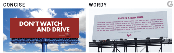
Source: Netflix, lyft
One of these billboard designs is much easier to read and absorb than the other.
Some color combinations that work in printed advertisements may not work as well on billboards. The higher the contrast between your text and background, the better.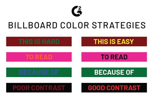
Still not sure you have a good understanding of the appropriate color combinations?
Print your mockup in black and white. If the greys are too similar to one another, you’ll need higher contrasting colors.
Use WebAIM’s contrast checker to learn a little more.
Some billboards are simply copy on a background with a logo. Other designers choose to use an image on their billboards to show their product or service. Reasons for this could be to display the product or show the face of the company.
If you decide to use a picture on your billboard design, make sure it’s a good one.
Meadow Outdoor Advertising says that a photo that is 800x800 pixels is large enough for a billboard, with 300 dpi (dots per inch). If you’re taking the photograph yourself, set your camera to the highest resolution possible.
If you aren’t careful, you could end up with something like this:
Source: VacantBoards
Nobody wants to look at that.
You may not be completely in charge of the content that goes on this billboard, but it’s important to keep this advice in mind no matter what you’re working with. While they might be old-fashioned, billboards are still an effective way to advertise a brand.
Billboards are big, so you might as well work to make yours bold and beautiful, too!
Take a moment to learn a little more about brand marketing.

Our society seems to think that handing out little pieces of paper with our names on them are...
by Daniella Alscher

May 7th is National Packaging Design Day — mark your calendars!
by Daniella Alscher

Some may think that a cover letter isn't necessary for graphic design.
by Daniella Alscher